Shannon V. OKeets
Posts: 22095
Joined: 5/19/2005
From: Honolulu, Hawaii
Status: offline

|
quote:
ORIGINAL: Froonp
quote:
1 - This is a serious concern of mine [it aggravates me everytime I look at it - text requires much more contrast], but I am not sure how to fix it.
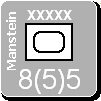
As I said in the post immediately above, I do not want to reinvent the wheel. White text has the connotation of being an elite unit (worth 3 strength points when disrupted instead of only 1). For the SS units, ADG uses red numbers. That is also hard to read. If you look at the printed counters, you will see that this is a problem with them too. When I played this game over the board, I bought several articulated lights (you could swivel them anywhere you wanted to over the map) that I clamped to the game table when we played; so you could position the light directly over what you were loooking at and read it more easily. I am open to suggestions here. I have even played around with different brightness and contrast levels on my monitor to see if that would help. It didn't.
Maybe using a light grey outline to the letters when the text is not readable.
Not writing in white, but outlining in grey or white.
Pixels for outlining are hard to find.
I am mainly concerned about this for the major powers. There are dozens of minor countries and though I would like the Netherlands and Poland to be easier to read, I am willing to abandon the minor countries to their current status if I can get the major powers looking sharp. The problem children here are the USA, USSR, and the Commonwealth (maybe Japan). Germany, France, China, and Italy have light enough backgrounds that black text shows up well. The white text is also relatively easy to read.
Option A
Messing around with the background color for the USSR is almost a WIF tradition, so I am willing to ask the artist for his opinion about tweaking that. However, since we are taking the graphics straight from the WIF FE masters for the air and naval units, it might cause other problems. In particular, I want each country's primary background color for all land units to match those of the air and naval units.
Option B
I am considering using a large asterisk after a land unit's movement # to indicate its elite status (aka "white print"). This would let me always use a white font for the major powers with dark backgrounds and a black font for those with light backgrounds. Indeed, I could do that for all the minor countries too. Then all the combat and movement factors for land units would be clearly visible all the time. This should rile the experienced WIF players, because it changes a fundamental definition in the game: white print units would no longer be white print! Taking a broader point of view, the asterisk (or some other symbol, E for Elite?) could communicate the same information. The gain in legibility would be enormous. I can do the same thing for the numbers in the corners of the air and naval units to make them more legible too.
Option C
Another possibility is to change the background color that the font is drawn against. You see this now for the air unit range, the naval unit range and movement points and a bunch of other places. Actually, those examples aren't quite what I am proposing here though. Those examples have a larger rectangle into which the numbers are placed (using transparency). The boxes are much larger than the letters. Right now the text for a land unit's combat strength and movement are drawn using transparency. If I change that and specify a background color, the text will sit within a smaller rectangle. I'll try to get around to producing an example today.
Option D
Leave everything as is.
And your opinion on these options is ....? Or perhaps you have another solution?
_____________________________
Steve
Perfection is an elusive goal.
|
 Printable Version


 , because divisional units (especialy artillery units) must stand out also from the rest, because they are different and behave differently in many aspects of the game mechanics.
 .
. 

 , in fact I knew the difference, but I typed too fast without giving it a second look.


 New Messages
 No New Messages
 Hot Topic w/ New Messages
 Hot Topic w/o New Messages
 Locked w/ New Messages
 Locked w/o New Messages
 Post New Thread