YohanTM2
Posts: 1143
Joined: 10/7/2002
From: Toronto
Status: offline

|
quote:
ORIGINAL: Manic Inertia
As you've said yourself already, Shannon, 'you can't please all of the people all of the time'.
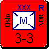
The shadowy 3D effect on the counters is a massive leap forward in the graphics, it really, REALLY brings the game up to date, and lends a much more satisfying visual appeal, but I think it's time to let let go of this priority that's evolved regarding those who are blighted with colour blindness. Regretably prejudiced as I might sound, I'm pretty sure we're talking about an absolutely tiny proportion of potential players, and if your time is consumed catering for THEM, what's next - a politically correct work-up for jewish players, with Nazi Generals that were indited at Nuremburg erased from the HQ counter names? SS counters and Japanese HQs reworked so as not to offend the descendants of POWs? What about counter name translations for those not savvy with the english language, or country specific partisan counters for Malaya, Israel and Northern Ireland? Shouldn't Leningrad and Stalingrad be renamed so as not to cause offence, and I'm quite sure that there's something mightily controversial about Japanese Manchurian Territorials, or armoured units named 'Mussolini'...
My point is, whether someone's in a wheelchair, dyslexic, politically sensitive, gay, incontinent or colourblind, is it really worth devoting valuable programming time to cater for a very small - nay microscopic - potential consumer group? Appealing to the safest possible denominator can only lead to further delays, can't it? Harry Rowland didn't let such considerations affect his design, and your oft-repeated intention is to reproduce his in the closest way possible .. unbridle your genius, my master, and create like a god!
quote:
As you've said yourself already, Shannon, 'you can't please all of the people all of the time'.
The shadowy 3D effect on the counters is a massive leap forward in the graphics, it really, REALLY brings the game up to date, and lends a much more satisfying visual appeal, but I think it's time to let let go of this priority that's evolved regarding those who are blighted with colour blindness. Regretably prejudiced as I might sound, I'm pretty sure we're talking about an absolutely tiny proportion of potential players, and if your time is consumed catering for THEM, what's next - a politically correct work-up for jewish players, with Nazi Generals that were indited at Nuremburg erased from the HQ counter names? SS counters and Japanese HQs reworked so as not to offend the descendants of POWs? What about counter name translations for those not savvy with the english language, or country specific partisan counters for Malaya, Israel and Northern Ireland? Shouldn't Leningrad and Stalingrad be renamed so as not to cause offence, and I'm quite sure that there's something mightily controversial about Japanese Manchurian Territorials, or armoured units named 'Mussolini'...
My point is, whether someone's in a wheelchair, dyslexic, politically sensitive, gay, incontinent or colourblind, is it really worth devoting valuable programming time to cater for a very small - nay microscopic - potential consumer group? Appealing to the safest possible denominator can only lead to further delays, can't it? Harry Rowland didn't let such considerations affect his design, and your oft-repeated intention is to reproduce his in the closest way possible .. unbridle your genius, my master, and create like a god!
Wow, only 22 posts and you have proved you are a complete f%$^ing idiot.
|
 Printable Version
 RE: CSV file info -
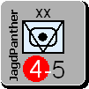


 Evolution, with the help of many people.

 ) for the ships & planes. A graphic similar to the graphics that we can find on the back of the real counters would be good.


 New Messages
 No New Messages
 Hot Topic w/ New Messages
 Hot Topic w/o New Messages
 Locked w/ New Messages
 Locked w/o New Messages
 Post New Thread