Shannon V. OKeets
Posts: 22095
Joined: 5/19/2005
From: Honolulu, Hawaii
Status: offline

|
quote:
ORIGINAL: Gendarme
Greetings and salutations to the Matrix Wif community.
First, my compliments to those working on the game and keeping a tab on us posting on these forums. You're hard work is appreciated and I'm looking forward eagerly to the game's release. Everything -- maps, counters, etc. -- looks fantastic. As Wif is the final word in strategic WWII boardgaming, it looks like Matrix Wif will be the final word in computer strategic WWII wargaming.
Second, and I'm not certain if this post quite fits in with this topic, but I have three questions/wishes concerning Matrix Wif:
1) I know this game must be too far in development to allow for the feature I am about to suggest, but to me, one of the things I like most about wargaming is the variability that dice bring in. I like rolling the dice. The ups and downs, the lucky streaks and yes even the runs of bad luck. I hope there can be an option for the PC gamer to generate his own dice rolls and enter the results into the game as it progresses, whether the rolls be for combat, US Entry, weather, etc. I don't know if this is even an option with other computer wargames or not, but it's just an idea.
2) I've read on an earlier thread that having a feature that will allow a gamer to print the (absolutely beautiful) Matrix Wif maps would take up too much space on the disc, so the idea is impractical. In spite of this, I would like to voice my wish that this will be an option, even if it means having a second disc for the game or whatever it would take.
3) One way I can possibly see Matrix Wif improving on Wif with regards to small historical details is having the unit scale at divisional level, with each land playing piece being an actual division that existed, numbered and with nicknames if any (the Big Red One, Ariete, Das Reich, etc.), rated by combat strength and movement allowance for Matrix Wif. I realize this would add a whole lot of work for the developers with regards to researching Orders of Battle, so I know this is entirely a pipe dream. Not to mention, the number of playing pieces would be quadrupled: imagine the number of divisions the Soviet or Chinese Armies would have. I know what some guys are thinking, if you want to go divisional, go play Europa. Plus, play balance issues would be involved if Wif moved from Corps-level to divisional level.
Anyways, keep up the good work, guys. It is appreciated by all.
Anthony DeChristopher
Well, I always like to hear from new forum members but I don't think your requests will be part of MWIF product 1.
While adding outside die rolling would be rather easy (for example, the debug version lets the players enter the die rolls for testing unusual results), making it a standard part of the game (as, say, an optional rule) presents some other difficulties. I am worrying here about PEBM and internet play where the resulting die rolls have to transmitted to other players.
Printing out the maps can be achieved using other software to take screen shots and then putting the pieces together. Building it into the program seems unnecessary. I use HyperSnap to take screen shots and that works well for me. It support dozens of different formats.
Going to division level in MWIF is not going to happen. The problem is fundamental: teh ADG designers started with a hex scale, a time scale, and a unit scale (for air, naval, and land units). The rules blend those 4 basic elements into a simulation/game: Map + Units + Time + Rules. Every time ADG made shange to 1 of those aspects of the simulation, they had to make changes to 1 or more of the others. I'm not going to mess with those elements except when absolutely forced to (e.g., for the unified map).
----------
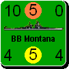
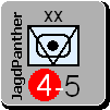
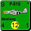
I don't believe I have posted a recent screen shot showing the medium resolution counters. I've added outlines and moved the shadowing to the right/bottom. I will probably make the shadowing a little larger (up from 1 to 2 or 3 pixels). This is zoom level 3, and I think all the numbers are easy to read (except maybe the # of units in a hex).

 Attachment (1) Attachment (1)
_____________________________
Steve
Perfection is an elusive goal.
|
 Printable Version
 RE: MWIF Game Interface Design -
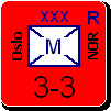
 Every day is a search for needles in the haystack. I guess my home is crowded with thousands of found needles already. I know they will come handy one day.


 New Messages
 No New Messages
 Hot Topic w/ New Messages
 Hot Topic w/o New Messages
 Locked w/ New Messages
 Locked w/o New Messages
 Post New Thread