Matrix Games Forums

Forums  Register  Login  Photo Gallery  Member List  Search  Calendars  FAQ 

My Profile  Inbox  Address Book  My Subscription  My Forums  Log Out

"Indoor Union" Fantasy League Thread (56k Warning?)

 
View related threads: (in this forum | in all forums)

Logged in as: Guest
Users viewing this topic: none
  Printable Version
All Forums >> [Current Games From Matrix.] >> [Sports] >> Maximum-Football 2.0 >> Graphics Related >> "Indoor Union" Fantasy League Thread (56k Warning?) Page: [1] 2   next >   >>
Login
Message << Older Topic   Newer Topic >>
"Indoor Union" Fantasy League Thread (56k War... - 5/30/2006 4:24:36 AM   
NickZ


Posts: 22
Joined: 8/14/2005
From: Orchard Park, NY
Status: offline
I am currently putting together a small project, for fun, called the Indoor Union. With the rules you can customize in the game, I'm planning it to be a fast-paced, loose-fouled hybrid of Canadian, American, and Indoor football. Pics from the addons I am working on will be posted here, along with screenshots from in-game and on the GUI. I am currently having trouble making in-game pics, for some reason, because all Print Screen does for me is give me a black screen with a black window inside of it. I'll try harder, but maybe there's some other way I'm missing.

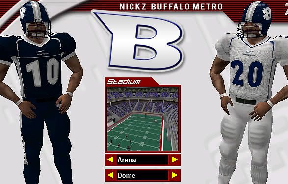
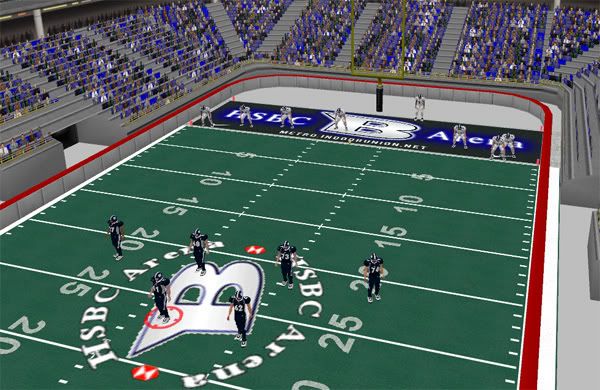
For now, here's a sneak preview of Team #1, out of the Eastern Conference, Northern Division, the Buffalo Metro.


Name: Buffalo Metro
Home Arena: HSBC Arena - Buffalo, NY
Playbook: TBD
Colors: Dark Blue, Dark Gray, Gray, Black, White
Star Players: QB #7 Mark Lowry, HB #26 J.D. Paul
Coach: Lindy Ruff Jr.


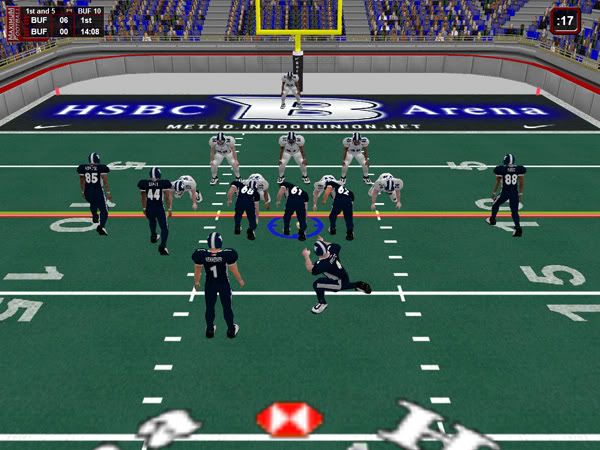
I still have some work to do on these unis, as well as make some alternates and also think about putting sponsor ads on the jerseys much like the AFL does. I made some nice endzone and 25-yard line art for the Metro but I can't currently post it on here due to the fact that I can't properly make screenshots in-game as of late. Let me know how I'm doing, and, like I said, I'll post more shots later.

< Message edited by NickZ -- 5/30/2006 4:58:29 AM >
Post #: 1
RE: "Indoor Union" Fantasy League Thread - 5/30/2006 4:33:52 AM   
MSO94


Posts: 419
Joined: 4/10/2006
Status: offline
DONT USE PRINT SCREEN

use the F12 key to get game shots


(in reply to NickZ)
Post #: 2
RE: "Indoor Union" Fantasy League Thread - 5/30/2006 4:39:22 AM   
NickZ


Posts: 22
Joined: 8/14/2005
From: Orchard Park, NY
Status: offline
Thanks a lot for the info, I was trying to look around the boards to see how other people were taking shots, but I couldn't find it anywhere. Now, I can finally get some screens out.

(in reply to MSO94)
Post #: 3
RE: "Indoor Union" Fantasy League Thread - 5/30/2006 4:57:55 AM   
NickZ


Posts: 22
Joined: 8/14/2005
From: Orchard Park, NY
Status: offline
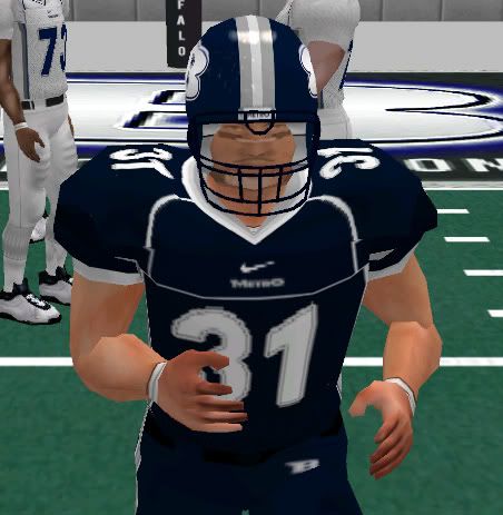
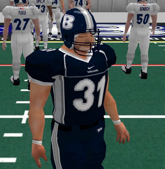
Here are some screens:


(in reply to NickZ)
Post #: 4
RE: "Indoor Union" Fantasy League Thread - 5/30/2006 5:45:27 AM   
DONMVP


Posts: 1378
Joined: 3/6/2006
From: Husker in california
Status: offline
LOOKING  GOOD . Was wondering if  you have helmet logos   the right way , or  if  thats  way you want them .

(in reply to NickZ)
Post #: 5
RE: "Indoor Union" Fantasy League Thread - 5/30/2006 6:00:14 AM   
NickZ


Posts: 22
Joined: 8/14/2005
From: Orchard Park, NY
Status: offline
 If you're asking about the "B" on the helmet, I've tried many methods. First, I had it the way it currently stands, with the B forward on one side and reversed on the other. I thought it looked funny, so I changed it so that the B was forward on both sides, however, the symmetry was broken and I had the "pointy edge" of the B on one side and the rounded edge on the other side, and it looked even more funny. So, I kept it to the "reversed" B on the opposite side of the helmet, since I can't really think of any other way the helmet would be symmetrical, yet not have some quirk.

BTW, I am trying my hardest to push the limits of the program, meaning I'm trying to pack every detail I can texture-wise into the game and still have it look great. I know the jerseys can't be AMAZING quality, but that's what I'm trying to do, playing around with sharpness, different textures and such until the jerseys look detailed enough in my mind. I think that's what a lot of you are doing as well, and I'm waiting for that "breakthough" addon that will change everything...like those addons people are making for NHL 06 right now with stitched logo crests...amazing stuff.

(in reply to DONMVP)
Post #: 6
RE: "Indoor Union" Fantasy League Thread - 5/30/2006 6:20:26 AM   
DONMVP


Posts: 1378
Joined: 3/6/2006
From: Husker in california
Status: offline
well  know  what  you mean  about  getting  logo`s right . Had  a few  problems in  all  uniforms i  have made  . Most  helmet  problems  seem to  be in angeling  the decal   sometimes . I   also   when  i  was making  some cfl  , and  arena teams that i posted at fb.max .Put  sponser   logos on  some  jerseys  One  word of warning , avoid the shoulder pads if you can .It  streches the logo  to much . You  mentioned nhl  06  is that  for the pc  or  play station  . 

(in reply to NickZ)
Post #: 7
RE: "Indoor Union" Fantasy League Thread - 5/30/2006 6:27:30 AM   
nmleague


Posts: 2361
Joined: 1/14/2006
Status: offline
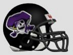
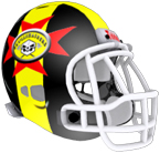
Speaking of texture and trying some different things, today I decided to try something different with a helmet.  If you have seen my Andaconda or Gators uniforms you can see what I did with textures on those helmets.  This fits with what you are doing in that the helmet I did today was for a buffalo team, the helmet and jersey is using a fur texture.  Also for the horns on the helmet I used a 3d bevel.  Below is a screen shot of how it turned out.


Attachment (1)

(in reply to NickZ)
Post #: 8
RE: "Indoor Union" Fantasy League Thread - 5/30/2006 8:43:15 AM   
NickZ


Posts: 22
Joined: 8/14/2005
From: Orchard Park, NY
Status: offline
Don, it's NHL 06 for PC...I haven't heard of addons being made for the PS2 version, although that would be interesting if there was a possibility that it would happen. It's really amazing stuff. Take a look at this, for example. I have no idea how they do it so well...I think it's time for a little bit more experimentation with Photoshop to see how they make the crests look actually stitched...

http://www.doubleminor.net/forums/downloads.php?do=file&id=1391

...you also have to admit that, yes, NHL 06 has much more graphical power than a lot of programs, so this would be possible without that annoying texture blur that happens in a lot of games people make skins for...

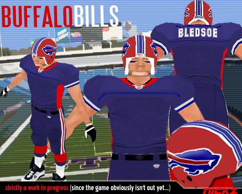
nmleague, looks nice. I think if people put a tiny (and i mean TINY) bit of bevel on the helmet logo I think it can make a world of difference (even if, in real life, the logos are decals). That's what I did with my old, now defunct Buffalo Bills pack I worked on eons before the game came out (I only used the character viewer):


You can notice I used some bevel on the Bills logo, and it looks like the helmet has a bit more dimension than it used to have...that, combined with the helmet reflections on the highest graphical quality, gives the helmets that much more definition to 'em.

I'm beginning work on the (fantasy) team from the city the Sabres' adversaries hail from: My next screens posted from the Indoor Union will be from the Eastern Conference's Southern Division, the Raleigh Rush.

(in reply to DONMVP)
Post #: 9
RE: "Indoor Union" Fantasy League Thread - 5/30/2006 10:56:47 AM   
DONMVP


Posts: 1378
Joined: 3/6/2006
From: Husker in california
Status: offline
Thanks for the imfo  about  NHL 06  , . I definately  be looking into  buying that soon .

(in reply to NickZ)
Post #: 10
RE: "Indoor Union" Fantasy League Thread - 5/30/2006 6:26:07 PM   
redwolf1


Posts: 366
Joined: 5/13/2005
From: Maple Ridge, B.C., Canada
Status: offline
Very nice colour scheme and excellent striping design, Nick. Looking forward to what is yet to come.

Regarding wording and lettering on the helmets, I would have forgone the symmetry and kept the B in the proper direction on both sides since it is the promenant feature on the helmet (I think I got away with it with my Bandits team as the B is very small and a very minor part of the logo design). The majority of the real life teams that use lettering/wording on their helmets that I have seen forego the symmetry in order that the letters appear right (eg. BC Lions, Packers, Terps, etc.)...just my 2 cents, but an excellent team nonetheless.

< Message edited by redwolf1 -- 5/30/2006 6:27:31 PM >

(in reply to DONMVP)
Post #: 11
RE: "Indoor Union" Fantasy League Thread (56k... - 6/1/2006 2:45:50 AM   
NickZ


Posts: 22
Joined: 8/14/2005
From: Orchard Park, NY
Status: offline
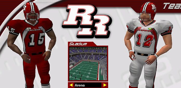
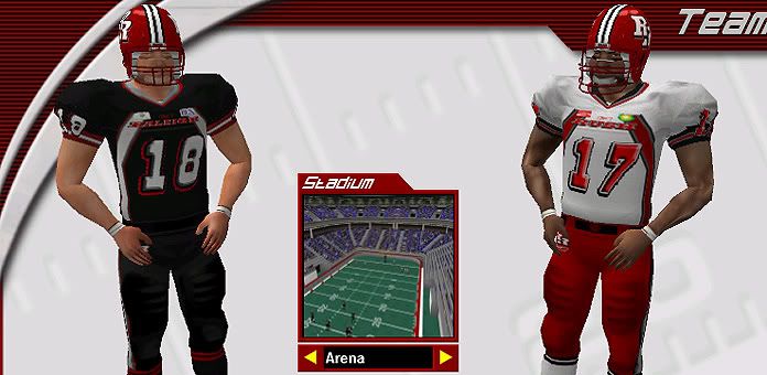
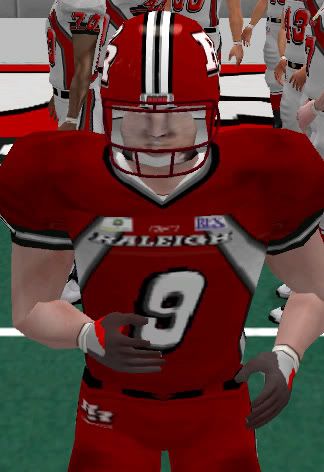
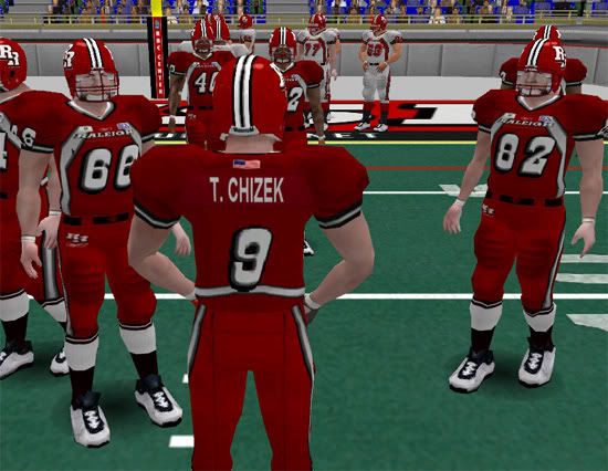
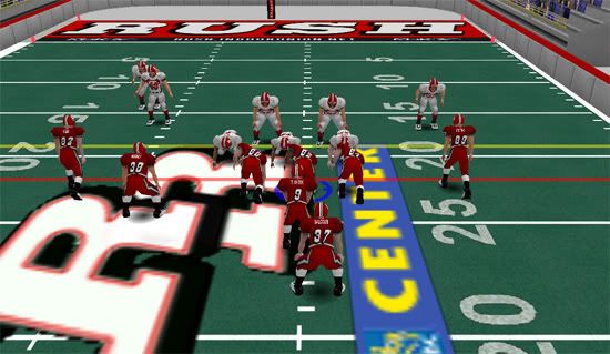
Officially, here's Team 2: The Raleigh Rush of the Eastern Conference, South Division.


Name: Raleigh Rush
Home Arena: RBC Center - Raleigh, NC
Playbook: TBD
Colors: Blood Red, Black, Dark Grey, Silver, White
Star Player: QB #9 Todd Chizek
Coach: David Miller

Additional Screenshots:


< Message edited by NickZ -- 6/3/2006 5:26:52 AM >

(in reply to NickZ)
Post #: 12
RE: "Indoor Union" Fantasy League Thread (56k... - 6/3/2006 5:28:01 AM   
NickZ


Posts: 22
Joined: 8/14/2005
From: Orchard Park, NY
Status: offline
BTW, I have also been trying to work with the unpacked arena model for possible "real" arena modifications. I just have to find out where everything goes in the arena from the unpacked images and I might be able to pull something off.

(in reply to NickZ)
Post #: 13
RE: "Indoor Union" Fantasy League Thread (56k... - 6/3/2006 5:59:19 AM   
David Winter


Posts: 5158
Joined: 11/24/2004
From: Vancouver, BC
Status: offline
Those look really shap NickZ.. very nice.

(in reply to NickZ)
Post #: 14
RE: "Indoor Union" Fantasy League Thread (56k... - 6/3/2006 9:04:14 PM   
Breeze


Posts: 324
Joined: 12/3/2005
From: Cherry Hill, NJ, USA
Status: offline
Has anyone tried scaling down the midfield images on the indoor field to see if they come up smaller?  The midfield graphic really needs to be half the size that it is.

(in reply to David Winter)
Post #: 15
RE: "Indoor Union" Fantasy League Thread (56k... - 6/3/2006 9:12:06 PM   
David Winter


Posts: 5158
Joined: 11/24/2004
From: Vancouver, BC
Status: offline
Making the mid field logo smaller would be fairly simple. I forget the texture size off the top of my head but I think it's a 128*128 size image. Making the texture you create 64*64 would not result in a smaller on field logo. It would result in a lower quality logo of the same size. To make a smaller logo, you need to make 64*64 size logo on a 128*128 sized texture. Yes, it's waisted texture space but it's only a small amount and it gets you a smaller logo.

(in reply to Breeze)
Post #: 16
RE: "Indoor Union" Fantasy League Thread (56k... - 6/3/2006 10:37:52 PM   
walkerws


Posts: 16
Joined: 12/17/2005
Status: offline
So if I wanted to have a bigger on field logo with all the sponsor adds and all, I would just have to make the midfield bigger or is it just set at 128 x 128?

(in reply to David Winter)
Post #: 17
RE: "Indoor Union" Fantasy League Thread (56k... - 6/4/2006 1:03:20 AM   
Tbird


Posts: 1187
Joined: 12/15/2004
Status: offline
128X128 covers it
You can probably increase it to 256x256 but it'll still the same amount of space it takes up

You can put ads on the field but everything is tiled 


< Message edited by Tbird -- 6/4/2006 1:04:11 AM >

(in reply to walkerws)
Post #: 18
RE: "Indoor Union" Fantasy League Thread (56k... - 6/4/2006 3:17:37 AM   
walkerws


Posts: 16
Joined: 12/17/2005
Status: offline
Tiled? So you can't just make a field ala Bowl Bound etc. and do it that way? Hmmmm. I am still debating buying this. It's the price more than anything. The graphics look great so far.

(in reply to Tbird)
Post #: 19
RE: "Indoor Union" Fantasy League Thread (56k... - 6/4/2006 4:21:52 AM   
NickZ


Posts: 22
Joined: 8/14/2005
From: Orchard Park, NY
Status: offline
I believe, if you DO want to put ads on the field, that it's best putting them in either the endzone, the 50- (or 25-) yard line, or even trying other methods such as the goalpost or even the stadium walls. Since the field is mostly textured in small, separate pieces, the addition of advertisements, say, on the 25-yard line, may be an impossibility as of now. However, if enough people play around, we could reach a point where it may be possible.

< Message edited by NickZ -- 6/4/2006 5:52:11 AM >

(in reply to walkerws)
Post #: 20
RE: "Indoor Union" Fantasy League Thread (56k... - 6/4/2006 5:16:32 AM   
Tbird


Posts: 1187
Joined: 12/15/2004
Status: offline
These are all the field textures minus the numbers. I think tiling is used to avoid making the field texture not to look stretchy and to better manage distances.

edit
Whoops forgot the picture


Attachment (1)

< Message edited by Tbird -- 6/4/2006 5:18:15 AM >

(in reply to NickZ)
Post #: 21
RE: "Indoor Union" Fantasy League Thread (56k... - 6/4/2006 5:49:48 AM   
NickZ


Posts: 22
Joined: 8/14/2005
From: Orchard Park, NY
Status: offline
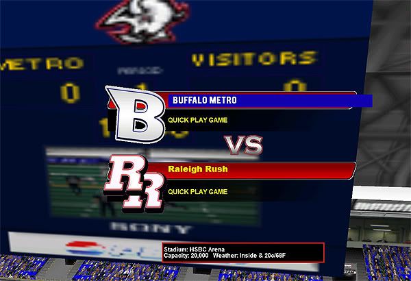
OK, took a break from jersey making a bit tonight, and played around with the textures of the unpacked arena model. I tried to make some various things in the HSBC Arena such as a LCD Banner, but the textures won't allow me to (at least the ones I've played around with). However, I can make an LCD on the sides only. The reason is that Maximum-Football uses the same concrete texture on the wall separating the 100 and the 200 levels of the arena as the texture on the walls behind the endzone. This gave me a pretty weird image when I replaced the texture in-game, it was like my LCD banner texture was on the wall, and that didn't look right. Anyhoo, more experimenting will lead to more surprises, I guess.

I also tried to make the HSBC's jumbotron, but since there's only one jumbotron texture in the game, the HSBC's tron won't be 100% accurate as it is in real life. I wonder if transparency will work on this texture, since, in real life, the Buffalo Sabres logo is half on, half off the jumbotron...

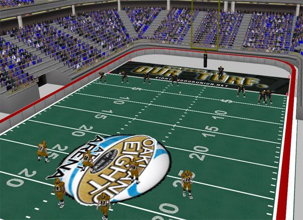
Also, I modified some things on-field, too, changing the gray padded walls to something most football teams are using, their team colors and graphics to match, as well as changing the tip of the wall to a dark grey, replacing the default red. You may see some odd textures here and there, but that is because I am kinda unaware of the correspondences between the textures and the ingame models. Just need to find out how to change that concrete texture behind the endzone into something...um...more "matchable" to the endzone art.
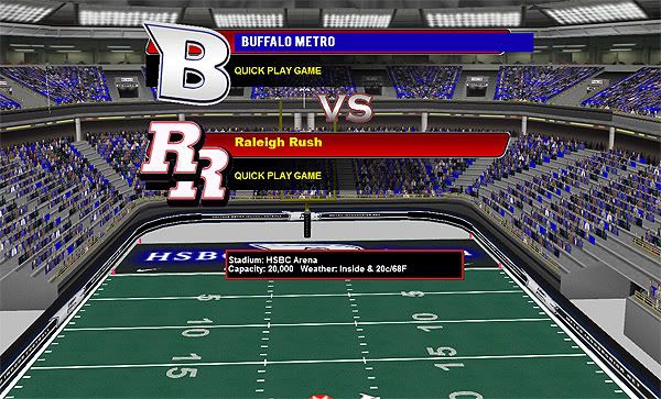


I'm also in the process of working on my next team, The Oakland Eight, from the west coast. Now, you may say that The Oakland Eight is a terrible name, but, brainstorming sports teams' names is harder than it seems...I've done it for tons of leagues (mostly for Out of the Park Baseball leagues), and once you look for something unique, something terrible comes hand in hand. The Oakland Eight, though, needs to be said with "The" every time because it rolls of the tongue better, and...8 players on an indoor football field. Kinda makes it more dramatic. Whatever, they're coming up next.

(in reply to NickZ)
Post #: 22
RE: "Indoor Union" Fantasy League Thread (56k... - 6/4/2006 6:57:11 PM   
walkerws


Posts: 16
Joined: 12/17/2005
Status: offline
Nice work. The teams look great.

(in reply to NickZ)
Post #: 23
RE: "Indoor Union" Fantasy League Thread (56k... - 6/4/2006 9:35:55 PM   
DONMVP


Posts: 1378
Joined: 3/6/2006
From: Husker in california
Status: offline
Thats not a bad name you came up with for your Oakland team . Can`t wait to see what your uniform look like . I live near oakland , and i can tell you thats type of name they liked . I was going to make one for my league to . Was leading towards crusaders , but like your name indeed .Might make a team in San Francisco call them the Fairies . With tinkerbell as a logo .But that be a few more days as i finish up Arena football 2 teams .

(in reply to walkerws)
Post #: 24
RE: "Indoor Union" Fantasy League Thread (56k... - 8/5/2006 5:30:16 AM   
NickZ


Posts: 22
Joined: 8/14/2005
From: Orchard Park, NY
Status: offline
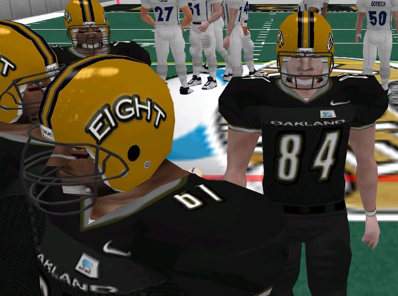
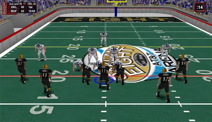
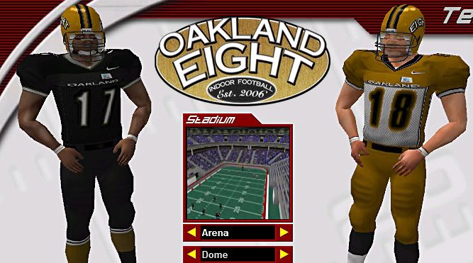
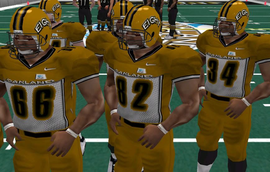
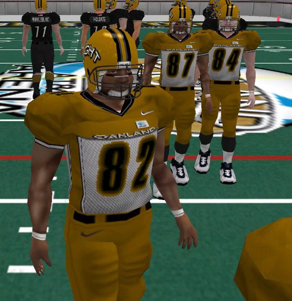
All RIGHT! New developments! Here is a sneak peek of THE OAKLAND EIGHT, the team I said I'd finish nearly two months ago...and, well, it's still not quite finish. Some color matching still needs to be done here and there, and it is very apparent in these jerseys. Some of the mesh textures I played around with for the UB Jerseys are making their way into the Indoor Union jerseys now, as well. Here 'tis...


(in reply to NickZ)
Post #: 25
RE: "Indoor Union" Fantasy League Thread (56k... - 8/6/2006 2:38:03 AM   
NickZ


Posts: 22
Joined: 8/14/2005
From: Orchard Park, NY
Status: offline
OK, here is the official look at Team 3: The Oakland Eight.


Name: The Oakland Eight
Home Arena: AT&T Arena (fantasy arena) - Oakland, CA
Playbook: TBD
Colors: Gold, Black, Silver, White, Dark Gray
Star Player: LB #55 Shaun Starr, QB #3 Kyle White
Coach: Todd Krueger

Oakland, home of the headquarters of the Indoor Union, has some of the craziest Indoor Football fans in the nation, and, their hometown team, the Oakland Eight, represents the very basics of indoor football: eight men on one side of the ball at a time, representing the true essence of the sport. The lights dim every single night, the music stops, and the crowd erupts in deafening cheers as their Oakland Eight take the field, an entrance that is both as dramatic and as sublime as any in professional sports. Led by 22-year old first-year Western Michigan graduate Kyle White at quarterback, and led defensively by the self-proclaimed "strongest linebacker in the game", Shaun Starr, Oakland is an annual favorite to win the Indoor Union Championship due to their sheer talent on both sides of the football, not to mention the obvious presence of a ninth man in the AT&T Arena that always makes it hard for opposing offenses to run plays, let alone win football games...and the Eight's IU-record 11 straight (and counting) home wins statistically prove it.


(in reply to NickZ)
Post #: 26
RE: "Indoor Union" Fantasy League Thread (56k... - 2/3/2007 7:42:24 PM   
MSO94


Posts: 419
Joined: 4/10/2006
Status: offline
What ever happened to this league how did it turn out for you .
We have the PIFL and could use a good owner in it as such in you.


_____________________________


(in reply to NickZ)
Post #: 27
RE: "Indoor Union" Fantasy League Thread (56k... - 2/3/2007 11:58:54 PM   
boggyjr


Posts: 89
Joined: 8/22/2006
From: Edmonton, Canada
Status: offline

quote:

ORIGINAL: MSO94

What ever happened to this league how did it turn out for you .
We have the PIFL and could use a good owner in it as such in you.


Yeah, we were supposed to have an Oakland team in the PIFL, but the owner backed out at the last second.

(in reply to MSO94)
Post #: 28
RE: "Indoor Union" Fantasy League Thread (56k... - 2/4/2007 3:04:23 AM   
MSO94


Posts: 419
Joined: 4/10/2006
Status: offline
we are always looking for owners that are wanting to be involved in the PIFL

so far we are in week 3 and it is going great


_____________________________


(in reply to boggyjr)
Post #: 29
RE: "Indoor Union" Fantasy League Thread (56k... - 2/4/2007 5:13:41 AM   
jrodsly


Posts: 236
Joined: 4/17/2006
From: Charlotte NC!
Status: offline
i WANTED one, but no one took my entry on here serious enough.

_____________________________

Back from the dead, I'm here to make ammends with the people I've ticked off and the people that were nice enough to make stuff I requested.

(in reply to MSO94)
Post #: 30
Page:   [1] 2   next >   >>
All Forums >> [Current Games From Matrix.] >> [Sports] >> Maximum-Football 2.0 >> Graphics Related >> "Indoor Union" Fantasy League Thread (56k Warning?) Page: [1] 2   next >   >>
Jump to:


New Messages No New Messages
Hot Topic w/ New Messages Hot Topic w/o New Messages
Locked w/ New Messages Locked w/o New Messages
 Post New Thread
 Reply to Message
 Post New Poll
 Submit Vote
 Delete My Own Post
 Delete My Own Thread
 Rate Posts


Forum Software © ASPPlayground.NET Advanced Edition 2.4.5 ANSI

0.672