Matrix Games Forums

Forums  Register  Login  Photo Gallery  Member List  Search  Calendars  FAQ 

My Profile  Inbox  Address Book  My Subscription  My Forums  Log Out

RE: Memo

 
View related threads: (in this forum | in all forums)

Logged in as: Guest
Users viewing this topic: none
  Printable Version
All Forums >> [New Releases from Matrix Games] >> World in Flames >> RE: Memo Page: <<   < prev  40 41 [42] 43 44   next >   >>
Login
Message << Older Topic   Newer Topic >>
RE: Memo - 6/14/2008 4:53:33 AM   
Shannon V. OKeets


Posts: 22095
Joined: 5/19/2005
From: Honolulu, Hawaii
Status: offline

quote:

ORIGINAL: Taxman66

I presume for a stack of units the color of the worst status indicator is displayed.  Would it be possible to stick a number inside the status indicator so we know how many units are out of supply or disorganized, etc...


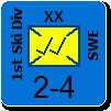
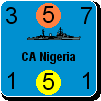
No, the status indicators are for the top unit only. However, when viewing a stack of units using any of the forms, each unit is shown separately, which makes the status indicators clear for each unit.

The status indicators are very small so putting a number inside isn't possible.

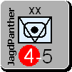
I tried what you suggested, displaying the indicator for the 'worst' unit in the hex as the indicator for the stack. In fact, I have a complete system developed, ranking the various stati for each indicator. I even had a system where 3 indicators were shown, slightly offset (left to right) so you could see the status for each of the top 3 units. But all of these fell by the wayside simply because there is so little room available. Rather than communicate information, they were just confusing, or even worse, so muddy as to be illegible. In the end I had to give up trying to show the status for more than 1 unit in a stack as hopeless, simply because of the small number of pixels available.

To emphasize my point here, I agree with you comlpetely that it would be a great thing to have, and I put 60+ hours into trying different schemes to find something that would work. ... I am emotionally past that now, and committed to the current system.

_____________________________

Steve

Perfection is an elusive goal.

(in reply to Taxman66)
Post #: 1231
RE: Memo - 6/14/2008 4:22:19 PM   
Taxman66


Posts: 1665
Joined: 3/19/2008
From: Columbia, MD. USA
Status: offline
Ok, fair enough.

(in reply to Shannon V. OKeets)
Post #: 1232
RE: Memo - 6/14/2008 10:13:09 PM   
Shannon V. OKeets


Posts: 22095
Joined: 5/19/2005
From: Honolulu, Hawaii
Status: offline
Here is today's version of the status indicator form.

Changes since the last posted version are:

1 - Reduced the size of the fonts to make for more "white space". This also made the grouping more pronounced.

2 - Reduced the size of the indicators within the explanations - to match the font size.

3 - Changed the color scheme for the status indicators so they can be distinguished one from the other even by people with difficulty telling colors apart. For those of us who do not have that problem, the colors seem somewhat more muted. But that is a small price to pay for enabling every player to be able to interpret the status indicators correctly.

4 - Reworked some of the text for clarity.

5 - Added the NOTES section.

6 - Placed the black squares behind the status indicators, since that is how they appear in the game.

So, wadda ya think?


Attachment (1)

_____________________________

Steve

Perfection is an elusive goal.

(in reply to Taxman66)
Post #: 1233
RE: Memo - 6/14/2008 10:25:09 PM   
Froonp


Posts: 7995
Joined: 10/21/2003
From: Marseilles, France
Status: offline
quote:

ORIGINAL: Shannon V. OKeets

Here is today's version of the status indicator form.

Changes since the last posted version are:

1 - Reduced the size of the fonts to make for more "white space". This also made the grouping more pronounced.

2 - Reduced the size of the indicators within the explanations - to match the font size.

3 - Changed the color scheme for the status indicators so they can be distinguished one from the other even by people with difficulty telling colors apart. For those of us who do not have that problem, the colors seem somewhat more muted. But that is a small price to pay for enabling every player to be able to interpret the status indicators correctly.

4 - Reworked some of the text for clarity.

5 - Added the NOTES section.

6 - Placed the black squares behind the status indicators, since that is how they appear in the game.

So, wadda ya think?

All good changes.
Looks good to me.

(in reply to Shannon V. OKeets)
Post #: 1234
RE: Memo - 6/14/2008 11:01:55 PM   
Orm


Posts: 22154
Joined: 5/3/2008
From: Sweden
Status: offline

quote:

ORIGINAL: Shannon V. OKeets

So, wadda ya think?


I think it looks awesome.

I made some small observations.

Position 1.
-A parethesis with (may not be undone) after "Done movement" for clarification.

Position 5
-A 'space' is missing in the sentence "Naval unitforced to abort"

Position 3
- think it might look better if position 3 supply is moved on step to the right so it gets to the top right corner.

-"Pimary supply source for turn (HQ)" feels a bit unclear and confusing to me since
"A primary supply source for a unit is:
• any friendly city in the unit’s unconquered home country; or
• for a Commonwealth unit, any friendly city in another
unconquered Commonwealth home country; or
• any friendly city in an unconquered home country of a major
power the unit co-operates with (see 18.1)."
and
"A secondary supply source for a unit is:
• an HQ the unit co-operates with (see 18.1); or
• the capital city of a minor country controlled by the unit’s major
power; or
• the capital city of a major power, or a minor country, conquered by
the unit’s major power, or by a major power the unit co-operates
with."

-Often (for me) the most important information about a unit is if it is organized and in supply or not.
So if both of these could be to the right of the "stack indicator" would make it faster and easier for me to note the units status.

And with that said.

It looks truly awesome.

(in reply to Shannon V. OKeets)
Post #: 1235
RE: Memo - 6/14/2008 11:12:09 PM   
Shannon V. OKeets


Posts: 22095
Joined: 5/19/2005
From: Honolulu, Hawaii
Status: offline
Orm,

Thanks.

I'll make some of your suggested changes. I am not sure about moving the Organization status to the right side since it leaves a hole on the left. And a disorganized unit can't move, so having that next to Movement appeals to me. An argument could even be made for merging those two positions.

The Primary & Emergency supply status indicator only applies to HQ units, if those optional rules are being used. Note that these are unit status indicators; they have nothing to do with cities, which are the only other supply sources.

_____________________________

Steve

Perfection is an elusive goal.

(in reply to Orm)
Post #: 1236
RE: Memo - 6/14/2008 11:42:29 PM   
Orm


Posts: 22154
Joined: 5/3/2008
From: Sweden
Status: offline
Steve,

I cited the rules since the primary supply for HQ confused me. I forgot about the supply counter. I blame it on the wine I had to the family dinner.

Still. Since this is a help page and got a me, a player of WIF since 25 years confused, it may also confuse sober new players.

Could the wording be made clearer?
Perhaps a note would be best.
Maybe something in the notes like this?

"HQ made a primary supply source for the rest of the turn by a supply unit"

-Orm

(in reply to Shannon V. OKeets)
Post #: 1237
RE: Memo - 6/15/2008 12:46:20 AM   
Shannon V. OKeets


Posts: 22095
Joined: 5/19/2005
From: Honolulu, Hawaii
Status: offline

quote:

ORIGINAL: Orm

Steve,

I cited the rules since the primary supply for HQ confused me. I forgot about the supply counter. I blame it on the wine I had to the family dinner.

Still. Since this is a help page and got a me, a player of WIF since 25 years confused, it may also confuse sober new players.

Could the wording be made clearer?
Perhaps a note would be best.
Maybe something in the notes like this?

"HQ made a primary supply source for the rest of the turn by a supply unit"

-Orm

Yeah, well, what I had originally was "(HQ only)" instead of (HQ), but the one line is so long I trimmed them all. Probably a poor decision on my part.

_____________________________

Steve

Perfection is an elusive goal.

(in reply to Orm)
Post #: 1238
RE: Memo - 6/15/2008 12:53:39 AM   
Shannon V. OKeets


Posts: 22095
Joined: 5/19/2005
From: Honolulu, Hawaii
Status: offline
How about this:


Attachment (1)

_____________________________

Steve

Perfection is an elusive goal.

(in reply to Shannon V. OKeets)
Post #: 1239
RE: Memo - 6/15/2008 1:08:00 AM   
Taxman66


Posts: 1665
Joined: 3/19/2008
From: Columbia, MD. USA
Status: offline
I poked around trying to find a picture of the flyouts but wasn't successful.  Yeah I know, I'm lame...

If the flyouts have the status indicators for each unit I think that pretty much takes care of the issue of looking at multiple units with different status indicators 'lit'.

_____________________________

"Part of the $10 million I spent on gambling, part on booze and part on women. The rest I spent foolishly." - George Raft

(in reply to Shannon V. OKeets)
Post #: 1240
RE: Memo - 6/15/2008 2:33:42 AM   
Shannon V. OKeets


Posts: 22095
Joined: 5/19/2005
From: Honolulu, Hawaii
Status: offline

quote:

ORIGINAL: Taxman66

I poked around trying to find a picture of the flyouts but wasn't successful.  Yeah I know, I'm lame...

If the flyouts have the status indicators for each unit I think that pretty much takes care of the issue of looking at multiple units with different status indicators 'lit'.

They don't. I made the flyouts display as small as possible, and I begrudge the extra pixels for status indicators because it would make the overall footprint larger. But I have not closed the door on the possibility...

_____________________________

Steve

Perfection is an elusive goal.

(in reply to Taxman66)
Post #: 1241
RE: Memo - 6/15/2008 10:26:16 PM   
Orm


Posts: 22154
Joined: 5/3/2008
From: Sweden
Status: offline

quote:

ORIGINAL: Shannon V. OKeets

How about this:


Thank you Steve.

For me it feels much clearer.

-Orm

(in reply to Shannon V. OKeets)
Post #: 1242
RE: Memo - 6/15/2008 10:35:47 PM   
Zorachus99


Posts: 1066
Joined: 9/15/2000
From: Palo Alto, CA
Status: offline

quote:

ORIGINAL: Orm


quote:

ORIGINAL: Shannon V. OKeets

How about this:


Thank you Steve.

For me it feels much clearer.

-Orm


The two greens of secondary supply source and primary supply source are very close.

How about making primary supply source blue?


_____________________________

Most men can survive adversity, the true test of a man's character is power. -Abraham Lincoln

(in reply to Orm)
Post #: 1243
RE: Memo - 6/15/2008 10:40:26 PM   
Shannon V. OKeets


Posts: 22095
Joined: 5/19/2005
From: Honolulu, Hawaii
Status: offline
Today's version.


EDIT:
Orm you thanked me, but it should be me thanking you.

This form is vastly improved over the version I first proposed, primarily because forum members identified weaknesses and offered suggestions. Of course it may seem like I ignore most suggestions (probably true) but the complaints I always pay very close attention to.

There are (maybe) 100 people involved in making posts to this forum. Now I hope we sell 30,000 copies of MWIF, so each person who makes a comment carries the weight of 300 customers (in my mind).

Attachment (1)

< Message edited by Shannon V. OKeets -- 6/15/2008 10:45:48 PM >


_____________________________

Steve

Perfection is an elusive goal.

(in reply to Orm)
Post #: 1244
RE: Memo - 6/15/2008 10:49:09 PM   
Shannon V. OKeets


Posts: 22095
Joined: 5/19/2005
From: Honolulu, Hawaii
Status: offline

quote:

ORIGINAL: Zorachus99


quote:

ORIGINAL: Orm


quote:

ORIGINAL: Shannon V. OKeets

How about this:


Thank you Steve.

For me it feels much clearer.

-Orm


The two greens of secondary supply source and primary supply source are very close.

How about making primary supply source blue?


Yes, I am worried about my use of Mint Green (the lighter shade), but only for players who have trouble telling colors apart. Are you in that group?

Mint green is one of the colors I added that wasn't only the color palette recommended (in a post above) for people with trouble telling colors apart.

_____________________________

Steve

Perfection is an elusive goal.

(in reply to Zorachus99)
Post #: 1245
RE: Memo - 6/15/2008 10:50:56 PM   
Orm


Posts: 22154
Joined: 5/3/2008
From: Sweden
Status: offline

quote:

ORIGINAL: Shannon V. OKeets

How about this:


After playing a supply marker to make a HQ a primary supply source for turn I try to see to it that the HQ is in "normal" supply when the turn ends so that the HQ can function normally next turn.

It would be nice to have a different color for marking a difference between that HQ being in "normal" supply or not.

This can also be done by adding a position just for HQ units. Then it could show a flag for being a primary supply source for turn and a flag for out of "normal" supply.

It is not important since it so seldom happens but when you have that HQ it is easier to have the computer calculate supply than to check it manually.

-Orm

(in reply to Shannon V. OKeets)
Post #: 1246
RE: Memo - 6/15/2008 10:56:52 PM   
Shannon V. OKeets


Posts: 22095
Joined: 5/19/2005
From: Honolulu, Hawaii
Status: offline

quote:

ORIGINAL: Orm


quote:

ORIGINAL: Shannon V. OKeets

How about this:


After playing a supply marker to make a HQ a primary supply source for turn I try to see to it that the HQ is in "normal" supply when the turn ends so that the HQ can function normally next turn.

It would be nice to have a different color for marking a difference between that HQ being in "normal" supply or not.

This can also be done by adding a position just for HQ units. Then it could show a flag for being a primary supply source for turn and a flag for out of "normal" supply.

It is not important since it so seldom happens but when you have that HQ it is easier to have the computer calculate supply than to check it manually.

-Orm

A good point I hadn't thought of.

I think I would rather handle it as part of the routine "trace supply". The player can see the supply path for any unit by right clicking on the unit and choosing that menu item. I'll just have this path calculation request ignore the fact that the HQ is functioning as a primary supply source (when that is the case).

_____________________________

Steve

Perfection is an elusive goal.

(in reply to Orm)
Post #: 1247
RE: Memo - 6/16/2008 2:14:05 AM   
Zorachus99


Posts: 1066
Joined: 9/15/2000
From: Palo Alto, CA
Status: offline

quote:

ORIGINAL: Shannon V. OKeets


quote:

ORIGINAL: Zorachus99


quote:

ORIGINAL: Orm


quote:

ORIGINAL: Shannon V. OKeets

How about this:


Thank you Steve.

For me it feels much clearer.

-Orm


The two greens of secondary supply source and primary supply source are very close.

How about making primary supply source blue?


Yes, I am worried about my use of Mint Green (the lighter shade), but only for players who have trouble telling colors apart. Are you in that group?

Mint green is one of the colors I added that wasn't only the color palette recommended (in a post above) for people with trouble telling colors apart.


I can make out the difference, but the only difference I detect is the shade of the unit, not the color, perhaps they are both pastels? Possibly a poorly calibrated LCD. I'm not color-blind though.

_____________________________

Most men can survive adversity, the true test of a man's character is power. -Abraham Lincoln

(in reply to Shannon V. OKeets)
Post #: 1248
RE: Memo - 6/16/2008 4:14:53 AM   
Shannon V. OKeets


Posts: 22095
Joined: 5/19/2005
From: Honolulu, Hawaii
Status: offline
Z,

They are very close except that one is lighter.

I am fearful of doing too much more because of the difficulty roughly 10% of the players will have telling colors apart. For me, my original color selections were great, with clean distinctions between them all. But that is not true for everyone. If you examine the "unambiguous color chart" (in one of the posts above), it is really surprising how differently colors are perceived.

Steve

(in reply to Zorachus99)
Post #: 1249
RE: Memo - 6/16/2008 11:18:19 AM   
oscar72se


Posts: 100
Joined: 8/28/2006
From: Gothenburg Sweden
Status: offline

quote:


I am fearful of doing too much more because of the difficulty roughly 10% of the players will have telling colors apart. For me, my original color selections were great, with clean distinctions between them all.

Considering that only men suffer from color blindness, I guess that we have established that this game mainly appeals to the male audience

(in reply to Shannon V. OKeets)
Post #: 1250
RE: Memo - 6/16/2008 6:06:06 PM   
composer99


Posts: 2923
Joined: 6/6/2005
From: Ottawa, Canada
Status: offline
The current version of the status indicator help page looks great.

This is important as I am sure I will be using it a lot initially.

_____________________________

~ Composer99

(in reply to oscar72se)
Post #: 1251
RE: Memo - 6/16/2008 6:37:39 PM   
sajbalk


Posts: 264
Joined: 7/11/2005
From: Davenport, Iowa
Status: offline
Would it be of benefit to put "Naval units only" in the heading to category 7 and "Naval and air only" for category 5?

Also, what is "Sentry" in category 1?


_____________________________

Steve Balk
Iowa, USA

(in reply to composer99)
Post #: 1252
RE: Memo - 6/16/2008 7:58:47 PM   
Shannon V. OKeets


Posts: 22095
Joined: 5/19/2005
From: Honolulu, Hawaii
Status: offline

quote:

ORIGINAL: sajbalk

Would it be of benefit to put "Naval units only" in the heading to category 7 and "Naval and air only" for category 5?

Also, what is "Sentry" in category 1?


My use of HQ Only for section 3 was because the indicators below apply not only to HQ units, but also apply to all HQ units.

For section 7 some of the indicators are even more restrictive: Milchcow subs and Naval supply units.

For section 5 the same thing applies, in that some of the indicators are exclusively for naval units, while other are for air & naval units.

Sentry is a status introduced in MWIF - for playing using the computer. The computer offers the player the ability to cycle through all units that are eligible to move (i.e., Next, Previous). Now that can become rather tedious when you are cycling through all the CW convoy units. By marking a unit as a 'Sentry', it merely means that the unit is skipped when you cycle through all your units that are eligible to move in the phase/subphase. It has no other effect (i.e., it has zero effect on game play).

_____________________________

Steve

Perfection is an elusive goal.

(in reply to sajbalk)
Post #: 1253
RE: Memo - 6/17/2008 1:46:05 PM   
*Lava*


Posts: 1924
Joined: 2/9/2004
Status: offline
quote:

ORIGINAL: composer99

This is important as I am sure I will be using it a lot initially.


Agreed. Possibly Matrix could make a big poster of this to hang by your computer for reference...


Ray (alias Lava)

(in reply to composer99)
Post #: 1254
RE: Memo - 6/17/2008 8:34:49 PM   
Shannon V. OKeets


Posts: 22095
Joined: 5/19/2005
From: Honolulu, Hawaii
Status: offline

quote:

ORIGINAL: Lava

quote:

ORIGINAL: composer99

This is important as I am sure I will be using it a lot initially.


Agreed. Possibly Matrix could make a big poster of this to hang by your computer for reference...


Ray (alias Lava)

There are a lot of these actually. For example, each of the unit types has 3 or 4 pages describing the meaning of the different numbers and symbols shown in the unit depictions. And there are the different pages describing terrain.

All of these are handled the same way, with separate pages in the tutorials and accessible during play from the Help drop down menu. They are also stored in the help directory/folder as BMP files which can be printed by the player if he wants a hard copy. Lastly, they will be part of the appendices in the Player's Manual, but I don't see us creating separate/removable pages for them.

_____________________________

Steve

Perfection is an elusive goal.

(in reply to *Lava*)
Post #: 1255
RE: Memo - 6/18/2008 7:35:03 PM   
*Lava*


Posts: 1924
Joined: 2/9/2004
Status: offline

quote:

ORIGINAL: Shannon V. OKeets


quote:

ORIGINAL: Lava

quote:

ORIGINAL: composer99

This is important as I am sure I will be using it a lot initially.


Agreed. Possibly Matrix could make a big poster of this to hang by your computer for reference...


Ray (alias Lava)

There are a lot of these actually. For example, each of the unit types has 3 or 4 pages describing the meaning of the different numbers and symbols shown in the unit depictions. And there are the different pages describing terrain.

All of these are handled the same way, with separate pages in the tutorials and accessible during play from the Help drop down menu. They are also stored in the help directory/folder as BMP files which can be printed by the player if he wants a hard copy. Lastly, they will be part of the appendices in the Player's Manual, but I don't see us creating separate/removable pages for them.


You forgot the implantable brain stem microchip...


Ray (alias Lava)

(in reply to Shannon V. OKeets)
Post #: 1256
RE: Memo - 6/19/2008 3:19:11 AM   
Zorachus99


Posts: 1066
Joined: 9/15/2000
From: Palo Alto, CA
Status: offline

quote:

ORIGINAL: oscar72se


quote:


I am fearful of doing too much more because of the difficulty roughly 10% of the players will have telling colors apart. For me, my original color selections were great, with clean distinctions between them all.

Considering that only men suffer from color blindness, I guess that we have established that this game mainly appeals to the male audience


And to make it even more interesting when you pass on that so-called 'useless' Y chromosome, hum a little tune, because it's a perfect palindrome!

Who needs duplicate copies?

_____________________________

Most men can survive adversity, the true test of a man's character is power. -Abraham Lincoln

(in reply to oscar72se)
Post #: 1257
RE: Memo - 6/19/2008 11:13:57 AM   
oscar72se


Posts: 100
Joined: 8/28/2006
From: Gothenburg Sweden
Status: offline
quote:

ORIGINAL: Zorachus99
And to make it even more interesting when you pass on that so-called 'useless' Y chromosome, hum a little tune, because it's a perfect palindrome!

Who needs duplicate copies?

Are we not drawn onward, we few, drawn onward to new era?

(in reply to Zorachus99)
Post #: 1258
RE: Memo - 7/2/2008 9:32:04 AM   
Shannon V. OKeets


Posts: 22095
Joined: 5/19/2005
From: Honolulu, Hawaii
Status: offline
Rob has created new borders for the forms so there are no longer any transparent portions. This lets the player nest the forms tightly together.

Here is a screen shot showing a bunch of forms visible at the same time.


Attachment (1)

_____________________________

Steve

Perfection is an elusive goal.

(in reply to oscar72se)
Post #: 1259
RE: Memo - 7/2/2008 9:41:36 AM   
Shannon V. OKeets


Posts: 22095
Joined: 5/19/2005
From: Honolulu, Hawaii
Status: offline
Second and last in series.

Here is another screen shot of multiple forms with the rectangular borders.

Recent changes have been:
- the use of the theme color around the border of the detailed map - that is a "hot zone" which will automatically scroll the map in that direction when the cursor enters it.

- I redid the colors and arrangement of the information panels within the Main Command form. The N2 means the player (Commonwealth because of the little flag) has 2 naval moves remaining. The P+ inidcates the cursor is over a major port. I really like the Turn (white font, black background), Impulse (black font, silver background), and phase/subphase (black font, white background) having similar colors, with the most important one (phase/subphase) being the strongest visually.

Note that the 3 major powers that have naval moves in this phase are CW, USA, and France, as indiciated by the flags at the top of the form. Clicking on one of those flags switches to that major power and you get to make its naval moves for the impulse.


Attachment (1)

_____________________________

Steve

Perfection is an elusive goal.

(in reply to Shannon V. OKeets)
Post #: 1260
Page:   <<   < prev  40 41 [42] 43 44   next >   >>
All Forums >> [New Releases from Matrix Games] >> World in Flames >> RE: Memo Page: <<   < prev  40 41 [42] 43 44   next >   >>
Jump to:


New Messages No New Messages
Hot Topic w/ New Messages Hot Topic w/o New Messages
Locked w/ New Messages Locked w/o New Messages
 Post New Thread
 Reply to Message
 Post New Poll
 Submit Vote
 Delete My Own Post
 Delete My Own Thread
 Rate Posts


Forum Software © ASPPlayground.NET Advanced Edition 2.4.5 ANSI

0.938