desert
Posts: 827
Joined: 9/14/2006
Status: offline

|
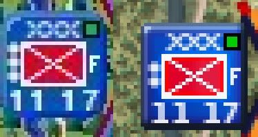
The thing is, I don't want the classic defaults. I just want density icons, supply icons, and movement paths to look the way they used to. I'm certain this will involve something or other in the two graphics folders. Likely something similar for the counters. The third item I'm not even sure has been changed. Compare: do the numbers look different at all? IMO, it's subtle, but it's there. The one's have bars on their bottoms and are fatter, for example. And the colors are more vibrant, but I'm ok with that.
quote:
Any way of getting the classic font for place names back? It's not a priority, but it'd be nice...
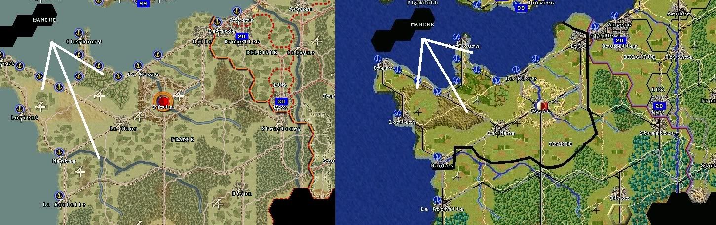
They are the same. Here, compare: the non-playable hex is identical in both versions, so there's your control; as you can see, the "MANCHE"'s are - not different. Are you sure that WindowsFont = N under PlaceNameFont in the Fonts .ini?
< Message edited by desert -- 3/25/2011 11:59:49 PM >
_____________________________
"I would rather he had given me one more division"
- Rommel, when Hitler made him a Field Marshall
|
 Printable Version
 Cherrypicking Classic Graphics -


 New Messages
 No New Messages
 Hot Topic w/ New Messages
 Hot Topic w/o New Messages
 Locked w/ New Messages
 Locked w/o New Messages
 Post New Thread