Shannon V. OKeets
Posts: 22095
Joined: 5/19/2005
From: Honolulu, Hawaii
Status: offline

|
quote:
ORIGINAL: bretg80
Well fan boys... enjoy the dated graphics... There are definitely parts of this game that look great. I'm not being unreasonable about the textures, they look dated and to be honest, they look like crap. It doesn't take much effort to correct this and any UI guy worth their salt will tell you this.
Stick you head in the mud (mtn hex) and in denial. Just like a chef who doesn't want to hear that their food tastes bad and then wonders why they get a terrible review from the food critics. You too shall suffer this fate when you release this product.
Hey someone has to say it. The emperor has no clothes. If no one is critical of your work, then it's not worth working on. If you are building a great game, then build it, don't marginalize it by making excuses about the graphics being good enough. Make it great and reap the rewards. This is not a difficult task. It just requires you to open your eyes and bringing in the right talent to help you.
Again, I am bringing this to your attention to help you. You may not see it that way now, but in the end if you at least consider what I am saying, you will benefit in the long run.
And guys, the graphics textures suck, they really do. You need honest unbiased opinions in order to improve your product, not fan boys who are yes men.
I have been a wargamer for a long time and graphics DO MATTER.
The MWIF world map is 360 hexes wide and 195 hexes high. The game is designed for players who have a monitor 1024w by 768h pixels.
So, the global map 'form' depicts each hex either as 4 pixels (2 by 2) or as 16 pixels (4 by 4). It isn't possible to use an odd number of pixels for the width because we are showing a hexagonal grid and each row has to be offset fomr the one above. A design criterion I set for myself was that the global map could be viewwed in its entirety by the players.
If you know of an UI guy worth his salt who can depict the world map accurately using 16 pixels per hex and provide all the visual wonderfulness you desire, please have him contact me via PM.
---
As for the detailed map, there are a lot of pixels to work with. At highest resolution each hex is 136 pixels wide by 152 pixels high, but that rectangular figure is cropped to a hexagon, which reduces the available pixels somewhat.
I made the decision to use muted graphics for the map. I am familiar with the highly textured hexagons used in other games, dark green for forests, snow white peaks for alpine mountain tops, and the other items you described. But the purpose of the map is to communicate information to the player. When the underlying terrain is a complex visual image, it is more difficult to see the rivers, rail lines, and roads. You have probably encountered this when trying to read text on a web site that uses a fancy background, making the words almost illegible at times.
A second constraint on choice of terrain graphics was the need to scale them to 8 levels of zoom. If you start with really fancy graphics at the highest level of zoom, then zoom them down to 1/2 size, the prettiness wanes and becomes a smudge instead of meaningful information.
Lastly, I choose (i.e., had the graphics artist create) pastel colors for the terrain so the units that appear in the hexes would stand out - the units use all the primary colors. There are 8 major powers in the game and it is crucial when playing the game to be able to identify to which country each unit belongs. There are also dozens of minor countries, each of which has its own uniquely identifying color. Add on top of that the requirement to make all the terrain and unit types capable of being distinguished by color for the 10% of the players who have difficulty in differentiating some color combinations.
So, yes, we could have created really neat graphics for the terrain, provided that we were willing to reduce the levels of zoom to, say, 2. And if there weren't so many different hex borders and icons required by the game. And if we were willing to have the map graphics compete with the unit graphics for the visual attention of the players.
I guess my main point here is that the graphics weren't dashed off by a neophyte/amatuer in a couple of hours. It took us about 6 months and multiple iterations to get each element of the detailed map to work in harmony with the others. And only then did we work on the unit colors and the weather overlays, which required several more months of trial and error and numerous tweaks.
Look at Metz in the attached figure - shown using zoom level 8. The inset in the upper right corner shows the same area at zoom level 2. In the alps the alpine hexsides (crucial to game play) are shown using white - if the basic mountain terrain was more dramatic, the ability of the players to see the alpine hexsides at a glance would be impacted. This screen shot used the entire 1920 by 1080 of one of my monitors. For someone with a smaller monitor, zoom level 8 is only useful when examining a close-in land combat. For air operations you need to see more hexes. And for naval operations, you need to be using zoom levels 2 or 3 (or the global map).
In tournament chess, the board and chess set are mandated to be certain colors and sizes, so the players do not get confused when deep in concerntration. All those fancy chess sets of pewter and bronze with a beautiful wooden board of mahogany and oak (one of which I own) are disallowed when you sit down to play in a tournament.
Given the choice between fancy and functional, I chose the latter. But of course, you can disagree vehemently with my decision.

 Attachment (1) Attachment (1)
_____________________________
Steve
Perfection is an elusive goal.
|
 Printable Version



 ), but I agree with warspite1 (Rob) that this is a strategic level game and not intended to be a graphics paradise.


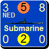

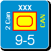


 Yeah great idea - lets waste time and delay the game even more to deal with something only you seem to care about ... why did you even bother to type that crap.

 New Messages
 No New Messages
 Hot Topic w/ New Messages
 Hot Topic w/o New Messages
 Locked w/ New Messages
 Locked w/o New Messages
 Post New Thread