Matrix Games Forums

Forums  Register  Login  Photo Gallery  Member List  Search  Calendars  FAQ 

My Profile  Inbox  Address Book  My Subscription  My Forums  Log Out

Graphics Enhancement Mod (GEM) v2.4. Updated: December 22, 2012

 
View related threads: (in this forum | in all forums)

Logged in as: Guest
Users viewing this topic: none
  Printable Version
All Forums >> [New Releases from Matrix Games] >> Distant Worlds 1 Series >> Design and Modding >> Graphics Enhancement Mod (GEM) v2.4. Updated: December 22, 2012 Page: [1] 2 3 4 5   next >   >>
Login
Message << Older Topic   Newer Topic >>
Graphics Enhancement Mod (GEM) v2.4. Updated: December ... - 11/10/2012 3:14:08 PM   
Martian


Posts: 121
Joined: 8/26/2012
Status: offline


Current version: 2.4
Updated: December 22, 2012

Quick overview of GEM features:

- New icons & pictograms for game's interface
- New cursors set
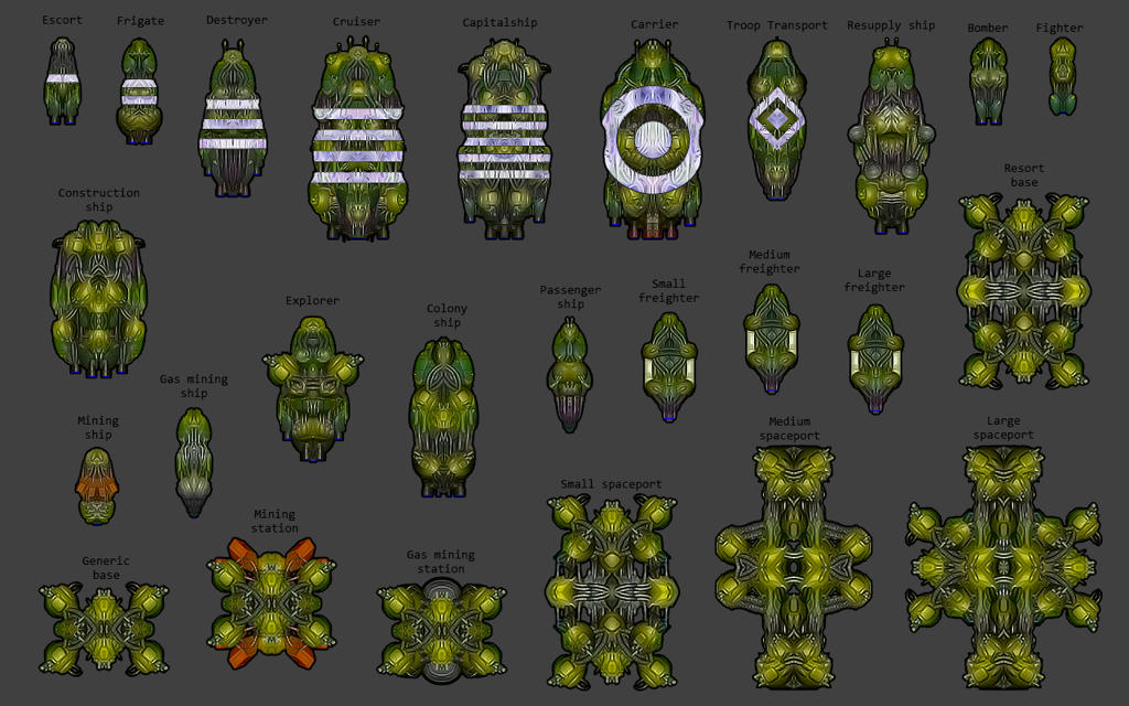
- Restyled ship graphics
- Improved planet & star graphics
- New landscapes
- New ruins
- New galaxy backdrop


- FEATURES -


NEW ICONS & PICTOGRAMS

53 new redesigned and refined icons & pictograms for game's interface.
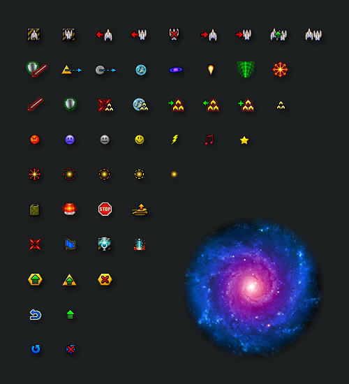


Resized to perfectly fit interface's elements so there is no need for the game to resize them to fit in buttons and frames. As a result all new pictograms look very sharp and clear in the game (except those which are used in more than one place and with various scale). Here are some examples:
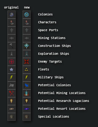
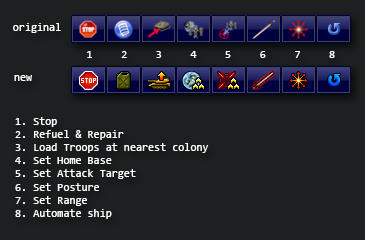
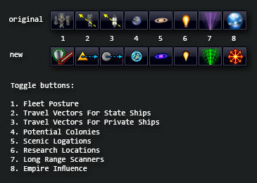


Unfortunately most of other interface elements are not available for modding. There are some of interface's resources present in "images\ui\chrome" folder which are not used by game (Or at least not where it was expected).
Another issue is that the game sometimes uses same resourcses for different elements of interface (for example "firepower.png" is used both for military ships and crash research icons). This fact limits design choices for the interface improvement. So looking forward to modding improvements in DW's future releases.


NEW CURSORS SET

14 all new "pixelart" cursors.


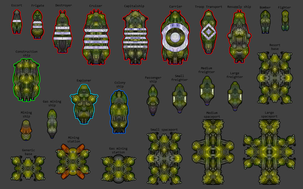
RESTYLED SHIP GRAPHICS

The ship restyling has several purposes in mind:

1. Make ships look clearer and distinctive on various bright and dark backgrounds during gameplay.
2. Quick identification of all controllable state ships.
3. Quick identification of military ship types.
4. More eye candy look.

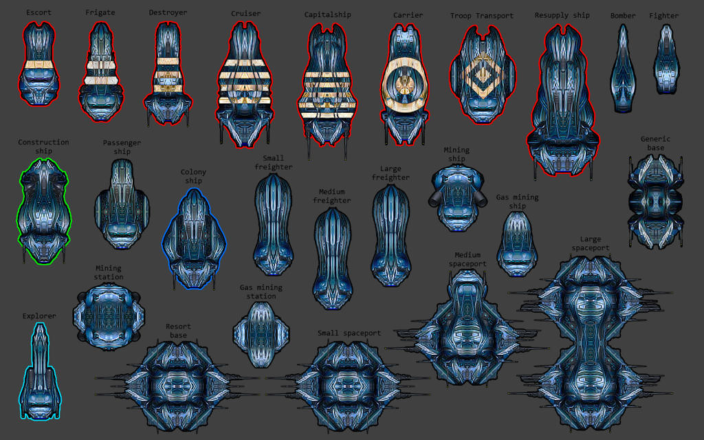
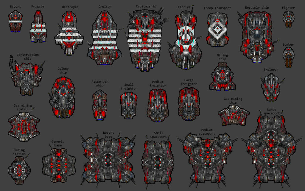
I know that game already has good ship type identification signs such as triangles for military ships, rectangles for construction ships and so on, but I believe average human eye is much more responsive to colours than to shapes. So I decided to use different colour outlines to make it even easier to quickly identify ships during a gameplay.

All controllable ships have various colour outlines:

Red - Military ships
Green - Construction ships
Cyan - Exploration ships
Blue - Colony ships

Military ships have following distinctive insignia painted on them:

One stripe - Escort
Two stripes - Frigate
Three stripes - Destroyer
Four stripes - Cruiser
Five stripes - Capitalship
Small circle inside a bigger one - Carrier
Small diamond inside a bigger one - Troop transport

Here are few examples:


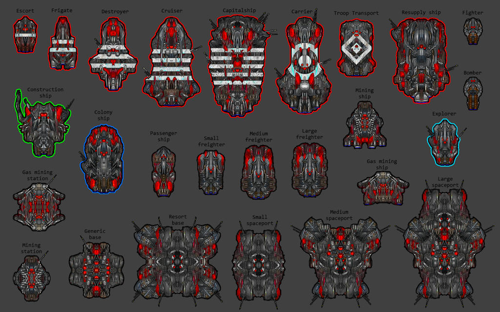
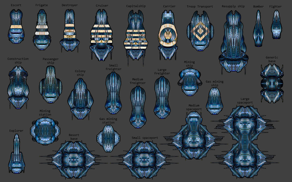
Additionally, there is an alternative shipset for those who prefer ships with black outlines only:


IMPROVED PLANET GRAPHICS

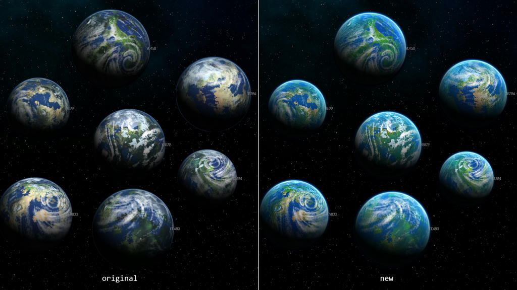
Continental planets

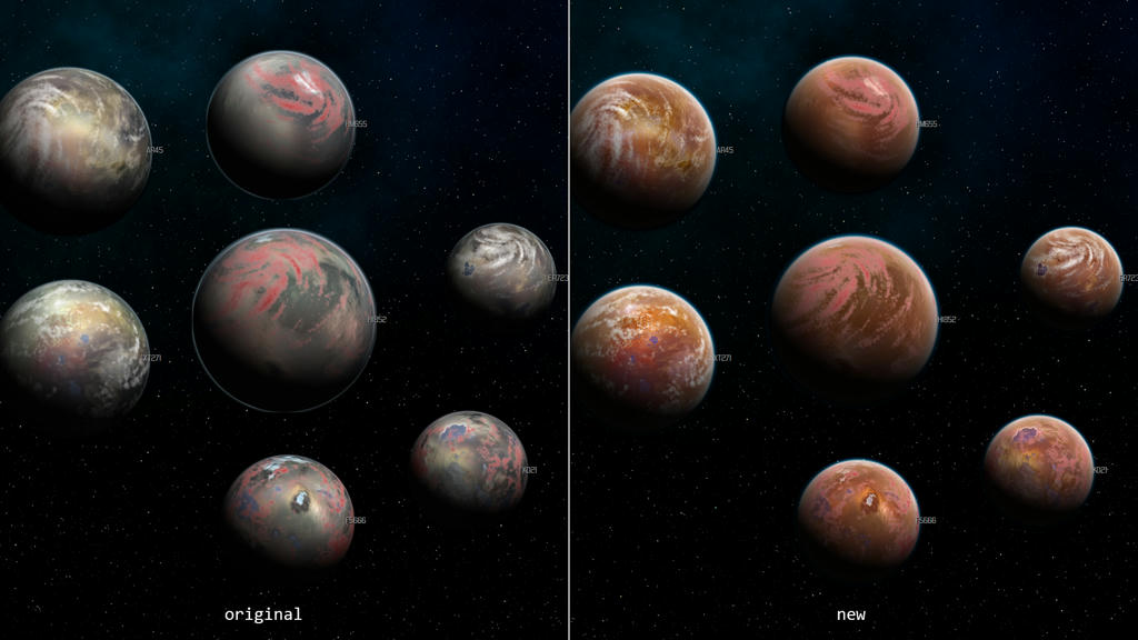
Desert planets

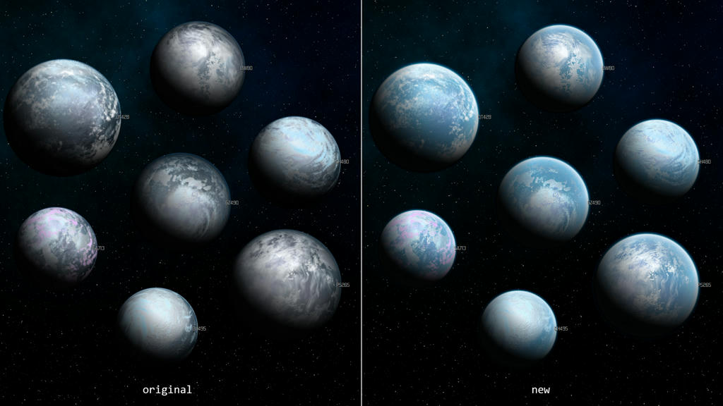
Ice planets

Marshyswamp planets
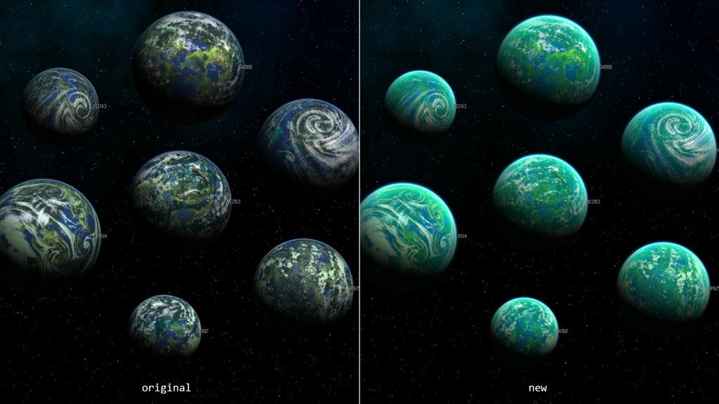

Oceanic planets
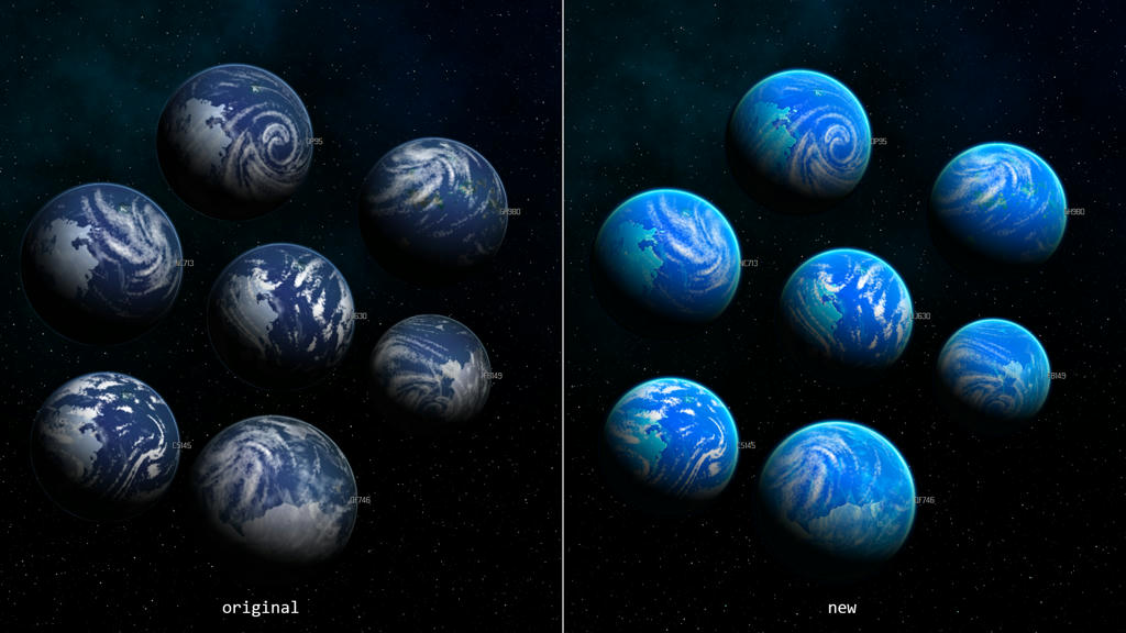

Volcanic planets
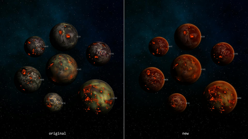

Barrenrock planets
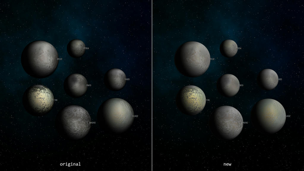


IMPROVED STAR GRAPHICS

Main sequence star


Red Giant


Super Giant


White Dwarf


Neutron Star


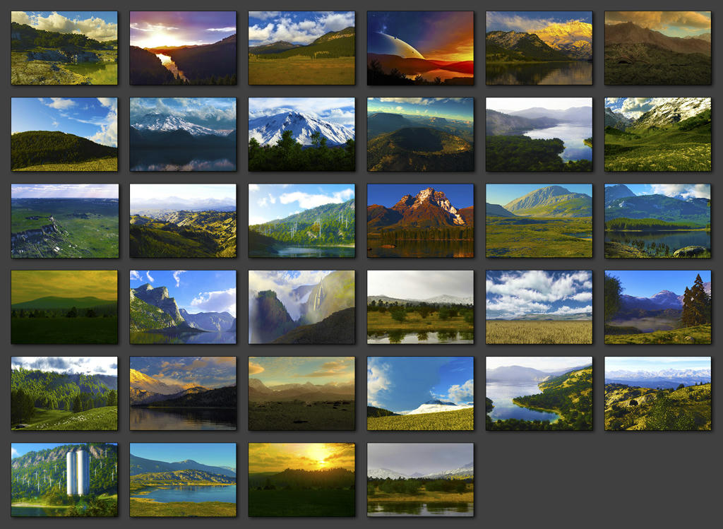
NEW LANDSCAPES

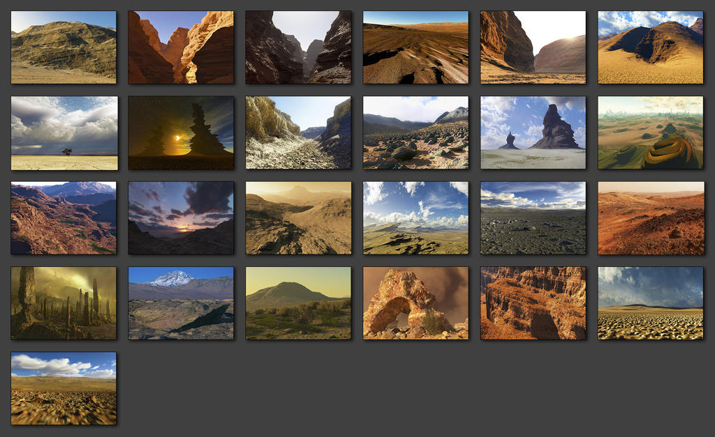
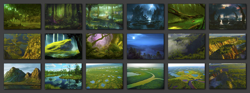
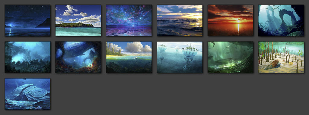
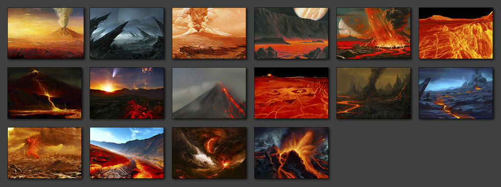
Original artworks were not created by me but were searched and taken from the net, mostly from Terragen's gallery. I just resized, framed and colour graded them. So all kudos and credits go to their creators.

Landscapes are resized and adjusted to perfectly fit game's interface.

Unfortunately, at the present moment DW has a hard-coded limit to use only few first images. So it uses only 4 images for continental planets (+1 from forest folder), 3 for desert, marshyswamp and ice planets, 2 for volcanic and oceanic planets. Hopefully this will be fixed in "Shadows" release, but for now most of these landscapes wouldn't appear in the game.

If you want some particular landscapes to be present in the game, please rename them to use first few numbers. For example, use names from "landscape_0" up to "landscape_3" for continental planets.


Continental planet's landscapes

Desert planet's landscapes

Ice planet's landscapes


Marshyswamp planet's landscapes

Oceanic planet's landscapes

Volcanic planet's landscapes


IMPROVED RUINS

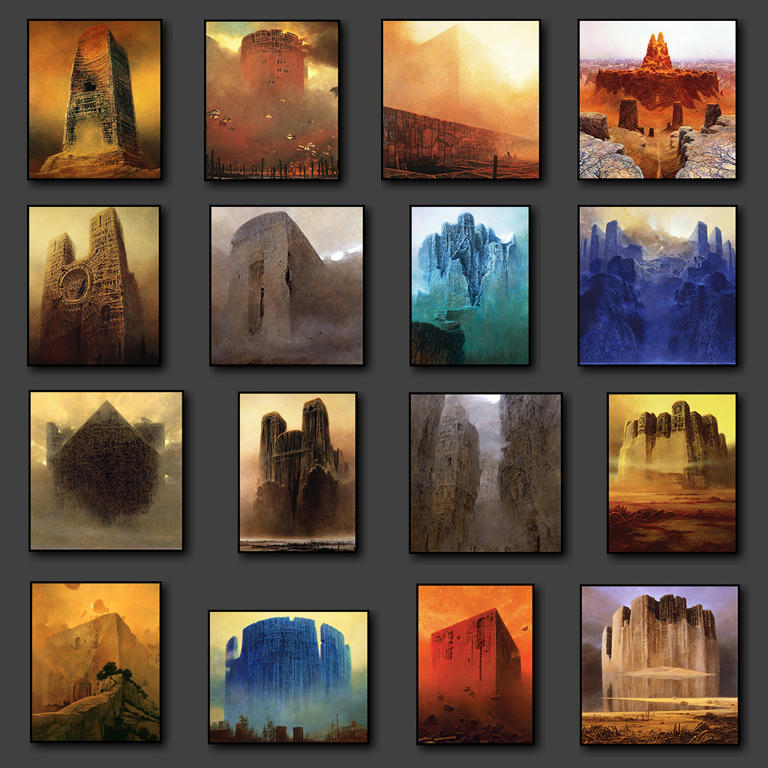
For the ruins I used amazing and myserious paintings of Polish artist Zdzisław Beksiński.


NEW GALAXY BACKDROP


GEM DOWNLOAD LINKS

GEM v2.4 - Complete mod
http://www.mediafire.com/?7r0xul9p7fd36a8


Alternatively, if you don't need all of the features, you can choose which individual parts of the mod to download:

GEM v2.4 - Galaxy backdrop only
http://www.mediafire.com/?ipwww3mbdekwswo

GEM v2.4 - Cursors & icons only
http://www.mediafire.com/?2odwi8mndekqd30

GEM v2.4 - Landscapes & ruins only
http://www.mediafire.com/?8tpm52tgjin0r95

GEM v2.4 - Planets & stars only
http://www.mediafire.com/?w3o99fn0j4o7ac0

GEM v2.4 - Shipset only
http://www.mediafire.com/?0rrcz3z7s47s712

GEM v2.4 - Alternative shipset only (without colour outlines)
http://www.mediafire.com/?v123ydbyja41nhb


INSTALLATION:

1. Backup original "Distant Worlds\images" folder
2. Extract archive and overwrite original files in Distant Worlds\images
3. Enjoy!


CHANGELOG

[+] new content/feature
[-] update/fix

v1.0
+ Upgraded original graphics for all planets except frozen gas giants & gas giants.
+ Upgraded original graphics for all stars on a system zoom level.
+ Upgraded original galaxy backdrop.

v2.0
+ Upgraded original ship graphics.
+ Integrated updated version of "Surrealistic ruins" mod.
+ Integrated updated version of "Beautiful landscapes" mod.
- Made the atmosphere slightly visible even on a dark side of planets.
- Fixed a shadow artifact appeared when a planet overlaps another planet.

v2.1
+ Added 9 new cursors.

v2.2
+ Added 5 more new cursors and updated most of previously released cursors.

v2.2.1
- Minor design update of bombard, construction and mine cursors.

v2.3
+ Added 53 new & refined pictograms for game's interface.
- Most of the cursors are redesigned or refined.
- New version of galaxy backdrop.

v2.4
- Improved planet graphics, including new atmospheric effect.
- Added an alternative version of shipset without colour outlines.
- Updated version of galaxy backdrop. Slightly redesigned and significantly desaturated to improve contrast between backdrop and active objects on the map.


< Message edited by Martian -- 12/24/2012 4:10:19 AM >


_____________________________

Post #: 1
RE: "Gems & Pearls" Mod - 11/10/2012 3:45:11 PM   
Shark7


Posts: 7937
Joined: 7/24/2007
From: The Big Nowhere
Status: offline
Wow, you really managed to clear up and improve the graphics there, downloading this one now.

_____________________________

Distant Worlds Fan

'When in doubt...attack!'

(in reply to Martian)
Post #: 2
RE: "Gems & Pearls" Mod - 11/10/2012 4:44:17 PM   
Martian


Posts: 121
Joined: 8/26/2012
Status: offline
Thank you, Shark! Yes, it took me some time...
The game is very sensitive to errors. Sometimes even one wrong pixel can make things look awful!

(in reply to Shark7)
Post #: 3
RE: "Gems & Pearls" Mod - 11/10/2012 4:59:02 PM   
w1p


Posts: 135
Joined: 11/23/2011
Status: offline
I've always been a "gameplay over graphics" type of person, but the lots of little modifications you make sure do make a massive difference, and they have such a polished feel to them. I think Erik should consider getting you to help out with Shadows. No offence to the art team, but Martian's artwork is simply superb.

Simply put - Thanks!!

(in reply to Martian)
Post #: 4
RE: "Gems & Pearls" Mod - 11/10/2012 11:47:43 PM   
unidterror


Posts: 43
Joined: 11/3/2012
Status: offline
these are real nice, ill download em and paste them in. this would be the first World mod i actualy try.
thank Mars keep up the fabulous work.

(in reply to Martian)
Post #: 5
RE: "Gems & Pearls" Mod - 11/11/2012 1:00:05 AM   
tjhkkr


Posts: 2428
Joined: 6/3/2010
Status: offline
This is a very nice piece of work.
Thank you, very much.

_____________________________

Remember that the evil which is now in the world will become yet more powerful, and that it is not evil which conquers evil, but only love -- Olga Romanov.

(in reply to unidterror)
Post #: 6
RE: "Gems & Pearls" Mod - 11/11/2012 2:27:33 AM   
Igard


Posts: 2282
Joined: 3/29/2010
From: Scotland
Status: offline
Excellent work, Martian. The stars in particular look amazing!

_____________________________


(in reply to tjhkkr)
Post #: 7
RE: "Gems & Pearls" Mod - 11/11/2012 2:42:02 AM   
Martian


Posts: 121
Joined: 8/26/2012
Status: offline
w1p, unidterror, tjhkkr, Igard

Thank you guys!

< Message edited by Martian -- 11/11/2012 2:43:06 AM >

(in reply to tjhkkr)
Post #: 8
RE: "Gems & Pearls" Mod - 11/11/2012 2:46:56 AM   
Martian


Posts: 121
Joined: 8/26/2012
Status: offline
quote:

ORIGINAL: Igard

Excellent work, Martian. The stars in particular look amazing!


Yes, planets received most of my love, while all patience was spent for the stars!

< Message edited by Martian -- 11/11/2012 7:15:36 AM >

(in reply to Igard)
Post #: 9
RE: "Gems & Pearls" Mod - 11/12/2012 8:59:08 PM   
Arcatus


Posts: 197
Joined: 1/2/2012
Status: offline
Oooooh. Shiny!

Very nice stars. Especially that neutron star.

Downloading :)

(in reply to Martian)
Post #: 10
RE: "Gems & Pearls" Mod - 11/14/2012 6:07:59 PM   
tjhkkr


Posts: 2428
Joined: 6/3/2010
Status: offline
Is that the Great Nebula of Orion for that background?
How did you dim it down?
My version is very, very bright.

_____________________________

Remember that the evil which is now in the world will become yet more powerful, and that it is not evil which conquers evil, but only love -- Olga Romanov.

(in reply to Arcatus)
Post #: 11
RE: "Gems & Pearls" Mod - 11/15/2012 5:04:20 AM   
Martian


Posts: 121
Joined: 8/26/2012
Status: offline
quote:

ORIGINAL: tjhkkr

Is that the Great Nebula of Orion for that background?
How did you dim it down?
My version is very, very bright.


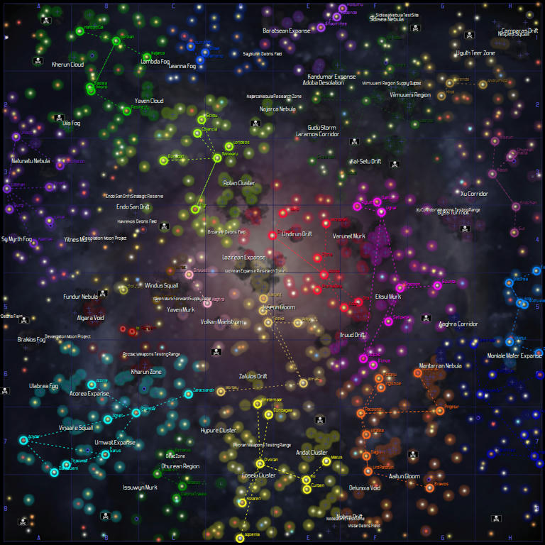
I used original "galaxy_backdrop_OLD2.jpg" file which was located in "Distant Worlds\images\environment\galaxybackdrops" folder.
Here it is:


Then I just resized, slightly blurred (to soften "pixelization" effect when you zoom galaxy map in the game) and colour graded it.

Can you show me your version?


Attachment (1)

< Message edited by Martian -- 11/15/2012 5:10:03 AM >


_____________________________


(in reply to tjhkkr)
Post #: 12
RE: "Gems & Pearls" Mod - 11/15/2012 5:13:21 AM   
tjhkkr


Posts: 2428
Joined: 6/3/2010
Status: offline
I will get it to you soon...

_____________________________

Remember that the evil which is now in the world will become yet more powerful, and that it is not evil which conquers evil, but only love -- Olga Romanov.

(in reply to Martian)
Post #: 13
RE: "Gems & Pearls" Mod - 11/15/2012 10:14:11 AM   
Kalthaniell


Posts: 320
Joined: 5/31/2011
Status: offline
The sun looks tenfolds better now. Thx!

(in reply to tjhkkr)
Post #: 14
RE: "Gems & Pearls" Mod - 11/16/2012 7:43:23 AM   
nelsonlee_slith


Posts: 19
Joined: 12/29/2011
Status: offline
why it donot work if I just modify the num of new pics?
form 1001 to 1023 for example

(in reply to Kalthaniell)
Post #: 15
RE: "Gems & Pearls" Mod - 11/16/2012 5:16:32 PM   
Martian


Posts: 121
Joined: 8/26/2012
Status: offline

quote:

ORIGINAL: nelsonlee

why it donot work if I just modify the num of new pics?
form 1001 to 1023 for example


Sorry I don't quite understand your question. Can you be more specific?

_____________________________


(in reply to nelsonlee_slith)
Post #: 16
RE: "Gems & Pearls" Mod - 11/19/2012 6:31:43 AM   
nelsonlee_slith


Posts: 19
Joined: 12/29/2011
Status: offline
for example
I change the /planets/continental/Continental-0001.png-->Continental-1001.png
donot replace the old pic,then put it in the game dir,but donot displayed in game.....

(in reply to Martian)
Post #: 17
RE: "Gems & Pearls" Mod - 11/19/2012 7:10:46 AM   
Martian


Posts: 121
Joined: 8/26/2012
Status: offline
I guess the problem here is about how game itself reads files. Ether "1001" is too high number for game to "see" it. Or maybe its because of gap between numbers. Just for a test try renaming it to the consequent number after last one already used (0024 for example).


_____________________________


(in reply to nelsonlee_slith)
Post #: 18
RE: "Gems & Pearls" Mod - 11/20/2012 8:46:55 PM   
Martian


Posts: 121
Joined: 8/26/2012
Status: offline
Mod is updated and renamed. See first post...

_____________________________


(in reply to Martian)
Post #: 19
RE: "Gems & Pearls" Mod - 11/20/2012 10:02:03 PM   
Shark7


Posts: 7937
Joined: 7/24/2007
From: The Big Nowhere
Status: offline
Good idea on the ship icons, but I have to ask to be sure...

You did use a blue other than pure blue (R= 0, G = 0, B= 255) right? Pure blue would just give you a giant moving engine glow.

Landscapes and ruins look great and are about to get downloaded.

_____________________________

Distant Worlds Fan

'When in doubt...attack!'

(in reply to Martian)
Post #: 20
RE: "Gems & Pearls" Mod - 11/20/2012 10:04:57 PM   
Shark7


Posts: 7937
Joined: 7/24/2007
From: The Big Nowhere
Status: offline
Another Suggestion Martian:

Can you break this up into 2 or 3 downloads. I have fast broadband and it isn't a problem for me, but for some of our community broadband might not be available and a 120mb DL will take them a long time.

_____________________________

Distant Worlds Fan

'When in doubt...attack!'

(in reply to Shark7)
Post #: 21
RE: "Gems & Pearls" Mod - 11/21/2012 2:29:21 AM   
Martian


Posts: 121
Joined: 8/26/2012
Status: offline
Thanks Shark!


quote:

You did use a blue other than pure blue (R= 0, G = 0, B= 255) right? Pure blue would just give you a giant moving engine glow.


Everything should look fine. Light's yellow (255,255,0) and Engine's blue (0,0,255) are not used.

I wish the game's engine allowed closer zooming. I wanted to make ships size smaller. IMHO in vanilla their scale is too big compared to planets, spaceport and stations. But if I make them say 2 times smaller it would be difficult to see and identify them clearly with current zooming limit.

quote:

Can you break this up into 2 or 3 downloads. I have fast broadband and it isn't a problem for me, but for some of our community broadband might not be available and a 120mb DL will take them a long time.


Sure, added.

< Message edited by Martian -- 11/21/2012 8:07:34 AM >


_____________________________


(in reply to Shark7)
Post #: 22
RE: "Gems & Pearls" Mod - 11/25/2012 2:14:54 PM   
Martian


Posts: 121
Joined: 8/26/2012
Status: offline
To those who already tried this mod.
I would like to know what do you think about ship restyling? Is this a step in right direction?
Also what do think about making ships (and maybe stations too) smaller compared to planets? Maybe about 2 times smaller than now?


_____________________________


(in reply to Martian)
Post #: 23
RE: "Gems & Pearls" Mod - 11/25/2012 2:30:21 PM   
ASHBERY76


Posts: 2136
Joined: 10/10/2001
From: England
Status: offline
I am not sure the game uses more than 4 pictures for each planet landscape.I have never seen a landscape_4 picture onwards on a planet screen yet.

_____________________________


(in reply to Martian)
Post #: 24
RE: "Gems & Pearls" Mod - 11/25/2012 2:39:31 PM   
Martian


Posts: 121
Joined: 8/26/2012
Status: offline
Hmmmm... Thanks for pointing this out, Ashbery. I didn't pay much attention, but looks like you are right. That explains why there are only 4 images at maximum in original landscapes folders... It's sad. Looks almost like a bug to me. I hope Elliot will remove this limit in Shadows. Otherwise my landscape mod is half in vain..

< Message edited by Martian -- 11/25/2012 2:40:19 PM >


_____________________________


(in reply to ASHBERY76)
Post #: 25
RE: "Gems & Pearls" Mod - 11/25/2012 3:06:55 PM   
Martian


Posts: 121
Joined: 8/26/2012
Status: offline
Yes, you were completely right! I've made some testing. I used editor to make 80-100 continental planets. I checked them and for all of them game used only first 4 images from continental landscape folder and only one image from "forest" folder!!!


< Message edited by Martian -- 11/25/2012 3:07:34 PM >


_____________________________


(in reply to Martian)
Post #: 26
RE: "Gems & Pearls" Mod - 11/25/2012 3:46:44 PM   
Martian


Posts: 121
Joined: 8/26/2012
Status: offline
I did same testing for all of colonizable type of planets and things are even worse. From my understanding the game uses only original amount of images.
So for continental planets it uses 4 images (plus one from forest folder). For ice, marshyswamp and desert planets only 3. But for oceanic and volcanic it's only two images! I really hope this will be improved in Shadows.


_____________________________


(in reply to Martian)
Post #: 27
RE: "Gems & Pearls" Mod - 11/25/2012 4:41:42 PM   
Cruis.In


Posts: 202
Joined: 11/10/2012
Status: offline
id ont like the outlines on the ships no way to turn off?

(in reply to Martian)
Post #: 28
RE: "Gems & Pearls" Mod - 11/26/2012 12:24:20 AM   
Martian


Posts: 121
Joined: 8/26/2012
Status: offline
You don't like all outlines including black ones? Or it's only bright outlines (red, blue cyan and green) which bothers you?

_____________________________


(in reply to Cruis.In)
Post #: 29
RE: Graphics Enhancement Mod (GEM) v2.0 - 11/26/2012 3:46:12 PM   
Arcatus


Posts: 197
Joined: 1/2/2012
Status: offline
quote:

ORIGINAL: Martian


NEW RESTYLED SHIP GRAPHICS

The ship restyling has several purposes in mind:

1. Make ships look clearer and distinctive on various bright and dark backgrounds during gameplay.
2. Quick identification of all controllable state ships.
3. Quick identification of military ship types.
4. More eye candy look.


All controllable ships have various colour outlines:

Red - Military ships
Green - Construction ships
Cyan - Exploration ships
Blue - Colony ships

Military ships have following distinctive insignia painted on them:

One stripe - Escort
Two stripes - Frigate
Three stripes - Destroyer
Four stripes - Cruiser
Five stripes - Capitalship
Small circle inside a bigger one - Carrier
Small diamond inside a bigger one - Troop transport


Aw, man that is innovative.

(damn you for thinking of this before me )

As my shipsets are frankensteined from many sources, this would be a odd one to add, as only some races would use this new outline.

But I really like the concept. Especially on the troop transports - being able to identify and target those quickly is something I really, really want to add.

So, I'll frankenstein this concept into my shipsets. Thankyou!

Edit: And you added even more stuff as I made this post. You, martians are awesome!

< Message edited by Arcatus -- 11/26/2012 3:53:22 PM >

(in reply to Martian)
Post #: 30
Page:   [1] 2 3 4 5   next >   >>
All Forums >> [New Releases from Matrix Games] >> Distant Worlds 1 Series >> Design and Modding >> Graphics Enhancement Mod (GEM) v2.4. Updated: December 22, 2012 Page: [1] 2 3 4 5   next >   >>
Jump to:


New Messages No New Messages
Hot Topic w/ New Messages Hot Topic w/o New Messages
Locked w/ New Messages Locked w/o New Messages
 Post New Thread
 Reply to Message
 Post New Poll
 Submit Vote
 Delete My Own Post
 Delete My Own Thread
 Rate Posts


Forum Software © ASPPlayground.NET Advanced Edition 2.4.5 ANSI

1.078