Matrix Games Forums

Forums  Register  Login  Photo Gallery  Member List  Search  Calendars  FAQ 

My Profile  Inbox  Address Book  My Subscription  My Forums  Log Out

Das Resource UI Mod (Superseded by Chrome Mod)

 
View related threads: (in this forum | in all forums)

Logged in as: Guest
Users viewing this topic: none
  Printable Version
All Forums >> [New Releases from Matrix Games] >> Distant Worlds 1 Series >> Design and Modding >> Das Resource UI Mod (Superseded by Chrome Mod) Page: [1] 2   next >   >>
Login
Message << Older Topic   Newer Topic >>
Das Resource UI Mod (Superseded by Chrome Mod) - 5/20/2014 6:45:58 PM   
DasTactic


Posts: 1083
Joined: 10/10/2005
Status: offline
Das Resource UI
for Distant Worlds: Universe

PLEASE NOTE: This mod is now part of the Das Chrome Mods which re-skins the user interface in the game. That pack is a much more complete user experience and is recommended over this one!



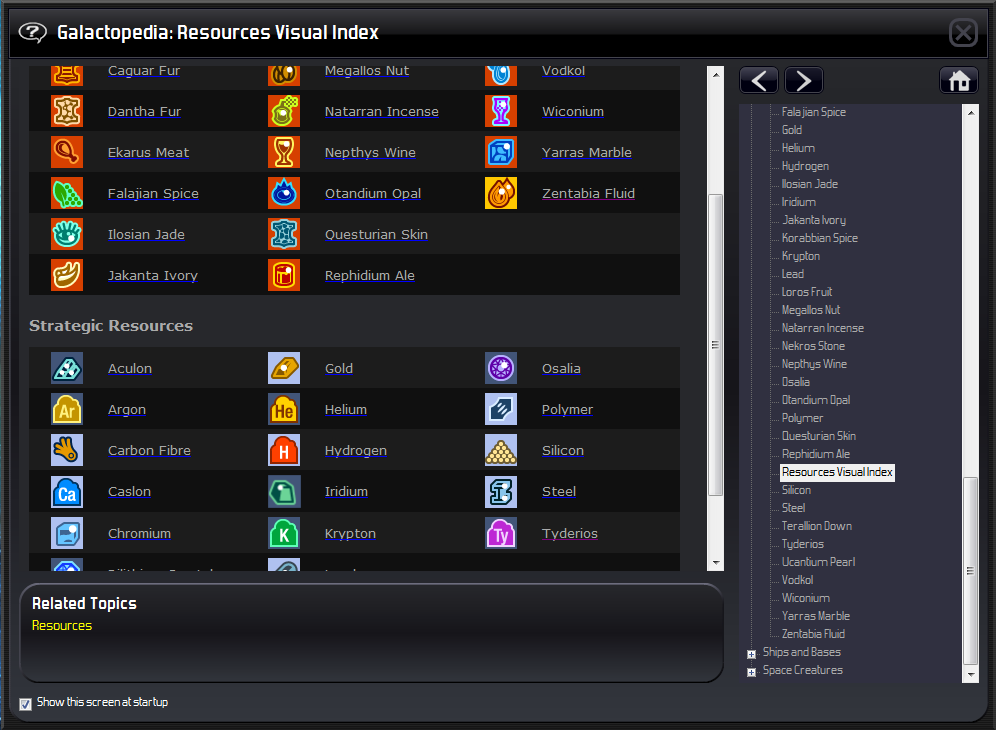
With a view to helping new players ease into the game I thought I'd make a set of resource icons that can be instantly recognisable.

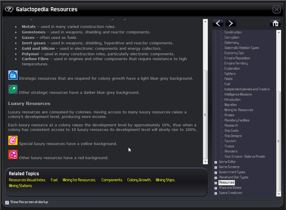
Strategic resources that are required to boost colony growth have a light blue-grey background.
Other strategic resources have a darker blue-grey background.
Special luxury resources have a yellow background.
Other luxury resources have a red background.

The resource help files have all been updated with new imagery and information.

This is unabashedly inspired by Sirian's excellent Resources mod.

Usage:
The attached file has an MIT license inside it that allows unrestricted use. So if you want to add it to other mods, or if you want to change it in any way - not a problem. Go for it. :)

Source files:
Source files are not attached to the zip file. The icons are all created as vector images in Adobe Illustrator so can be scaled to any size. The file has the 32x32 icons used in the mod but also has 64x64 icons as well which are used in the help files.

Patch notes:
Version 1.1
* All gases now have gas giant background image.
* Also replaced many icons with new versions (Steel, Silicon, Rephidium Ale, Polymer, Otandium Opal, Lead, Jakanta Ivory, Iridium, Gold, Chromium, Carbon Fibre)


Attachment (1)

< Message edited by Das123 -- 5/24/2014 2:54:34 AM >
Post #: 1
RE: Das Resource UI Mod - 5/20/2014 7:00:01 PM   
joeyeti


Posts: 329
Joined: 2/28/2012
Status: offline
Nice one! Pls pls, some in-game screenshots!


_____________________________

Joe

(in reply to DasTactic)
Post #: 2
RE: Das Resource UI Mod - 5/20/2014 7:37:39 PM   
DasTactic


Posts: 1083
Joined: 10/10/2005
Status: offline
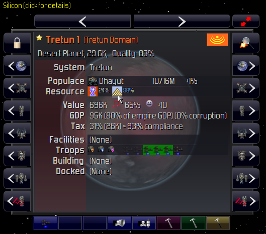
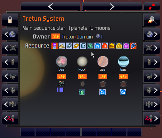
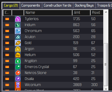
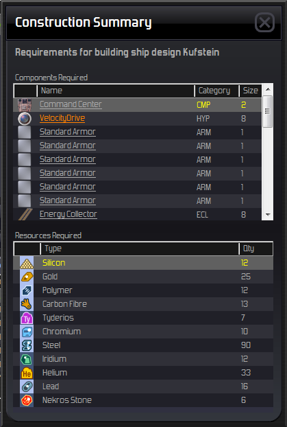
Here's some in-game images...


(in reply to joeyeti)
Post #: 3
RE: Das Resource UI Mod - 5/20/2014 7:49:48 PM   
ASHBERY76


Posts: 2136
Joined: 10/10/2001
From: England
Status: offline
Silicon looks like a snooker triangle.

_____________________________


(in reply to DasTactic)
Post #: 4
RE: Das Resource UI Mod - 5/20/2014 8:03:47 PM   
joeyeti


Posts: 329
Joined: 2/28/2012
Status: offline
Even more nice! :)
Thx Das for this!

_____________________________

Joe

(in reply to ASHBERY76)
Post #: 5
RE: Das Resource UI Mod - 5/20/2014 9:47:22 PM   
FireLion1983


Posts: 149
Joined: 4/18/2014
Status: offline
Hmmm, Sirian's mod has new competition - which one to choose...

(in reply to joeyeti)
Post #: 6
RE: Das Resource UI Mod - 5/20/2014 10:06:38 PM   
Darkspire


Posts: 1986
Joined: 6/12/2003
From: My Own Private Hell
Status: offline
Still wondering why folks on XP have a crap font on DW compared to the other OS's

Darkspire

_____________________________


(in reply to FireLion1983)
Post #: 7
RE: Das Resource UI Mod - 5/20/2014 11:05:25 PM   
FireLion1983


Posts: 149
Joined: 4/18/2014
Status: offline
Das, any hope of u reskinning the entire GUI in this likeness? The game is in desperate need of a quick facelift - even beyond GEM.

EDIT: Autocorrect mumbo jumbo

< Message edited by FireLion1983 -- 5/21/2014 2:27:59 AM >

(in reply to Darkspire)
Post #: 8
RE: Das Resource UI Mod - 5/21/2014 12:03:46 AM   
DasTactic


Posts: 1083
Joined: 10/10/2005
Status: offline

quote:

ORIGINAL: FireLion1983

Das, any hope of u desk inning the entire GUI in this likeness? The game is in desperate need for a quick facelift - even beyond GEM.

If I have time I was going to give it a go. Originally I was wanting to make a minimalistic resource set but found it needed colour to more easily differentiate. I'm already thinking there are a number of resources I don't like the look of so will probably tweak those a bit.

(in reply to FireLion1983)
Post #: 9
RE: Das Resource UI Mod - 5/21/2014 1:49:25 AM   
DasTactic


Posts: 1083
Joined: 10/10/2005
Status: offline
After playing for while with this there were some icons I really disliked so have now uploaded version 1.1 with nearly half the icons replaced.

The link in the OP is the right one.

(in reply to DasTactic)
Post #: 10
RE: Das Resource UI Mod - 5/21/2014 4:41:13 AM   
tbrass


Posts: 21
Joined: 4/22/2014
Status: offline
Wow, Das - Thanks. v. 1.1 is fantastic!

I may try to merge this with Arcatus's real resources (mostly for the visual index that includes where resources are found, but also for that touch of realism)

< Message edited by tbrass -- 5/21/2014 5:54:59 AM >

(in reply to DasTactic)
Post #: 11
RE: Das Resource UI Mod - 5/21/2014 5:44:03 AM   
FireLion1983


Posts: 149
Joined: 4/18/2014
Status: offline

quote:

ORIGINAL: tbrass

Wow, Das - Thanks. v. 1.1 is fantastic!

I may try to merge this with Arcatus's real resources (mostly for the visual index that includes where resources are found, but also for that touch of realism)


I like that mod, I just wish more references were adjusted. It's jarring to read iron and steel in different places throughout. I wonder if you can adjust every mention in game somehow?

(in reply to tbrass)
Post #: 12
RE: Das Resource UI Mod - 5/21/2014 1:51:45 PM   
TanC


Posts: 74
Joined: 5/8/2013
Status: offline
My gosh, dat resource!

Great work on the reskin; I'd have to agree with FireLion1983...DW could use an alternate skin-set just to refresh the game's image. :D

(in reply to FireLion1983)
Post #: 13
RE: Das Resource UI Mod - 5/22/2014 5:45:32 AM   
DasTactic


Posts: 1083
Joined: 10/10/2005
Status: offline
Started playing with making new icons for the chrome but this is going to be a big task. Not sure how long it will take or even if I'll get it done. I started making icons for the top - which has the smallest amount of work required. Still need to make icons for history, messages and money but this bit is nearly there.


I'll also make icons for the left panel and the galaxy map but the explorer bar in the bottom-left has a lot of hidden items. I might just start with the outside sections.

(in reply to TanC)
Post #: 14
RE: Das Resource UI Mod - 5/22/2014 8:55:11 AM   
joeyeti


Posts: 329
Joined: 2/28/2012
Status: offline
Wowza! Never thought there could be such a difference possible!

_____________________________

Joe

(in reply to DasTactic)
Post #: 15
RE: Das Resource UI Mod - 5/22/2014 11:07:48 AM   
StarLab


Posts: 844
Joined: 8/27/2012
From: Ontario, Canada
Status: offline

quote:

ORIGINAL: Das123

Started playing with making new icons for the chrome but this is going to be a big task. Not sure how long it will take or even if I'll get it done. I started making icons for the top - which has the smallest amount of work required. Still need to make icons for history, messages and money but this bit is nearly there.


I'll also make icons for the left panel and the galaxy map but the explorer bar in the bottom-left has a lot of hidden items. I might just start with the outside sections.


Nice! +1

_____________________________

-Larry Monte

Latest YouTube Series
DW2 Mortalen Preview
DW2 Ackdarian Preview

(in reply to DasTactic)
Post #: 16
RE: Das Resource UI Mod - 5/22/2014 11:46:54 AM   
Gareth_Bryne


Posts: 232
Joined: 5/16/2010
Status: offline
Very nice!

_____________________________

"Only an idiot fights a war on two fronts. Only the heir to the throne of the Kingdom of Idiots would fight a war on twelve fronts," - Londo Mollari

(in reply to StarLab)
Post #: 17
RE: Das Resource UI Mod - 5/22/2014 6:42:44 PM   
DasTactic


Posts: 1083
Joined: 10/10/2005
Status: offline
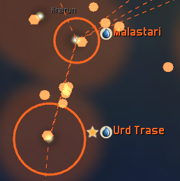
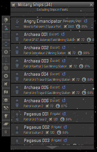
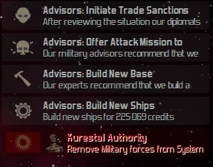
A few more screen showing the work in progress.


It is quite difficult to get the sizes right all the time but the original art is vector based so it is relatively easy to resize the image frames as required.

Some of the images in the chrome are used multiple times for different concepts such as the Fleet Leader star also being used for Regional Capital and military ships also being the same icon for fire-power. Other images are shared for similar things such as the advisor build messages being the same image used for construction ships. There are also images pulled from the character and ship-sets such as the various ship filters on the left hand side. The last image for Special Locations is being pulled from somewhere I don't know because I can't locate this one.

(in reply to Gareth_Bryne)
Post #: 18
RE: Das Resource UI Mod - 5/23/2014 1:26:57 AM   
FireLion1983


Posts: 149
Joined: 4/18/2014
Status: offline
Oh my word! Keep it up, you have definite download from me when finished! :)

(in reply to DasTactic)
Post #: 19
RE: Das Resource UI Mod - 5/23/2014 2:16:57 AM   
Buio


Posts: 247
Joined: 11/21/2012
Status: offline
Looks great, looking forward to the UI icons too.

(in reply to FireLion1983)
Post #: 20
RE: Das Resource UI Mod - 5/23/2014 2:26:20 AM   
Simulation01


Posts: 540
Joined: 5/12/2010
Status: offline
Looks great!

_____________________________

"Tho' much is taken, much abides; and though we are not now that strength which in old days moved Earth and Heaven; that which we are, we are; One equal temper of heroic hearts, made weak by time and fate, but strong in will." -Tennyson

(in reply to Buio)
Post #: 21
RE: Das Resource UI Mod - 5/23/2014 2:35:56 AM   
Shark7


Posts: 7937
Joined: 7/24/2007
From: The Big Nowhere
Status: offline
Hmm, nice looking chrome update. I'll have to be sure to keep up with your progress.

_____________________________

Distant Worlds Fan

'When in doubt...attack!'

(in reply to Simulation01)
Post #: 22
RE: Das Resource UI Mod - 5/23/2014 8:07:09 PM   
FireLion1983


Posts: 149
Joined: 4/18/2014
Status: offline
Das, Universe is here - need your GUI update NAOW

(in reply to Shark7)
Post #: 23
RE: Das Resource UI Mod - 5/23/2014 8:48:33 PM   
Cauldyth


Posts: 752
Joined: 6/27/2010
Status: offline
I'm sold.

(in reply to FireLion1983)
Post #: 24
RE: Das Resource UI Mod - 5/23/2014 11:11:06 PM   
arkhometha


Posts: 75
Joined: 5/18/2013
Status: offline
That looks great Das! Great work!

(in reply to Cauldyth)
Post #: 25
RE: Das Resource UI Mod - 5/23/2014 11:26:47 PM   
FroBodine


Posts: 872
Joined: 5/5/2007
From: Brentwood, California (not the OJ one)
Status: offline
I am brand new to Distant Worlds. This mod looks like it is essential. How do I install these mods? Where do I put the files, please?

(in reply to arkhometha)
Post #: 26
RE: Das Resource UI Mod - 5/24/2014 12:23:23 AM   
Buio


Posts: 247
Joined: 11/21/2012
Status: offline
quote:

ORIGINAL: jglazier

I am brand new to Distant Worlds. This mod looks like it is essential. How do I install these mods? Where do I put the files, please?


Do what the others said, I was stuck in Shadows thinking.

< Message edited by Buio -- 5/24/2014 1:35:46 AM >

(in reply to FroBodine)
Post #: 27
RE: Das Resource UI Mod - 5/24/2014 12:31:34 AM   
FireLion1983


Posts: 149
Joined: 4/18/2014
Status: offline
Or just put this entire package into your customization folder and choose it as a theme at startup.

< Message edited by FireLion1983 -- 5/24/2014 1:38:11 AM >

(in reply to Buio)
Post #: 28
RE: Das Resource UI Mod - 5/24/2014 12:31:41 AM   
Haree78


Posts: 1269
Joined: 5/18/2010
Status: offline
no no no, no need to do that any more, that's the point of Universe! :)

You put the directory in the Customization folder and change theme within game.

_____________________________


(in reply to Buio)
Post #: 29
RE: Das Resource UI Mod - 5/24/2014 12:34:06 AM   
Haree78


Posts: 1269
Joined: 5/18/2010
Status: offline
Also worth mentioning it's easy to merge a mod like this with other mods by chucking them in the same theme folder, as long as you aren't overwriting files they should play nice.

_____________________________


(in reply to Haree78)
Post #: 30
Page:   [1] 2   next >   >>
All Forums >> [New Releases from Matrix Games] >> Distant Worlds 1 Series >> Design and Modding >> Das Resource UI Mod (Superseded by Chrome Mod) Page: [1] 2   next >   >>
Jump to:


New Messages No New Messages
Hot Topic w/ New Messages Hot Topic w/o New Messages
Locked w/ New Messages Locked w/o New Messages
 Post New Thread
 Reply to Message
 Post New Poll
 Submit Vote
 Delete My Own Post
 Delete My Own Thread
 Rate Posts


Forum Software © ASPPlayground.NET Advanced Edition 2.4.5 ANSI

0.953