Matrix Games Forums

Forums  Register  Login  Photo Gallery  Member List  Search  Calendars  FAQ 

My Profile  Inbox  Address Book  My Subscription  My Forums  Log Out

Request - better placed and sized sea/airport icons

 
View related threads: (in this forum | in all forums)

Logged in as: Guest
Users viewing this topic: none
  Printable Version
All Forums >> [New Releases from Matrix Games] >> The Operational Art of War IV >> Mods and Scenarios >> Mods >> Request - better placed and sized sea/airport icons Page: [1] 2   next >   >>
Login
Message << Older Topic   Newer Topic >>
Request - better placed and sized sea/airport icons - 12/10/2017 5:21:49 AM   
DanNeely


Posts: 489
Joined: 10/18/2005
Status: offline
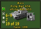
TOAW 4's seaport and airport icons are a usability regression from TOAW 3's.

In 3 both were visible poking out from behind the edge of unit icons if located behind them, in TOAW4 they're completely hidden by units if not floating on top; and in that position they obscure a lot more of the unit details.

In the attached image TOAW4 is on the left, TOAW3 the right.

At the bottom is a bad MS paint drawing of what I'd really like; the icons offset to the edge like in TOAW3 but slightly smaller and with the airfield flipped around to minimize the impact on unit details when floating on top.


EDIT: pointer to where I managed to get what I was looking for: http://www.matrixgames.com/forums/tm.asp?m=4397525&mpage=2&key=�

Attachment (1)

< Message edited by DanNeely -- 12/17/2017 3:05:57 AM >


_____________________________

Did you ever see history portrayed as an old man ... weighing all things in the balance of reason?
Is not [it] an eternal, imploring maiden, full of fire, with a burning heart and flaming soul, humanly warm and humanly beautiful?
--Zachris Topelius
Post #: 1
RE: Request - better placed and sized sea/airport icons - 12/10/2017 12:34:00 PM   
Lobster


Posts: 5104
Joined: 8/8/2013
From: Third rock from the Sun.
Status: offline
If they are like you portray in the bottom picture they will be almost invisible if you zoom out from the huge view. Far too small. You could modify your icons to look like that by the way. The huge view is on the h_tiles_misc.png graphic.

< Message edited by Lobster -- 12/10/2017 12:36:54 PM >


_____________________________

http://www.operationbarbarossa.net/

Two things are infinite: the universe and human stupidity and I’m not sure about the universe-Einstein

Q: What do you call a boomerang that doesn’t come back?
A: A stick.

(in reply to DanNeely)
Post #: 2
RE: Request - better placed and sized sea/airport icons - 12/10/2017 4:42:57 PM   
sPzAbt653


Posts: 9511
Joined: 5/3/2007
From: east coast, usa
Status: offline
I like your ideas on this. Would you mind working with me to come up with some looks like the ones you have posted above ? If so, please unzip and place these files individually in your Graphics Override folder, then see how they look in game. We can work on them further to get what you want.

Preliminary look:

Attachment (1)

(in reply to DanNeely)
Post #: 3
RE: Request - better placed and sized sea/airport icons - 12/10/2017 5:30:45 PM   
gbaby


Posts: 180
Joined: 2/2/2016
Status: offline
Maybe just add a thick light blue hex border? Or blue hex overlay like the destroyed bridge change for visibility?

(in reply to DanNeely)
Post #: 4
RE: Request - better placed and sized sea/airport icons - 12/10/2017 5:40:30 PM   
Meyer1


Posts: 899
Joined: 2/9/2010
Status: offline

quote:

ORIGINAL: gbaby

Maybe just add a thick light blue hex border? Or blue hex overlay like the destroyed bridge change for visibility?

I like that idea.

(in reply to gbaby)
Post #: 5
RE: Request - better placed and sized sea/airport icons - 12/10/2017 6:35:15 PM   
DanNeely


Posts: 489
Joined: 10/18/2005
Status: offline

quote:

ORIGINAL: Lobster

If they are like you portray in the bottom picture they will be almost invisible if you zoom out from the huge view. Far too small. You could modify your icons to look like that by the way. The huge view is on the h_tiles_misc.png graphic.


If they end up too small to work on the huge and maybe the large 2d views so be it. Small 2d's a lost cause, but since at that zoom all the details on the counters I'm trying to preserve aren't shown anyway its a moot point. I've got a huge high res screen, and the screenshots I included were from my default map size.

_____________________________

Did you ever see history portrayed as an old man ... weighing all things in the balance of reason?
Is not [it] an eternal, imploring maiden, full of fire, with a burning heart and flaming soul, humanly warm and humanly beautiful?
--Zachris Topelius

(in reply to Lobster)
Post #: 6
RE: Request - better placed and sized sea/airport icons - 12/10/2017 6:39:34 PM   
DanNeely


Posts: 489
Joined: 10/18/2005
Status: offline

quote:

ORIGINAL: gbaby

Maybe just add a thick light blue hex border? Or blue hex overlay like the destroyed bridge change for visibility?


I'm not sure that'd work well. A full color overlay is only going to be useable for one purpose. Trying to combine broken bridge, sea port, and airport overlays is almost certainly not going to work. Maybe if you split the overlay into 3 wedges and did top left seaport, bottom left airport, right broken bridge. I think that'd end up looking too cluttered.

Any sort of ring'd end up fighting for screen space with the current unit/formation rings.

_____________________________

Did you ever see history portrayed as an old man ... weighing all things in the balance of reason?
Is not [it] an eternal, imploring maiden, full of fire, with a burning heart and flaming soul, humanly warm and humanly beautiful?
--Zachris Topelius

(in reply to gbaby)
Post #: 7
RE: Request - better placed and sized sea/airport icons - 12/10/2017 6:46:17 PM   
DanNeely


Posts: 489
Joined: 10/18/2005
Status: offline

quote:

ORIGINAL: sPzAbt653

I like your ideas on this. Would you mind working with me to come up with some looks like the ones you have posted above ? If so, please unzip and place these files individually in your Graphics Override folder, then see how they look in game. We can work on them further to get what you want.

Preliminary look:


I loaded them up and took a look, in terms of poking out around the edge of the units the large zoom version works better than the huge one I think. Partly it's the seaport icon running right up to the edge of the hex and actually showing wider than on huge. The other half is that on Huge the placenames are moved down farther and when not floating the airport ends up buried in the text.

I took screenshots to show how they're looking on my system.


Attachment (1)

_____________________________

Did you ever see history portrayed as an old man ... weighing all things in the balance of reason?
Is not [it] an eternal, imploring maiden, full of fire, with a burning heart and flaming soul, humanly warm and humanly beautiful?
--Zachris Topelius

(in reply to sPzAbt653)
Post #: 8
RE: Request - better placed and sized sea/airport icons - 12/10/2017 7:18:27 PM   
gbaby


Posts: 180
Joined: 2/2/2016
Status: offline
You could also not make the port circle solid blue. Just an anchor and maybe blue outline will leave the unit info not so blocked. It still would block on float, but not as much.

Most of the time we just hit float temporarily to get an idea of ports. Not been that much of a pain, but I've found any additional visibility helps a lot. Anything would be appreciated.

(in reply to DanNeely)
Post #: 9
RE: Request - better placed and sized sea/airport icons - 12/10/2017 7:28:43 PM   
sPzAbt653


Posts: 9511
Joined: 5/3/2007
From: east coast, usa
Status: offline
Based on what you see, what are your recommendations. There are three views: 2D Large [normal], Small [zoomed out] and Huge [zoomed in].

Lets work on one at a time. Is 2D Large ok, or does it need more adjustment? I am relying on your views there, because I have different settings and graphics here.

(in reply to DanNeely)
Post #: 10
RE: Request - better placed and sized sea/airport icons - 12/10/2017 7:33:19 PM   
sPzAbt653


Posts: 9511
Joined: 5/3/2007
From: east coast, usa
Status: offline
Really the Port markers should be water side specific, not always anchored to the upper left. We can't do that, but I have done a workaround in the past by using Map Optionals [see Sicily to Brenner Pass, which uses separate Supply Icons to signify hidden Allied Supply Points]. Something similar could be done with ports, but then if a scenario does use any of the Map Optionals, it won't work properly.

(in reply to gbaby)
Post #: 11
RE: Request - better placed and sized sea/airport icons - 12/10/2017 7:53:22 PM   
DanNeely


Posts: 489
Joined: 10/18/2005
Status: offline

quote:

ORIGINAL: sPzAbt653

Based on what you see, what are your recommendations. There are three views: 2D Large [normal], Small [zoomed out] and Huge [zoomed in].

Lets work on one at a time. Is 2D Large ok, or does it need more adjustment? I am relying on your views there, because I have different settings and graphics here.


Small can stay as is. Lobster's right that there's not really enough room to do anything at that size. Probably best to drop it entirely unless someone can up up with a workable option.

And since I mostly play on huge let's work on it ahead of normal.

For the sea port marker, 20% smaller and on shifted vertically to the top edge of the hex looks like it'd be more or less what I'm looking for.

For the airport, 20% smaller and shifted as far down and to the left as it can go would be reasonably close to what I'm looking for (below the strength/move numbers when floating sticking out below placenames when not).

I am assuming the icons can be moved up directly against the edges of the hexes, if there's a minimum margin that's protected they'd probably need to go smaller.

A concept image is attached.


Attachment (1)

_____________________________

Did you ever see history portrayed as an old man ... weighing all things in the balance of reason?
Is not [it] an eternal, imploring maiden, full of fire, with a burning heart and flaming soul, humanly warm and humanly beautiful?
--Zachris Topelius

(in reply to sPzAbt653)
Post #: 12
RE: Request - better placed and sized sea/airport icons - 12/10/2017 8:00:07 PM   
sPzAbt653


Posts: 9511
Joined: 5/3/2007
From: east coast, usa
Status: offline
Ok, try this on for Huge. These icons are floating in the file, with no hex borders, so I have no idea where they are ending up or how far I can go.

Attachment (1)

(in reply to DanNeely)
Post #: 13
RE: Request - better placed and sized sea/airport icons - 12/10/2017 9:37:15 PM   
gbaby


Posts: 180
Joined: 2/2/2016
Status: offline

quote:

ORIGINAL: DanNeely


I like it, shrink and shift, leave alone color wise. You can leave float on and it does not block the unit counter so much. I also play mostly in the "huge" view for movement, only zooming out to get a more strategic view. But unit counter view is most important in the Huge view.

So where are they?


(in reply to DanNeely)
Post #: 14
RE: Request - better placed and sized sea/airport icons - 12/10/2017 10:33:03 PM   
DanNeely


Posts: 489
Joined: 10/18/2005
Status: offline
I'm playing around with positioning now, having fun with weird clipping glitches.

For the seaport I think the size is good if the shadow effect around it can be removed? It's only really noticeable to me when triggering clipping glitches and pulling it off gives a bit more room to play with.

If you can take the shadow off, move it up 6 pixels and left 2. If you can't up 5 and left 1; and then shrink it by 2 pixels.

Still tinkering with the airport trying to get a feel for what I can and can't do without it getting clipped when I mouse over the hex to its lower left.


< Message edited by DanNeely -- 12/10/2017 10:36:43 PM >


_____________________________

Did you ever see history portrayed as an old man ... weighing all things in the balance of reason?
Is not [it] an eternal, imploring maiden, full of fire, with a burning heart and flaming soul, humanly warm and humanly beautiful?
--Zachris Topelius

(in reply to gbaby)
Post #: 15
RE: Request - better placed and sized sea/airport icons - 12/10/2017 10:42:43 PM   
sPzAbt653


Posts: 9511
Joined: 5/3/2007
From: east coast, usa
Status: offline
Shadow off, moved up 6 pixels and left 3. Shrunk by 75% from original [last one was 80%, can't do pixels easily].

Attachment (1)

(in reply to DanNeely)
Post #: 16
RE: Request - better placed and sized sea/airport icons - 12/10/2017 11:32:34 PM   
DanNeely


Posts: 489
Joined: 10/18/2005
Status: offline
The seaport looks good.

Airport needs a bit more work since it's still covering the leftmost digit of a 2 digit strength.

On account of the clipping (3rd image on the attachment) I'm not entirely sure how to fix it. The standard airport is affected too, but to a much smaller degree; so I'm not anticipating its fix being a high priority item unless it screws something else up at lot more visibly.

If it wasn't for the bug, I'd just push the airport 6 or 8 pixels farther left and call it a day. But that would take the clipping bug from bad to horrible.


_____________________________

Did you ever see history portrayed as an old man ... weighing all things in the balance of reason?
Is not [it] an eternal, imploring maiden, full of fire, with a burning heart and flaming soul, humanly warm and humanly beautiful?
--Zachris Topelius

(in reply to sPzAbt653)
Post #: 17
RE: Request - better placed and sized sea/airport icons - 12/11/2017 12:20:55 AM   
gbaby


Posts: 180
Joined: 2/2/2016
Status: offline
What if the runway was changed from a three way runway to a two way? Take the diagonal one out and it might not block so much (the one you have vertically flipped).

Also TOAW III runway was fine, thinner. But again, it is a matter of individual taste.

Looking better though.

(in reply to DanNeely)
Post #: 18
RE: Request - better placed and sized sea/airport icons - 12/11/2017 1:28:21 AM   
Lobster


Posts: 5104
Joined: 8/8/2013
From: Third rock from the Sun.
Status: offline
Just make the interior of the airfield transparent. Then it can float and won't be a big deal since most of what is under it will be visible. Same for the port icon. Just a circle and an anchor with the rest transparent.

_____________________________

http://www.operationbarbarossa.net/

Two things are infinite: the universe and human stupidity and I’m not sure about the universe-Einstein

Q: What do you call a boomerang that doesn’t come back?
A: A stick.

(in reply to gbaby)
Post #: 19
RE: Request - better placed and sized sea/airport icons - 12/11/2017 3:26:14 AM   
DanNeely


Posts: 489
Joined: 10/18/2005
Status: offline

quote:

ORIGINAL: Lobster

Just make the interior of the airfield transparent. Then it can float and won't be a big deal since most of what is under it will be visible. Same for the port icon. Just a circle and an anchor with the rest transparent.


to work like that it'd need to be narrowed massively, I wouldn't want to go much below the TOAW3 airfield; but even that's wide enough to obliterate (not just captcha-ify) whatever stat number it's on top of.

_____________________________

Did you ever see history portrayed as an old man ... weighing all things in the balance of reason?
Is not [it] an eternal, imploring maiden, full of fire, with a burning heart and flaming soul, humanly warm and humanly beautiful?
--Zachris Topelius

(in reply to Lobster)
Post #: 20
RE: Request - better placed and sized sea/airport icons - 12/11/2017 4:24:58 AM   
sPzAbt653


Posts: 9511
Joined: 5/3/2007
From: east coast, usa
Status: offline
Do you need the airfield to be on top if it is obvious enough to see it below ? I was thinking of maybe trying to manipulate it so that two of the runways were mostly at the bottom and left bottom of the hex, so that it sticks out more. Can you give a screen shot of what it looks like now, when it is underneath ?

(in reply to DanNeely)
Post #: 21
RE: Request - better placed and sized sea/airport icons - 12/11/2017 4:55:04 AM   
DanNeely


Posts: 489
Joined: 10/18/2005
Status: offline

quote:

ORIGINAL: sPzAbt653

Do you need the airfield to be on top if it is obvious enough to see it below ? I was thinking of maybe trying to manipulate it so that two of the runways were mostly at the bottom and left bottom of the hex, so that it sticks out more. Can you give a screen shot of what it looks like now, when it is underneath ?


This's 2 in a row I either forgot or screwed up the attachment.

It's been long enough since the last time i played heavily that I don't remember if I normally had them on top or not. I was mostly reacting to TOAW4 having them useless in both places.

I think I'd like it on top more if it could be made to fit; and the text clipping problem makes the space on the lower left more or less unusable though which is going to more or less kill underneath unless fixed.


Attachment (1)

_____________________________

Did you ever see history portrayed as an old man ... weighing all things in the balance of reason?
Is not [it] an eternal, imploring maiden, full of fire, with a burning heart and flaming soul, humanly warm and humanly beautiful?
--Zachris Topelius

(in reply to sPzAbt653)
Post #: 22
RE: Request - better placed and sized sea/airport icons - 12/11/2017 6:30:19 AM   
sPzAbt653


Posts: 9511
Joined: 5/3/2007
From: east coast, usa
Status: offline
Thanks for the shots. It kinda looks like the airfield should go up more, to get out of the way of the text. My opinion is that it should normally be under so that the counters can be clearly seen, and should poke out enough to be noticeable at a glance. Try this one and see what you think, I moved it up but it might not be high enough or left enough [I wanted it to be below the anchorage symbol].

Attachment (1)

(in reply to DanNeely)
Post #: 23
RE: Request - better placed and sized sea/airport icons - 12/11/2017 10:38:24 AM   
DanNeely


Posts: 489
Joined: 10/18/2005
Status: offline
quote:

ORIGINAL: sPzAbt653

Thanks for the shots. It kinda looks like the airfield should go up more, to get out of the way of the text. My opinion is that it should normally be under so that the counters can be clearly seen, and should poke out enough to be noticeable at a glance. Try this one and see what you think, I moved it up but it might not be high enough or left enough [I wanted it to be below the anchorage symbol].


That almost worked. 1 or 2 pixels of clipping where you had it originally located but a bit of a mess on top. I tried shifting it a bit more so it was on the left edge instead of the bottom left. I only took a single attempt since I don't have much time this morning; the results while not quite perfect make me think it might work on top if shrank a bit more. Or maybe if the runways were made narrower and the angled one shifted to the left so it's not covering one of the loss tolerance dots.


Attachment (1)

< Message edited by DanNeely -- 12/11/2017 10:39:45 AM >


_____________________________

Did you ever see history portrayed as an old man ... weighing all things in the balance of reason?
Is not [it] an eternal, imploring maiden, full of fire, with a burning heart and flaming soul, humanly warm and humanly beautiful?
--Zachris Topelius

(in reply to sPzAbt653)
Post #: 24
RE: Request - better placed and sized sea/airport icons - 12/11/2017 5:41:30 PM   
sPzAbt653


Posts: 9511
Joined: 5/3/2007
From: east coast, usa
Status: offline
Here is a Huge on that is see thru, and a Large one that is red. Moving one airfield might be above my skill level.

Attachment (1)

(in reply to DanNeely)
Post #: 25
RE: Request - better placed and sized sea/airport icons - 12/11/2017 8:23:03 PM   
Lobster


Posts: 5104
Joined: 8/8/2013
From: Third rock from the Sun.
Status: offline
The whole reason Norm made names, airfields, etc float was so you could see them since counters hid them. It's not like it's anything new. And to be honest there really isn't any single golden solution to it.

_____________________________

http://www.operationbarbarossa.net/

Two things are infinite: the universe and human stupidity and I’m not sure about the universe-Einstein

Q: What do you call a boomerang that doesn’t come back?
A: A stick.

(in reply to sPzAbt653)
Post #: 26
RE: Request - better placed and sized sea/airport icons - 12/11/2017 8:51:16 PM   
sPzAbt653


Posts: 9511
Joined: 5/3/2007
From: east coast, usa
Status: offline
It IS new, its crappy shaded png's with all the same colors as the terrain, and they are very difficult to see. But it's easy to make a few adjustments so that they can be seen on the map at a glance.

(in reply to Lobster)
Post #: 27
RE: Request - better placed and sized sea/airport icons - 12/11/2017 11:12:29 PM   
DanNeely


Posts: 489
Joined: 10/18/2005
Status: offline

quote:

ORIGINAL: Lobster

The whole reason Norm made names, airfields, etc float was so you could see them since counters hid them. It's not like it's anything new. And to be honest there really isn't any single golden solution to it.


They were better in TOAW3 where they did stick out from under units vs 4 carefully placing them to be fully hidden.

From playing around so far we've already proven that large and huge can have them placed to stick out from under again, and I think at least on huge I can get them placed so they can float on top without obscuring anything important. Large's iffier there, small enough not to be in the way might be too small for legibility.

_____________________________

Did you ever see history portrayed as an old man ... weighing all things in the balance of reason?
Is not [it] an eternal, imploring maiden, full of fire, with a burning heart and flaming soul, humanly warm and humanly beautiful?
--Zachris Topelius

(in reply to Lobster)
Post #: 28
RE: Request - better placed and sized sea/airport icons - 12/11/2017 11:18:30 PM   
Lobster


Posts: 5104
Joined: 8/8/2013
From: Third rock from the Sun.
Status: offline
No it's not new. They have always been under the unit counters. That's the reason there's an option to float them above the unit counters. That option has been there forever.

< Message edited by Lobster -- 12/11/2017 11:20:04 PM >


_____________________________

http://www.operationbarbarossa.net/

Two things are infinite: the universe and human stupidity and I’m not sure about the universe-Einstein

Q: What do you call a boomerang that doesn’t come back?
A: A stick.

(in reply to DanNeely)
Post #: 29
RE: Request - better placed and sized sea/airport icons - 12/12/2017 12:30:27 AM   
Meyer1


Posts: 899
Joined: 2/9/2010
Status: offline
I think the reason of this is that things got smaller* in TOAW IV compared with III, counters and map at least. but those symbols appear to be the same size as before, so there's less room.

*Easily to see running III and IV side by side, but a surprising change considering that screens got bigger and bigger. Small screen guys lobby?

(in reply to Lobster)
Post #: 30
Page:   [1] 2   next >   >>
All Forums >> [New Releases from Matrix Games] >> The Operational Art of War IV >> Mods and Scenarios >> Mods >> Request - better placed and sized sea/airport icons Page: [1] 2   next >   >>
Jump to:


New Messages No New Messages
Hot Topic w/ New Messages Hot Topic w/o New Messages
Locked w/ New Messages Locked w/o New Messages
 Post New Thread
 Reply to Message
 Post New Poll
 Submit Vote
 Delete My Own Post
 Delete My Own Thread
 Rate Posts


Forum Software © ASPPlayground.NET Advanced Edition 2.4.5 ANSI

1.875