cathar1244
Posts: 1003
Joined: 9/5/2009
Status: offline

|
Thanks to all for the comments.
quote:
I always prefer pastel colors over saturated colors, but they bring up a problem: aren't those counters for US, Italy and Japanese too similar. It would be nice to see how they would display side by side in a high density map. --Cabido
This touches upon the issue raised by gliz2 (number visibility) and the same cause is at root. This issue is the "design philosophy" I'm using, and that is to use authentic colors of military forces of World War II (and there will be some Cold War ones as well) where possible. This choice drives the concern mentioned by Cabido; many of the field uniform colors were similar. (Cabido, I had precisely the same thought you did regarding the U.S. and Japanese counters. In many games, the U.S. are a shade of green and the Japanese are sometimes yellow or red; "saturated colors" is something I'm trying to minimize the use of.)
One thing I should mentioned is when I write "colors taken from", that is not really even a "suggested use" for the counter. It was simply a set of colors to use as a source. To be sure, I have kept those "sets" nationally aligned, but a scenario designer can pick and choose color arrangements as desired.
Once the .col file is done, I will probably also put some "singles" -- simply color combos that a scenario designer can put into a .col file for use. The "singles" will do things like represent national flag colors.
That said, I have set aside three columns of the 22 aside for more generic colors. These are tentatively assigned as a medium green, red, and blue. If anyone thinks a different color should serve for the generic sets, let me know.
Cabido, I'll put together a TOAW display of the three sets you mentioned so they can be compared in the game environment. (see below for two viewing scales)
Cheers
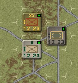
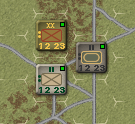
< Message edited by cathar1244 -- 2/28/2019 7:08:28 AM >
|
 Printable Version










 New Messages
 No New Messages
 Hot Topic w/ New Messages
 Hot Topic w/o New Messages
 Locked w/ New Messages
 Locked w/o New Messages
 Post New Thread