Daniele
Posts: 1812
Joined: 2/7/2015
Status: offline

|
The third - and last - part of the Dev Interview on the upcoming Command: Modern Operations is available.
This time, a great focus on how the new system processes the huge amount of information, what changes have been done to the AI, new UI and menus, e many other additions.
Welcome to Information management and future plans
10) We can assume that AI will play a key role in C: MO, given that multiplayer won’t be added at release. Could you give us more details on how the AI has been improved?
The improvements to the AI in this release have been mostly incremental, in accordance with the “game first” direction. However, there are some new features that are likely to please new and existing players alike:
- In CMANO v1.x, ships and submarines may sometimes “hug the coast” a bit too tight when plotting their pathfinding routes, which can result in them getting stuck as they ‘surf the beach”. In CMO they now use a far more intelligent cost-based pathfinding algorithm which tries hard to keep them preferably in deeper waters (the tolerances depend on vessel size; small cutters are more willing to close to the coast than supercarriers). This results both in far more life-like navigation patterns and also effectively deals with “stuck on coast” issues.
- Aircraft have a number of improvements in their close air-combat logics. One of the most important is that now not only missiles but also enemy aircraft are considered threats to actively maneuver against. So for example in a typical Vietnam setup you may have a MiG-19 closing in on an F-105 egressing from a strike. In CMANO v1.x the Thud would not maneuver to avoid (or engage) the MiG even if the latter engaged with guns, as long no missile was launched. Now the Thud will watch out for the gun threat and start maneuvering against it as soon as the MiG gets within gun range.
- Significant change in unit AI logic: The "evaluate targets" and "evaluate threats" logics are now not performed on every pulse, but instead on regular intervals dictated by the OODA-Targeting (modified by crew proficiency) and OODA-Evasion values respectively. This has two effects:
[list]
These two OODA values, and crew proficiency, become even more critical to a unit's effectiveness and survivability.
Because these AI parts are called less frequently (and they are among the top CPU-killers), overall sim-core performance in large/complex scenarios is significantly improved.
[/list]
- One of the biggest improvements on the AI side is that you can disable it (bet you didn’t see this coming :). Specifically, you can selectively disable numerous AI functions through the Lua API and then implement your own logic to override them. This allows scenario authors to more easily create their own custom AI behaviors. It can also allow much bigger scenarios with lots of neutral/non-active units, since these can be instructed to skip their AI checks altogether, thus radically improving performance.
11) The amount of information available in CMANO has always been massively daunting. What solutions have been taken in C:MO to help new players in not being overwhelmed?
Oh boy... where do we start? Providing a more user-friendly experience has been undoubtedly the primary direction in this iteration, and this clearly shows in the number and variety of “things” towards this end. To recap just some of them:
Additional unit-level message log: All messages relevant to a specific unit are aggregated on a window specific to this unit and only optionally also shown on the side-level message log. This both declutters the main message log and makes it much easier to quickly examine a unit's message history.
Message balloons: When an event happens on the main map, a "balloon" containing the message pops up for ~10 sec. This makes it immediately obvious where the event described is happening. The balloons appear at a random bearing and semi-random distance from the reported event, to avoid overlapping on top of each other. They stay visible for 5 seconds, then fade out.
The appearance or not of the balloons is configurable per message type.
The side-level message log groups reported messages by type, and highlights the unread ones. This makes it easy to prioritize reading important messages (e.g. weapon engagements, battle damage etc) and quickly catch up on unread traffic:
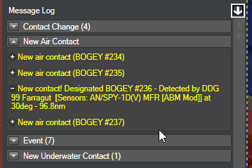
- When clicking any of the messages on the interactive message log, the map will auto-center on the message origin location.
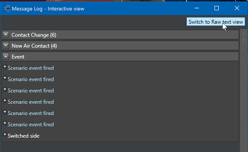
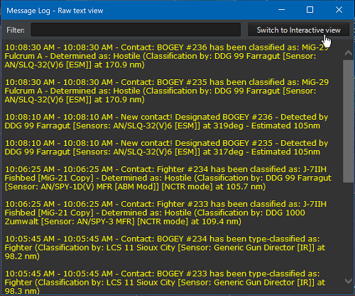
- When used in detached mode, the interactive message log can also switch to the “classic v1” raw-text style and back again, by clicking on the “Switch to [other style]” button:
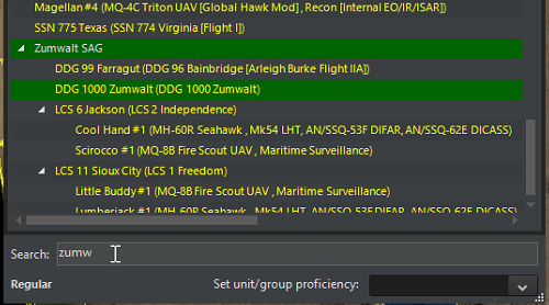
- UI addition: Keyword search on ORBAT window. This works similarly to web browsers, ie. as you type the desired keyword, entries matching are highlighted:
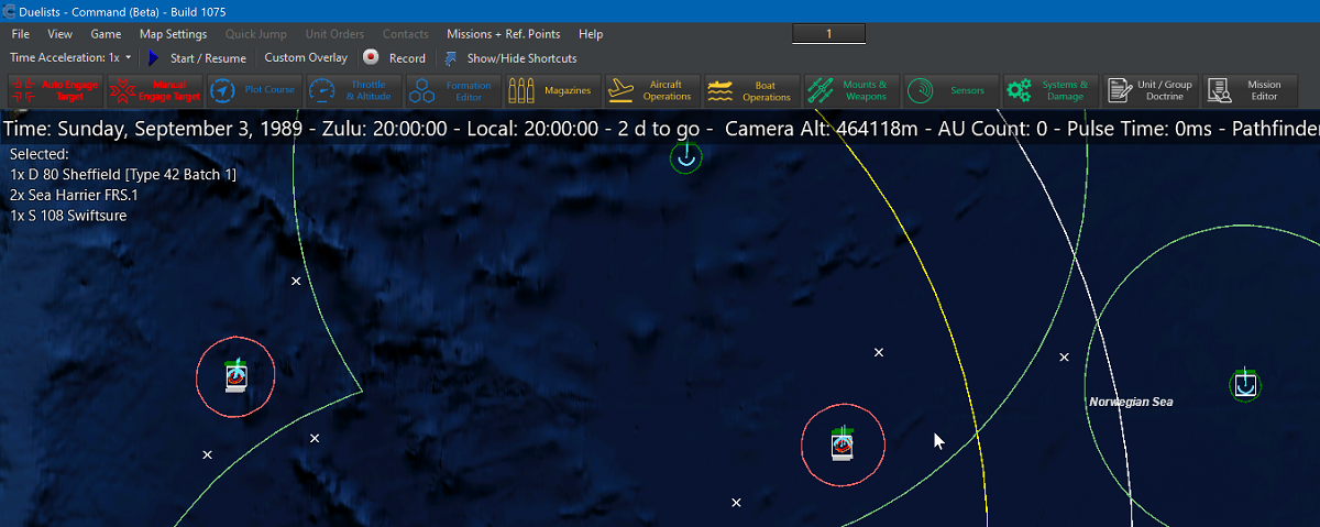
Map/UI addition: Show list of currently selected friendly units grouped by class/type, similar to Homeworld. Example:
- UI addition: It is now possible to have multiple windows of the DB-viewer open concurrently
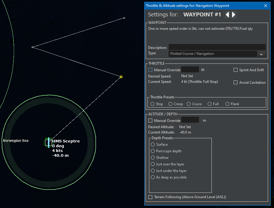
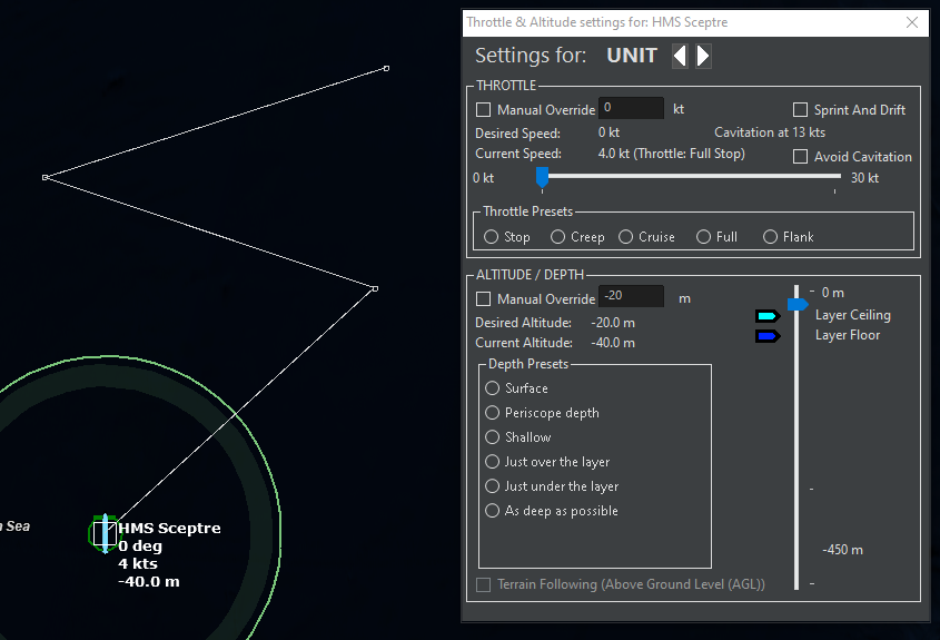
- UI tweak: The throttle/altitude window (aka F2 window) more clearly distinguishes between having selected a waypoint of a unit’s plotted course or the unit itself.
Example with waypoint selected:
Example with the unit itself selected:
- Also, by using the white “previous” and “next” arrows next to the unit/waypoint description, it is possible to select the previous/next waypoint or the unit itself without leaving this window.
New UI feature: Time-step buttons:
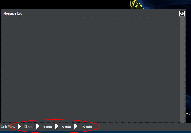
Clicking on any of these (while paused) will advance the simulation time forward by 15 sec, 1 min, 5 mins or 15 mins, and then stop again. This effectively solves the “runaway sim” problem and allows players to play in almost turn-based fashion. The key combinations Alt + 1/2/3/4 are mapped to the 15 sec, 1 min, 5 min and 15 min timesteps respectively. This makes it possible to control time-flow without having the mouse cursor leave the area of interest.
- Map/UI tweak: When clicking on a stack of units/contacts on the map, a new menu pops up allowing selection of the specific desired unit. Example:
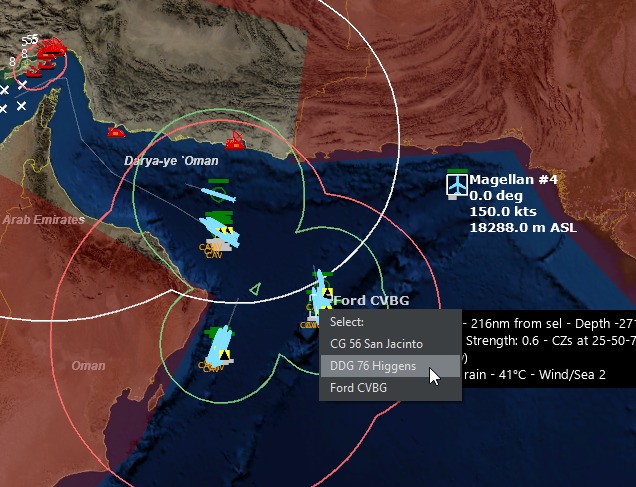
This is designed to avoid the need for extreme close-up on a map location just to select a unit.
- New UI feature: Hover-info box. If the user holds down the Control key while hovering the cursor over a unit, group or contact, a box pops up with summary information on the object of interest. Example:
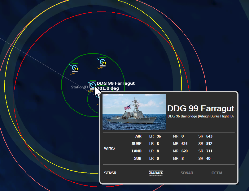
This is great for getting an at-a-glance overview of a unit/contact without having to look at the details on the right column.
- UI tweak: The "contact status" panel now also display's the contact's WRA-type information:
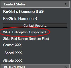
This helps to better understand AI decisions on WRA-driven weapon allocations (e.g. "why are my planes shooting 8 instead of 2 Harpoons at this ship contact?")
- An expanded series of air, surface and sub-surface tutorials, together with some subject-specific tutorials (e.g. mine warfare). Some of them you have already seen in CMANO v1.x updates, while others are brand new. These provide a smoother learning curve to new players.
- A wholly re-written manual, which addresses both old and completely new players.
I could go on, but I think you get the gist by now. We play the game too :)
12) On a side topic, could you confirm there are plans to integrate Steam Workshop with C:MO? Will the modding process will be altered in some significant way?
We will most definitely support Steam Workshop, and this time from the first day of launch. The basic mechanism is the same, but we are adding some UI improvements to more clearly delineate between official and community-created content. Unfortunately we will probably be unable to directly hook up to CMANO’s existing rich workshop content, but that may represent an opportunity for interested players to make a clean break from existing material and utilize CMO’s advantages from the get go.
13) Is there a feature or mechanic that you would have loved to have at release but had to drop?
A few. I would prefer not to list specifics, but if you browse through some of the posts reacting to our initial announcement (“what, still no XYZ?”) you can easily spot patterns. What I can say is: We hear you, and we want these things too. We’re not holding anything back, in fact we are working harder than any other point in WS history, and the things you want to see one day in Command are very much the same we are daydreaming about. I’d like to think we’ve stood by our players and customers well over the years, so have a little faith in us.
14) We are sure that your commitment with this project won’t stop just with the release of C:MO. Any glimpse of future plans? Are you planning a new take with DLCs and expansions?
We already have some very interesting works underway. Some of them cover some theaters and conflicts that you probably expect to see at some point, where others are quite outside our comfort zone and will demand some serious additions - and we welcome the challenge.
15) On the positive side of things, What has pleased you the most so far in developing the game?
Few things are as rewarding as when you add a new feature (particularly on the UI side) and the response from the beta guys is “this is brilliant and makes my life so much easier, wish I had thought to request this earlier”.
A similar case is when you add a feature or mechanic for a specific purpose, and then you see users turning around and using it in ways you never foresaw (mostly for the better :). It’s almost like watching great artists at work and knowing you previously handed them the tools, completely unsuspecting of what they had in mind.
Thanks a lot for your time and keep up the excellent work!
Thank you! We plan to be around and working on Command and related projects for “quite a while” yet.
< Message edited by Daniele -- 9/30/2019 6:59:16 AM >
|
 Printable Version


 Great to have the original scenarios brought up-to-date, among the other things.

 Bravo.!!!!!

 New Messages
 No New Messages
 Hot Topic w/ New Messages
 Hot Topic w/o New Messages
 Locked w/ New Messages
 Locked w/o New Messages
 Post New Thread