Matrix Games Forums

Forums  Register  Login  Photo Gallery  Member List  Search  Calendars  FAQ 

My Profile  Inbox  Address Book  My Subscription  My Forums  Log Out

DW2: Let's talk about the User Interface

 
View related threads: (in this forum | in all forums)

Logged in as: Guest
Users viewing this topic: none
  Printable Version
All Forums >> [Coming Soon] >> Distant Worlds 2 >> DW2: Let's talk about the User Interface Page: [1] 2 3   next >   >>
Login
Message << Older Topic   Newer Topic >>
DW2: Let's talk about the User Interface - 1/29/2021 6:39:24 PM   
Galaxy227


Posts: 142
Joined: 12/1/2020
Status: offline
All user interfaces in game design should accomplish two fundamental goals: function and form. The first goal, function, pertains to the actual usability of the interface, such as where the buttons are located, what organizational structure the interface adopts, how many layers deep the interface should go, et cetera. These are all factors that make up how an interface functions, and arguably are the most important ingredients in any good user interface—for you've hardly got a user interface at all without it properly functioning.

The second goal, form, is purely the aesthetics of the user interface. How large should this button be? What color should that button be? These types of questions are what an individual will ask themselves when designing the form of an interface.

It pains me to admit, but should not take you by surprise, that Erik, Elliot, and the rest of the developers of the Distant Worlds series are not the most "interface-savvy." Distant Worlds: Universe struggled to have a functioning interface, let alone an attractive one, and countless players have shied away from the magic of Distant Worlds solely because the interface was overwhelmingly... terrible, to say the least. In retrospect, I feel I can safely admit the first installment of Distant Worlds missed the mark on both its function & form regarding UI.

As a result, of all the improvements one could long for in a Distant Worlds sequel, to me, (surprise, surprise!), the most principal improvement was the user interface. My god, I've always thought, how much less of a headache Distant Worlds would be with a functioning interface. My god, I've always thought, how pleasant Distant Worlds would be with an attractive, clean, candy-for-the-eyes interface. I wept over function and form.

Then the gameplay reveal came for Distant Worlds 2. We were treated with a tour of the new UI, which was packed with a plethora of new icons, menus, and tabs. Gone were the days of screen-wide spread sheets for everything in the game. In addition, a healthy portion of the information was presented neatly on the playing screen. To me, this was a dream come true, and would surely attract a new generation of Distant Worlds players. The game had a functioning interface!

Then time passed. I looked back on the gameplay reveal and began to investigate DW2 for flaws in an effort to provide feedback. For whatever reason, my attention was focused almost entirely on the user interface. Something was wrong.

It lacked form.

I was not the only one who didn't feel completely satisfied with the new interface for DW2. I noticed people began commenting on how it appeared throughout the forums and other places around the internet. Some were constructive, others were flat-out rude, but all shared a common theme: it didn't look attractive. It was ugly, they said, and unfortunately I couldn't agree more.

I wanted to bring this to the attention of Erik but failed to untangle my mess of words. It's difficult to describe exactly what feels wrong about the looks of something, and I knew I wasn't going to provide any useful feedback with an opinionated paragraph or two. There's plenty of those already.

I convinced myself the only way I was ever going to demonstrate exactly how I believe the UI should look is by creating the appearance of such an interface myself. So I went about to do precisely that. Below, you will first find the original screenshot of DW2's interface, followed up by my own rendition presented alongside a gif to quickly compare the differences between the two. I believe my UI works to bring Distant Worlds 2 into the 21st century, de-cluttering, simplifying, and modernizing what was before a retro mess.

< Message edited by Galaxy227 -- 1/29/2021 6:54:34 PM >
Post #: 1
RE: DW2: Let's talk about the User Interface - 1/29/2021 6:40:50 PM   
Galaxy227


Posts: 142
Joined: 12/1/2020
Status: offline
Distant Worlds 2:


Attachment (1)

(in reply to Galaxy227)
Post #: 2
RE: DW2: Let's talk about the User Interface - 1/29/2021 6:41:21 PM   
Galaxy227


Posts: 142
Joined: 12/1/2020
Status: offline
My rendition:


Attachment (1)

(in reply to Galaxy227)
Post #: 3
RE: DW2: Let's talk about the User Interface - 1/29/2021 6:41:48 PM   
Galaxy227


Posts: 142
Joined: 12/1/2020
Status: offline
Gif for drawing a quick comparison:


Attachment (1)

(in reply to Galaxy227)
Post #: 4
RE: DW2: Let's talk about the User Interface - 1/29/2021 6:42:56 PM   
Galaxy227


Posts: 142
Joined: 12/1/2020
Status: offline
My interface makes every effort to retain the original function of DW2's UI, (which is actually quite well-made), while simultaneously improving its form. It's the appearance that needed some work.

And again, I am going to stress the user interface was the most principal failure of DW:U, and before anything else, should be at the forefront of development in Distant Worlds 2.
I highly suggest the developers of DW2 invest some much-needed love into the looks of their UI. A sleek, modern interface would greatly expand DW2's playerbase, and in my opinion is well worth delaying the current launch schedule, assuming the team's resources allow as much.

Let me know what you guys think, and whether or not something akin to my interface would be a worthwhile improvement.

(in reply to Galaxy227)
Post #: 5
RE: DW2: Let's talk about the User Interface - 1/29/2021 6:47:31 PM   
Sild


Posts: 37
Joined: 1/26/2021
Status: offline
I wouldn't say the UI was/is terrible. Yes the esthetics are outdated, but aesthetically it's not just the UI that is outdated. It's something I can live with, however. Functionality wise, it does the job.

That said, while your rendition dosen't change much, I do prefer it,and would like to see the UI change in that direction. Maybe with a bit more visual depth to it.


< Message edited by Sild -- 1/29/2021 6:49:55 PM >

(in reply to Galaxy227)
Post #: 6
RE: DW2: Let's talk about the User Interface - 1/29/2021 6:54:23 PM   
Miletkir


Posts: 589
Joined: 7/7/2020
From: Eastern Nebula
Status: offline
Nice work you did there mate. It is indeed cleaner and much easier to read... but at the same time it's become like "just another Unity interface". In the process you took away the identity of the original UI and the little it had that made it look like some sort of console / command board.

I'd say it needs the cleanliness you achieved, but by staying true to its identity. The frames and gizmos need to stay, or others should replace them. Shadows and 3D buttonized effects have an aesthetic and immersive role too. I wouldn't want a Windows 10 version of an UI... I want something that is integrated to the rest of the game and carries me to outer space.


(in reply to Sild)
Post #: 7
RE: DW2: Let's talk about the User Interface - 1/29/2021 7:01:40 PM   
Galaxy227


Posts: 142
Joined: 12/1/2020
Status: offline
I do agree that it lacks some resemblance of soul, and also fails to encapsulate what Sild best-described as "visual depth." My inspiration was almost solely rooted in Endless Space 2's UI, an interface that also shares the same minimalistic, "Windows 10" design that my rendition holds. I think ES2 pulls it off though by the addition of some seriously fantastic art, which obviously DW2 won't have in abundance, and which my rendition lacks entirely.

< Message edited by Galaxy227 -- 1/29/2021 7:03:29 PM >

(in reply to Miletkir)
Post #: 8
RE: DW2: Let's talk about the User Interface - 1/29/2021 7:09:14 PM   
OnePercent


Posts: 73
Joined: 12/12/2019
From: Australia
Status: offline
Only issue I had with DW:U ui was the fact it is so tiny and DIDN'T take up a larger portion of the screen, making the font hard to read especially in the fleet tabs.

I also prefer the way it is shown in the current DW2 build, though I do agree with you that they should make it a bit more contrasted, and also allow us to properly scale the UI in game to suit our visual needs.

I think FWIW we should also consider the comparison of a heavily compressed twitch stream image vs a new rendition UI at full resolution, let's get a raw image of the UI for a better comparison.

< Message edited by OnePercent -- 1/29/2021 7:11:17 PM >

(in reply to Galaxy227)
Post #: 9
RE: DW2: Let's talk about the User Interface - 1/29/2021 7:13:36 PM   
DrWolfsherz


Posts: 16
Joined: 6/1/2013
Status: offline
I like the brighter font of the mockup. Readability of the font is also better. Might be due to low quality screenshot of the original video though. My main concern is, that if this is the same font than in DW1 it might cause some trouble on higher resolution screens. I am curious to see a 1440p screenshot of the interface, not from a video but from the actual game.

(in reply to Galaxy227)
Post #: 10
RE: DW2: Let's talk about the User Interface - 1/29/2021 7:37:16 PM   
Miletkir


Posts: 589
Joined: 7/7/2020
From: Eastern Nebula
Status: offline
quote:

ORIGINAL: Galaxy227

I do agree that it lacks some resemblance of soul, and also fails to encapsulate what Sild best-described as "visual depth." My inspiration was almost solely rooted in Endless Space 2's UI, an interface that also shares the same minimalistic, "Windows 10" design that my rendition holds. I think ES2 pulls it off though by the addition of some seriously fantastic art, which obviously DW2 won't have in abundance, and which my rendition lacks entirely.


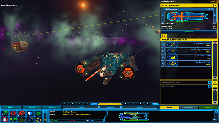
To me, Endless Space rather represents what I don't want a UI to be: a bunch of 1 pixel thick lines. There's nothing to it. And recently there have been so many games going that route. Where's the fantasy, the creativity, the immersion? As was said elsewhere, rescalability imposes some tough constraints and perhaps some classic artistic UI are not possible anymore. The most integrated and immersive UI in a strategy game was perhaps:


In more recent titles, for instance, I consider Total War UI to be references, especially Attila, but for something closer to the theme discussed here, take Homeworld, the Remastered version:


It's clean, sleek, user-friendly, and has a clear space-vibe, without being overdone with arts and textures.

(in reply to Galaxy227)
Post #: 11
RE: DW2: Let's talk about the User Interface - 1/29/2021 8:01:45 PM   
LordMM


Posts: 574
Joined: 5/29/2016
Status: offline
God, Don't give me such a nostalgic attack with that screenshot of Star Wars Rebellion. I think the font style and size is correct for the original DW2 UI, but the brightness you have added to it should stay. So much easier on the eyes.

(in reply to Miletkir)
Post #: 12
RE: DW2: Let's talk about the User Interface - 1/29/2021 8:02:13 PM   
SirHoraceHarkness


Posts: 400
Joined: 5/17/2015
Status: offline
As long as the ui is open for modding then fancy graphical overlays can be made but will be restricted to a certain resolution. But modders tend to be highly focused on what they do so expect them to have multiple res versions to cover the popular sizes.

(in reply to Miletkir)
Post #: 13
RE: DW2: Let's talk about the User Interface - 1/29/2021 8:04:06 PM   
Miletkir


Posts: 589
Joined: 7/7/2020
From: Eastern Nebula
Status: offline

quote:

ORIGINAL: LordMM

God, Don't give me such a nostalgic attack with that screenshot of Star Wars Rebellion. I think the font style and size is correct for the original DW2 UI, but the brightness you have added to it should stay. So much easier on the eyes.


I shed a tear too.

(in reply to LordMM)
Post #: 14
RE: DW2: Let's talk about the User Interface - 1/29/2021 8:08:37 PM   
Sild


Posts: 37
Joined: 1/26/2021
Status: offline
Miletkir does raise a fair point. If the UI is made slicker that way, care should be taken to not lose it's "soul" and fall into a generic style.

Ofc, mods are always an option.

< Message edited by Sild -- 1/29/2021 8:10:12 PM >

(in reply to Miletkir)
Post #: 15
RE: DW2: Let's talk about the User Interface - 1/29/2021 8:28:30 PM   
Latisrof


Posts: 260
Joined: 6/19/2020
Status: offline
Hey bud, good post! Just a couple questions, what in particular is unfunctional about DWU and DW2 UI's. Maybe we could see some real change if you made a list of improvement's, personally I've never encountered anything broken within DWU UI, but I guess time will have to tell when it comes to DW2. I'll accept the UI's aren't pretty but that is to be expected from small developers who are making very systems heavy games, let's not forget stellaris has a good looking UI though lacks in the depth of systems we are used to, like micromanaging nearly every ship in your empire for example.

I'll have to make one complaint about your UI though, the reason your UI looks better is because it is fully transparent, but this isn't typically done in game design because although it may look good at first once you zoom out on the map, it will become completely unusable due to the background colors becoming inconsistent, you would see big red and blue balls through the UI terminal obscuring your view. This is why I think Erick and the crew went for something darker, I'll give you credit though against the blackness of space it looks really nice.

(in reply to Sild)
Post #: 16
RE: DW2: Let's talk about the User Interface - 1/29/2021 8:44:47 PM   
Galaxy227


Posts: 142
Joined: 12/1/2020
Status: offline
I'm not even going to dive into the mess of DW:U's UI, there's plenty to be said and enough experience with the game would have you familiar with it's issues.

As for Distant Worlds 2, functionally speaking, the UI appears fine. Aesthetically speaking, I'd prefer something else, but of course that is a highly subjective statement. What I can definitively say is the moment you leave the Matrix Forums echo chamber, you'll find a large majority of people, time and again, shooting down Distant Worlds solely due to its user interface. This occurrence is rooted in the UI's inherent flaws, regardless if you're personally comfortable with DW's interface or not.

As for the transparency of my rendition's interface, I borrowed from Endless Space 2's appearance. What makes ES2's transparent UI work against any background, regardless of color, is a fine balance of opacity coupled alongside a considerable amount of blur. These two factors allow the interface to work against even the most appalling backgrounds, which can be seen here, here, and here. With proper care, transparent interfaces are absolutely plausible, and in my opinion work to give the impression of less clutter; it feels more airy, spacious, and free.


< Message edited by Galaxy227 -- 1/29/2021 9:36:48 PM >

(in reply to Latisrof)
Post #: 17
RE: DW2: Let's talk about the User Interface - 1/29/2021 9:57:39 PM   
Jorgen_CAB


Posts: 336
Joined: 3/17/2010
Status: offline
I totally agree on the readability of the UI. It needs to be much cleaner and the most important thing that it is easy to read. Make the background more opaque and the text brighter would do a ton for the overall presentation of the UI.

While I don't think the old UI in DW:U was bad from a functionality point of view it certainly was not good and outright bad from a readability perspective, especially on high resolution monitors.

The new UI seem very good from a functional perspective and that is certainly the most important (for me personally)... but... I have also seen allot of bad words being mentioning about how the UI looks from different forums with the new DW2 UI as well.

I also think that the developers should take some extra time to make it look just a bit more modern and improve the readability and use more contrast so the important things is highlighted and the text is easy to read. In my opinion they would actually earn quite a bit more money in the end if they did this so it should even be for selfish reasons, not just to support my preferences (I will buy the game anyway). ;)

< Message edited by Jorgen_CAB -- 1/29/2021 9:58:18 PM >

(in reply to Galaxy227)
Post #: 18
RE: DW2: Let's talk about the User Interface - 1/29/2021 10:00:55 PM   
Latisrof


Posts: 260
Joined: 6/19/2020
Status: offline
>I'm not even going to dive into the mess of DW:U's UI, there's plenty to be said and enough experience with the game would have you familiar with it's issues.

Wouldn't it be easy to provide at least one example? I have plenty of experience with the game, and of course it was slow going from one page to the next but that was obviously a technology problem. Like all and all it wasn't like the UI didn't work...

>What makes ES2's transparent UI work against any background, regardless of color, is a fine balance of opacity coupled alongside a considerable amount of blur.

Actually I disagree with this design choice as it's obviously overcompensating in it's attempt to display information clearly. In combination of a transparent background and thin info barriers it becomes difficult to understand when one slide ends and the other begins, especially with all of the background colors seeping through. For example this UI may seem clear at first but these thin white lines are going to become difficult to notice against the contrast of brighter more over powering colors. What the DW2 Dev's did I think is take the best of both worlds, coloring in the boxes of space between critical information with dark color's to split the information up so it can be seen.


(in reply to Galaxy227)
Post #: 19
RE: DW2: Let's talk about the User Interface - 1/29/2021 10:15:25 PM   
Galaxy227


Posts: 142
Joined: 12/1/2020
Status: offline
I've refrained from arguing on any subjective matter up to this point, and will continue to do so. It's not worthwhile or productive to bicker about whether or not transparency is viable. My only point was it has been achieved in the past, and is my personal preference.

What isn't subjective is the irrefutable fact that an overwhelming majority of strategy gamers refuse to play Distant Worlds due to its interface. For the sake of the argument, I'll link two recent threads from two different forums (here and here), but evidence is hardly needed if you've ever paid attention to Distant Worlds outside of the Matrix Forums. The interface is, at best, inefficient & bland.

It would be incredibly worthwhile, on orders of magnitude that I simply cannot stress enough, for the developers of Distant Worlds 2 to invest time into redesigning their UI. And by no means does a redesign have to bear any resemblance to my rendition. My rendition serves only as a subjective, visual example of what I personally think DW2's UI should look like.

The current appearance of the user interface for Distant Worlds 2 is the most disruptive factor in measuring the game's success, and only serves to hinder sales from here on out. As a long-time player of the Distant Worlds series, I strongly urge Erik, Elliot, and the rest of the developers of Distant Worlds 2 to reconsider their approach to DW2's interface. The fruits of a sleeker, more modern UI far outweigh the labor involved in creating it.

Get out of the echo chamber.

< Message edited by Galaxy227 -- 1/29/2021 10:52:33 PM >

(in reply to Latisrof)
Post #: 20
RE: DW2: Let's talk about the User Interface - 1/29/2021 10:43:39 PM   
Miletkir


Posts: 589
Joined: 7/7/2020
From: Eastern Nebula
Status: offline

quote:

ORIGINAL: Jorgen_CAB

I totally agree on the readability of the UI. It needs to be much cleaner and the most important thing that it is easy to read. Make the background more opaque and the text brighter would do a ton for the overall presentation of the UI.


Actually we started discussing this in a previous thread, and I tried to show with an example that this wouldn't be hard to accomplish on the new UI by tweaking vibrance, brightness and contrast. What I did though was a bit too much to Erik's taste, which is for the UI to be really unobtrusive and discrete. But I'm sure a middle ground can be found.

quote:

ORIGINAL: Jorgen_CAB

While I don't think the old UI in DW:U was bad from a functionality point of view it certainly was not good and outright bad from a readability perspective, especially on high resolution monitors.

The new UI seem very good from a functional perspective and that is certainly the most important (for me personally)... but... I have also seen allot of bad words being mentioning about how the UI looks from different forums with the new DW2 UI as well.

I also think that the developers should take some extra time to make it look just a bit more modern and improve the readability and use more contrast so the important things is highlighted and the text is easy to read.


I totally agree.

(in reply to Jorgen_CAB)
Post #: 21
RE: DW2: Let's talk about the User Interface - 1/29/2021 10:46:15 PM   
Jorgen_CAB


Posts: 336
Joined: 3/17/2010
Status: offline
quote:

ORIGINAL: Latisrof

>I'm not even going to dive into the mess of DW:U's UI, there's plenty to be said and enough experience with the game would have you familiar with it's issues.

Wouldn't it be easy to provide at least one example? I have plenty of experience with the game, and of course it was slow going from one page to the next but that was obviously a technology problem. Like all and all it wasn't like the UI didn't work...

>What makes ES2's transparent UI work against any background, regardless of color, is a fine balance of opacity coupled alongside a considerable amount of blur.

Actually I disagree with this design choice as it's obviously overcompensating in it's attempt to display information clearly. In combination of a transparent background and thin info barriers it becomes difficult to understand when one slide ends and the other begins, especially with all of the background colors seeping through. For example this UI may seem clear at first but these thin white lines are going to become difficult to notice against the contrast of brighter more over powering colors. What the DW2 Dev's did I think is take the best of both worlds, coloring in the boxes of space between critical information with dark color's to split the information up so it can be seen.


I disagree and the ES2 GUI has been praised for being clean, easy to read and be one of the best in the genre. So there is a good reason to see what makes this interface successful. The majority of people seem to agree with this, it is simply a fact.

In general I don't thing the UI as presented is bad it just need to look a bit cleaner and less cluttered and the text need to be more readable, this is important. I also think is is important to replace as much text as possible with symbols or something else if possible, the more the better. Text is often the worse way to present information if a symbol/picture can do it to.
As an example.. on the event log... axe the time stamp in the log. We already know it shows in chronological order. Then add a symbol in front to show what type of event it is... this way we don't have to read the text to roughly know what it is. When we press the even we can be given the timestamp and more info on the event.

< Message edited by Jorgen_CAB -- 1/29/2021 10:51:20 PM >

(in reply to Latisrof)
Post #: 22
RE: DW2: Let's talk about the User Interface - 1/29/2021 10:49:09 PM   
sinbuster


Posts: 60
Joined: 7/29/2006
Status: offline
First off, big thank you to Miletkir for the Rebellion pic. I loved that game so damn much. The AI was pretty pedestrian though; I'd usually give it a 500-turn head start in ship-building.

Back to the topic at hand. I'd agree that the OP revision is a cleaner look, and much more readable, but as far as betas go I'm happy with the UI so far. Definitely could do for some brighter fonts and more crisp edges.

(in reply to Miletkir)
Post #: 23
RE: DW2: Let's talk about the User Interface - 1/29/2021 10:50:57 PM   
Miletkir


Posts: 589
Joined: 7/7/2020
From: Eastern Nebula
Status: offline
quote:

ORIGINAL: Jorgen_CAB

I disagree and the ES2 GUI has been praised for being clean, easy to read and be one of the best in the genre. So there is a good reason to see what makes this interface successful. The majority of people seem to agree with this, it is simply a fact.


But I very disagree with your disagreement there Although I guess if you're just pragmatic and not interested in immersion and character the UI of ES2 might be the right thing. It's a hard no for me. It's soul-less, like my bank's website.

< Message edited by Miletkir -- 1/29/2021 10:54:56 PM >

(in reply to Jorgen_CAB)
Post #: 24
RE: DW2: Let's talk about the User Interface - 1/29/2021 10:54:37 PM   
Jorgen_CAB


Posts: 336
Joined: 3/17/2010
Status: offline

quote:

ORIGINAL: Miletkir


quote:

ORIGINAL: Jorgen_CAB

I disagree and the ES2 GUI has been praised for being clean, easy to read and be one of the best in the genre. So there is a good reason to see what makes this interface successful. The majority of people seem to agree with this, it is simply a fact.


But I very disagree with your disagreement there Although I guess if you're just pragmatic and not interested in immersion and character the UI of ES2 might be the right thing. It's a hard no for me.


We all have different preferences... if you can get both a nice feeling and good readability at the same time that obviously is best. But I prefer a nice and clean interface that is easy to read over theme any day.

(in reply to Miletkir)
Post #: 25
RE: DW2: Let's talk about the User Interface - 1/29/2021 11:01:21 PM   
Sild


Posts: 37
Joined: 1/26/2021
Status: offline
The way it looks now isn't bad. It could look better, yes. My primary suggestion for improving the look would be to make the text font clearer, sharper. Text and numbers. But subtle and unobtrusive. A vibrant or otherwise too embelished UI would only take away from everything that's going on. And there's always a lot of things going on in these games. As for functionality, i'll reserve judgement until i've played it, but i found DW:U UI to be perfectily functionable, if rather slow, so i expect this to be even better in that regard.

(in reply to Jorgen_CAB)
Post #: 26
RE: DW2: Let's talk about the User Interface - 1/29/2021 11:11:41 PM   
Latisrof


Posts: 260
Joined: 6/19/2020
Status: offline

quote:

ORIGINAL: Sild

The way it looks now isn't bad. It could look better, yes. My primary suggestion for improving the look would be to make the text font clearer, sharper. Text and numbers. But subtle and unobtrusive. A vibrant or otherwise too embelished UI would only take away from everything that's going on. And there's always a lot of things going on in these games. As for functionality, i'll reserve judgement until i've played it, but i found DW:U UI to be perfectily functionable, if rather slow, so i expect this to be even better in that regard.


very much agreed

(in reply to Sild)
Post #: 27
RE: DW2: Let's talk about the User Interface - 1/29/2021 11:23:32 PM   
Miletkir


Posts: 589
Joined: 7/7/2020
From: Eastern Nebula
Status: offline
I think at this point it's also important to talk about the actual layout of the UI, but, no, I'm not trying to save a thread dead in the water

(in reply to Latisrof)
Post #: 28
RE: DW2: Let's talk about the User Interface - 1/29/2021 11:28:20 PM   
Galaxy227


Posts: 142
Joined: 12/1/2020
Status: offline
It's nearly impossible to measure the functionality of DW2's interface to any meaningful extent until we can get our hands on the game ourselves. Otherwise, rest assured I'd have included it in this thread.

The purpose of this thread was more to emphasize the poor form of DW2's interface. Not its function. I had opened this thread with precisely that distinction, and my rendition of DW2's UI reflects as much; only the appearance changed, the layout remained the same.

< Message edited by Galaxy227 -- 1/29/2021 11:54:29 PM >

(in reply to Miletkir)
Post #: 29
RE: DW2: Let's talk about the User Interface - 1/30/2021 1:01:34 AM   
Latisrof


Posts: 260
Joined: 6/19/2020
Status: offline
You did bring up function multiple times in reference to DWU, and in the case of your criticism, form directly effect's the function of the interface itself.

(in reply to Galaxy227)
Post #: 30
Page:   [1] 2 3   next >   >>
All Forums >> [Coming Soon] >> Distant Worlds 2 >> DW2: Let's talk about the User Interface Page: [1] 2 3   next >   >>
Jump to:


New Messages No New Messages
Hot Topic w/ New Messages Hot Topic w/o New Messages
Locked w/ New Messages Locked w/o New Messages
 Post New Thread
 Reply to Message
 Post New Poll
 Submit Vote
 Delete My Own Post
 Delete My Own Thread
 Rate Posts


Forum Software © ASPPlayground.NET Advanced Edition 2.4.5 ANSI

1.031