Mantuvec
Posts: 100
Joined: 10/13/2020
Status: offline

|
Welcome dear reader and thank you for your interest in Distant Worlds 2. This is the first of several Developer Diaries that we’ll be releasing roughly every two weeks from now until release to cover different parts of Distant Worlds 2 in some additional detail.
First, let me introduce who we are. As you may be aware, Distant Worlds 2 has a fairly small development team, though it has grown since Distant Worlds: Universe. The two core team members are Elliot Gibbs who is the one and only programmer and designer and Erik Rutins (that’s me) who is the producer and co-designer. There are many additional and crucial team members who we work with every week: a “Supertester” and expert XML data wrangler and tools developer, several incredibly creative and dedicated 3D, 2D and UI artists who provide us with our models, characters, animations, effects, illustrations, interface elements and concept art, and a very talented music composer. We have also been blessed to have the assistance of many dedicated and remarkably talented Distant Worlds volunteer testers and fans who have helped us in very important ways throughout Alpha and Beta testing with their feedback and suggestions. Any acclaim should deservedly go to the whole team as Distant Worlds 2 has been a real team effort.
This initial diary will discuss a few of our key goals when we finished support on Distant Worlds: Universe and decided that making a new Distant Worlds game was what we wanted to do.
The pre-cursor to Distant Worlds 2, Distant Worlds: Universe is a very successful Sci-Fi 4x game, which while strongly influenced by many 4x and strategy games that came before it, also added some new innovations to the genre. Some of the main innovations were the seamless “living galaxy” feel of the game, the very flexible automation and advisor settings that allowed you to tailor the game to your preferred playstyle, and the remarkable depth which allowed you to dive into your preferred gameplay areas with significantly less abstraction that many games allow. The end result was a great deal of positive acclaim from players that focused on these innovations and the overall gameplay, while most of the negative feedback was related to the limitations of the underlying engine, including memory usage, performance, graphical quality and interface scaling.
Distant Worlds: Universe was unfortunately built on a 32-bit Windows engine with some very real limitations in what could be done in many of these problem areas while maintaining adequate performance within the scope of an always active “living galaxy”. We were bumping up against these limits ourselves from the initial release and they became increasingly more difficult to deal with over time.
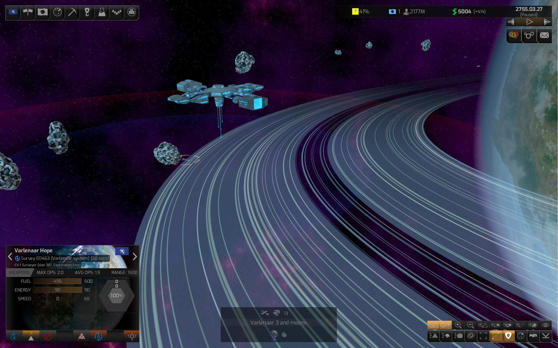
By the time we released Distant Worlds: Universe, we knew that any future game would need a new engine that would not only allow us to make Distant Worlds look better, but would also allow it to perform better and expand what we could do in terms of gameplay choices. Elliot spent a good deal of time researching this and in fact one year into the project we even went through the pain of switching engines, just to make sure we would be able to achieve all of our engine-related goals. Distant Worlds 2 is now based on the Stride engine, is fully 64-bit and 3D and with a full dynamic scaling for all elements, including the interface. I can’t overstate how much work and time it required of the entire team to make this leap, but we strongly feel the end result will be worthwhile and will allow us to continue to develop for Distant Worlds 2 for many years to come.
The second main goal relates to the interface. In making the big jump to a new and modern engine, we knew we could address dynamic scalability, but there were also many comments from Distant Worlds: Universe players about the original interface being difficult to learn. While it was quite functional once you learned it, the initial learning curve was harder than it should have been and partly because it evolved over multiple releases, the organization of information in some cases made things quite difficult for players to find.
A significant effort was put into a re-design of the interface, focused on providing players with easy top-level access to the most significant information both for better awareness and quicker decision-making. The bottom-left area remains focused on information about whatever the player has selected, but the selection menus and buttons themselves have been reorganized as well as additional information added where it previously required diving into other menus or dialogs. The bottom-middle now has a dynamic summary when in the system level of all significant “objects’ within the player’s current location or view.
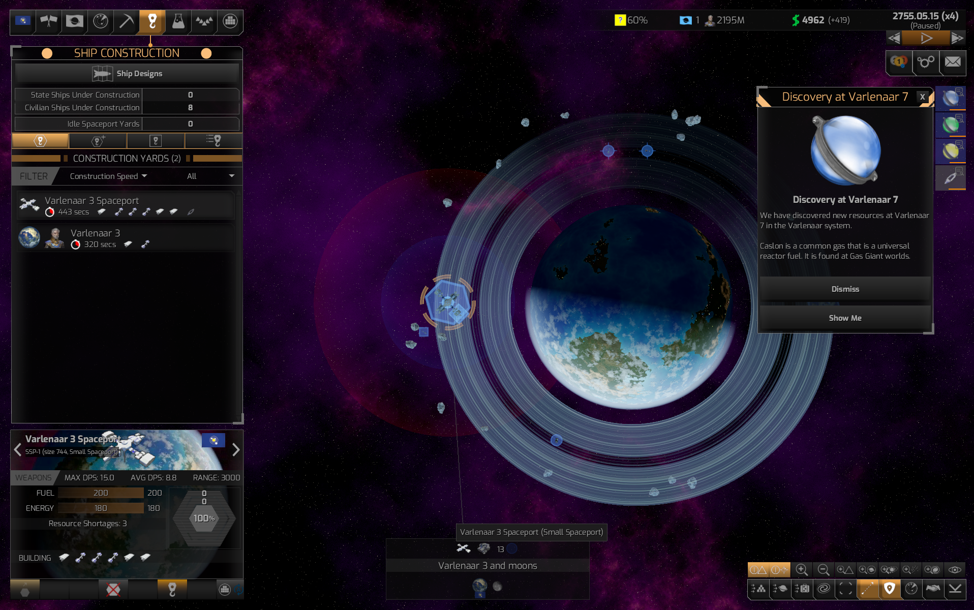
The top-left now has a series of major “headings” (in order from left to right, Empire Summary, Diplomacy, Colonies, Exploration, Resources, Construction, Research, Military and Civilian). When the player hovers the mouse over any of these, a summary of key metric in that area is shown. Moving the mouse down to the summary expands the menu further, allowing any of a series of sub-menus to be chosen that provide more information or detail. Moving the mouse off this area, collapses them back to the top, but clicking anywhere in these menus “locks” them open for ongoing interaction. Another click on the top “unlocks” them.
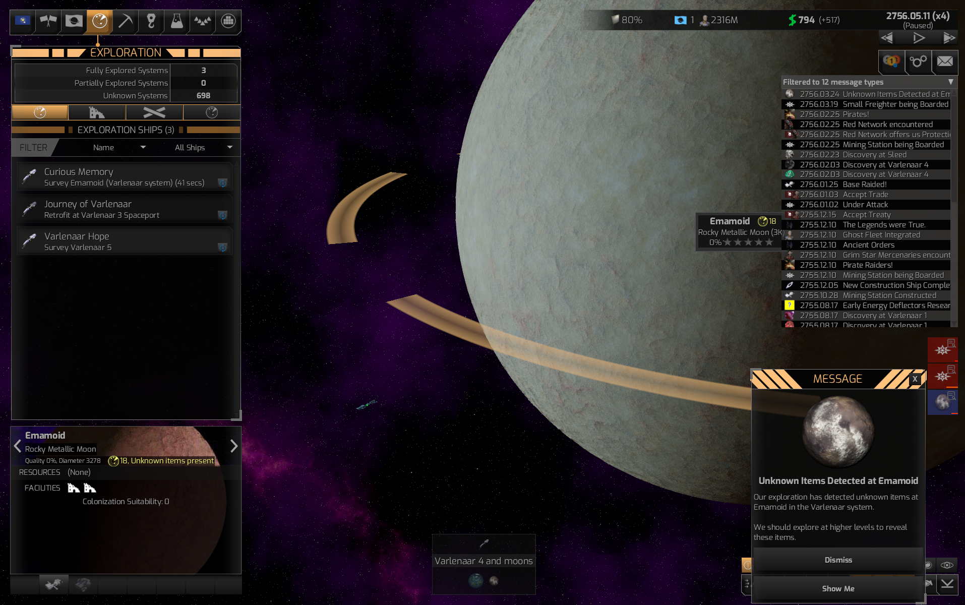
The top-right has a few basic piece of summary information – your current research projects, number of colonies and population, surplus income and cashflow and game date and speed. Clicking any of these also jumps to the relevant dialog to manage them in more detail. Below the speed controls are the victory conditions, game options and the message log.
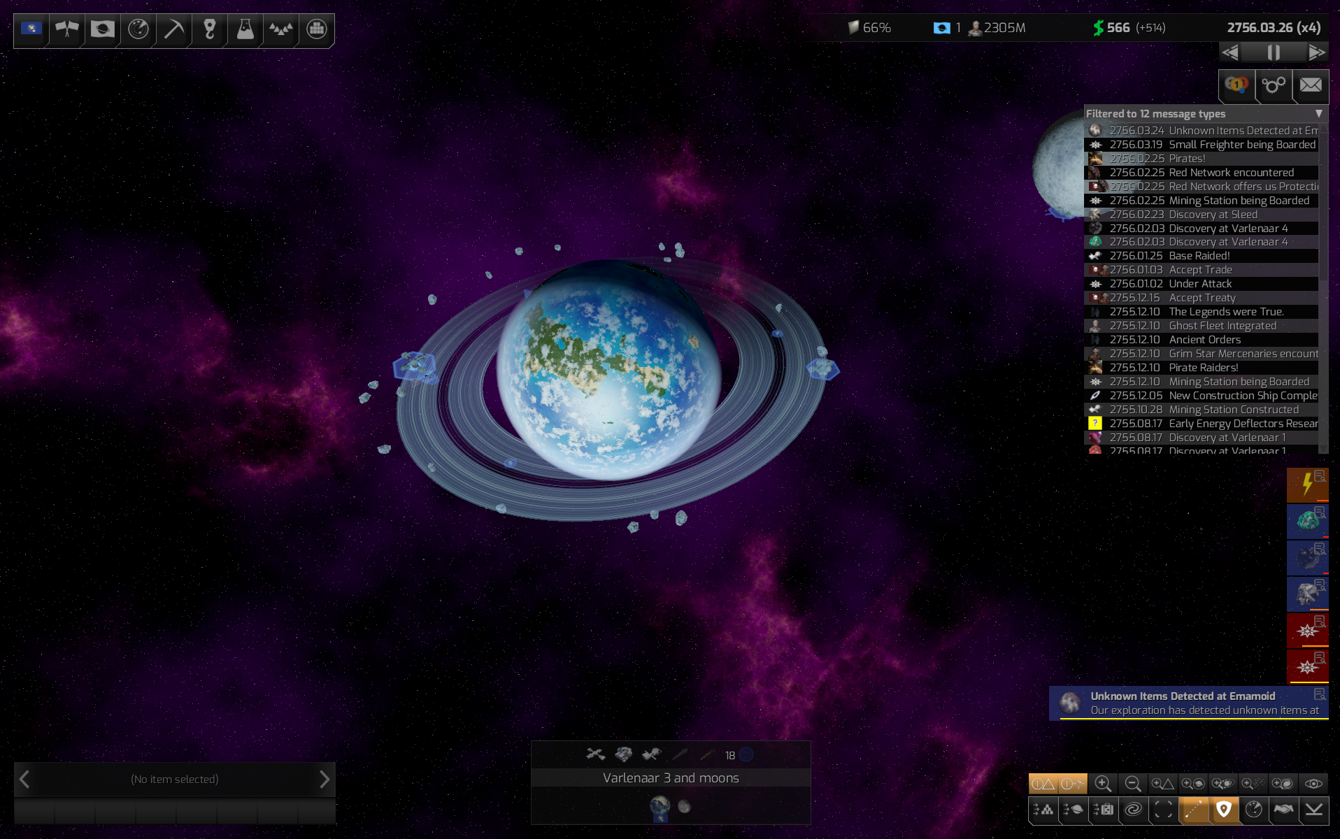
The Message Log has had fillters added and can be opened at any time to review old messages. Current messages appear on the right hand side below the log. When they first appear, they are briefly expanded at first to allow the player at a glance to get a sense of what they are about, then they collapse back to a smaller color-coded message category icon. Depending on the player’s chosen options, these many include advisor messages as well as other notifications or warnings. If ignored, the vast majority “auto-expire” after a delay (a small line under the message icon shrinks as the message expires) and go to the message log. Hovering the mouse over a message allows a quick glance at its expanded form. A single left-click on the message will open and lock it so that any actions related to it may be decided on. A double left-click will go to the message location. A single right-click will immediately dismiss the message.
A third goal was to make it easier for the player to gain information at a glance from the map. Part of this involved connecting up the User Interface to the map more directly. For example, when you have a dialog open on the top left and are reviewing your colonies, or exploration ships, or fleets, or even a filtered list of freighters currently transporting Hexodorium, the relevant items will also be highlighted on the map and will “ping” as you mouse over them so that you can more quickly and easily see where everything is. It also means that we added planetary and system “badges” which provide a summary of key assets, resources and capabilities at a given location. These have a planetary system version and a galacitc version depending on how zoomed in you are. There’s also additional information available when you mouse-over locations or objects.
In the view above, you can see that for the planet and moon on the right side of the system, I have found two ruins that are not yet fully explored. I also know of two available resources that could be mined and the exploration indicator in yellow is tellng me the current exploration level and that exploration there is not yet completed. The middle planetary group just has four resources. The middle left has a star showing that it’s our capitol planet, what its population is, what its happiness is, that it has the capability for construction (both due to the planet and the spaceport) and that it is a location that can refuel ships. Under that, it shows an explored ruin, the various explored resources and that we have 120 Troop Strength there.

Finally, in order to allow you to play the game your way, we’ve added a lot of policy, automation and advisor settings and grouped them all together in one convenient location to allow you to automate the parts you don’t want to deal with, turn on two different levels of advisors for areas you’d like to supervise, or set areas to full manual control when you really want to dive in. This level of automation extends down from this top level to being able to automate or manually control planets, fleets and even individual state ships.
I hope this review of our goals in improving the engine and the user interface helped you see how far we’ve come from Distant Worlds: Universe. I’ll be back in a couple of weeks with a new Developer Diary for you all!
|
 Printable Version





 New Messages
 No New Messages
 Hot Topic w/ New Messages
 Hot Topic w/o New Messages
 Locked w/ New Messages
 Locked w/o New Messages
 Post New Thread