Matrix Games Forums

Forums  Register  Login  Photo Gallery  Member List  Search  Calendars  FAQ 

My Profile  Inbox  Address Book  My Subscription  My Forums  Log Out

Stack depiction

 
View related threads: (in this forum | in all forums)

Logged in as: Guest
Users viewing this topic: none
  Printable Version
All Forums >> [New Releases from Matrix Games] >> World in Flames >> Stack depiction Page: [1]
Login
Message << Older Topic   Newer Topic >>
Stack depiction - 6/23/2009 9:55:20 AM   
Greywolf


Posts: 105
Joined: 11/15/2000
Status: offline
Looking at the AAR I noticed that with the new mapboard, wich is really nice, the number for the stack height become quite hard to read and doesnt stick out that much, making it a bit hard to see what is a multi unit stack and what is not in the front line.

Is there some provision to have the multi-unit stacks show a larger shadow than single unit one ?

_____________________________

Lt. Col. Ivan 'Greywolf' Kerensky
Post #: 1
RE: Stack depiction - 6/23/2009 1:24:51 PM   
Joseignacio


Posts: 2449
Joined: 5/8/2009
From: Madrid, Spain
Status: offline
Is there a larger shadow?  No, seriously, I didn't see any the first time, and only carefully searching it could see it now.

(in reply to Greywolf)
Post #: 2
RE: Stack depiction - 6/23/2009 1:36:28 PM   
Anendrue


Posts: 817
Joined: 7/8/2005
Status: offline
Looking at this post from the Barbarossa AAR, I see the white number on black at the top of each stack quite well. Is this what you are talking about or is there a different change?

_____________________________

Integrity is what you do when nobody is watching.

(in reply to Joseignacio)
Post #: 3
RE: Stack depiction - 6/23/2009 1:41:25 PM   
Greywolf


Posts: 105
Joined: 11/15/2000
Status: offline
You can see it, when you are looking for it. The trouble is that when you use a larger picture of the front all thoses symbols blur a bit and your mind have trouble visualising wich stack is smaller. By using the old trick of the enforced shadow it will be far more easy tolocate the single unit stack from the multiple unit ones. Such as to see when you have a single plane in the hex and when you have a FTR on top a 3 unit stack.

_____________________________

Lt. Col. Ivan 'Greywolf' Kerensky

(in reply to Anendrue)
Post #: 4
RE: Stack depiction - 6/23/2009 1:47:37 PM   
Anendrue


Posts: 817
Joined: 7/8/2005
Status: offline
I know what you are getting at. Could you post a picture of what you are seeing at the different zoom level?

_____________________________

Integrity is what you do when nobody is watching.

(in reply to Greywolf)
Post #: 5
RE: Stack depiction - 6/23/2009 2:21:59 PM   
Joseignacio


Posts: 2449
Joined: 5/8/2009
From: Madrid, Spain
Status: offline
Ok, I didn't know about the number. Now that I know it's evident.

Anyway, in the images of the AAR the units are focused very close, because very small portions of the map are shown. In a farther distance, which will be the usual, the numbers may not be seen.

As for the shadows, now I can see the greenish shadow is some kind of selection of units (like in the first image in http://www.matrixgames.com/forums/tm.asp?m=2033408&mpage=2&key= , but I though initially it was a different way to show that they had other units stacked.

Nevertheless, I think it would be a good idea to show graphically a stack, with enough size for the "shadow" so that it can be appreciated from the a more distant zoom.

< Message edited by Joseignacio -- 6/23/2009 2:23:51 PM >

(in reply to Anendrue)
Post #: 6
RE: Stack depiction - 6/23/2009 2:33:11 PM   
Anendrue


Posts: 817
Joined: 7/8/2005
Status: offline

quote:

ORIGINAL: Joseignacio

Ok, I didn't know about the number. Now that I know it's evident.

Anyway, in the images of the AAR the units are focused very close, because very small portions of the map are shown. In a farther distance, which will be the usual, the numbers may not be seen.

As for the shadows, now I can see the greenish shadow is some kind of selection of units (like in the first image in http://www.matrixgames.com/forums/tm.asp?m=2033408&mpage=2&key= , but I though initially it was a different way to show that they had other units stacked.

Nevertheless, I think it would be a good idea to show graphically a stack, with enough size for the "shadow" so that it can be appreciated from the a more distant zoom.

I agree an offset of the counters to show the stack would be nice. However, this was thouroughly discussed early on in the development process years ago. Someone correct me if I am wrong here but I believe the decision was "there is not enough room in the hexes and counters to get enough pixels available to do an offset". Unfortunately it would require a rewrite of the maps and probably the counters as well. I do not think at this late date it will happen. So hopefully MWiF is successful and "Product X" down the road will do so.

_____________________________

Integrity is what you do when nobody is watching.

(in reply to Joseignacio)
Post #: 7
RE: Stack depiction - 6/23/2009 5:40:39 PM   
Shannon V. OKeets


Posts: 22095
Joined: 5/19/2005
From: Honolulu, Hawaii
Status: offline

quote:

ORIGINAL: abj9562


quote:

ORIGINAL: Joseignacio

Ok, I didn't know about the number. Now that I know it's evident.

Anyway, in the images of the AAR the units are focused very close, because very small portions of the map are shown. In a farther distance, which will be the usual, the numbers may not be seen.

As for the shadows, now I can see the greenish shadow is some kind of selection of units (like in the first image in http://www.matrixgames.com/forums/tm.asp?m=2033408&mpage=2&key= , but I though initially it was a different way to show that they had other units stacked.

Nevertheless, I think it would be a good idea to show graphically a stack, with enough size for the "shadow" so that it can be appreciated from the a more distant zoom.

I agree an offset of the counters to show the stack would be nice. However, this was thouroughly discussed early on in the development process years ago. Someone correct me if I am wrong here but I believe the decision was "there is not enough room in the hexes and counters to get enough pixels available to do an offset". Unfortunately it would require a rewrite of the maps and probably the counters as well. I do not think at this late date it will happen. So hopefully MWiF is successful and "Product X" down the road will do so.

Yes.

More shadow means either: smaller units or larger hexes (fewer hexes visible on the screen). Neither of those sacrifices are justified just to increase the shadow. The status indicators take up the space that use to be allocated for increasing the shadow.

A single unit in a hex does not have the stack count top center above the unit, which makes it rather easy to see which hexes have only 1 unit.

_____________________________

Steve

Perfection is an elusive goal.

(in reply to Anendrue)
Post #: 8
RE: Stack depiction - 6/24/2009 6:47:32 AM   
Joseignacio


Posts: 2449
Joined: 5/8/2009
From: Madrid, Spain
Status: offline
Ok, boys, if you have gone throgh this, I'll believe your conclusions.

(in reply to Shannon V. OKeets)
Post #: 9
RE: Stack depiction - 6/30/2009 12:12:47 PM   
Froonp


Posts: 7995
Joined: 10/21/2003
From: Marseilles, France
Status: offline
quote:

ORIGINAL: Shannon V. OKeets
More shadow means either: smaller units or larger hexes (fewer hexes visible on the screen). Neither of those sacrifices are justified just to increase the shadow. The status indicators take up the space that use to be allocated for increasing the shadow.

I stumbled upon that old screenshot from June 2006, when the shadows of the stacks were projected on the top left, and were of different sizes for stacks of 1 counter, 2 counters or 3 and more counters.

I know that there is no room for a larger shadow currently, but why have it larger anyway for 3+ counters and have the shadow overflow in the next hex if it is too large, going under the stacks or counters that might be present in that next hex ?

It's just a suggestion, if it is too hard to implement or too dumb please ignore.


Attachment (1)

(in reply to Shannon V. OKeets)
Post #: 10
RE: Stack depiction - 6/30/2009 3:23:17 PM   
Mike Parker


Posts: 583
Joined: 12/30/2008
From: Houston TX
Status: offline
What is the largest number of counters that could be in a hex (not counting ships).  two corps, a division and three planes?  I am not super up on the rules, but that seems to be 6.  So if you doubled the size of the 3 unit shadow it would be pretty big!

(in reply to Froonp)
Post #: 11
RE: Stack depiction - 6/30/2009 3:40:38 PM   
Greywolf


Posts: 105
Joined: 11/15/2000
Status: offline
And why not simply have 3 size shadow : 1 unit ( no shadow),  2 units ( small shadow ), 3+ units (large shadows) ?

_____________________________

Lt. Col. Ivan 'Greywolf' Kerensky

(in reply to Mike Parker)
Post #: 12
RE: Stack depiction - 6/30/2009 3:44:26 PM   
Froonp


Posts: 7995
Joined: 10/21/2003
From: Marseilles, France
Status: offline
quote:

ORIGINAL: Mike Parker

What is the largest number of counters that could be in a hex (not counting ships).  two corps, a division and three planes?  I am not super up on the rules, but that seems to be 6.  So if you doubled the size of the 3 unit shadow it would be pretty big!

My proposal was for 3 shasow sizes :
Size 1 : 1 unit
Size 2 : 2 units
Size 3 : 3+ units

So 6 units or 3 units would be the same.

(in reply to Mike Parker)
Post #: 13
RE: Stack depiction - 6/30/2009 3:45:25 PM   
Froonp


Posts: 7995
Joined: 10/21/2003
From: Marseilles, France
Status: offline

quote:

ORIGINAL: Greywolf

And why not simply have 3 size shadow : 1 unit ( no shadow),  2 units ( small shadow ), 3+ units (large shadows) ?

Single units need to have a shadow. This is much beautiful with a shadow than without.
This single unit shadow can be half the current one for example, but it need to be kept IMO.

(in reply to Greywolf)
Post #: 14
RE: Stack depiction - 6/30/2009 6:09:10 PM   
Shannon V. OKeets


Posts: 22095
Joined: 5/19/2005
From: Honolulu, Hawaii
Status: offline

quote:

ORIGINAL: Froonp

quote:

ORIGINAL: Shannon V. OKeets
More shadow means either: smaller units or larger hexes (fewer hexes visible on the screen). Neither of those sacrifices are justified just to increase the shadow. The status indicators take up the space that use to be allocated for increasing the shadow.

I stumbled upon that old screenshot from June 2006, when the shadows of the stacks were projected on the top left, and were of different sizes for stacks of 1 counter, 2 counters or 3 and more counters.

I know that there is no room for a larger shadow currently, but why have it larger anyway for 3+ counters and have the shadow overflow in the next hex if it is too large, going under the stacks or counters that might be present in that next hex ?

It's just a suggestion, if it is too hard to implement or too dumb please ignore.


You apparently don't recall the dozens of posts complaining about having the shadows "in the wrong place". The consensus of the forum members was that the shadows 'had' to be on the right and below the counter image or else they would be 'wrong'. Any logic that I used to move them to top and left was considered irrelevant.

So I went with the flow.

_____________________________

Steve

Perfection is an elusive goal.

(in reply to Froonp)
Post #: 15
RE: Stack depiction - 6/30/2009 6:14:33 PM   
Mike Parker


Posts: 583
Joined: 12/30/2008
From: Houston TX
Status: offline
irrelevent or irreverent :)

but once Froonp said it was 1 2 or 3+ it makes a little sense..

(in reply to Shannon V. OKeets)
Post #: 16
RE: Stack depiction - 6/30/2009 6:24:14 PM   
Shannon V. OKeets


Posts: 22095
Joined: 5/19/2005
From: Honolulu, Hawaii
Status: offline

quote:

ORIGINAL: Mike Parker

irrelevent or irreverent :)

but once Froonp said it was 1 2 or 3+ it makes a little sense..

No spell checker available for forum posts.

Right now, the shadows are always the same, regardless of the number of units in the stack. I do not have room for even the 1, 2, 3+ variations.

Bear in mind that these would have to be worked out for all 8 levels of zoom (which I had done for the upper left, once upon a time, long, long ago).

_____________________________

Steve

Perfection is an elusive goal.

(in reply to Mike Parker)
Post #: 17
RE: Stack depiction - 6/30/2009 6:36:04 PM   
Orm


Posts: 22154
Joined: 5/3/2008
From: Sweden
Status: offline
I actually prefer it as it is now. With the shadow always the same regardless on how many units there are in the hex.

_____________________________

Have a bit more patience with newbies. Of course some of them act dumb -- they're often students, for heaven's sake. - Terry Pratchett

(in reply to Shannon V. OKeets)
Post #: 18
RE: Stack depiction - 6/30/2009 6:55:51 PM   
Grapeshot Bob


Posts: 642
Joined: 12/16/2007
From: Canada
Status: offline
Personally, I like it the way it currently is.


GSB

(in reply to Orm)
Post #: 19
RE: Stack depiction - 6/30/2009 8:14:49 PM   
Froonp


Posts: 7995
Joined: 10/21/2003
From: Marseilles, France
Status: offline
quote:

ORIGINAL: Grapeshot Bob

Personally, I like it the way it currently is.

I also like it the way it is now , but was posting the idea that the shadow could overflow underneath the units of the next hex, so that room for it was made (in the next hex underneath any unit that would be there).
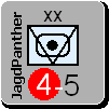
I also prefer the shadow on the lower right.

(in reply to Grapeshot Bob)
Post #: 20
RE: Stack depiction - 7/1/2009 2:46:53 AM   
Zorachus99


Posts: 1066
Joined: 9/15/2000
From: Palo Alto, CA
Status: offline

quote:

ORIGINAL: Shannon V. OKeets

No spell checker available for forum posts.


Try Google Chrome, It uses an inline auto-spell checker while you type into web pages, which I rather enjoy.

_____________________________

Most men can survive adversity, the true test of a man's character is power. -Abraham Lincoln

(in reply to Shannon V. OKeets)
Post #: 21
RE: Stack depiction - 7/1/2009 8:32:59 AM   
Greywolf


Posts: 105
Joined: 11/15/2000
Status: offline
Well no problem with shadows on lower right... I understood you put the shadow directly in the counter pics...

Too bad you doesnt have an invisible color counter with the shadow in diferrent size that you could just have pasted on top of every stacks...

_____________________________

Lt. Col. Ivan 'Greywolf' Kerensky

(in reply to Zorachus99)
Post #: 22
RE: Stack depiction - 7/1/2009 9:35:24 AM   
Shannon V. OKeets


Posts: 22095
Joined: 5/19/2005
From: Honolulu, Hawaii
Status: offline

quote:

ORIGINAL: Greywolf

Well no problem with shadows on lower right... I understood you put the shadow directly in the counter pics...

Too bad you doesnt have an invisible color counter with the shadow in diferrent size that you could just have pasted on top of every stacks...

Rendering the unit depictions on the screen is rather complex. It is done as a series of overlays. And many of the numeric factors are dynamic and reflect the unit's current 'situation'.

_____________________________

Steve

Perfection is an elusive goal.

(in reply to Greywolf)
Post #: 23
RE: Stack depiction - 7/1/2009 11:15:29 AM   
Greywolf


Posts: 105
Joined: 11/15/2000
Status: offline
And the shadow is not an overlay ? too bad :(

_____________________________

Lt. Col. Ivan 'Greywolf' Kerensky

(in reply to Shannon V. OKeets)
Post #: 24
RE: Stack depiction - 7/1/2009 6:07:17 PM   
Shannon V. OKeets


Posts: 22095
Joined: 5/19/2005
From: Honolulu, Hawaii
Status: offline

quote:

ORIGINAL: Greywolf

And the shadow is not an overlay ? too bad :(

Each unit occupies a 96 pixels by 96 pixels square. Actually the (black) shadow is done first. Then the corners are rounded, then the base color for the unit, then the bitmapped image (if any), ...

_____________________________

Steve

Perfection is an elusive goal.

(in reply to Greywolf)
Post #: 25
RE: Stack depiction - 7/2/2009 3:22:36 PM   
BallyJ


Posts: 142
Joined: 5/25/2008
Status: offline
Don't worry about this nit picking Steve. The game looks great. Keep going forward not back.
Regards John

(in reply to Shannon V. OKeets)
Post #: 26
RE: Stack depiction - 8/16/2009 10:59:13 PM   
obermeister


Posts: 74
Joined: 4/24/2009
Status: offline
[accidental post, sorry]

< Message edited by obermeister -- 8/16/2009 11:01:03 PM >

(in reply to BallyJ)
Post #: 27
Page:   [1]
All Forums >> [New Releases from Matrix Games] >> World in Flames >> Stack depiction Page: [1]
Jump to:


New Messages No New Messages
Hot Topic w/ New Messages Hot Topic w/o New Messages
Locked w/ New Messages Locked w/o New Messages
 Post New Thread
 Reply to Message
 Post New Poll
 Submit Vote
 Delete My Own Post
 Delete My Own Thread
 Rate Posts


Forum Software © ASPPlayground.NET Advanced Edition 2.4.5 ANSI

2.688