Matrix Games Forums

Forums  Register  Login  Photo Gallery  Member List  Search  Calendars  FAQ 

My Profile  Inbox  Address Book  My Subscription  My Forums  Log Out

RE: New Screen for Surface Combat

 
View related threads: (in this forum | in all forums)

Logged in as: Guest
Users viewing this topic: none
  Printable Version
All Forums >> [New Releases from Matrix Games] >> War in the Pacific: Admiral's Edition >> RE: New Screen for Surface Combat Page: <<   < prev  1 2 [3]
Login
Message << Older Topic   Newer Topic >>
RE: New Screen for Surface Combat - 2/19/2011 4:41:55 AM   
USSAmerica


Posts: 18715
Joined: 10/28/2002
From: Graham, NC, USA
Status: offline

quote:

ORIGINAL: TOMLABEL

quote:

ORIGINAL: Big B

I agree wholeheartedly with both of you.

I am working on that now (removing the shoehorned 3-D background).

The final effect should be visually more agreeable.

Thanks,

B


Brian wanted me to post this in response to his post above to get your thoughts. Please let us know what those are. You guys are invaluable!!!!!

TOMLABEL


I love the chart compass rose background, and it is "faded" just enough to make the ships still pop. Is the magnetic North offset on that chart accurate for '42-45? It does shift over time, and if you're making a screen like this from scratch, it might as well be as accurate as possible. I'm not that high on the flags. They just seem out of place to me.

You guys all impress me so much with your artistic skill and creativity. Thanks for allowing us all to share it.

_____________________________

Mike

"Good times will set you free" - Jimmy Buffett

"They need more rum punch" - Me


Artwork by The Amazing Dixie

(in reply to TOMLABEL)
Post #: 61
RE: New Screen for Surface Combat - 2/19/2011 6:20:33 AM   
TOMLABEL


Posts: 5116
Joined: 1/27/2006
From: Alabama - ROLL TIDE!!!!!
Status: offline
quote:

ORIGINAL: USS America


quote:

ORIGINAL: TOMLABEL

quote:

ORIGINAL: Big B

I agree wholeheartedly with both of you.

I am working on that now (removing the shoehorned 3-D background).

The final effect should be visually more agreeable.

Thanks,

B


Brian wanted me to post this in response to his post above to get your thoughts. Please let us know what those are. You guys are invaluable!!!!!

TOMLABEL


I love the chart compass rose background, and it is "faded" just enough to make the ships still pop. Is the magnetic North offset on that chart accurate for '42-45? It does shift over time, and if you're making a screen like this from scratch, it might as well be as accurate as possible. I'm not that high on the flags. They just seem out of place to me.

You guys all impress me so much with your artistic skill and creativity. Thanks for allowing us all to share it.


Thanks USS America!! You guys keep sending your gut feelings and suggestions!

_____________________________


Art by the Rogue-USMC

WITP Admiral's Edition: Ship & Sub Art/Base Unit Art/Map Icon Art

"If destruction be our lot - it will come from within"...Abraham Lincoln

(in reply to USSAmerica)
Post #: 62
RE: New Screen for Surface Combat - 2/19/2011 6:28:46 AM   
TOMLABEL


Posts: 5116
Joined: 1/27/2006
From: Alabama - ROLL TIDE!!!!!
Status: offline

quote:

ORIGINAL: csatahajos

Guys, can we have some more teasers at least while we wait on the release? :) The wait is getting really difficult to bear :D


OK good 'ole buddy!!! How 'bout some AOs?


Attachment (1)

_____________________________


Art by the Rogue-USMC

WITP Admiral's Edition: Ship & Sub Art/Base Unit Art/Map Icon Art

"If destruction be our lot - it will come from within"...Abraham Lincoln

(in reply to Akos Gergely)
Post #: 63
RE: New Screen for Surface Combat - 2/19/2011 7:29:40 AM   
Shark7


Posts: 7937
Joined: 7/24/2007
From: The Big Nowhere
Status: offline

quote:

ORIGINAL: TOMLABEL

quote:

ORIGINAL: Big B

I agree wholeheartedly with both of you.

I am working on that now (removing the shoehorned 3-D background).

The final effect should be visually more agreeable.

Thanks,

B


Brian wanted me to post this in response to his post above to get your thoughts. Please let us know what those are. You guys are invaluable!!!!!

TOMLABEL


OK, I do like this. However, if it were 2-3 shades darker (IE more of a medium blue) I'd like it even more. Again its my eyes, but the compass in the background is almost not visible to me. Maybe that is what you intended?

_____________________________

Distant Worlds Fan

'When in doubt...attack!'

(in reply to TOMLABEL)
Post #: 64
RE: New Screen for Surface Combat - 2/19/2011 8:23:47 AM   
stuman


Posts: 3907
Joined: 9/14/2008
From: Elvis' Hometown
Status: offline

quote:

ORIGINAL: USS America


quote:

ORIGINAL: TOMLABEL

quote:

ORIGINAL: Big B

I agree wholeheartedly with both of you.

I am working on that now (removing the shoehorned 3-D background).

The final effect should be visually more agreeable.

Thanks,

B


Brian wanted me to post this in response to his post above to get your thoughts. Please let us know what those are. You guys are invaluable!!!!!

TOMLABEL


I love the chart compass rose background, and it is "faded" just enough to make the ships still pop. Is the magnetic North offset on that chart accurate for '42-45? It does shift over time, and if you're making a screen like this from scratch, it might as well be as accurate as possible. I'm not that high on the flags. They just seem out of place to me.

You guys all impress me so much with your artistic skill and creativity. Thanks for allowing us all to share it.


I really like that a hell of a lot. I like the flags tbh, but no matter. It looks great. Thank you guys very much for continuing your work on all of this.

_____________________________

" Gentlemen, you can't fight in here! This is the War Room. " President Muffley


(in reply to USSAmerica)
Post #: 65
RE: New Screen for Surface Combat - 2/19/2011 9:30:22 AM   
BigDuke66


Posts: 2013
Joined: 2/1/2001
From: Terra
Status: offline
The later one with its overall blue looks a bit boring, the compass rose distracts a bit and the flags look like they don't belong there.
If you want to go that road further try a map that depicts depth with different shades of blue maybe that won't be so boring.

I still would go for the first picture, try it without the highlights in the middle and overall more like it looks on the far right or left side you can also keep the sky at the top as its a good finish there together with the "Nval Combat" sign.

_____________________________


(in reply to stuman)
Post #: 66
RE: New Screen for Surface Combat - 2/19/2011 4:04:52 PM   
berto


Posts: 20708
Joined: 3/13/2002
From: metro Chicago, Illinois, USA
Status: offline

quote:

ORIGINAL: TOMLABEL

Prior to this posting B and I have decided that we are going to narrow down all the idea/options to a few Combat Screens (instead of just one) so you guys can pick which one works best for your paticular interests. Some folks have sent us some very interesting options that we will include as well.


In the final implementation, giving us several options is a great idea. One size does not fit all. Different tastes...

FWIW, I tend to like the latest "chart compass rose background," although I find the flags as currently implemented to be a bit garish and distracting. Maybe fade (lower the contrast, bleach the color) the flags too?

_____________________________

Campaign Series Legion https://cslegion.com/
Campaign Series Lead Coder https://www.matrixgames.com/forums/tt.asp?forumid=1515
Panzer Campaigns, Panzer Battles, Civil War Battles Lead Coder https://wargameds.com

(in reply to TOMLABEL)
Post #: 67
RE: New Screen for Surface Combat - 2/19/2011 4:44:01 PM   
Big B


Posts: 4870
Joined: 6/1/2005
From: Old Los Angeles pre-1960
Status: offline
Guys, all of your feedback has been invaluable to me, and is most sincerely appreciated. (I just also wanted to note that the praise is always heartwarming - but right now it's the criticism that has been most helpful...it's hard working in a vacuum).

Working on it - and there will be several choices....

B

EDIT: If any talented map making artists out there are interested in lending a hand - it would be welcome

< Message edited by Big B -- 2/19/2011 4:56:25 PM >

(in reply to berto)
Post #: 68
RE: New Screen for Surface Combat - 2/19/2011 4:58:12 PM   
Cap Mandrake


Posts: 23184
Joined: 11/15/2002
From: Southern California
Status: offline
This is a bit like a polygamist going with his 5 wives to pick out drapes.

It may be best to let each wife pick out the drapes for one room.

I completely agree again with Kull's concept of the ship art being the feature. Eveything else should be subservient to that goal, subdued but perhaps adding some historical flavor. I like the flag idea but perhaps it could just be a hint. I realize this sounds a little interior designerish but you wouldn't put an art deco frame on a Picasso etching.

(in reply to Big B)
Post #: 69
RE: New Screen for Surface Combat - 2/19/2011 5:21:26 PM   
berto


Posts: 20708
Joined: 3/13/2002
From: metro Chicago, Illinois, USA
Status: offline

quote:

ORIGINAL: Cap Mandrake

I completely agree again with Kull's concept of the ship art being the feature. Eveything else should be subservient to that goal, subdued but perhaps adding some historical flavor.

+1

_____________________________

Campaign Series Legion https://cslegion.com/
Campaign Series Lead Coder https://www.matrixgames.com/forums/tt.asp?forumid=1515
Panzer Campaigns, Panzer Battles, Civil War Battles Lead Coder https://wargameds.com

(in reply to Cap Mandrake)
Post #: 70
RE: New Screen for Surface Combat - 2/19/2011 5:39:38 PM   
Cap Mandrake


Posts: 23184
Joined: 11/15/2002
From: Southern California
Status: offline
Famous picture of US battleships in line ahead...super washed out on a canvas texture. Just another idea. I have no PSP on this computer so I cant do a proper color wash or even dasaturate. Seems to me you want the background color to be something fromt he spectrum of colors you have in the ship art which are subdued greys and blues because it is desinged to be cammoflage.


Attachment (1)

(in reply to berto)
Post #: 71
RE: New Screen for Surface Combat - 2/19/2011 6:07:35 PM   
FeurerKrieg


Posts: 3397
Joined: 6/15/2005
From: Denver, CO
Status: offline
I like the flags, but do agree they could stand to be washed out/weathered/filtered a bit.

_____________________________


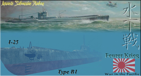
Upper portion used with permission of www.subart.net, copyright John Meeks

(in reply to Cap Mandrake)
Post #: 72
RE: New Screen for Surface Combat - 2/19/2011 6:22:05 PM   
Bullwinkle58


Posts: 11302
Joined: 2/24/2009
Status: offline

quote:

ORIGINAL: Cap Mandrake

This is a bit like a polygamist going with his 5 wives to pick out drapes.

It may be best to let each wife pick out the drapes for one room.

I completely agree again with Kull's concept of the ship art being the feature. Eveything else should be subservient to that goal, subdued but perhaps adding some historical flavor. I like the flag idea but perhaps it could just be a hint. I realize this sounds a little interior designerish but you wouldn't put an art deco frame on a Picasso etching.


Yeah, and could the French flag be just a little smaller than the US flag?

(Joke! Joke!)

_____________________________

The Moose

(in reply to Cap Mandrake)
Post #: 73
RE: New Screen for Surface Combat - 2/19/2011 6:36:15 PM   
Cap Mandrake


Posts: 23184
Joined: 11/15/2002
From: Southern California
Status: offline
quote:

ORIGINAL: Bullwinkle58


quote:

ORIGINAL: Cap Mandrake

This is a bit like a polygamist going with his 5 wives to pick out drapes.

It may be best to let each wife pick out the drapes for one room.

I completely agree again with Kull's concept of the ship art being the feature. Eveything else should be subservient to that goal, subdued but perhaps adding some historical flavor. I like the flag idea but perhaps it could just be a hint. I realize this sounds a little interior designerish but you wouldn't put an art deco frame on a Picasso etching.


Yeah, and could the French flag be just a little smaller than the US flag?

(Joke! Joke!)


I think it is Dutch. I think the one Free French destroyer in the game loses out.

(in reply to Bullwinkle58)
Post #: 74
RE: New Screen for Surface Combat - 2/19/2011 6:39:11 PM   
Big B


Posts: 4870
Joined: 6/1/2005
From: Old Los Angeles pre-1960
Status: offline
Here is how it would look with the flags subdued, 1st attempt (and it's the Dutch flag not French...ABDA)
And the compass rose is supposed to be very washed out and low visibility.

I think I need Andrew Brown to really make a good screen, Andrew? (Back to work...)

quote:

ORIGINAL: Bullwinkle58


quote:

ORIGINAL: Cap Mandrake

This is a bit like a polygamist going with his 5 wives to pick out drapes.

It may be best to let each wife pick out the drapes for one room.

I completely agree again with Kull's concept of the ship art being the feature. Eveything else should be subservient to that goal, subdued but perhaps adding some historical flavor. I like the flag idea but perhaps it could just be a hint. I realize this sounds a little interior designerish but you wouldn't put an art deco frame on a Picasso etching.


Yeah, and could the French flag be just a little smaller than the US flag?

(Joke! Joke!)


Attachment (1)

(in reply to Bullwinkle58)
Post #: 75
RE: New Screen for Surface Combat - 2/19/2011 6:42:57 PM   
Bullwinkle58


Posts: 11302
Joined: 2/24/2009
Status: offline

quote:

ORIGINAL: Cap Mandrake

I think it is Dutch. I think the one Free French destroyer in the game loses out.


And there goes a good joke.

You're right. Same colors and design, horizontal versus vertical. I had thought/recalled the Dutch flag as having some orange in it.

_____________________________

The Moose

(in reply to Cap Mandrake)
Post #: 76
RE: New Screen for Surface Combat - 2/19/2011 6:47:30 PM   
ny59giants


Posts: 9869
Joined: 1/10/2005
Status: offline
I would like to see a screen like a navigational chart of maybe Iron Bottom Sound area with the land masses more like waterspots on the map edges.

(in reply to Big B)
Post #: 77
RE: New Screen for Surface Combat - 2/19/2011 6:51:23 PM   
Hotschi


Posts: 548
Joined: 1/18/2010
From: Austria
Status: offline
quote:

ORIGINAL: BigDuke66

The later one with its overall blue looks a bit boring, the compass rose distracts a bit and the flags look like they don't belong there.
If you want to go that road further try a map that depicts depth with different shades of blue maybe that won't be so boring.

I still would go for the first picture, try it without the highlights in the middle and overall more like it looks on the far right or left side you can also keep the sky at the top as its a good finish there together with the "Nval Combat" sign.


Got the same opinion as BigDuke.

About the flags, I wouldn't add any at all, as on the Allied side there's also the Royal New Zealand Navy, Royal Canadian Navy, Indian Navy, Free French Navy involved, which aren't shown on this screen. Why show this flag but the other not? Better not use any at all, saves discussions.

< Message edited by Hotschi -- 2/19/2011 6:52:11 PM >

(in reply to BigDuke66)
Post #: 78
RE: New Screen for Surface Combat - 2/19/2011 7:17:21 PM   
berto


Posts: 20708
Joined: 3/13/2002
From: metro Chicago, Illinois, USA
Status: offline

quote:

ORIGINAL: Big B

Here is how it would look with the flags subdued, 1st attempt...

I would prefer them even more subdued, not visually distracting away from the ships at all.

Or, yes, maybe even remove them altogether (since there's not enough room to display them all--unless you dispense with the symmetry, and display Allied flags on the left also; or maybe move the "NAVAL COMBAT" plate back to the extreme left, then show a single Japanese flag, followed by the American, followed by ...).

Addition through subtraction, or aiming for the least common denominator?

"You see, you can't please everyone, so you've got to please yourself."

It's enough to drive you crazy, no?

_____________________________

Campaign Series Legion https://cslegion.com/
Campaign Series Lead Coder https://www.matrixgames.com/forums/tt.asp?forumid=1515
Panzer Campaigns, Panzer Battles, Civil War Battles Lead Coder https://wargameds.com

(in reply to Big B)
Post #: 79
RE: New Screen for Surface Combat - 2/19/2011 7:29:55 PM   
Shark7


Posts: 7937
Joined: 7/24/2007
From: The Big Nowhere
Status: offline

quote:

ORIGINAL: Big B

Here is how it would look with the flags subdued, 1st attempt (and it's the Dutch flag not French...ABDA)
And the compass rose is supposed to be very washed out and low visibility.

I think I need Andrew Brown to really make a good screen, Andrew? (Back to work...)

quote:

ORIGINAL: Bullwinkle58


quote:

ORIGINAL: Cap Mandrake

This is a bit like a polygamist going with his 5 wives to pick out drapes.

It may be best to let each wife pick out the drapes for one room.

I completely agree again with Kull's concept of the ship art being the feature. Eveything else should be subservient to that goal, subdued but perhaps adding some historical flavor. I like the flag idea but perhaps it could just be a hint. I realize this sounds a little interior designerish but you wouldn't put an art deco frame on a Picasso etching.


Yeah, and could the French flag be just a little smaller than the US flag?

(Joke! Joke!)


The only thing is that the blue could stand to be a bit darker. It might be easier to show you what I mean...would there be any problems with me taking this image into PSP and making and example of what I am talking about for you to see?

_____________________________

Distant Worlds Fan

'When in doubt...attack!'

(in reply to Big B)
Post #: 80
RE: New Screen for Surface Combat - 2/19/2011 7:50:59 PM   
Big B


Posts: 4870
Joined: 6/1/2005
From: Old Los Angeles pre-1960
Status: offline
No problem at all - as far as I can see this is open to everyone... it's your forum.

PM me with your email and I send you a bitmap to play with (though the darker the blue the worse the ship display will look... just sayin')


B
quote:

ORIGINAL: Shark7

The only thing is that the blue could stand to be a bit darker. It might be easier to show you what I mean...would there be any problems with me taking this image into PSP and making and example of what I am talking about for you to see?


(in reply to Shark7)
Post #: 81
RE: New screens for surface combat - 2/19/2011 8:22:50 PM   
Mac Linehan


Posts: 1484
Joined: 12/19/2004
From: Denver Colorado
Status: offline
Very sharp images, Big B.

Greatly appreciate your work!

Mac

_____________________________

LAV-25 2147

(in reply to Big B)
Post #: 82
RE: More new ships - 2/19/2011 8:24:14 PM   
Mac Linehan


Posts: 1484
Joined: 12/19/2004
From: Denver Colorado
Status: offline

quote:

ORIGINAL: Big B

While we wait for details to be sorted out, here is an example of "Optional" ships. or, "Ships That Never Were" to now be available...


I must say again - outstanding work, Gents!

_____________________________

LAV-25 2147

(in reply to Big B)
Post #: 83
RE: New Screen for Surface Combat - 2/19/2011 9:24:43 PM   
Cap Mandrake


Posts: 23184
Joined: 11/15/2002
From: Southern California
Status: offline
How about something like this with a border but a very simple background?

This is just an example, I dont know how big a border you could have and the dimensions are wrong.


Attachment (1)

(in reply to USSAmerica)
Post #: 84
Ship Art Thread - 2/19/2011 9:33:42 PM   
Big B


Posts: 4870
Joined: 6/1/2005
From: Old Los Angeles pre-1960
Status: offline
let's leave this thread alone...

(in reply to Big B)
Post #: 85
RE: Ship Art Thread - 7/26/2019 1:12:56 PM   
Halsey


Posts: 5069
Joined: 2/7/2004
Status: offline
Bump...
Another oldie but goodie...

_____________________________


(in reply to Big B)
Post #: 86
Page:   <<   < prev  1 2 [3]
All Forums >> [New Releases from Matrix Games] >> War in the Pacific: Admiral's Edition >> RE: New Screen for Surface Combat Page: <<   < prev  1 2 [3]
Jump to:


New Messages No New Messages
Hot Topic w/ New Messages Hot Topic w/o New Messages
Locked w/ New Messages Locked w/o New Messages
 Post New Thread
 Reply to Message
 Post New Poll
 Submit Vote
 Delete My Own Post
 Delete My Own Thread
 Rate Posts


Forum Software © ASPPlayground.NET Advanced Edition 2.4.5 ANSI

4.922