Redmarkus5
Posts: 4456
Joined: 12/1/2007
From: 0.00
Status: offline

|
quote:
ORIGINAL: bretg80
Sorry guys, I just have to say this, the terrain textures on the maps are BORING. Come'on, it's 2011 and you probably won't finish this game for a while, so in the mean time please revamp the terrain textures so that they at least look like something we would expect to see in this decade.
For example: Mtn hexes look like mud (where are the snowcapped peaks?)
Where are the beaches on land/sea hexes?
Sand hexes look like tan blah - how bout some dunes
Weather symbology obscures the map, why not use some transparency and clouds to indicate weather or
use transparency and weather symbology.
From what I've seen in the AAR, the global high level summary map looks like something right out of the 1980's . Whaz up with that?
I know, it's a harsh critique, but not undeserved. Hire a texture dude and have him fix them up. It'll make the game a lot more enjoyable to look at while playing.
I know this is a big complex game and the rules engine alone must be mind numbing and excruciatingly complex to develop, but the UI look-and-feel is important too. The maps are nice, just spend the extra time to make them look pretty. It means a lot to those of us who have to stare at them all the time while playing. 
Best of luck in your endeavor... I'll buy this game if you fix up the textures or at least provide a way for us to mod the game to fix them later on.
Bret
As someone who does a lot of map modding, I have to say that I am pretty ok with the maps as they are in this game. I would probably change the March and Mountains graphics right away, but it wouldn't affect my decision to purchase.
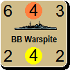
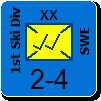
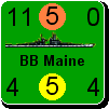
I assume these are all bitmap images?
_____________________________
WitE2 tester, WitW, WitP, CMMO, CM2, GTOS, GTMF, WP & WPP, TOAW4, BA2
|
 Printable Version
 RE: The maps are dated - fix the terrain -


 ).
).
 New Messages
 No New Messages
 Hot Topic w/ New Messages
 Hot Topic w/o New Messages
 Locked w/ New Messages
 Locked w/o New Messages
 Post New Thread