Matrix Games Forums

Forums  Register  Login  Photo Gallery  Member List  Search  Calendars  FAQ 

My Profile  Inbox  Address Book  My Subscription  My Forums  Log Out

RE: Better Graphics

 
View related threads: (in this forum | in all forums)

Logged in as: Guest
Users viewing this topic: none
  Printable Version
All Forums >> [Current Games From Matrix.] >> [World War II] >> John Tiller's Campaign Series >> RE: Better Graphics Page: <<   < prev  1 [2] 3 4 5   next >   >>
Login
Message << Older Topic   Newer Topic >>
RE: Better Graphics - 1/17/2012 11:31:52 PM   
Warhorse


Posts: 5712
Joined: 5/12/2000
From: Birdsboro, PA, USA
Status: offline
Hey RR,

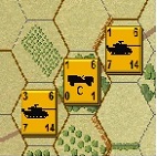
Here is a very quick rendition I did, just to show you what it would be like, mind you this was done in like 30 seconds, it wouldn't look this jive finished!!


Attachment (1)

< Message edited by Warhorse -- 1/17/2012 11:33:06 PM >


_____________________________

Mike Amos

Meine Ehre heißt Treue
www.cslegion.com

(in reply to MrRoadrunner)
Post #: 31
RE: Better Graphics - 1/18/2012 2:32:21 AM   
MrRoadrunner


Posts: 1323
Joined: 10/7/2005
Status: offline
Cool mike!
Once again, kudos from me!
You guys really know how to go to the next level to improve the game.
I wish I had the ability and/or the talent!

I guess only infantry would benefit? Though, tanks can be hull down?
I wonder how long it would take to dig in?

Thanks!
RR


< Message edited by MrRoadrunner -- 1/18/2012 2:35:14 AM >


_____________________________

“The object of life is not to be on the side of the majority, but to escape finding oneself in the ranks of the insane.”
― Marcus Aurelius, Meditations

(in reply to Warhorse)
Post #: 32
RE: Better Graphics - 1/18/2012 11:36:38 PM   
Otto von Blotto


Posts: 273
Joined: 7/18/2008
Status: offline
If it is made to work like Improved potions but in open ground then tanks would benefit too maybe a small U shaped earthwork graphic on each side with slip trenches like mike has show around them. It might need something more distinct to show up in woodland or rough ground though.

Also Improved positions as they stand are always spotted I seem to recall, would some small earthworks show as easily they would be much harder to spot I think.?

Digging in would have to use the same chance and time rules as filling lots of sandbags and stacking them. Quite a feat in 6 mins I would agree but it's very rarely happens first turn and would depend on immediately local available supplies, ground conditions and how motivated you were.

< Message edited by Otto von Blotto -- 1/18/2012 11:42:59 PM >


_____________________________

"Personal isn't the same as important"

(in reply to MrRoadrunner)
Post #: 33
RE: Better Graphics - 1/19/2012 1:16:32 AM   
MrRoadrunner


Posts: 1323
Joined: 10/7/2005
Status: offline
LOL! I'm used to the time for improved positions. 
I do like the idea of the "U" shape for dug in tanks. Can that be done Mike? Mix the "U"s around the fox holes?
We'll need to code the terrain similar to IP's?

RR


_____________________________

“The object of life is not to be on the side of the majority, but to escape finding oneself in the ranks of the insane.”
― Marcus Aurelius, Meditations

(in reply to Otto von Blotto)
Post #: 34
RE: Better Graphics - 2/6/2012 7:34:24 PM   
Crossroads


Posts: 17372
Joined: 7/5/2009
Status: offline

quote:

ORIGINAL: Huib

Can anyone post an example of TOAW 2d representation? I'm curious.

Huib


Lots of map mods available to TOAW - naturally I picked the one resembling board games the most:


TOAW seems to be able to support bitmaps and PNG files simultaneously. For an example the above example is with bitmap map elements with PNG unit counters.

I am quite happy about the JTCS 3D view, but do not really use the 2D at all due to limits of the details available. A PNG 2D view would be awesome...

_____________________________


(in reply to Huib)
Post #: 35
RE: Better Graphics - 2/8/2012 10:43:48 AM   
Huib


Posts: 585
Joined: 11/21/2006
From: Nederland
Status: offline
On another (non graphical) note. Trenches seem to block LOS in CS, which is totally ridiculous.

Huib

< Message edited by Huib -- 2/8/2012 10:45:26 AM >

(in reply to Crossroads)
Post #: 36
RE: Better Graphics - 2/8/2012 7:10:15 PM   
Crossroads


Posts: 17372
Joined: 7/5/2009
Status: offline
Vanilla TOAW with visible hexes, for comparison.


_____________________________


(in reply to Huib)
Post #: 37
RE: Better Graphics - 2/16/2012 6:14:46 PM   
osiris_slith


Posts: 240
Joined: 1/5/2007
Status: offline
Hi Jason

How about the 3d unit icon graphics being used by Panzer Corp? They seem to be crisp and clean. Would be nice know if those graphics would be compatible with JTCS.


http://www.matrixgames.com/products/420/details/Panzer.Corps.Grand.Campaign.'42

http://www.matrixgames.com/products/399/details/Panzer.Corps.

rene

(in reply to MrRoadrunner)
Post #: 38
RE: Better Graphics - 2/16/2012 9:44:45 PM   
Jason Petho


Posts: 15009
Joined: 6/22/2004
From: Terrace, BC, Canada
Status: offline
Panzer Corp is a drop in the bucket compared to the graphics necessary to replace all of the existing graphics.

Jason Petho

_____________________________


(in reply to osiris_slith)
Post #: 39
RE: Better Graphics - 2/17/2012 1:03:51 AM   
Warhorse


Posts: 5712
Joined: 5/12/2000
From: Birdsboro, PA, USA
Status: offline
Trust me!!!!!!!!!!!!!!!!

_____________________________

Mike Amos

Meine Ehre heißt Treue
www.cslegion.com

(in reply to Jason Petho)
Post #: 40
RE: Better Graphics - 2/17/2012 5:59:39 PM   
Jason Petho


Posts: 15009
Joined: 6/22/2004
From: Terrace, BC, Canada
Status: offline

quote:

ORIGINAL: Warhorse

Trust me!!!!!!!!!!!!!!!!


Preaching to the choir... *laughs*

Jason Petho

_____________________________


(in reply to Warhorse)
Post #: 41
RE: Better Graphics - 2/19/2012 9:12:10 AM   
Crossroads


Posts: 17372
Joined: 7/5/2009
Status: offline
I am quite happy about the 3D views as is. This of course has to do a lot about personal taste, I just find the Panzer corps 3D view to be too much of an eye-candy type of thing, while for some reason I very much like the current bitmap units.

It would be nice to revamp the 2D view completely though. I have no idea what that would involve however. I would imagine that should the engine support png files, the community could quite quickly come up with superior 2D unit counters in comparison to existing ones, as PNG files have a very high resolution.

The 2D bitmap view is the part where the engine really shows it age, imho.

_____________________________


(in reply to Jason Petho)
Post #: 42
RE: Better Graphics - 2/20/2012 5:29:25 PM   
osiris_slith


Posts: 240
Joined: 1/5/2007
Status: offline
HI

If new 2d graphics are going to be done which would be very cool...theres 3 ways to go

Top down view-with camo or with out camo colouring

Side View-with camo or with out camo colouring

Standard NATO Symbols-with the name of the unit (type) on it

Given its a 2d map I think either the 1st or 2nd would be the best options-Currently 2d uses a side profile but its really small and doesnt look to good and its hard to see

In either case the 2d view needs to be bigger. For example since the the TOAW upgrade I play completely in 2d since the colours are nice and deep


rene

(in reply to Crossroads)
Post #: 43
RE: Better Graphics - 2/21/2012 1:39:31 AM   
Big Ivan


Posts: 1963
Joined: 6/9/2008
From: Mansfield, Ohio USA
Status: offline
I feel kind of bad now Warhorse.

Sorry but I keep giving you new work/suggestions on improving the existing terrain graphics in the KW Mod.

I know its a lot of work but I do appreciate it!!

The redo of the trees and brush was well recieved by all !

Take Care!

Big Ivan (ItB over at the other site)

(in reply to osiris_slith)
Post #: 44
RE: Better Graphics - 2/22/2012 10:27:25 PM   
osiris_slith


Posts: 240
Joined: 1/5/2007
Status: offline
here is the link which I found and this dude has made some very cool looking counters..It might be difficult but these would be very cool in 2d in JTCS

http://www.imaginative-strategist.layfigures.com/IMSTRAT%20PB%20Plates.html

rene

(in reply to Big Ivan)
Post #: 45
RE: Better Graphics - 2/23/2012 3:56:28 PM   
Jason Petho


Posts: 15009
Joined: 6/22/2004
From: Terrace, BC, Canada
Status: offline
Those are quite nice, but won't fit in with the current system. The 2D counters aren't that detailed graphically.

_____________________________


(in reply to osiris_slith)
Post #: 46
RE: Better Graphics - 2/23/2012 5:57:56 PM   
MrRoadrunner


Posts: 1323
Joined: 10/7/2005
Status: offline
And, the links bring you to a treatise on garages and garage doors?


RR

_____________________________

“The object of life is not to be on the side of the majority, but to escape finding oneself in the ranks of the insane.”
― Marcus Aurelius, Meditations

(in reply to Jason Petho)
Post #: 47
RE: Better Graphics - 2/24/2012 12:37:52 AM   
Warhorse


Posts: 5712
Joined: 5/12/2000
From: Birdsboro, PA, USA
Status: offline

quote:

ORIGINAL: Big Ivan

I feel kind of bad now Warhorse.

Sorry but I keep giving you new work/suggestions on improving the existing terrain graphics in the KW Mod.

I know its a lot of work but I do appreciate it!!

The redo of the trees and brush was well recieved by all !

Take Care!

Big Ivan (ItB over at the other site)


LOL!!! No man, it's all good, seriously, I love doing this stuff, it IS a lot of work, but always worth the effort!! Keep those suggestions coming, you guys input is what has made these games what they are, so long after their initial release!!!

Mike


_____________________________

Mike Amos

Meine Ehre heißt Treue
www.cslegion.com

(in reply to Big Ivan)
Post #: 48
RE: Better Graphics - 2/24/2012 12:44:13 AM   
Warhorse


Posts: 5712
Joined: 5/12/2000
From: Birdsboro, PA, USA
Status: offline
quote:

ORIGINAL: osiris

here is the link which I found and this dude has made some very cool looking counters..It might be difficult but these would be very cool in 2d in JTCS

http://www.imaginative-strategist.layfigures.com/IMSTRAT%20PB%20Plates.html

rene


Rene, they ARE very cool, unfortunately, JTCS counters in 2D are only 17x17 pixels, and the ones you show are 700x700, so you see the dilemma?! Would be very cool though, I gotta say!

Mike


< Message edited by Warhorse -- 2/24/2012 12:46:19 AM >


_____________________________

Mike Amos

Meine Ehre heißt Treue
www.cslegion.com

(in reply to osiris_slith)
Post #: 49
RE: Better Graphics - 2/25/2012 6:53:41 PM   
osiris_slith


Posts: 240
Joined: 1/5/2007
Status: offline
HI Mike

check these pics from slitherine out I know they wont work but they are cool anyway


http://www.slitherine.com/games/coh_pc

rene

(in reply to Warhorse)
Post #: 50
RE: Better Graphics - 2/25/2012 7:41:32 PM   
MrRoadrunner


Posts: 1323
Joined: 10/7/2005
Status: offline
I looked at them and did not like them.
3-D looks like Combat Mission and I do not play CM. 2-D counters looked OK but the map looked like crap. 2-D distance was not much better. Sharper Nato icons on a blurry map must be the reason. Would they not get jumbled in the more detailed CS map features?

I think the 3-D icons for CS are fine and the 2-D playable.

Graphic changes I would want regard more terrain options, more building options, etc. With the limits on time and work involved (and that this may be the last round of upgrades to CS) I want the time spent on other things than revising the units.

Getting rid of Extreme Assault and Variable Visibility would be on my bonus wish list. But, I know that is not coming.

RR

_____________________________

“The object of life is not to be on the side of the majority, but to escape finding oneself in the ranks of the insane.”
― Marcus Aurelius, Meditations

(in reply to osiris_slith)
Post #: 51
RE: Better Graphics - 2/25/2012 8:03:53 PM   
Crossroads


Posts: 17372
Joined: 7/5/2009
Status: offline
Ed, getting rid of EA and VV is easy: just make sure the option box is not ticked

_____________________________


(in reply to MrRoadrunner)
Post #: 52
RE: Better Graphics - 2/25/2012 10:35:34 PM   
MrRoadrunner


Posts: 1323
Joined: 10/7/2005
Status: offline
Getting rid of it would also get rid of the option to use it.
My point, but, I understand your point. Divided we must be? You can stay with the dark side.


RR

_____________________________

“The object of life is not to be on the side of the majority, but to escape finding oneself in the ranks of the insane.”
― Marcus Aurelius, Meditations

(in reply to Crossroads)
Post #: 53
RE: Better Graphics - 2/26/2012 9:41:38 AM   
Crossroads


Posts: 17372
Joined: 7/5/2009
Status: offline
Hey, easy with that fish! :) I have to confess The Dark Side of EA has grown stronger in me lately... But, to each with their own right.

It would be really nice to have png graphics enabled, that would be on my own top wish list. The community could then come up with new graphics option I am sure.

The first TOAW 2D example I posted is so cool the words fail me in describing my feelings :)

_____________________________


(in reply to MrRoadrunner)
Post #: 54
RE: Better Graphics - 2/26/2012 12:41:42 PM   
MrRoadrunner


Posts: 1323
Joined: 10/7/2005
Status: offline
Remember a fish in the hand is worth two in the bush?

I guess some people were also resistant to the Black Plague?
They looked around and said, "I'm healthy. Why is everyone else so sick?"

I've accepted that it is here. I do not have to like it. I have even worked on scenario designs that require using it and some that have both as options. I prefer the king to the usurper.

I do like the look of the TOAW maps in 2-D. I'm not a fan of the terrain graphics. The features of the trees, marsh, and hills are "mush". But, the appearance of the hexes is bright, crisp, and fresh looking.

RR

< Message edited by MrRoadrunner -- 2/26/2012 12:46:36 PM >


_____________________________

“The object of life is not to be on the side of the majority, but to escape finding oneself in the ranks of the insane.”
― Marcus Aurelius, Meditations

(in reply to Crossroads)
Post #: 55
RE: Better Graphics - 3/3/2012 5:00:36 AM   
TheGrayMouser


Posts: 296
Joined: 7/12/2009
Status: offline

quote:

ORIGINAL: Jason Petho

I have seen mention of enhancing the graphics for the Campaign Series.

This leads to some question:

1. What kind of graphics are you wanting, exactly -- provide images, if possible.

2. Is it the map graphics? The unit graphics? Or both?

3. How does using a higher bit system help?

Thank you for the answers.

Jason Petho


I personally think the 3d terrain is great. Similarly I think 90% of the vehicle graphics are all I need in a wargame. The weak link graphic wise for me are the infantry units which seam, hmm..... fuzzy??, dis-proportionate to the vehicles??, lacking in clarity?? ( and especially hard to see with bases off.) I might be wrong but I often found myself reading the original Talonsoft paper manuals on the porceline throne, and I recall that maybe the vehicle graphics were actually images based off actual painted miniatures? If this the case and the infantry units were hand made , then I can understand why they have completely different looks... IMHO if the infantry graphics could be leveled up to the detail of the tanks etc that would be a huge eye candy bonus.

(in reply to Jason Petho)
Post #: 56
RE: Better Graphics - 3/3/2012 12:44:45 PM   
wings7


Posts: 4591
Joined: 8/11/2003
From: Phoenix, Arizona
Status: offline

quote:

ORIGINAL: The Gray Mouser


quote:

ORIGINAL: Jason Petho

I have seen mention of enhancing the graphics for the Campaign Series.

This leads to some question:

1. What kind of graphics are you wanting, exactly -- provide images, if possible.

2. Is it the map graphics? The unit graphics? Or both?

3. How does using a higher bit system help?

Thank you for the answers.

Jason Petho


I personally think the 3d terrain is great. Similarly I think 90% of the vehicle graphics are all I need in a wargame. The weak link graphic wise for me are the infantry units which seam, hmm..... fuzzy??, dis-proportionate to the vehicles??, lacking in clarity?? ( and especially hard to see with bases off.) I might be wrong but I often found myself reading the original Talonsoft paper manuals on the porceline throne, and I recall that maybe the vehicle graphics were actually images based off actual painted miniatures? If this the case and the infantry units were hand made , then I can understand why they have completely different looks... IMHO if the infantry graphics could be leveled up to the detail of the tanks etc that would be a huge eye candy bonus.


I agree, the infantry unit graphics really need to be leveled up to the detail of all the vehicles. I hope we see that change in the future!

(in reply to TheGrayMouser)
Post #: 57
RE: Better Graphics - 4/24/2012 7:43:51 AM   
digiartst


Posts: 22
Joined: 1/12/2011
Status: offline

quote:

ORIGINAL: The Gray Mouser


quote:

ORIGINAL: Jason Petho

I have seen mention of enhancing the graphics for the Campaign Series.

This leads to some question:

1. What kind of graphics are you wanting, exactly -- provide images, if possible.

2. Is it the map graphics? The unit graphics? Or both?

3. How does using a higher bit system help?

Thank you for the answers.

Jason Petho


I personally think the 3d terrain is great. Similarly I think 90% of the vehicle graphics are all I need in a wargame. The weak link graphic wise for me are the infantry units which seam, hmm..... fuzzy??, dis-proportionate to the vehicles??, lacking in clarity?? ( and especially hard to see with bases off.) I might be wrong but I often found myself reading the original Talonsoft paper manuals on the porceline throne, and I recall that maybe the vehicle graphics were actually images based off actual painted miniatures? If this the case and the infantry units were hand made , then I can understand why they have completely different looks... IMHO if the infantry graphics could be leveled up to the detail of the tanks etc that would be a huge eye candy bonus.


Gentlemen: I was a part of the old Talonsoft graphics team for East Front 2 and West Front. I was not paid staff but a fan. I became a part of the team based on all the graphics mods I did.
To answer your questions, Talonsoft used GHQ Miniatures primed and took photos of them on white lit for no shadow, the miniature was on a small turntable with marks to line up the 6 angles needed for the vehicle.
With East Front 2 they did not have alot of miniatures of the poles or hungarians to call upon . Charlie Uncliss from Talonsoft asked me if I could build the vehicles they needed from line drawing they would provide for me, I built almost all the Romanian units and many of the Polish and Italian trucks and guns that had no miniature representation. also the 6 rad german scout car and one of the other 4 wheel scout cars, basically anything they did not have a miniature for. The reproduction of the rulebook leaves off alot of the old credits or you would see my special thanks credit in the back of the manual.
When I first got East Front the German units were all desert color, so my first mod was to make the units Grey with mud,these are the standard units you see in the Game now. Basically in photoshop I retinted the units grey and pulled keys to only make the brown paint turn grey. I also made snow, and Western Front Camo units, but back in those days you had to manually load the different graphics because they did not write the progam to change the art by Season untill West front came along.
I only did the vehicles so I do not know how the did the terrain. but I was turning out 1 vehicle in 3d a night and I did about 40 vehicles in total ,when I did the camo I chose the big vehicles that the camo would show on the most, that took awhile to digitally paint all the camo schemes so that was the slowest, to turn the brow to grey was the fastest, do a magic wand on the brown and desaturate it , any brown edges left over looked like mud or dirt so that was Ok. To increase the graphic quality would be to increase resolution of the various art pieces, but there are thousands of pieces, now granded the pieces seem to hold up fairly well to a 200% blowup in photoshop then some retouching to bring the blurryness back into sharp but still we are talking about thousands of assets. Would I love to see it you bet.
Could the game engine handle a double the resolution type revamp or would its centers be off and new code have to be written to support the new graphics? That I do not know.
I do know the Mr Rose and the Talonsoft team were a great team to work with, and have to me turned out the best graphics for this level of wargame still to this day. I am also so happy Matrix got this game and have done what they have done so far to improve it.

Here is an example of the tiger tank graphic up-rezed to double resolution. I then adjusted the various values contrast,whites and blacks and got the tiger detail back. Could I get it sharper sure I could with additional reworking in photoshop.


The up resed infanrty would give you more to work with , I remember experimenting with waffen SS Camo for the infantry and just not having enough resolution to make it look good, but again the infantry you see in the game came from miniature figures ,sprayed with primer then digitally painted. To get the scale right as some people have wanted which is the infantry in correct size to the vehicles or towns,and still have great detail when zoomed into,it would mean the vehicles would have to be triple res at least. which would mean a simple up-rez would fall apart in detail and have to be replaced by new vehicle artwork from scratch or if Matrix was lucky and was given the high res photos that were taken of the original miniatures ,matrix could digitally paint on the high res pictures making a highly detailed piece of artwork.

I do not see Matrix investing into that so for me I just enjoy the amazing artwork that took at least a year to make by a team of very talented artists.

I hope this kinda sheds a light on how Talonsoft did the original artwork

Digiartst

Formally known as Jager56 for Talonsoft
and part of the Beta Brigade


Attachment (1)

(in reply to TheGrayMouser)
Post #: 58
RE: Better Graphics - 4/24/2012 9:36:05 AM   
Josh


Posts: 2576
Joined: 5/9/2000
From: Leeuwarden, Netherlands
Status: offline
Wow thanks for your post.
And a *big* thank you for your hardwork (albeit a bit late...) , specifically the camo and mud, I enjoyed that a lot back in those days. I mean it was pure eyecandy then
I wonder, what happened to all the GHQ scale models? 

(in reply to digiartst)
Post #: 59
RE: Better Graphics - 4/24/2012 4:21:20 PM   
Jason Petho


Posts: 15009
Joined: 6/22/2004
From: Terrace, BC, Canada
Status: offline
Thank you for chiming in, Digiartist! Your efforts are truly appreciated!

Many of the new units have been created pixel by pixel without the use of GHQ models by Warhorse and myself. Very time consuming but rewarding at the same time!

In addition to new graphics by Warhorse and I, Warhorse has been working on the camo versions for the the Modern Wars: Volume I. They are looking excellent!

Hope you're well
Jason Petho

_____________________________


(in reply to Josh)
Post #: 60
Page:   <<   < prev  1 [2] 3 4 5   next >   >>
All Forums >> [Current Games From Matrix.] >> [World War II] >> John Tiller's Campaign Series >> RE: Better Graphics Page: <<   < prev  1 [2] 3 4 5   next >   >>
Jump to:


New Messages No New Messages
Hot Topic w/ New Messages Hot Topic w/o New Messages
Locked w/ New Messages Locked w/o New Messages
 Post New Thread
 Reply to Message
 Post New Poll
 Submit Vote
 Delete My Own Post
 Delete My Own Thread
 Rate Posts


Forum Software © ASPPlayground.NET Advanced Edition 2.4.5 ANSI

1.828