Matrix Games Forums

Forums  Register  Login  Photo Gallery  Member List  Search  Calendars  FAQ 

My Profile  Inbox  Address Book  My Subscription  My Forums  Log Out

RE: Graphics Help

 
View related threads: (in this forum | in all forums)

Logged in as: Guest
Users viewing this topic: none
  Printable Version
All Forums >> [New Releases from Matrix Games] >> World in Flames >> Mods and Scenarios >> RE: Graphics Help Page: <<   < prev  1 [2] 3 4 5   next >   >>
Login
Message << Older Topic   Newer Topic >>
RE: Graphics Help - 3/5/2014 4:17:33 PM   
Ichirou989


Posts: 54
Joined: 6/7/2005
Status: offline
OK, got the outline done. This just requires a flag to be set to -1 in the CSV files. This is described on pg. 199 as the Elite Outline Flag, and is basically the first number just after the colors. In the case of the CW, this needs to be done in both the CMa.CSV file as well as in the CMi.CSV file for the other countries in the CW. Works great as seen below, but there is a problem. The three letter abbreviation for the country, in this case Australia, shows up in white and is very hard to read even at full zoom. Trouble is, I can't seem to find where to change this color so it may be hardcoded, or I just missed it somewhere, though I've checked in the Map and Unit Data files as well as in the Bitmaps. If that can't be changed, then will likely need to use a darker color Khaki than was used in KiF.


Attachment (1)

_____________________________

A real leader faces the music, even when he doesn't like the tune.


(in reply to WarHunter)
Post #: 31
RE: Graphics Help - 3/5/2014 4:41:35 PM   
Ichirou989


Posts: 54
Joined: 6/7/2005
Status: offline
Here's an example of straight up Khaki as opposed to Light Khaki. Easier now to read the AUS, as well as CAN which was almost invisible before with the Light Khaki. However it does take away that it's not the same as KiF. Wouldn't want to go any darker than this as it starts to get too close to the USSR.


Attachment (1)

_____________________________

A real leader faces the music, even when he doesn't like the tune.


(in reply to Ichirou989)
Post #: 32
RE: Graphics Help - 3/5/2014 4:42:40 PM   
YellowNo5


Posts: 23
Joined: 2/28/2014
Status: offline
I really like the lighter khaki but the darker is better for reading units.

(in reply to Ichirou989)
Post #: 33
RE: Graphics Help - 3/5/2014 6:04:12 PM   
Dabrion


Posts: 733
Joined: 11/5/2013
From: Northpole
Status: offline
Warhunter: These will be "named" colours. clRed will be the same as $000000ff I believe, and so on. Would have thought they can be used interchangeably with the ABGR codes. Perhaps there is something mentioned in the PM or Steve can comment on it.

Khaki: The darker khaki doesn't look like the print counter's colour at all. It also might be too close to the GE and Tots minor grayish palette.


CW Dominon tags don't seem to be modable. Print counters have an inset letter in the symbol, like MIL and TERR, and only planes/ships use an either red or blue color tag. Perhaps this could be brought in line in general.

< Message edited by Dabrion -- 3/5/2014 7:14:55 PM >


_____________________________

“WiF is like sex: sure, it may give some practical results, but that's not why we do it.”
- Richard P. Feynman, 'WiF, Sex, and the Dual Slit Experiment'.

(in reply to WarHunter)
Post #: 34
RE: Graphics Help - 3/5/2014 6:29:46 PM   
AxelNL


Posts: 2386
Joined: 9/24/2011
From: The Netherlands
Status: offline
How about the khaki color of A3R? The lighter colour is as much "sickly" as Warhunter described the Italian colour.
The darker is indeed too dark. Something in between would be nicer. What did you folks think of the colour of the CW fighter in the south east corner in my own experiment?
I think that with your approach you will loose the border effect I suddenly got. I wonder how that came to be.....

(in reply to Dabrion)
Post #: 35
RE: Graphics Help - 3/5/2014 6:47:37 PM   
Dabrion


Posts: 733
Joined: 11/5/2013
From: Northpole
Status: offline
The border was a side effect that will only kick in then counters have an entry in the CMi list. The "border" would come from the CMa enrtry and the interior colour from the CMi entry. You should still be able to recreate it for CW.

_____________________________

“WiF is like sex: sure, it may give some practical results, but that's not why we do it.”
- Richard P. Feynman, 'WiF, Sex, and the Dual Slit Experiment'.

(in reply to AxelNL)
Post #: 36
RE: Graphics Help - 3/5/2014 7:17:33 PM   
AxelNL


Posts: 2386
Joined: 9/24/2011
From: The Netherlands
Status: offline

quote:

ORIGINAL: Dabrion

The border was a side effect that will only kick in then counters have an entry in the CMi list. The "border" would come from the CMa enrtry and the interior colour from the CMi entry. You should still be able to recreate it for CW.


Ok, question: I manually changed the colour in the "pageX.bmp" files. If the interior colour is defined in the CMi entry, how can the manual changes override that? Or rather: how can the CMi entry override the bmp colors?

(in reply to Dabrion)
Post #: 37
RE: Graphics Help - 3/5/2014 7:34:59 PM   
Dabrion


Posts: 733
Joined: 11/5/2013
From: Northpole
Status: offline
My guess is, that what you perceive as a border is the leftover of the coutner background that is not covered by the cutout area from the page.bmp files. The cut out is rectangular, counters have rounded corners. So when the background colour and the fill colour from the page file are identical you dont see anything. At first I only changed the CW entry in the CMa file and had a similar effect, a khaki "border".

In other words I have no clue whats going on but this is one plausible and I saw it happen while playing around with the files..

_____________________________

“WiF is like sex: sure, it may give some practical results, but that's not why we do it.”
- Richard P. Feynman, 'WiF, Sex, and the Dual Slit Experiment'.

(in reply to AxelNL)
Post #: 38
RE: Graphics Help - 3/5/2014 7:41:10 PM   
Orm


Posts: 22154
Joined: 5/3/2008
From: Sweden
Status: offline
The lighter khaki is to bright for me. It almost hurt my eyes looking at those counters. The darker one is nice but I am concerned how it compares to the Soviet counters.

I think that the brighter khaki looks better on air counters where there is a darker coloured silhouette in the middle.

_____________________________

Have a bit more patience with newbies. Of course some of them act dumb -- they're often students, for heaven's sake. - Terry Pratchett

(in reply to AxelNL)
Post #: 39
RE: Graphics Help - 3/5/2014 7:48:46 PM   
Ichirou989


Posts: 54
Joined: 6/7/2005
Status: offline
Dabrion has it. If you change the background on the bmp files only, then the extra border area that makes up the rest of the counter outside the bmp image will be the background as set in the CSV files. As for the Khaki, I believe that it does need to be in between the two examples above, but it can't go too light or the AUS/NZL and especialy CAN get very hard to read. Pity I can't seem to find where to change the color of that text, then I would just make them some more contrasting shade and stick with the KiF shade for the background. Or I suppose one could just leave it since the NATO symbol backgrounds also have different shades for the various CW nations.

_____________________________

A real leader faces the music, even when he doesn't like the tune.


(in reply to Dabrion)
Post #: 40
RE: Graphics Help - 3/5/2014 8:03:21 PM   
WarHunter


Posts: 1207
Joined: 3/21/2004
Status: offline
Before i knew about playing in the .csv files, thanks to all of you here. I made sand castles in the bitmaps folder.

My main reason for asking about the color red. Is the red for Japan is a little bright for me. Mixing red came up with this flat red which works well with the Aircraft and ships. Now i have to figure out how to get it into the land units.

Still searching for red in the .csv files.

I like what you all are doing for the Khaki. The black on blue for the CW always had the charm of a toad. As we get older, its still a Toad. The Khaki color is kinda a princess.


Attachment (1)

_____________________________


“We never felt like we were losing until we were actually dead.”
Marcus Luttrell

(in reply to Ichirou989)
Post #: 41
RE: Graphics Help - 3/5/2014 8:03:28 PM   
Ichirou989


Posts: 54
Joined: 6/7/2005
Status: offline
Here's some variations in between the above examples.


Attachment (1)

_____________________________

A real leader faces the music, even when he doesn't like the tune.


(in reply to Ichirou989)
Post #: 42
RE: Graphics Help - 3/5/2014 8:03:42 PM   
AxelNL


Posts: 2386
Joined: 9/24/2011
From: The Netherlands
Status: offline

quote:

ORIGINAL: Dabrion

My guess is, that what you perceive as a border is the leftover of the coutner background that is not covered by the cutout area from the page.bmp files. The cut out is rectangular, counters have rounded corners. So when the background colour and the fill colour from the page file are identical you dont see anything. At first I only changed the CW entry in the CMa file and had a similar effect, a khaki "border".

In other words I have no clue whats going on but this is one plausible and I saw it happen while playing around with the files..


New avatar? I can read the word "evil" on the left die, but what has fate decided to come up for you on the right one?

Looks like we are slowly re-engineering and finding out what is needed for KiF. I would wager that we'll have it in one week. Pity for the colour blinds among us. Thanks for contributing nevertheless.

(in reply to Dabrion)
Post #: 43
RE: Graphics Help - 3/5/2014 8:08:26 PM   
AxelNL


Posts: 2386
Joined: 9/24/2011
From: The Netherlands
Status: offline

quote:

ORIGINAL: Ichirou989

Here's some variations in between the above examples.


Bottom is better. More sandy, while the above has a pink glow. Not conviced we have the final colour, however. I think we need it a bit more yellow. But you can choose to ignore me, as I am still in my couch with my iPad on my lap, instead of experimenting on my own PC.
Did my tour of duty last weekend, however.

(in reply to Ichirou989)
Post #: 44
RE: Graphics Help - 3/5/2014 8:10:57 PM   
Ichirou989


Posts: 54
Joined: 6/7/2005
Status: offline
WarHunter - Is the below what you're after? Just go into the CMa.CSV file and change that first clRed to $003332C4 and that will do it.


Attachment (1)

_____________________________

A real leader faces the music, even when he doesn't like the tune.


(in reply to WarHunter)
Post #: 45
RE: Graphics Help - 3/5/2014 8:15:58 PM   
WarHunter


Posts: 1207
Joined: 3/21/2004
Status: offline

quote:

ORIGINAL: Ichirou989

WarHunter - Is the below what you're after? Just go into the CMa.CSV file and change that first clRed to $003332C4 and that will do it.


Thanks so Much!!! I'll go do it right away.

_____________________________


“We never felt like we were losing until we were actually dead.”
Marcus Luttrell

(in reply to Ichirou989)
Post #: 46
RE: Graphics Help - 3/5/2014 8:19:45 PM   
Ichirou989


Posts: 54
Joined: 6/7/2005
Status: offline
AxeINL - Here's a bit more yellow for comparison. I'll have to go to BGG and see if I can find the A3R khaki. It's been a long time since I've played that one, and I no longer have a copy.


Attachment (1)

_____________________________

A real leader faces the music, even when he doesn't like the tune.


(in reply to AxelNL)
Post #: 47
RE: Graphics Help - 3/5/2014 8:39:19 PM   
AxelNL


Posts: 2386
Joined: 9/24/2011
From: The Netherlands
Status: offline

quote:

ORIGINAL: Ichirou989

AxeINL - Here's a bit more yellow for comparison. I'll have to go to BGG and see if I can find the A3R khaki. It's been a long time since I've played that one, and I no longer have a copy.


Better, but still not there. I will do some experimenting tomorrow evening myself. Will also get my A3R copy out of the moth balls and scan one of those 2-5 armour counters I still remember fondly. First some sleep.

Nice following this thread this evening - reminds me that this hobby was about having fun.

(in reply to Ichirou989)
Post #: 48
RE: Graphics Help - 3/5/2014 8:42:43 PM   
YellowNo5


Posts: 23
Joined: 2/28/2014
Status: offline
How do I post a unit with the color. I was looking at #DECEAC or around there as a color

(in reply to AxelNL)
Post #: 49
RE: Graphics Help - 3/5/2014 9:01:54 PM   
Dabrion


Posts: 733
Joined: 11/5/2013
From: Northpole
Status: offline
Problem with scans and photos is that light conditions and hardware introduce quire some bias already. here is a photo of the a khaki sheet, i can try again tomorrow with daylight.


Attachment (1)

_____________________________

“WiF is like sex: sure, it may give some practical results, but that's not why we do it.”
- Richard P. Feynman, 'WiF, Sex, and the Dual Slit Experiment'.

(in reply to YellowNo5)
Post #: 50
RE: Graphics Help - 3/5/2014 11:13:54 PM   
Ichirou989


Posts: 54
Joined: 6/7/2005
Status: offline
Agreed, between scanners, photos, and hardware it can be difficult to get the right color. For example, the color I first used was from image of KiF on the ADG site. Looking at the countersheets, it is a bit darker, with more of a sandy shade that AxeINL is looking for.

YellowNo5 - Here is an image using #DECEAC. I added a Russian unit just for color comparison, and there seems to be quite enough variation between the two with this shade.


Attachment (1)

_____________________________

A real leader faces the music, even when he doesn't like the tune.


(in reply to Dabrion)
Post #: 51
RE: Graphics Help - 3/6/2014 4:55:37 PM   
YellowNo5


Posts: 23
Joined: 2/28/2014
Status: offline
Wow there is lots of minor countries!

(in reply to Ichirou989)
Post #: 52
RE: Graphics Help - 3/6/2014 6:19:21 PM   
AxelNL


Posts: 2386
Joined: 9/24/2011
From: The Netherlands
Status: offline

quote:

ORIGINAL: Ichirou989

Agreed, between scanners, photos, and hardware it can be difficult to get the right color. For example, the color I first used was from image of KiF on the ADG site. Looking at the countersheets, it is a bit darker, with more of a sandy shade that AxeINL is looking for.

YellowNo5 - Here is an image using #DECEAC. I added a Russian unit just for color comparison, and there seems to be quite enough variation between the two with this shade.


If only for fun I found the A3R WDF and also took a CW unit from Fortress Europe. I think the sandy color which I am looking for lies somewhere between.


Attachment (1)

(in reply to Ichirou989)
Post #: 53
RE: Graphics Help - 3/6/2014 6:22:40 PM   
AxelNL


Posts: 2386
Joined: 9/24/2011
From: The Netherlands
Status: offline
We also have to have the right background to see if the color I am looking for makes the right impression. I will try to get a nice screenshot of the western egyptian desert, with DAK and some sickly looking Italians. Will be back.

(in reply to AxelNL)
Post #: 54
RE: Graphics Help - 3/6/2014 6:32:19 PM   
AxelNL


Posts: 2386
Joined: 9/24/2011
From: The Netherlands
Status: offline
Seems to me this is the perfect location for a try-out, both desert and normal terrain available, with sea to add some blue.


Attachment (1)

(in reply to AxelNL)
Post #: 55
RE: Graphics Help - 3/6/2014 6:44:29 PM   
AxelNL


Posts: 2386
Joined: 9/24/2011
From: The Netherlands
Status: offline
First tried to put the latest candidate in. Your votes please. I think it needs to be a tad bit darker.


Attachment (1)

(in reply to AxelNL)
Post #: 56
RE: Graphics Help - 3/6/2014 7:58:10 PM   
AxelNL


Posts: 2386
Joined: 9/24/2011
From: The Netherlands
Status: offline
I have a healthy respect for you guys. Have been experimenting until now, and have come up with three statements:

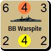
1. The original modding I did for the naval and air counters is too much the same colour of the desert. When I did this, I picked already the perfect "sandy" colour. Which results in too much camouflage in the desert. See BB Repulse.
2. Editing the CSV files is tricky. I edited the CMa file for the CW, and nothing happened. I used the code for the colour in Paint for the BB Repulse for the Indians and they were so repulsed they turned even more sickly than the Italians.
3. Going vice-versa, and starting with the last candidate colour in Paint, I turned it slightly darker. Changed the convoy counter in the bmp file, and somehow turned the nice dark blue border effect in light French blue.

And I forgot the save the colour combination for the convoy. I think it came closer to what it needs to be, but is still a bit "pinkish". Perhaps the red needs to be turned down a bit more.

Currently I am repulsed by my clunsiness - and before I have the same reaction as the Indians in below screenshot, I will give this a bit of a rest. I do would like your opinion on the colour of the convoy.


Attachment (1)

(in reply to AxelNL)
Post #: 57
RE: Graphics Help - 3/7/2014 12:03:37 AM   
WarHunter


Posts: 1207
Joined: 3/21/2004
Status: offline
Using the examples posted so far i came up with this color combination. See if it works for you.

$0089bcd0

The only real problem i see with a Khaki in flames is how the South African units will look. No matter what shade i tried to use, they just don't Khaki well. I did notice Dabrion's countersheet, how they dealt with the color issues. Use white sparingly. Change colors as needed.

Would like some feedback on the South African speedbump. Any suggestions appreciated.


Attachment (1)

_____________________________


“We never felt like we were losing until we were actually dead.”
Marcus Luttrell

(in reply to AxelNL)
Post #: 58
RE: Graphics Help - 3/7/2014 5:30:17 AM   
AxelNL


Posts: 2386
Joined: 9/24/2011
From: The Netherlands
Status: offline
looks very good!

RSA will have to get used in this game they will be discrimated against because of their colour. (pun intended towards their government at that time).

Apartheid was Dutch word, BTW.

(in reply to WarHunter)
Post #: 59
RE: Graphics Help - 3/7/2014 5:36:59 AM   
warspite1


Posts: 41353
Joined: 2/2/2008
From: England
Status: offline

quote:

ORIGINAL: WarHunter

Using the examples posted so far i came up with this color combination. See if it works for you.

$0089bcd0

The only real problem i see with a Khaki in flames is how the South African units will look. No matter what shade i tried to use, they just don't Khaki well. I did notice Dabrion's countersheet, how they dealt with the color issues. Use white sparingly. Change colors as needed.

Would like some feedback on the South African speedbump. Any suggestions appreciated.


warspite1

Looks good - why not just use white for the RSA lettering on the right-hand side?

_____________________________

England expects that every man will do his duty. Horatio Nelson October 1805


(in reply to WarHunter)
Post #: 60
Page:   <<   < prev  1 [2] 3 4 5   next >   >>
All Forums >> [New Releases from Matrix Games] >> World in Flames >> Mods and Scenarios >> RE: Graphics Help Page: <<   < prev  1 [2] 3 4 5   next >   >>
Jump to:


New Messages No New Messages
Hot Topic w/ New Messages Hot Topic w/o New Messages
Locked w/ New Messages Locked w/o New Messages
 Post New Thread
 Reply to Message
 Post New Poll
 Submit Vote
 Delete My Own Post
 Delete My Own Thread
 Rate Posts


Forum Software © ASPPlayground.NET Advanced Edition 2.4.5 ANSI

0.734