Matrix Games Forums

Forums  Register  Login  Photo Gallery  Member List  Search  Calendars  FAQ 

My Profile  Inbox  Address Book  My Subscription  My Forums  Log Out

RE: Graphics Help

 
View related threads: (in this forum | in all forums)

Logged in as: Guest
Users viewing this topic: none
  Printable Version
All Forums >> [New Releases from Matrix Games] >> World in Flames >> Mods and Scenarios >> RE: Graphics Help Page: <<   < prev  2 3 4 5 [6]
Login
Message << Older Topic   Newer Topic >>
RE: Graphics Help - 3/14/2014 7:13:01 PM   
Shannon V. OKeets


Posts: 22095
Joined: 5/19/2005
From: Honolulu, Hawaii
Status: offline

quote:

ORIGINAL: WarHunter


quote:

ORIGINAL: paulderynck
I had hoped the twinges of orange would go with the NATO color.
Edit: now if they were swapped again, along with the orange this time (because I think it looks better with that paler shade of green).
I think this is what's hitting me subconsciously (yes I know it wasn't the flag until 1947)...
Of course on that note, you need to also swap Canada and Australia.


paulderynck, Don't think we want to change Canada and Australia. they are pretty close to the board game colors considering our restrictions. Centuur gave an ok for colorblind players.

Using the flag colors of India is a good idea. I have a few color combos you can look at. See which one catches your fancy.


I have to chuckle at the voting. Almost every one of the six got at least one vote.

Legibility lies in the contrast between adjacent colors. The light orange and the khaki don't have very much contrast to my eye (the good one). Notice that the black has a high contrast with the khaki, so the numbers and letters in black show up clearly. So, I recommend choosing a dark color for the NATO outline and a light color for the NATO interior.

I prefer, in order: top center, top left (a very close 2nd), top right, bottom right. The bottom left and center do not work for me at all, with the IND virtually disappearing against the khaki.

_____________________________

Steve

Perfection is an elusive goal.

(in reply to WarHunter)
Post #: 151
RE: Graphics Help - 3/14/2014 7:34:08 PM   
markb50k


Posts: 1224
Joined: 7/1/2004
From: Spring, TX
Status: offline
can we just go with something and finish this off, and then get a new version of the pack? pleaaaase!!!

I want to feature it in my AAR!

(in reply to Shannon V. OKeets)
Post #: 152
RE: Graphics Help - 3/14/2014 7:41:23 PM   
paulderynck


Posts: 8201
Joined: 3/24/2007
From: Canada
Status: offline
OK everyone gets 4 votes and Warhunter can do a weighted choice selection.

Looking again, I now hereby renounce my first two choices and go with top left first, then top center, top right, bottom right.

_____________________________

Paul

(in reply to markb50k)
Post #: 153
RE: Graphics Help - 3/14/2014 7:57:32 PM   
Centuur


Posts: 8802
Joined: 6/3/2011
From: Hoorn (NED).
Status: offline
I go for top left first.

_____________________________

Peter

(in reply to paulderynck)
Post #: 154
RE: Graphics Help - 3/14/2014 8:08:24 PM   
warspite1


Posts: 41353
Joined: 2/2/2008
From: England
Status: offline
As I said, top left - but I would not use my other three votes as I do not like the others enough, even as 2nd, 3rd and 4th choices.

_____________________________

England expects that every man will do his duty. Horatio Nelson October 1805


(in reply to Centuur)
Post #: 155
RE: Graphics Help - 3/14/2014 8:22:43 PM   
AxelNL


Posts: 2386
Joined: 9/24/2011
From: The Netherlands
Status: offline
ok - top centre,

I suggest Warhunter comes up with something in the middel of top left and top centre.

(in reply to warspite1)
Post #: 156
RE: Graphics Help - 3/14/2014 10:04:37 PM   
WarHunter


Posts: 1207
Joined: 3/21/2004
Status: offline
quote:

ORIGINAL: AxelNL
I suggest Warhunter comes up with something in the middel of top left and top centre.


With all the talk above, Green for the abbreviation it is. Its a darker green to show up better. Added 1 with black outline for comparison. And the previous screenshot also. the orange is in mid range not to light or dark. the Pink one is in case it is all fubar.
deleted Pink choice added a better one.

It has been fun working with you all


Attachment (1)

< Message edited by WarHunter -- 3/14/2014 11:43:11 PM >


_____________________________


“We never felt like we were losing until we were actually dead.”
Marcus Luttrell

(in reply to AxelNL)
Post #: 157
RE: Graphics Help - 3/15/2014 4:40:18 AM   
warspite1


Posts: 41353
Joined: 2/2/2008
From: England
Status: offline

quote:

ORIGINAL: WarHunter

quote:

ORIGINAL: AxelNL
I suggest Warhunter comes up with something in the middel of top left and top centre.


With all the talk above, Green for the abbreviation it is. Its a darker green to show up better. Added 1 with black outline for comparison. And the previous screenshot also. the orange is in mid range not to light or dark. the Pink one is in case it is all fubar.
deleted Pink choice added a better one.

It has been fun working with you all


warspite1

I'm confused - what have you gone with? The previous top left was easily the winner.


_____________________________

England expects that every man will do his duty. Horatio Nelson October 1805


(in reply to WarHunter)
Post #: 158
RE: Graphics Help - 3/15/2014 10:20:42 AM   
AxelNL


Posts: 2386
Joined: 9/24/2011
From: The Netherlands
Status: offline
I see. The 6 on the right are the previous ones.
So we have the 3 on the left which are the new versions, with an orange colour which is the middle of the previous top left and centre. I like that choice for orange.

The three new ones on the left are outlined in black, dark green and the light green of the old top left. For us to comment on.

I think the black is too dull for a CW nation. But that luckely that was only for comparison to the new dark green next to it. That is indeed much nicer for the eyes. The lower one has the same light green as the old top left.

My opinion is that the light green is a bit too light, and the dark green could be a tad lighter.

Conclusion: I think the orange colour is now OK. The green could have a bit more work. Although I would not mind the dark green chosen already.

(in reply to warspite1)
Post #: 159
RE: Graphics Help - 3/15/2014 10:25:56 AM   
warspite1


Posts: 41353
Joined: 2/2/2008
From: England
Status: offline
quote:

ORIGINAL: AxelNL

I see. The 6 on the right are the previous ones.
So we have the 3 on the left which are the new versions, with an orange colour which is the middle of the previous top left and centre. I like that choice for orange.

The three new ones on the left are outlined in black, dark green and the light green of the old top left. For us to comment on.

I think the black is too dull for a CW nation. But that luckely that was only for comparison to the new dark green next to it. That is indeed much nicer for the eyes. The lower one has the same light green as the old top left.

My opinion is that the light green is a bit too light, and the dark green could be a tad lighter.

Conclusion: I think the orange colour is now OK. The green could have a bit more work. Although I would not mind the dark green chosen already.
warspite1

If the choice is between the three on the left - then its the bottom one pour moi.


< Message edited by warspite1 -- 3/15/2014 11:26:10 AM >


_____________________________

England expects that every man will do his duty. Horatio Nelson October 1805


(in reply to AxelNL)
Post #: 160
RE: Graphics Help - 3/15/2014 3:03:06 PM   
WarHunter


Posts: 1207
Joined: 3/21/2004
Status: offline

quote:

ORIGINAL: AxelNL

I see. The 6 on the right are the previous ones.
So we have the 3 on the left which are the new versions, with an orange colour which is the middle of the previous top left and centre. I like that choice for orange.

The three new ones on the left are outlined in black, dark green and the light green of the old top left. For us to comment on.

I think the black is too dull for a CW nation. But that luckely that was only for comparison to the new dark green next to it. That is indeed much nicer for the eyes. The lower one has the same light green as the old top left.

My opinion is that the light green is a bit too light, and the dark green could be a tad lighter.

Conclusion: I think the orange colour is now OK. The green could have a bit more work. Although I would not mind the dark green chosen already.


All correct.

Left bottom has shades of green and orange in between the top left of the original six. Added the Black outlined and darker green for comparison.

I'll get a screen of the counter mix up so everyone can see how it looks completed. That will be the best way to compare everything together. I'll add the bottom left as the Indian colors for now.


_____________________________


“We never felt like we were losing until we were actually dead.”
Marcus Luttrell

(in reply to AxelNL)
Post #: 161
RE: Graphics Help - 3/15/2014 3:45:16 PM   
WarHunter


Posts: 1207
Joined: 3/21/2004
Status: offline
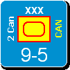
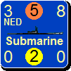
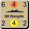
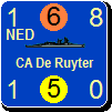
Latest changes to color mix Khaki for CW.
Your thoughts.


Attachment (1)

_____________________________


“We never felt like we were losing until we were actually dead.”
Marcus Luttrell
Post #: 162
RE: Graphics Help - 3/15/2014 4:18:47 PM   
Orm


Posts: 22154
Joined: 5/3/2008
From: Sweden
Status: offline

quote:

ORIGINAL: WarHunter


quote:

ORIGINAL: AxelNL

I see. The 6 on the right are the previous ones.
So we have the 3 on the left which are the new versions, with an orange colour which is the middle of the previous top left and centre. I like that choice for orange.

The three new ones on the left are outlined in black, dark green and the light green of the old top left. For us to comment on.

I think the black is too dull for a CW nation. But that luckely that was only for comparison to the new dark green next to it. That is indeed much nicer for the eyes. The lower one has the same light green as the old top left.

My opinion is that the light green is a bit too light, and the dark green could be a tad lighter.

Conclusion: I think the orange colour is now OK. The green could have a bit more work. Although I would not mind the dark green chosen already.


All correct.

Left bottom has shades of green and orange in between the top left of the original six. Added the Black outlined and darker green for comparison.

I'll get a screen of the counter mix up so everyone can see how it looks completed. That will be the best way to compare everything together. I'll add the bottom left as the Indian colors for now.


I liked the darker green one. It looks spiffy. The previous top left one is also very good.

_____________________________

Have a bit more patience with newbies. Of course some of them act dumb -- they're often students, for heaven's sake. - Terry Pratchett

(in reply to WarHunter)
Post #: 163
RE: Graphics Help - 3/15/2014 4:22:35 PM   
Orm


Posts: 22154
Joined: 5/3/2008
From: Sweden
Status: offline

quote:

ORIGINAL: WarHunter

Latest changes to color mix Khaki for CW.
Your thoughts.


Can the New Zeeland counters have the "NZL" in another colour than white? To me it does not look so good. Especially in the FTR2 (Corsair) counter at the bottom to the right. I think black would be better if no other colour fits.


_____________________________

Have a bit more patience with newbies. Of course some of them act dumb -- they're often students, for heaven's sake. - Terry Pratchett

(in reply to WarHunter)
Post #: 164
RE: Graphics Help - 3/15/2014 4:43:28 PM   
WarHunter


Posts: 1207
Joined: 3/21/2004
Status: offline

quote:

ORIGINAL: Orm
Can the New Zeeland counters have the "NZL" in another colour than white? To me it does not look so good. Especially in the FTR2 (Corsair) counter at the bottom to the right. I think black would be better if no other colour fits.

Orm,
I would love to change the White for NZL. The white on Khaki is not a good fit for most everyone.
Unfortunately whatever code controls the color change to NZL is unknown to me.


_____________________________


“We never felt like we were losing until we were actually dead.”
Marcus Luttrell

(in reply to Orm)
Post #: 165
RE: Graphics Help - 3/15/2014 5:39:27 PM   
AxelNL


Posts: 2386
Joined: 9/24/2011
From: The Netherlands
Status: offline
Just a little bit darker green for the indians, and we're there, I would say.

(in reply to WarHunter)
Post #: 166
RE: Graphics Help - 3/15/2014 6:05:31 PM   
WarHunter


Posts: 1207
Joined: 3/21/2004
Status: offline

quote:

ORIGINAL: AxelNL

Just a little bit darker green for the indians, and we're there, I would say.

I aim to green.


Attachment (1)

_____________________________


“We never felt like we were losing until we were actually dead.”
Marcus Luttrell

(in reply to AxelNL)
Post #: 167
RE: Graphics Help - 3/15/2014 6:10:22 PM   
AxelNL


Posts: 2386
Joined: 9/24/2011
From: The Netherlands
Status: offline
Better.

(in reply to WarHunter)
Post #: 168
RE: Graphics Help - 3/15/2014 6:18:51 PM   
WarHunter


Posts: 1207
Joined: 3/21/2004
Status: offline

quote:

ORIGINAL: AxelNL

Better.

Only better


Does that mean move on to phase "public download" soon?

_____________________________


“We never felt like we were losing until we were actually dead.”
Marcus Luttrell

(in reply to AxelNL)
Post #: 169
RE: Graphics Help - 3/15/2014 7:27:32 PM   
AxelNL


Posts: 2386
Joined: 9/24/2011
From: The Netherlands
Status: offline

it means I would have gone for a little, little bit darker myself, but am awaiting other opinions. If they are positive I think you should move indeed to the next phase. We should post a mix of the general opinion, not from one.

About the missing changes to the skins. We have had no feedback from the others about those files, and the Australian lead has not answered yet. If he does, we can always add the skins after the public release.

(in reply to WarHunter)
Post #: 170
RE: Graphics Help - 3/15/2014 7:32:29 PM   
warspite1


Posts: 41353
Joined: 2/2/2008
From: England
Status: offline
I really like the treatment of the Indian counters.

_____________________________

England expects that every man will do his duty. Horatio Nelson October 1805


(in reply to AxelNL)
Post #: 171
RE: Graphics Help - 3/16/2014 5:25:49 AM   
Shannon V. OKeets


Posts: 22095
Joined: 5/19/2005
From: Honolulu, Hawaii
Status: offline
quote:

ORIGINAL: AxelNL


it means I would have gone for a little, little bit darker myself, but am awaiting other opinions. If they are positive I think you should move indeed to the next phase. We should post a mix of the general opinion, not from one.

About the missing changes to the skins. We have had no feedback from the others about those files, and the Australian lead has not answered yet. If he does, we can always add the skins after the public release.

About the MSKN files, ...

They are not used by the program. You can test this by simply renaming the Skins subdirectory to some other temporary name - the program will still run the same.

My memory is vague about the MSKN files, since I first used them in September 2006, with a second version in December 2007. They were modified in July 2008, and maybe tweaked in December 2009. Most of the changes were to the menus, not the major power background colors.

If I remember correctly, I would need to run a little Delphi utility from Theme Engine to set what the different 'themes' are in the game based on the current files in the Skins folder. Once that is done, every form in the game would use the new set of themes. In other words, it requires recompiling (and linking) the program, which is outside the domain of players.

< Message edited by Shannon V. OKeets -- 3/16/2014 8:59:13 PM >


_____________________________

Steve

Perfection is an elusive goal.

(in reply to AxelNL)
Post #: 172
RE: Graphics Help - 3/16/2014 7:02:02 AM   
paulderynck


Posts: 8201
Joined: 3/24/2007
From: Canada
Status: offline
I think public download is now a go.

_____________________________

Paul

(in reply to Shannon V. OKeets)
Post #: 173
Page:   <<   < prev  2 3 4 5 [6]
All Forums >> [New Releases from Matrix Games] >> World in Flames >> Mods and Scenarios >> RE: Graphics Help Page: <<   < prev  2 3 4 5 [6]
Jump to:


New Messages No New Messages
Hot Topic w/ New Messages Hot Topic w/o New Messages
Locked w/ New Messages Locked w/o New Messages
 Post New Thread
 Reply to Message
 Post New Poll
 Submit Vote
 Delete My Own Post
 Delete My Own Thread
 Rate Posts


Forum Software © ASPPlayground.NET Advanced Edition 2.4.5 ANSI

1.221