Matrix Games Forums

Forums  Register  Login  Photo Gallery  Member List  Search  Calendars  FAQ 

My Profile  Inbox  Address Book  My Subscription  My Forums  Log Out

RE: The Rise and Fall Of An Empire!

 
View related threads: (in this forum | in all forums)

Logged in as: Guest
Users viewing this topic: none
  Printable Version
All Forums >> [New Releases from Matrix Games] >> Strategic Command Series >> Strategic Command WWII War in Europe >> Scenario Design and Modding >> RE: The Rise and Fall Of An Empire! Page: <<   < prev  5 6 [7] 8 9   next >   >>
Login
Message << Older Topic   Newer Topic >>
RE: The Rise and Fall Of An Empire! - 1/26/2017 12:45:30 PM   
TheBattlefield


Posts: 507
Joined: 6/11/2016
Status: offline

quote:

ORIGINAL: Hairog

Sorry if this has already been brought up. My search function isn't working in this forum.

Have mobile supply depots been discussed and how your are going to model them? I suggest that they were key to Napoleonic warfare.

Good idea. But every "special ability" (dive, fly, shipping, rail, airdrop, supply, etc.) of a unit is hard coded. If you know a "work around", please tell me.
I believe that this function (in the current scale and abstraction of the great campaign) is quite well represented by the headquarters. In a campaign a la Waterloo may look quite different again.
Thanks for your feedback, Hairog. How is your impression of our work so far?

(in reply to Hairog)
Post #: 181
RE: The Rise and Fall Of An Empire! - 1/26/2017 12:48:55 PM   
OxfordGuy3


Posts: 1041
Joined: 7/1/2012
From: Oxford, United Kingdom
Status: offline

quote:

ORIGINAL: TheBattlefield


quote:

ORIGINAL: Hairog

Sorry if this has already been brought up. My search function isn't working in this forum.

Have mobile supply depots been discussed and how your are going to model them? I suggest that they were key to Napoleonic warfare.

Good idea. But every "special ability" (dive, fly, shipping, rail, airdrop, supply, etc.) of a unit is hard coded. If you know a "work around", please tell me.
I believe that this function (in the current scale and abstraction of the great campaign) is quite well represented by the headquarters. In a campaign a la Waterloo may look quite different again.
Thanks for your feedback, Hairog. How is your impression of our work so far?


I'd be inclined to agree that, at this scale, the HQs already do a good job of this

(in reply to TheBattlefield)
Post #: 182
RE: The Rise and Fall Of An Empire! - 1/26/2017 2:05:08 PM   
Iñaki Harrizabalagatar


Posts: 825
Joined: 12/11/2001
Status: offline
IMO since you are using figures as icons, it would be best to use them to differentiate units and sizes, you already did this with cavalry (no need of L or H to pick an Hussar from cuirassier). For instance, use one figure for brigade, 2 for division aand so on.

(in reply to Hairog)
Post #: 183
RE: The Rise and Fall Of An Empire! - 1/26/2017 2:35:13 PM   
TheBattlefield


Posts: 507
Joined: 6/11/2016
Status: offline
quote:

ORIGINAL: Iñaki Harrizabalagatar

IMO since you are using figures as icons, it would be best to use them to differentiate units and sizes, you already did this with cavalry (no need of L or H to pick an Hussar from cuirassier). For instance, use one figure for brigade, 2 for division aand so on.

Good idea if you are using soldier miniatures. But it will be a problem using sculptured units. A problem of space on a tiny counter and a problem of graphic aesthetics. Maybe multilayered and slightly displaced shadows of the unit. But I'm fine with the "X" symbol for different sizes of the same (infantry) unit and a "task" icon for special and support units.

< Message edited by TheBattlefield -- 1/26/2017 2:36:36 PM >

(in reply to Iñaki Harrizabalagatar)
Post #: 184
RE: The Rise and Fall Of An Empire! - 1/26/2017 6:02:29 PM   
SIPRES


Posts: 398
Joined: 7/23/2015
Status: offline
Thank you all for feedback

I have seen a problem with tech values display (white text) against the infantry stripe
So I add a dark blue frame for values display (see the Brigade INF compared with the Division one)
I add a "sabretache" for hussard (light CAV)
Nothing yet for dragoons (still thinking, I wonder blade + carbine will maybe difficult to distinguish, I need something more compact)
I add a cuirass for heavy CAV but.... its little bit redundant with the Cuirassier picture, so will see.
I scale up a little the 2 pistols for Guerrilla partisan counter


Any idea for Militia instead of the ugly "M"?


Attachment (1)

(in reply to TheBattlefield)
Post #: 185
RE: The Rise and Fall Of An Empire! - 1/26/2017 6:19:50 PM   
SIPRES


Posts: 398
Joined: 7/23/2015
Status: offline

quote:

ORIGINAL: Iñaki Harrizabalagatar

IMO since you are using figures as icons, it would be best to use them to differentiate units and sizes, you already did this with cavalry (no need of L or H to pick an Hussar from cuirassier). For instance, use one figure for brigade, 2 for division aand so on.

quote:

Iñaki Harrizabalagatar


Hello Iñaki Harrizabalagatar

I do agree with you for cavalry units, but I am not sure some player could differentiate Hussard vs Dragoon or cuirassier if they dont know well Napoleonic uniforms, this is why I wanted to add some distinction item or symbol.

For unit size (mainly Line infantry brigade/Division/corps) I could change the unit portrait for each ones, instead of a generic image.
This could be easy for French, British, Austrians ect... but I expect to have problem for Ottomans as I have some difficulties to find sufficient pictures on ottoman soldiers of Napoleonic wars.

will see

(in reply to Iñaki Harrizabalagatar)
Post #: 186
RE: The Rise and Fall Of An Empire! - 1/26/2017 6:49:17 PM   
TheBattlefield


Posts: 507
Joined: 6/11/2016
Status: offline

quote:

ORIGINAL: SIPRES


Any idea for Militia instead of the ugly "M"?


Whatever size this unit has, please try to use the suitable "X" sign in a different color. (Militia often used as infantry reserve so they should have a uniformly look with the line infantry)


(in reply to SIPRES)
Post #: 187
RE: The Rise and Fall Of An Empire! - 1/26/2017 7:12:04 PM   
Iñaki Harrizabalagatar


Posts: 825
Joined: 12/11/2001
Status: offline
quote:

ORIGINAL: SIPRES


I do agree with you for cavalry units, but I am not sure some player could differentiate Hussard vs Dragoon or cuirassier if they dont know well Napoleonic uniforms, this is why I wanted to add some distinction item or symbol.

For unit size (mainly Line infantry brigade/Division/corps) I could change the unit portrait for each ones, instead of a generic image.
This could be easy for French, British, Austrians ect... but I expect to have problem for Ottomans as I have some difficulties to find sufficient pictures on ottoman soldiers of Napoleonic wars.

will see

I understand your concerns, but I think anyone playing the mod will have the basic knowledge to differentieate them. I hope you do not cloud with too many symbols those beautiful icons you did, IMO ideally differents units/sizes would be recognizable just by the different portraits, leaving additionally only numbers for strength and upgrades.


< Message edited by Iñaki Harrizabalagatar -- 1/26/2017 7:13:13 PM >

(in reply to SIPRES)
Post #: 188
RE: The Rise and Fall Of An Empire! - 1/26/2017 7:29:59 PM   
SIPRES


Posts: 398
Joined: 7/23/2015
Status: offline

quote:

ORIGINAL: TheBattlefield


quote:

ORIGINAL: SIPRES


Any idea for Militia instead of the ugly "M"?


Whatever size this unit has, please try to use the suitable "X" sign in a different color. (Militia often used as infantry reserve so they should have a uniformly look with the line infantry)


huumm..
I wanted to avoid too many colors on counters due to the fact that most of basic colors will be used for Background and then I expect some "melting effect with the colored X

I am not sure to understand what you mean with militia, using same picture as line Infantry?
I was thinking instead to use some nice prussian/Austrian Landwher picture, Opolchenie for Russians ect..
For France I use Bicorn hat unit as it was the case for the garde Nationale of Paris.

I agree with you the militia, reserve, or depot Battaillon were finally droped to the line but not always wearing same uniform (up to country)


(in reply to TheBattlefield)
Post #: 189
RE: The Rise and Fall Of An Empire! - 1/26/2017 7:36:30 PM   
SIPRES


Posts: 398
Joined: 7/23/2015
Status: offline

quote:

ORIGINAL: Iñaki Harrizabalagatar

quote:

ORIGINAL: SIPRES


I do agree with you for cavalry units, but I am not sure some player could differentiate Hussard vs Dragoon or cuirassier if they dont know well Napoleonic uniforms, this is why I wanted to add some distinction item or symbol.

For unit size (mainly Line infantry brigade/Division/corps) I could change the unit portrait for each ones, instead of a generic image.
This could be easy for French, British, Austrians ect... but I expect to have problem for Ottomans as I have some difficulties to find sufficient pictures on ottoman soldiers of Napoleonic wars.

will see

I understand your concerns, but I think anyone playing the mod will have the basic knowledge to differentieate them. I hope you do not cloud with too many symbols those beautiful icons you did, IMO ideally differents units/sizes would be recognizable just by the different portraits, leaving additionally only numbers for strength and upgrades.


Your right, I dont want to overload "too much" the counters, I think it kills readability
Anyway not so much pixels available, and I expect many trouble on scale down for zoom version
Its a shame that game designer dont include an additional zoom level


(in reply to Iñaki Harrizabalagatar)
Post #: 190
RE: The Rise and Fall Of An Empire! - 1/26/2017 8:01:32 PM   
OxfordGuy3


Posts: 1041
Joined: 7/1/2012
From: Oxford, United Kingdom
Status: offline

quote:

ORIGINAL: SIPRES

Thank you all for feedback

I have seen a problem with tech values display (white text) against the infantry stripe
So I add a dark blue frame for values display (see the Brigade INF compared with the Division one)
I add a "sabretache" for hussard (light CAV)
Nothing yet for dragoons (still thinking, I wonder blade + carbine will maybe difficult to distinguish, I need something more compact)
I add a cuirass for heavy CAV but.... its little bit redundant with the Cuirassier picture, so will see.
I scale up a little the 2 pistols for Guerrilla partisan counter


Any idea for Militia instead of the ugly "M"?


I think your solution for the tech display works well

Love the "sabretache" on the hussar unit!

I don't have any better suggestions for the others yet


(in reply to SIPRES)
Post #: 191
RE: The Rise and Fall Of An Empire! - 1/26/2017 8:06:01 PM   
OxfordGuy3


Posts: 1041
Joined: 7/1/2012
From: Oxford, United Kingdom
Status: offline
BTW having thought about it, I think just have the different X/XX/XXX values (as long as displayed clearly) is probably going to be enough to distinguish the units, they looks wonderful as is and too much clutter or mismash of colours will probably ruin that.

BTW very important for us Sharpe fans, is there going to be a separate counter for British Rifles (probably a Brigade strength unit)? :-)

(in reply to OxfordGuy3)
Post #: 192
RE: The Rise and Fall Of An Empire! - 1/26/2017 8:23:58 PM   
TheBattlefield


Posts: 507
Joined: 6/11/2016
Status: offline

quote:

ORIGINAL: SIPRES


quote:

ORIGINAL: TheBattlefield


quote:

ORIGINAL: SIPRES


Any idea for Militia instead of the ugly "M"?


Whatever size this unit has, please try to use the suitable "X" sign in a different color. (Militia often used as infantry reserve so they should have a uniformly look with the line infantry)


huumm..
I wanted to avoid too many colors on counters due to the fact that most of basic colors will be used for Background and then I expect some "melting effect with the colored X

I am not sure to understand what you mean with militia, using same picture as line Infantry?
I was thinking instead to use some nice prussian/Austrian Landwher picture, Opolchenie for Russians ect..
For France I use Bicorn hat unit as it was the case for the garde Nationale of Paris.

I agree with you the militia, reserve, or depot Battaillon were finally droped to the line but not always wearing same uniform (up to country)


Noooooo. Not a different uniform or picture. Leave it as it is. I mean a size-suitable "X" instead of "M" to reflect a kind of line infantry. And different (or lighter or darker or shaded or whatever) color for the "X" to reflect a reserve (weaker) status. Troop identity. Get it?

(in reply to SIPRES)
Post #: 193
RE: The Rise and Fall Of An Empire! - 1/26/2017 8:47:29 PM   
SIPRES


Posts: 398
Joined: 7/23/2015
Status: offline

quote:

ORIGINAL: oxford_guy

BTW having thought about it, I think just have the different X/XX/XXX values (as long as displayed clearly) is probably going to be enough to distinguish the units, they looks wonderful as is and too much clutter or mismash of colours will probably ruin that.

BTW very important for us Sharpe fans, is there going to be a separate counter for British Rifles (probably a Brigade strength unit)? :-)

Hello Oxford guy

dont worry you will get your green jackets (as soon as I start the british file), I plan to use Riflemen Graphics as British skirmisher unit slot.

(in reply to OxfordGuy3)
Post #: 194
RE: The Rise and Fall Of An Empire! - 1/26/2017 8:49:55 PM   
SIPRES


Posts: 398
Joined: 7/23/2015
Status: offline

quote:

ORIGINAL: TheBattlefield


quote:

ORIGINAL: SIPRES


quote:

ORIGINAL: TheBattlefield


quote:

ORIGINAL: SIPRES


Any idea for Militia instead of the ugly "M"?


Whatever size this unit has, please try to use the suitable "X" sign in a different color. (Militia often used as infantry reserve so they should have a uniformly look with the line infantry)


huumm..
I wanted to avoid too many colors on counters due to the fact that most of basic colors will be used for Background and then I expect some "melting effect with the colored X

I am not sure to understand what you mean with militia, using same picture as line Infantry?
I was thinking instead to use some nice prussian/Austrian Landwher picture, Opolchenie for Russians ect..
For France I use Bicorn hat unit as it was the case for the garde Nationale of Paris.

I agree with you the militia, reserve, or depot Battaillon were finally droped to the line but not always wearing same uniform (up to country)


Noooooo. Not a different uniform or picture. Leave it as it is. I mean a size-suitable "X" instead of "M" to reflect a kind of line infantry. And different (or lighter or darker or shaded or whatever) color for the "X" to reflect a reserve (weaker) status. Troop identity. Get it?


I see, maybe a smaller X or faded, I will do some try and in parallel still thinking about any Icon.

(in reply to TheBattlefield)
Post #: 195
RE: The Rise and Fall Of An Empire! - 1/26/2017 8:53:58 PM   
OxfordGuy3


Posts: 1041
Joined: 7/1/2012
From: Oxford, United Kingdom
Status: offline

quote:

ORIGINAL: SIPRES


quote:

ORIGINAL: oxford_guy

BTW having thought about it, I think just have the different X/XX/XXX values (as long as displayed clearly) is probably going to be enough to distinguish the units, they looks wonderful as is and too much clutter or mismash of colours will probably ruin that.

BTW very important for us Sharpe fans, is there going to be a separate counter for British Rifles (probably a Brigade strength unit)? :-)

Hello Oxford guy

dont worry you will get your green jackets (as soon as I start the british file), I plan to use Riflemen Graphics as British skirmisher unit slot.


Hurrah! Has to be done! :-)

(in reply to SIPRES)
Post #: 196
RE: The Rise and Fall Of An Empire! - 1/26/2017 9:36:27 PM   
Hairog


Posts: 1645
Joined: 7/11/2000
From: Cornucopia, WI
Status: offline

quote:

ORIGINAL: TheBattlefield


quote:

ORIGINAL: Hairog

Sorry if this has already been brought up. My search function isn't working in this forum.

Have mobile supply depots been discussed and how your are going to model them? I suggest that they were key to Napoleonic warfare.

Good idea. But every "special ability" (dive, fly, shipping, rail, airdrop, supply, etc.) of a unit is hard coded. If you know a "work around", please tell me.
I believe that this function (in the current scale and abstraction of the great campaign) is quite well represented by the headquarters. In a campaign a la Waterloo may look quite different again.
Thanks for your feedback, Hairog. How is your impression of our work so far?


You're absolutely right TheBattlefield. Headquarter units will work just fine I hadn't thought about that.

My impression is that you guys are doing a wonderful job. The graphics are amazing, and I think the game flow will work quite well with your concept. This is going to be a great mod. I can tell already.

Its so fantastic that Hubert has included such a great editor.


_____________________________

WW III 1946 Books
SC3 EAW WW Three 1946 Mod and Naval Mods
WarPlan and WarPlan Pac Alpha and Be

(in reply to TheBattlefield)
Post #: 197
RE: The Rise and Fall Of An Empire! - 1/27/2017 8:49:34 PM   
TheBattlefield


Posts: 507
Joined: 6/11/2016
Status: offline
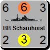
Because of a problem with SIPRES modified experience points and some other difficulties, the counter of the ships had to be completely redesigned. A lot of work, but now everything fits and there are also no more overlaps...


Attachment (1)

(in reply to Hairog)
Post #: 198
RE: The Rise and Fall Of An Empire! - 1/27/2017 8:52:36 PM   
OxfordGuy3


Posts: 1041
Joined: 7/1/2012
From: Oxford, United Kingdom
Status: offline

quote:

ORIGINAL: TheBattlefield

Because of a problem with SIPRES modified experience points and some other difficulties, the counter of the ships had to be completely redesigned. A lot of work, but now everything fits and there are also no more overlaps...


Those ship counters look amazing! Well done!

(in reply to TheBattlefield)
Post #: 199
RE: The Rise and Fall Of An Empire! - 1/27/2017 8:54:47 PM   
OxfordGuy3


Posts: 1041
Joined: 7/1/2012
From: Oxford, United Kingdom
Status: offline

quote:

ORIGINAL: TheBattlefield

Because of a problem with SIPRES modified experience points and some other difficulties, the counter of the ships had to be completely redesigned. A lot of work, but now everything fits and there are also no more overlaps...


BTW do you have any pics of one ship directly above another one? I think it will work with these new counters, though!

Also - please do the English land counters next, can't stand the suspense! :-)

(in reply to TheBattlefield)
Post #: 200
RE: The Rise and Fall Of An Empire! - 1/27/2017 11:20:58 PM   
TheBattlefield


Posts: 507
Joined: 6/11/2016
Status: offline
Check!


Attachment (1)

(in reply to OxfordGuy3)
Post #: 201
RE: The Rise and Fall Of An Empire! - 1/27/2017 11:30:31 PM   
OxfordGuy3


Posts: 1041
Joined: 7/1/2012
From: Oxford, United Kingdom
Status: offline

quote:

ORIGINAL: TheBattlefield

Check!


Perfect!

(in reply to TheBattlefield)
Post #: 202
RE: The Rise and Fall Of An Empire! - 1/28/2017 4:23:10 PM   
SIPRES


Posts: 398
Joined: 7/23/2015
Status: offline

quote:

ORIGINAL: oxford_guy


quote:

ORIGINAL: TheBattlefield

Because of a problem with SIPRES modified experience points and some other difficulties, the counter of the ships had to be completely redesigned. A lot of work, but now everything fits and there are also no more overlaps...


BTW do you have any pics of one ship directly above another one? I think it will work with these new counters, though!

Also - please do the English land counters next, can't stand the suspense! :-)


Very good job Battlefield, The counter is clear, nice, and the National banner is perfect.
Looks like I have to do the Brits Land counters next


(in reply to OxfordGuy3)
Post #: 203
RE: The Rise and Fall Of An Empire! - 1/28/2017 5:23:53 PM   
OxfordGuy3


Posts: 1041
Joined: 7/1/2012
From: Oxford, United Kingdom
Status: offline

quote:

ORIGINAL: SIPRES


quote:

ORIGINAL: oxford_guy


quote:

ORIGINAL: TheBattlefield

Because of a problem with SIPRES modified experience points and some other difficulties, the counter of the ships had to be completely redesigned. A lot of work, but now everything fits and there are also no more overlaps...


BTW do you have any pics of one ship directly above another one? I think it will work with these new counters, though!

Also - please do the English land counters next, can't stand the suspense! :-)


Very good job Battlefield, The counter is clear, nice, and the National banner is perfect.
Looks like I have to do the Brits Land counters next


(in reply to SIPRES)
Post #: 204
RE: The Rise and Fall Of An Empire! - 1/29/2017 4:22:56 PM   
BillRunacre


Posts: 4945
Joined: 7/22/2013
Status: offline
Very impressive work!

_____________________________

Follow us on Twitter: https://twitter.com/FurySoftware

We're also on Facebook! https://www.facebook.com/FurySoftware/

(in reply to OxfordGuy3)
Post #: 205
RE: The Rise and Fall Of An Empire! - 1/29/2017 5:23:58 PM   
SIPRES


Posts: 398
Joined: 7/23/2015
Status: offline
Hello Bill,

Still a lot to do.
The editor is very flexible and the fact that we can MOD all graphics is really a good fun.

If there is a chance (on future update) to add even more Graphics flexibility for minors nations, this could be great.
Something like to choose between 4 different Bitmaps folders for AXIS and 4 different Bitmaps folders for ALLIED.

This could fix my Graphic display for Wurtembergers, Bavarians, Napolitans ect......
And could enhance also the WW2 version (Romanians, Finns, ect...)

Thx for your comments

(in reply to BillRunacre)
Post #: 206
RE: The Rise and Fall Of An Empire! - 1/29/2017 8:10:48 PM   
SIPRES


Posts: 398
Joined: 7/23/2015
Status: offline
The Brits (on going).......


Attachment (1)

(in reply to SIPRES)
Post #: 207
RE: The Rise and Fall Of An Empire! - 1/29/2017 9:54:36 PM   
TheBattlefield


Posts: 507
Joined: 6/11/2016
Status: offline
The British navy also sails. Together with a Privateer and an Armed Merchantmen of the Coalition...


Attachment (1)

(in reply to SIPRES)
Post #: 208
RE: The Rise and Fall Of An Empire! - 1/29/2017 10:04:27 PM   
Cataphract88


Posts: 728
Joined: 10/5/2012
From: Britannia
Status: offline

quote:

ORIGINAL: Bill Runacre

Very impressive work!


+1

It sure is.

_____________________________

Richard

(in reply to BillRunacre)
Post #: 209
RE: The Rise and Fall Of An Empire! - 1/30/2017 12:56:11 PM   
OxfordGuy3


Posts: 1041
Joined: 7/1/2012
From: Oxford, United Kingdom
Status: offline

quote:

ORIGINAL: SIPRES

The Brits (on going).......


Good first pass, though not as polished and clear as the French counters yet. Nice to see the green jackets in there :-)

Are you trying out two different shades of red for the counter? Most the counters have a pinkish hue to them, whereas one (it a Guards counter?) looks a less pink/darker red?

(in reply to SIPRES)
Post #: 210
Page:   <<   < prev  5 6 [7] 8 9   next >   >>
All Forums >> [New Releases from Matrix Games] >> Strategic Command Series >> Strategic Command WWII War in Europe >> Scenario Design and Modding >> RE: The Rise and Fall Of An Empire! Page: <<   < prev  5 6 [7] 8 9   next >   >>
Jump to:


New Messages No New Messages
Hot Topic w/ New Messages Hot Topic w/o New Messages
Locked w/ New Messages Locked w/o New Messages
 Post New Thread
 Reply to Message
 Post New Poll
 Submit Vote
 Delete My Own Post
 Delete My Own Thread
 Rate Posts


Forum Software © ASPPlayground.NET Advanced Edition 2.4.5 ANSI

0.891