Matrix Games Forums

Forums  Register  Login  Photo Gallery  Member List  Search  Calendars  FAQ 

My Profile  Inbox  Address Book  My Subscription  My Forums  Log Out

RE: Board game style mod

 
View related threads: (in this forum | in all forums)

Logged in as: Guest
Users viewing this topic: none
  Printable Version
All Forums >> [New Releases from Matrix Games] >> The Operational Art of War IV >> Mods and Scenarios >> Mods >> RE: Board game style mod Page: <<   < prev  1 [2] 3   next >   >>
Login
Message << Older Topic   Newer Topic >>
RE: Board game style mod - 10/24/2018 9:36:54 PM   
rocketman71


Posts: 441
Joined: 2/20/2007
Status: offline

quote:

ORIGINAL: gliz2

This is a AMAZING ART bro. Kudos to You for Your efforts

Hear, hear! Truly a work of art. That's why I so desperately wanted it to work. Kudos to the maker

(in reply to gliz2)
Post #: 31
RE: Board game style mod - 11/3/2018 2:18:57 AM   
Cabido


Posts: 243
Joined: 12/11/2017
Status: offline
Thanks for the kind feedbacks. I've just updated the page with a new interface mod.


Attachment (1)

(in reply to rocketman71)
Post #: 32
RE: Board game style mod - 11/6/2018 8:34:01 PM   
Cabido


Posts: 243
Joined: 12/11/2017
Status: offline
For those who have downloaded version 1.2 of the mod, here are new cursors (already added to version 1.2.1). These make it easier to distinguish hotspots and movement vs selection functions. They are fancier too. You need to place them in your Cursors folder under Graphics Override. Delete circlesc.cur and cursor1.cur; you should have circlesc.ani, cursor1.ani and crosshai.cur files in this folder.

Attachment (1)

(in reply to Cabido)
Post #: 33
RE: Board game style mod - 11/7/2018 3:36:10 AM   
gwgardner


Posts: 6722
Joined: 4/7/2006
Status: offline
I very much enjoy your mod. Thanks for the updates.

May I ask why the dense urban has a white circle around it? It is the only graphic that seems out of keeping with the rest of the mod, to me.

_____________________________


(in reply to Cabido)
Post #: 34
RE: Board game style mod - 11/7/2018 9:20:27 AM   
Rasputitsa


Posts: 2903
Joined: 6/30/2001
From: Bedfordshire UK
Status: offline

quote:

ORIGINAL: gwgardner

I very much enjoy your mod. Thanks for the updates.

May I ask why the dense urban has a white circle around it? It is the only graphic that seems out of keeping with the rest of the mod, to me.


Is this not part of update v4.1, as I have noticed that it appears when you get a battle report and it highlights the battle hex. I don't know if it's adjustable, e.g. is there an off key ?

_____________________________

"In politics stupidity is not a handicap" - Napoleon

“A people which is able to say everything becomes able to do everything” - Napoleon

“Among those who dislike oppression are many who like to oppress" - Napoleon

(in reply to gwgardner)
Post #: 35
RE: Board game style mod - 11/7/2018 6:05:01 PM   
Cabido


Posts: 243
Joined: 12/11/2017
Status: offline
gwgardner is right. It's part of the mod. I may change it at some point, but it's not that easy. I have tried to create the look of hand drawn board, so as to give a greater impression of a real board game, since we cannot play with perspective or lighting. I could not simply change the drawing style of the dense urban completely (to keep a coherent look) and I have to deal with color limitations, since urban hexes are frequently placed over hills, forest, open, desert, etc. You have to get a color that fits well all those different tonalities. Density alone wasn't enough to distinguish - clearly - a dense urban hex from an urban hex when placed side by side. Since some games use circles to identify cities and dense urban tend to be very important hexes, for their huge defensive bonus and for being, usually, convergence points of roads and railroads, circling was a solution to highlight them as well as defining their borders with relation to urban hex.

Anyway, I may try to find a different solution, at some point, and upload it as an option.

(in reply to Rasputitsa)
Post #: 36
RE: Board game style mod - 11/8/2018 3:57:27 PM   
Rasputitsa


Posts: 2903
Joined: 6/30/2001
From: Bedfordshire UK
Status: offline
Ooops, looking at the wrong white circle !

_____________________________

"In politics stupidity is not a handicap" - Napoleon

“A people which is able to say everything becomes able to do everything” - Napoleon

“Among those who dislike oppression are many who like to oppress" - Napoleon

(in reply to Cabido)
Post #: 37
RE: Board game style mod - 11/9/2018 12:11:06 AM   
sPzAbt653


Posts: 9511
Joined: 5/3/2007
From: east coast, usa
Status: offline
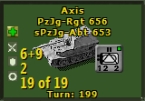
For what it's worth concerning urban and dense urban graphics, I was working on SC3 graphics mods and tried a few variations of urban graphics taken from old board game styles, and none of them looked very nice. I had noticed that some board games used simple circles [as you mention] so I tried them and liked the results enough to use them [as seen below].
Not trying to influence anything, just discussing it


Attachment (1)

(in reply to Cabido)
Post #: 38
RE: Board game style mod - 11/9/2018 8:12:13 PM   
Cabido


Posts: 243
Joined: 12/11/2017
Status: offline
Primitive forms are always an elegant solution. Spheres work very well for cities when we have a low scale map. In a large scale one, we would have multiple spheres for a single city, so it wouldn't work. TOAW uses multiple scales, so we have to find a middle ground.

(in reply to sPzAbt653)
Post #: 39
RE: Board game style mod - 11/10/2018 3:34:47 AM   
rhinobones


Posts: 1540
Joined: 2/17/2002
Status: offline
Much prefer Cabido’s graphics. His graphics design seem to enhance play of the game.

Regards, RhinoBones


_____________________________

Colin Wright:
Comprehensive Wishlist Forum #467 . . . The Norm (blessed be His name, genuflect three times and accept all values in the program as revealed truth)

Pre Combat Air Strikes # 64 . . . I need have no concern about keeping it civil

(in reply to Cabido)
Post #: 40
RE: Board game style mod - 11/16/2018 11:42:48 PM   
Cabido


Posts: 243
Joined: 12/11/2017
Status: offline
Just some additions to the mod.

A flatter looking border for urban hex (the old one is included as well). I have also tweaked the hex outline and included a black version, for those that are hex outline lovers like me. An alternative light urban hex was also included.


Attachment (1)

< Message edited by Cabido -- 11/16/2018 11:46:18 PM >

(in reply to rhinobones)
Post #: 41
RE: Board game style mod - 11/17/2018 6:08:00 PM   
gwgardner


Posts: 6722
Joined: 4/7/2006
Status: offline
Better and better; those urban outlines are so much less intrusive than before.

_____________________________


(in reply to Cabido)
Post #: 42
RE: Board game style mod - 11/18/2018 2:42:32 PM   
Cabido


Posts: 243
Joined: 12/11/2017
Status: offline
I have updated the mod to version 1.4 with new mountains, alpine and hills tiles and some tweaks to urban tiles.

Excuse me those that have just downloaded it for my erratic updates, but I never know when I'll have the time and will to deal with it. Usually it is something that is bothering me while playing.

Anyway, if you use a customized mod, the files that have been changed are listed in the instruction, so you can just grab those.


Attachment (1)

(in reply to gwgardner)
Post #: 43
RE: Board game style mod - 11/18/2018 2:43:44 PM   
Cabido


Posts: 243
Joined: 12/11/2017
Status: offline
One more picture


Attachment (1)

(in reply to Cabido)
Post #: 44
RE: Board game style mod - 11/18/2018 3:48:00 PM   
budd


Posts: 2972
Joined: 7/4/2009
From: Tacoma
Status: offline
This really is fantastic work, thank you for sharing.

_____________________________

Enjoy when you can, and endure when you must. ~Johann Wolfgang von Goethe

"Be Yourself; Everyone else is already taken" ~Oscar Wilde

*I'm in the Wargamer middle ground*
I don't buy all the wargames I want, I just buy more than I need.

(in reply to Cabido)
Post #: 45
RE: Board game style mod - 11/19/2018 9:34:15 PM   
rocketman71


Posts: 441
Joined: 2/20/2007
Status: offline
I have the version of the mod before the interface was added. Now I wanted to update with the new tiles and not the interface so I grabbed the 15 files as noted in the intstructions. Now I get these weird artifacts. How come?


Attachment (1)

(in reply to budd)
Post #: 46
RE: Board game style mod - 11/20/2018 12:00:05 AM   
Cabido


Posts: 243
Joined: 12/11/2017
Status: offline
There was really some uncleaned borders on the hills tiles bitmap. I've cleaned it and have uploaded the corrected version. But it should be noted that it shouldn't display the way it does in the picture you have posted, since the level of transparency is very high. In my computer it is unnoticeable. Anyway, try to use the new version and see if it works for you.

(in reply to rocketman71)
Post #: 47
RE: Board game style mod - 11/20/2018 10:44:08 PM   
rocketman71


Posts: 441
Joined: 2/20/2007
Status: offline
It looks great now again, thanks :)
I just installed all files again. However, I would like to go back to the previous Cursors. Can those be downloaded seperately?

(in reply to Cabido)
Post #: 48
RE: Board game style mod - 11/20/2018 11:28:02 PM   
Cabido


Posts: 243
Joined: 12/11/2017
Status: offline
This depends on what you mean by previous cursors. If you want the original TOAW cursors, just delete the cursors folder inside the graphics override folder. If you mean the cursors of the first version of the mod, just download it on the site (below) and substitute the cursors folder inside the graphics override folder. You'll notice the difference in the file name. The version 1 cursors have, all of them, .cur extension; from version 1.3 on, two of the files have .ani extension.

(in reply to rocketman71)
Post #: 49
RE: Board game style mod - 11/21/2018 3:54:12 PM   
rocketman71


Posts: 441
Joined: 2/20/2007
Status: offline
Solved. I got confused and thought that there were only three cursor files, so the animated ones remained when I updated the other three.
BTW, also had a look at the flow chard player's aid you made. Terrific stuff

(in reply to Cabido)
Post #: 50
RE: Board game style mod - 11/22/2018 6:58:56 PM   
lamarax


Posts: 6
Joined: 6/20/2016
Status: offline
My first post (ok, maybe second) in this forum after many years of lurking and being a Matrix customer, is to thank you for your outstanding work!

Below are my "historically corrected" flag and roundel files, adjusted for your mod. I hope you can find the time to review and integrate them better.

Attachment (1)

(in reply to Cabido)
Post #: 51
RE: Board game style mod - 11/23/2018 4:01:07 PM   
Cabido


Posts: 243
Joined: 12/11/2017
Status: offline
Thanks for the compliment. I'll take a look at your file when I get some time. But it is important to notice that the objective flags are the only thing in my mod with which I'm still very dissatisfied. I didn't find a way to alter the mask used to display the flag. It seems to be coded somewhere. It doesn't seem to be defined by a bitmap mask available for change. I may be wrong, but I've already posted a question about it and got no answer. I have just changed saturation and the flag's borders.

The flags are just extremely invasive, as you can see from the pictures I've posted. They cover all terrain features, but when there are a lot of objective hexes (exactly when they are more invasive) it is mandatory to keep them on. There are two solutions: one is to allow editing the mask and position of the flags in the hex, so that one can design a less invasive solution; the other would be to program a keyboard hotkey to switch on/off the flags and keep them above the counters while pressed (like the way the space bar works). Going to the panel to switch it below, above or off every time is painful, so that I'll keep them on all the time while planning, blocking the view of the terrain features and kind of spoiling the look of the map.


Attachment (1)

< Message edited by Cabido -- 11/23/2018 4:02:53 PM >

(in reply to lamarax)
Post #: 52
RE: Board game style mod - 11/23/2018 4:01:44 PM   
Cabido


Posts: 243
Joined: 12/11/2017
Status: offline
Without flags


Attachment (1)

(in reply to Cabido)
Post #: 53
RE: Board game style mod - 11/25/2018 10:16:44 AM   
gliz2


Posts: 454
Joined: 2/20/2016
Status: offline
I'd wish to make a complaint ;)

The new interface colours are to washed out and not contrasting enough. Yellow on drab green/olive is perefectly visible whereas yellow on beige is I can't see **** :(

Other than that amazing work. They should implement it by default in the next iterration.

(in reply to Cabido)
Post #: 54
RE: Board game style mod - 11/25/2018 11:49:09 AM   
Cabido


Posts: 243
Joined: 12/11/2017
Status: offline
If you refer to the text inside the boxes, they shouldn't be yellow anymore. Are you sure you are using the fonts file provided. Anyway, if you don't want to use the provided fonts, just change them at will in the Player Options menu. Yellow text won't work for sure.


(in reply to gliz2)
Post #: 55
RE: Board game style mod - 11/25/2018 11:58:14 AM   
Cabido


Posts: 243
Joined: 12/11/2017
Status: offline
This is the way it should look. You may prefer the original, but I think it is readable. If you want still further contrast, just don't adjust the transparency as suggested in the instructions.


Attachment (1)

(in reply to Cabido)
Post #: 56
RE: Board game style mod - 11/26/2018 7:35:16 AM   
gliz2


Posts: 454
Joined: 2/20/2016
Status: offline
Ok. Now it looks better. Thank You Sir :)

(in reply to Cabido)
Post #: 57
RE: Board game style mod - 11/26/2018 9:57:42 PM   
tcarusil


Posts: 210
Joined: 5/1/2011
From: Indianapolis, IN
Status: offline
I am trying out this mod and have a question. In the standard Opart4.ini there was a line "HugeIcons=Y" that would make the fonts in the Information Panel larger. This was a big help for my aging eyes. This command does not seem to work with this mod. Am I doing something wrong, or is this feature not supported by the mod?

Thanks for all your effort.

TomC

(in reply to gliz2)
Post #: 58
RE: Board game style mod - 11/26/2018 10:08:03 PM   
Cabido


Posts: 243
Joined: 12/11/2017
Status: offline
The mod doesn't change anything in Opart4.ini. The fonts should continue to work as previously. If you can't get the results you want by changing the ini file, try setting the font's size directly in the fonts editor (Play > Player Options > right arrow > Edit Fonts). I think the Information Panel font is called Status Bar in the editor. Just change the size, leave the editor and press CTRL + R in order to refresh.

(in reply to tcarusil)
Post #: 59
RE: Board game style mod - 11/27/2018 10:16:18 PM   
tcarusil


Posts: 210
Joined: 5/1/2011
From: Indianapolis, IN
Status: offline
You were on the right track, but not the correct name. Changing the font for the "Status Bar" impacts the box at the bottom of the screen. To change the fonts in what I called the "Information Panel" I discovered that the changes need to be made to the "Unit Info Medium Font" and the "Unit Info Value Font".

Again, thanks for your wonderful work on this mod.

TomC

(in reply to Cabido)
Post #: 60
Page:   <<   < prev  1 [2] 3   next >   >>
All Forums >> [New Releases from Matrix Games] >> The Operational Art of War IV >> Mods and Scenarios >> Mods >> RE: Board game style mod Page: <<   < prev  1 [2] 3   next >   >>
Jump to:


New Messages No New Messages
Hot Topic w/ New Messages Hot Topic w/o New Messages
Locked w/ New Messages Locked w/o New Messages
 Post New Thread
 Reply to Message
 Post New Poll
 Submit Vote
 Delete My Own Post
 Delete My Own Thread
 Rate Posts


Forum Software © ASPPlayground.NET Advanced Edition 2.4.5 ANSI

3.453