Zemke
Posts: 642
Joined: 1/14/2003
From: Oklahoma
Status: offline

|
Thanks, Loki for the detailed explanations. I do have a much better understand now, and in my current game, I understand the why and how "better", and I am seeing what is going on based on what you have stated...better.
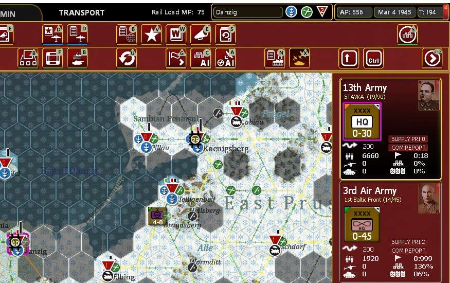
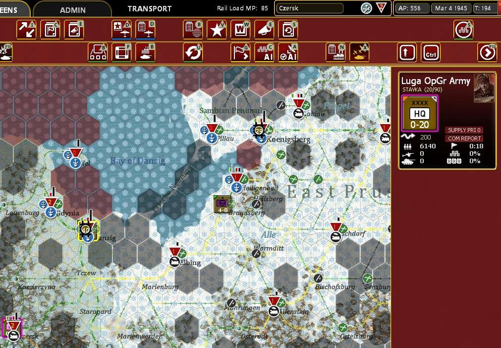
HOWEVER....I agree with Squatter, "One of the things about the logistics system for me, is that sadly it is completely unintuitive. Things you see with your eyes often don't equate to what your intuition would be."
This game and other frankly other Grisby titles flood you with tons of data, which is good. In a real US Army unit or NATO Unit or Command staff, the Commander is not given rems of data to sort through, (Staff Officer's sort through reams of data), the Commander is shown, usually in a visual format, graph or bullet points of the bottom line, at whatever level of Command he is at. This takes place today, in every US Army HQ from Battalion to the Pentagon. Commanders do not see the "data", they see a chart, so they can make a decision (if needed), based on the information. That is what this game and the previous WitE, WitW, and WitP: AE all do not have for the most part. You are forced to dig through the information up and down the chain of command to find critical information. The one thing that could be done better, and frankly is far more realistic, (if we are acting as Commanders), is to present the information simply, and charts are simple. The production graphs are a good start, but I would suggest expanding that concept throughout. I have no idea what programming that would take, but it would certainly make the player's job a lot easier, and save him lots of time.
I am certain 2by3 has access to either some of the designers or playtesters who have served as Staff Officers who would be more than happy to show examples. For Example, I could walk onto the TOC (Tactical Operations Center of my HQ, and see at a glance, Unit Strength, Ammo, Critical Equipment/Weapons status, Main Supply Route Status (MSR), and so on, and it was usually very simple. One way is the "Bubble Chart", showing a particular functional area as either Green, Yellow, Red, or Black. You never wanted to see red or black...bad.
This could be done for every single HQ in the game. Click on the HQ, and you could then click a "Critical Status Chart" or something like that. I can then see at a glance, and if there are issues, and work to fix them, perhaps with even a Recommendation. Commanders always ask their staff, "What is your recommendation" or How do we fix it!" I have heard both statements many times. Currently, you have to dig, and read, and click here, then there.
Not trying to be critical, I think the ideas behind the logistical system are good, and other details, I love the detail. I just don't like having to dig around and find info, that as a real commander I should have in a very easy quick format that anyone understands. The game should not be about who can master the data dig, it should be about making decisions based on easy-to-access information or a picture of what that information represents, ie the "bubble chart" so decisions can be made.
I am adding this: On a Staff, (every staff in the West anyway), the primary functional areas are broken into the big four, (there are other Staff Positions, but these are the main ones), G-1 Personal, G-2 Intelligence, G-3 Operations and G-4 Logistics. Usually, each will give a very short Situational Brief and have usually a couple of slides showing the relevant information for that functional area, (data). This could be done historically and I would expect they would be, given the level of detail. I am not exactly sure of the Soviet organization, but for the Germans, Operations was the Ia, Supply was the Ib, IIa was Personnel and Intelegence was the Ic
< Message edited by Zemke -- 4/1/2021 5:50:52 PM >
_____________________________
"Actions Speak Louder than Words"
|
 Printable Version


 New Messages
 No New Messages
 Hot Topic w/ New Messages
 Hot Topic w/o New Messages
 Locked w/ New Messages
 Locked w/o New Messages
 Post New Thread