Shannon V. OKeets
Posts: 22095
Joined: 5/19/2005
From: Honolulu, Hawaii
Status: offline

|
quote:
ORIGINAL: dhatchen
I like the changes you have shown with these screen shots, specifically:
1 - Iced in ports, great.
2 - Forest, good contrast with swamp now.
3 - Your earlier change to clear terrain, super.
4 - Darker blue outline on rivers, etc, too garish.
5 - The square resource is fine but does not stand out enough, backgound too dark. They are lost in the mountains in Spain (post# 511).
6 - I don't know if you are changing the factory icons yet, but they are poor and inconsistent. In the screen shot in post #510, the factory stack in Leipzig is crooked but one hex to the east the stack is straight. This particular problem is not evident in posts 508 and 509.
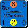
Thanks to pak19652002 for keeping us informed of the useability of these maps for colour-blind people. There are a couple of different types of colour-blindness and it would be good if all kinds were covered. Thanks Steve for being open to this. It would be terrible if anyone was excluded for such a thing.
Dan
#4 - the artist just informed me that he used anti-aliasing in generating the bitmaps I recieved for the rivers and lakes. That was done against a white background and it causes a blurring around the outside at lower levels of zoom. He is going to send me a revised copy without the anti-aliasing. That should help (a lot, I believe).
#6 - the distortion you are seeing in the factories is wholely the result of conversion to jpg - the reds and blues against a white background get particularly messed up. They are fine on the screen at all levels of zoom.
#5 - I see your point, but just barely. There are two opposing goals: maintaining a consistent ambience versus making things noticeable. You are saying the resources are not noticeable enough, I do not want to lose the consistency. But we are just 2 viewers. I would like to hear more opinions on this.
_____________________________
Steve
Perfection is an elusive goal.
|
 Printable Version
 RE: Maps for MWIF -


 RE: Maps for MWIF -

 New Messages
 No New Messages
 Hot Topic w/ New Messages
 Hot Topic w/o New Messages
 Locked w/ New Messages
 Locked w/o New Messages
 Post New Thread