Matrix Games Forums

Forums  Register  Login  Photo Gallery  Member List  Search  Calendars  FAQ 

My Profile  Inbox  Address Book  My Subscription  My Forums  Log Out

RE: MWIF Game Interface Design

 
View related threads: (in this forum | in all forums)

Logged in as: Guest
Users viewing this topic: none
  Printable Version
All Forums >> [New Releases from Matrix Games] >> World in Flames >> RE: MWIF Game Interface Design Page: <<   < prev  35 36 [37] 38 39   next >   >>
Login
Message << Older Topic   Newer Topic >>
RE: MWIF Game Interface Design - 3/26/2008 11:21:30 PM   
Shannon V. OKeets


Posts: 22095
Joined: 5/19/2005
From: Honolulu, Hawaii
Status: offline

quote:

ORIGINAL: Lava

quote:

ORIGINAL: Shannon V. OKeets

The trade off is between "how many" versus "how much detail" is shown. There is only so much real estate available on the screen and if I separate the rows (making each row more specific), then there is less room available for other stuff.


Maybe you are trying to put too much info in one screen. That is what it seems to me. Again, just an impression of someone who has never played the game and not a board gamer.

Have you thought about making two screens... one for ports and one for sea areas? You could then easily list all support ships (as well as all the different classes of ship) and quantities. Six Battleships doesn't mean anything to me unless I can associate it with support ships which can be combined to create task forces.

Ray (alias Lava)

I hadn't thought of that, and you make a good point. I'll mull it over for a while.

There is something fundamentally attractive at having a single form where you can find all the naval units. Which is why I designed the NRS to have the ports and sea areas displayed together.

_____________________________

Steve

Perfection is an elusive goal.

(in reply to *Lava*)
Post #: 1081
RE: MWIF Game Interface Design - 3/27/2008 12:04:46 AM   
warspite1


Posts: 41353
Joined: 2/2/2008
From: England
Status: offline
Steve

The forms are looking good and I think I understand what each is doing. Can you just confirm:
1. Do all ships (or even one ship) moving to a sea box need to be in a Task Force first - and then you move the task force - or is there a drag and drop facility?
2. Do I take it the computer will not "flip" units - and therefore the only way of knowing immediately if a unit is still available that turn will be to click the availability box? If so will this apply to Land and Air units too?

Are the Vichy units a different colour from the ordinary French units? If so that`s an excellent idea that the board game was (understandably) lacking.


(in reply to Shannon V. OKeets)
Post #: 1082
RE: MWIF Game Interface Design - 3/27/2008 1:08:16 AM   
Shannon V. OKeets


Posts: 22095
Joined: 5/19/2005
From: Honolulu, Hawaii
Status: offline
quote:

ORIGINAL: warspite1

Steve

The forms are looking good and I think I understand what each is doing. Can you just confirm:
1. Do all ships (or even one ship) moving to a sea box need to be in a Task Force first - and then you move the task force - or is there a drag and drop facility?
2. Do I take it the computer will not "flip" units - and therefore the only way of knowing immediately if a unit is still available that turn will be to click the availability box? If so will this apply to Land and Air units too?

Are the Vichy units a different colour from the ordinary French units? If so that`s an excellent idea that the board game was (understandably) lacking.


Once units become disorganized, or are 'used' to Intercept naval units or Initiative naval combat, their status indicators are changed. Usually this means that the status indicator in the upper left corner of the unit becomes orange. This applies to all units.

When units are stacked, only the status indicators for the top unit are visible. I played around with trying to show them for the stack (most important on top) but that was way too confusing.

Most forms show the status indicators when they show the units, but that takes up space above and to the left of the unit. For the naval review details and task force details forms I am not showing status indicators. So in these rare instances, yes the unit data panel is where you will find the equivalent of the status indicators for the unit under the cursor.

Vichy units are a different color. For land units, that applies to the entire unit background, but for bitmapped air and naval units, only a horizontal stripe is colored to depict it is Vichy.

I am thinking seriously of having a temporary task force created whenever naval units are moved. To go with that I am thinking of creating a small TF form into which the player 'moves' units. My thinking is quite fuzzy about this at the present. CWIF (and MWIF currently) creates a moving stack and while you do not 'drag' the units to their destination hex as per standard Windows commands, the equivalent is done.

Air units are usually moved one at a time and there is no necessity of moving more than one at a time.

Land units need to be picked up as a stack for performing overruns, but that is pretty easy to allow for, and the mechanism CWIF (now MWFI) uses works fine.

But naval units are different, in that they always move as a group, even if there is only one unit in the 'group'. CWIF's mechanism is a little awkward. I'm thinking I might be able to come up with something better.

[Warning: the vagueness that follows reflects the same in my head.]

1 - Bring up a naval review details form for a port or sea area section box.
2 - Select units from same.
3 - Click on "move units" or 'drag' them off the NRD form.
4 - Move the units (i.e., cursor) to the destination hex, or the first sea area in the path of sea areas through which they are moving.
5 - 'Drop' the units in their final destination hex.

EDIT: Typos.

< Message edited by Shannon V. OKeets -- 3/27/2008 1:11:28 AM >


_____________________________

Steve

Perfection is an elusive goal.

(in reply to warspite1)
Post #: 1083
RE: MWIF Game Interface Design - 3/27/2008 1:18:54 AM   
warspite1


Posts: 41353
Joined: 2/2/2008
From: England
Status: offline
Steve

I like the idea of unlimited Task Forces that you can name or number. I always had problems with large fleet powers e.g. CW, US or Japan where I was trying to juggle numerous stacks all over the place - some of which were for escort, some for shore bombardment, some for landings etc etc. By having a named task force, (suitably disguised!) for each stack, or groups of ships in a stack, this would make life so much easier in remembering what on earth they were supposed to be doing.

(in reply to Shannon V. OKeets)
Post #: 1084
Memo - 3/27/2008 8:55:38 AM   
Stabilo


Posts: 140
Joined: 2/3/2008
Status: offline
In long-lasting games like WIF I often have some ideas one day - and forget them until I play the next time. This happens especially when playing computer games.

When we play WIF we normally make some memo when we stop playing. Will there be any memo in MWIF? Will it be connected with the calendar (e.g. so the players can write a note to be remembered at the start of political/movement/... of any later turn)?

Sorry if this has been discussed before or this is not the right thread...

(in reply to warspite1)
Post #: 1085
RE: Memo - 3/27/2008 10:53:06 AM   
Shannon V. OKeets


Posts: 22095
Joined: 5/19/2005
From: Honolulu, Hawaii
Status: offline

quote:

ORIGINAL: Stabilo

In long-lasting games like WIF I often have some ideas one day - and forget them until I play the next time. This happens especially when playing computer games.

When we play WIF we normally make some memo when we stop playing. Will there be any memo in MWIF? Will it be connected with the calendar (e.g. so the players can write a note to be remembered at the start of political/movement/... of any later turn)?

Sorry if this has been discussed before or this is not the right thread...

Something else I have never considered.

The player has the ability to attach notes to each unit, as I alluded to in discussing task force 'units'.

I would expect players to use the HQ units as the focal points for land operations - attaching notes to individual units saying which HQ the are 'assigned' to. And then the HQ has its own note describing what it, with its group of attached units, is suppose to do.

But for naval units in general and all air units, there is no one unit that would serve as a convenient storage location for plans et al.

For now, I think players can just use non-MWIF text programs, either a word processing program or even NotePad.

Part of my reluctance to provide something more formal is that different players keep different information. Someone this week mentioned production spreadsheets, for instance. Building an elaborate system is beyond the scope for MWIF product 1. I would bet a lot of money that Patrice would like to have the ability to stored maps and mark them up for communicating with other players.

_____________________________

Steve

Perfection is an elusive goal.

(in reply to Stabilo)
Post #: 1086
RE: Memo - 3/27/2008 12:05:16 PM   
Stabilo


Posts: 140
Joined: 2/3/2008
Status: offline
OK so it will be the old pen and paper way.

(in reply to Shannon V. OKeets)
Post #: 1087
RE: Memo - 3/27/2008 1:11:36 PM   
*Lava*


Posts: 1924
Joined: 2/9/2004
Status: offline
Well...

Why can't you make a "Task Force Unit" which is created when you combine 2 or more naval units? It needn't be more than a counter which the player names... "4.1.1" It would serve as an administrative HQ (which you can attach notes to) and makes movement of stacks easy (stack automatically moves with TF counter). You just grab the "TF" counter and drop it where you want it to go and all the ships attached to the Task Force go there.

A mockup for your perusal (notice I included Task Forces with the Carriers)...


You could... given you care to... even create a number of different types:

CTF: Carrier Task Force
ATF: Amphibious Task Force
TF: General Grouping of ships

It's more "Navyish" to have some sort of structure then just a stack of ships and it would be functional in that it would make it easier for the player to group and move his "Task Forces" (strategic kinda thing which reduces accounting) vs individual ships (tactical kinda thing which for a major power could be a nightmare).

Also, given that you want to create a Task force kinda thing and list all the different types of ships available in the game, it makes much more sense to divide the NRS into 2 pages.

Ray (alias Lava)

< Message edited by Lava -- 3/27/2008 1:49:27 PM >

(in reply to Stabilo)
Post #: 1088
RE: Memo - 3/27/2008 8:40:03 PM   
Shannon V. OKeets


Posts: 22095
Joined: 5/19/2005
From: Honolulu, Hawaii
Status: offline

quote:

ORIGINAL: Lava

Well...

Why can't you make a "Task Force Unit" which is created when you combine 2 or more naval units? It needn't be more than a counter which the player names... "4.1.1" It would serve as an administrative HQ (which you can attach notes to) and makes movement of stacks easy (stack automatically moves with TF counter). You just grab the "TF" counter and drop it where you want it to go and all the ships attached to the Task Force go there.

A mockup for your perusal (notice I included Task Forces with the Carriers)...


You could... given you care to... even create a number of different types:

CTF: Carrier Task Force
ATF: Amphibious Task Force
TF: General Grouping of ships

It's more "Navyish" to have some sort of structure then just a stack of ships and it would be functional in that it would make it easier for the player to group and move his "Task Forces" (strategic kinda thing which reduces accounting) vs individual ships (tactical kinda thing which for a major power could be a nightmare).

Also, given that you want to create a Task force kinda thing and list all the different types of ships available in the game, it makes much more sense to divide the NRS into 2 pages.

Ray (alias Lava)

Ok. Thanks.

What I will do is give the player the option of seeing just ports, just sea areas, or both. If he chooses either of the first two, more details will be provided. For both, I'll use pretty much what I have been showing previously in this thread for teh naval review summary form..

All three of these options will use the same form, I'll just modify what is shown dynamically, which isn't that difficult to do.

I should have a first pass containing those revisions in the next few hours.

What I am wondernig about is how to show summary statistics on:
1 - air and land units in ports that are not aboard transports, and
2 - land based air units in sea areas.

We will have a lot of room for additional rows when just showing ports/sea areas, so that is not a serious constraint. But I would like each row to be meaningful, not so fine-grained as to produce zero entries 90% of the time.

_____________________________

Steve

Perfection is an elusive goal.

(in reply to *Lava*)
Post #: 1089
RE: Memo - 3/27/2008 8:47:02 PM   
Shannon V. OKeets


Posts: 22095
Joined: 5/19/2005
From: Honolulu, Hawaii
Status: offline
I forgot to add,...

Putting the task force units in with the carriers is a good idea.

I do not want to impose a structure on task forces, but will let the player name them however he likes. If he wants to use ATF as part of the name, that is up to him.

Some players may want to place all naval units in task forces, rather than have any "stray ships". For example, there could be an Atlantic Reserve East TF in Liverpool and Atlantic Reserve West TF in Norfolk. Though putting every convoy unit in a task force strikes me as a bit excessive.

_____________________________

Steve

Perfection is an elusive goal.

(in reply to Shannon V. OKeets)
Post #: 1090
RE: Memo - 3/27/2008 9:08:05 PM   
*Lava*


Posts: 1924
Joined: 2/9/2004
Status: offline
quote:

ORIGINAL: Shannon V. OKeets

All three of these options will use the same form


Options... can't have enough.

Probably as a newbie I would want to see the most detailed reports, but as I gain experience, the more condensed version will probably do.

As for Task Forces, totally agree, allowing the player to name them is a great way of allowing them to organize in a way which makes the most sense for the individuals style of play.

Thanks for your patience...

Ray (alias Lava)

(in reply to Shannon V. OKeets)
Post #: 1091
RE: Memo - 3/27/2008 9:49:41 PM   
Froonp


Posts: 7995
Joined: 10/21/2003
From: Marseilles, France
Status: offline
quote:

ORIGINAL: Stabilo

OK so it will be the old pen and paper way.

Why ?
It can be the Excel & Word way, why not ? You're on a computer, you're just a ALT+TAB away from all its resources.

(in reply to Stabilo)
Post #: 1092
RE: Memo - 3/27/2008 9:55:04 PM   
Froonp


Posts: 7995
Joined: 10/21/2003
From: Marseilles, France
Status: offline
I like the more detailed list of ships that Lava made on is draft drawing.

(in reply to *Lava*)
Post #: 1093
RE: Memo - 3/27/2008 11:02:32 PM   
*Lava*


Posts: 1924
Joined: 2/9/2004
Status: offline
quote:

ORIGINAL: Shannon V. OKeets

What I am wondernig about is how to show summary statistics on:
1 - air and land units in ports that are not aboard transports, and
2 - land based air units in sea areas.


Well...

For air and land units in ports, if you use two different screens, the Ports screen has room at the bottom of the left side below the summary totals to add a new info box. Or you could take the info box you already have, enlarge it and split it into two sections... "Ships/Profile" and "Port Units."

As for land based air units in sea areas, I would use a horizontally prioritized unit listing utilizing the "Carriers" box and rename it "Task Forces, Carriers, Aircraft." Thus, you have TF counters first, then the carriers with their compliment of aircraft to the right of the counter, followed below by any land based air units in the area stacked downwards individually like you do with the Cruisers.

Just ideas...

Ray (alias Lava)

< Message edited by Lava -- 3/27/2008 11:03:58 PM >

(in reply to Shannon V. OKeets)
Post #: 1094
RE: Memo - 3/27/2008 11:28:49 PM   
warspite1


Posts: 41353
Joined: 2/2/2008
From: England
Status: offline
.....Excellent ideas too IMO - I couldn`t quite see the point of changing to split screens (when you first mentioned it) for ports and sea boxes but with the aid of your mock up I can see how much space saving there is which can be used for port units and more detail on the counter make up.

Any chance of a mock up of your second point so we can see how it would look rather than try an visualise it?  

(in reply to *Lava*)
Post #: 1095
RE: Memo - 3/28/2008 12:48:07 AM   
Shannon V. OKeets


Posts: 22095
Joined: 5/19/2005
From: Honolulu, Hawaii
Status: offline

quote:

ORIGINAL: Lava

quote:

ORIGINAL: Shannon V. OKeets

What I am wondernig about is how to show summary statistics on:
1 - air and land units in ports that are not aboard transports, and
2 - land based air units in sea areas.


Well...

For air and land units in ports, if you use two different screens, the Ports screen has room at the bottom of the left side below the summary totals to add a new info box. Or you could take the info box you already have, enlarge it and split it into two sections... "Ships/Profile" and "Port Units."

As for land based air units in sea areas, I would use a horizontally prioritized unit listing utilizing the "Carriers" box and rename it "Task Forces, Carriers, Aircraft." Thus, you have TF counters first, then the carriers with their compliment of aircraft to the right of the counter, followed below by any land based air units in the area stacked downwards individually like you do with the Cruisers.

Just ideas...

Ray (alias Lava)

I've already decided, and coded, putting the number of carrier air units aboard carriers in with the carrier number. 4:3 means there are 4 carriers whcih are carrying 3 carrier air units.
===
That lets me do what Patrice wanted with splitting the # of units that can invade from other cargo. 3:1 would mean 3 units that can invade and 1 that cannot. This only pertains to sea areas though. Until units are assigned to transports, it would just be guesses about the number that can invade. Yes, I could work that out, but it would take a lot of effort and I do not see a substantial gain. For instance, you could take a corps unit that could not invade and break it down into two divisions that could invade. Far too complex for a 'simple' summary statistic.

_____________________________

Steve

Perfection is an elusive goal.

(in reply to *Lava*)
Post #: 1096
RE: Memo - 3/28/2008 1:23:03 AM   
Shannon V. OKeets


Posts: 22095
Joined: 5/19/2005
From: Honolulu, Hawaii
Status: offline
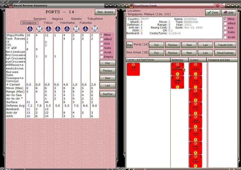
Here is where I am currently.

The Focus box is new and lets the player choose from one of the 3 layouts. I'll finish Both first and then do the other 2.

Note that the carriers row now shows the # of carrier air units too, following the colon.

I have added a Clear Column button, so the player can insert a blank column if he wants.

The filters are now working (except for Empty), which is why the # of ports with units is 12 but only 6 occupied ports are listed. That's because the CW only has units in those 6 ports. The same is true for the sea areas.

Displays is how I am going to handle Saved Display/configurations of columns. What is being saved are the 8 ports, 8 sea areas, and the Focus setting. If the focus is on the ports, then no sea areas will be saved. When a saved display/configuration is restored, I'll use whatever the current filter settings are and instantiate the columns according to which ports and sea areas have been saved. Oh, and the focus setting will be restored too.

Under the word Display there is room for the names of about a dozen different Saved Displays. There are none listed in this screen shot - more code needs to be written first. Left clicking on the name of a Saved Display will restore it. Right clicking on the word Displays will let you bring one in from disk, and save the current one. Right clicking on one of the Saved Display names will let you Rename, Delete, or Redefine it. For the last, the current setting will override whatever had been saved before under the given name.


Attachment (1)

_____________________________

Steve

Perfection is an elusive goal.

(in reply to Shannon V. OKeets)
Post #: 1097
RE: Memo - 3/28/2008 1:31:35 AM   
Shannon V. OKeets


Posts: 22095
Joined: 5/19/2005
From: Honolulu, Hawaii
Status: offline
How about this layout for the port symbols?


Attachment (1)

_____________________________

Steve

Perfection is an elusive goal.

(in reply to Shannon V. OKeets)
Post #: 1098
RE: Memo - 3/28/2008 1:54:52 AM   
Norman42


Posts: 244
Joined: 2/9/2008
From: Canada
Status: offline

quote:

ORIGINAL: Shannon V. OKeets

How about this layout for the port symbols?


I like it.

Above the data, but doesnt push the port names too far away from thier symbols.


_____________________________

-------------

C.L.Norman

(in reply to Shannon V. OKeets)
Post #: 1099
RE: Memo - 3/28/2008 2:16:25 AM   
composer99


Posts: 2923
Joined: 6/6/2005
From: Ottawa, Canada
Status: offline
I still kind of like having the port symbols under all the names. However, your notion in post #1098 couples each port with its corresponding symbol more effectively, which must be reckoned an improvement.

Edit: Correcting a split infinitive. Just because it works for Star Trek doesn't mean it works for everything.

< Message edited by composer99 -- 3/28/2008 2:20:47 AM >


_____________________________

~ Composer99

(in reply to Norman42)
Post #: 1100
RE: Memo - 3/28/2008 2:17:06 AM   
*Lava*


Posts: 1924
Joined: 2/9/2004
Status: offline
Hi!

Personally, I like the port symbol below all the port names.

As for the addition of aircraft unit data for the carriers... that is excellent.

Ray (alias Lava)

(in reply to Norman42)
Post #: 1101
RE: Memo - 3/28/2008 8:11:18 AM   
Stabilo


Posts: 140
Joined: 2/3/2008
Status: offline

quote:

ORIGINAL: Froonp

quote:

ORIGINAL: Stabilo

OK so it will be the old pen and paper way.

Why ?
It can be the Excel & Word way, why not ? You're on a computer, you're just a ALT+TAB away from all its resources.


The problem is to be remembered to your plans at the right moment. So I hoped for a system of notes with a calendar system. Then a massage "2 fighters!" could be written down during movement and would pop up exactly at the start of the next construction phase (like in Outlook).

If you work with Word or Excel you have to look there every impuls and every phase - I'm sure I will not do this.

(in reply to Froonp)
Post #: 1102
RE: Memo - 3/28/2008 9:13:31 AM   
warspite1


Posts: 41353
Joined: 2/2/2008
From: England
Status: offline

quote:

ORIGINAL: Shannon V. OKeets

How about this layout for the port symbols?

quote:

Warspite1

Sorry Steve - but I still prefer the Port symbols below the names - as it looks in 1097.

(in reply to Shannon V. OKeets)
Post #: 1103
RE: Memo - 3/28/2008 10:57:03 AM   
Froonp


Posts: 7995
Joined: 10/21/2003
From: Marseilles, France
Status: offline
quote:

ORIGINAL: Shannon V. OKeets
How about this layout for the port symbols?

I like it.

(in reply to Shannon V. OKeets)
Post #: 1104
RE: Memo - 3/28/2008 10:58:21 AM   
Froonp


Posts: 7995
Joined: 10/21/2003
From: Marseilles, France
Status: offline
quote:

ORIGINAL: Shannon V. OKeets
I've already decided, and coded, putting the number of carrier air units aboard carriers in with the carrier number. 4:3 means there are 4 carriers whcih are carrying 3 carrier air units.
===

And this is GREAT !

(in reply to Shannon V. OKeets)
Post #: 1105
RE: Memo - 3/28/2008 1:04:20 PM   
hakon


Posts: 298
Joined: 4/15/2005
Status: offline
The logical extension is to do the same with transports and SCS (divs), then, i guess?

(in reply to Froonp)
Post #: 1106
RE: Memo - 3/28/2008 8:39:32 PM   
Shannon V. OKeets


Posts: 22095
Joined: 5/19/2005
From: Honolulu, Hawaii
Status: offline

quote:

ORIGINAL: hakon

The logical extension is to do the same with transports and SCS (divs), then, i guess?

I know not what you are referring to.

_____________________________

Steve

Perfection is an elusive goal.

(in reply to hakon)
Post #: 1107
RE: Memo - 3/28/2008 8:41:31 PM   
Shannon V. OKeets


Posts: 22095
Joined: 5/19/2005
From: Honolulu, Hawaii
Status: offline
Here is my first pass on the help text for the naval review summary form. The first part is the same for all four forms (NRD, NRS, TFD, TFS).
=============
Introduction
There are four closely related forms for working with naval units: Naval Review Details, Naval Review Summary, Task Force Details, and Task Force Summary. These are referred to as NRD, NRS, TFD, and TFS respectively. The NRD and TFD forms have very similar visual designs; and the same is true for the NRS and TFS forms. Also, each of the forms only uses half of the minimum screen area, so that two of these forms can be shown side by side.

However, it is important to understand that each of the four forms is used to accomplish different tasks while playing. You might start by showing the NRD form to see all the units in a port, and then bring up the NRS form alongside of it, to see a summary of naval units in other ports and sea areas. From there you can use the NRS form to select a port or sea area, and refresh the NRD to see the units in the selected port/sea area.

Or, you might start with the NRD form for a sea area and bring up the TFD form for a task force that is in that sea area. You could then replace the NRD form with the TFS form to locate all the task forces under your command. Just like using the NRS and NRD forms together, you can use the TFS and TFD forms together, clicking on a task force in the TFS to refresh the TFD form with the information on the selected task force. The combination of TFS and TFD lets you review all your (or your enemy’s) task forces quickly and in great detail.

Another common use for these forms is to bring up the NRD for a port or sea area section box and then create a task force from the units in the selected port/sea area section box. It’s not possible to create a task force using units from different sections of a sea area, since the rules forbid them from moving as a group. The setup form has a button to initiate this task where the NRD form contains the units in the setup tray’s current location (e.g., US West Coast) and the TFD is placed alongside the NRD so you can create a new task force from the units to be setup. The advantage here is that once you have defined your task force, you merely place the single TF unit on the map, instead of having to place all the individual units.

By giving your task forces meaningful names and attaching Notes to them, you can identify the task/purpose for each of them. Though I would advise against naming them Invade Calais Task Force, unless you really meant to use them to invade Normandy.

A common activity when the NRD and TFD are shown side-by-side is to exchange units between them, modifying the composition of your task forces. Since task forces are purely MWIF administrative units, they have no interaction with the WIF rules. Creating, disbanding, and modifying task forces can be freely done at any time during game play, completely ignoring all rules concerning game play.


-----------------------
Naval Review Summary
The NRS form is three reports in one. Since naval units can only be located in two places on the map: in port or at sea, the NRS form provides the ability for you to focus on one of those two locations or both at once. When ports are the focal point, summary statistics are shown for up to 8 ports at a time. The same is true for sea areas when they are the focus of the report. Alternatively, you can choose to view both together, 8 of each. The Both report provides less detail than when the focus in on ports or sea areas alone. For example, the summary statistic for carriers in the Both report is for all carrier types, while when reviewing Ports or Sea Areas alone, the carriers are broken out into separate counts for: Carriers, Light Carriers, and ASW Carriers. So, the first control you need to set when viewing an NRS report is the Focus.

The second consideration is whose units you wish to view. Similar to the NRD report, the NRS contains filters for Mine, Allied, Axis, Subs, and Available. It does not have the Task Force filter. Instead all the units assigned to task forces are treated as individual units for the purpose of compiling summary statistics. It does have an additional filter labeled Empty. The Empty filter controls whether the report should display ports and sea areas even if there are no units therein that pass the filter. This is convenient when you want to know what units are in a sea area, even when there are no units in the sea area. This comes up a lot when you change the filters, since there often are only units from one side in a sea area. Rather than have a sea area column disappear from the report because there are no enemy ships present, having the Empty filter set means that the columns being displayed do not change when you change the filters

Which leads to the third decision you need to make when setting up a Naval Review Summary report: which ports and sea areas do you want to review? While it would be nice to see them all at once, the design decision to limit the footprint of the NRS form to half of the minimal screen means that no more than 8 of each can be seen at the same time. However, you have the ability to fine tune what is shown in each column of summary statistics and to save and restore these ‘Displays’ to disk for use at other times and when playing different major powers. Saved display files have the extension NRS.

To change which port or sea area is the subject of the summary statistics in a column, there are 7 buttons provided. The standard navigational buttons of: First, Previous, Next, and Last let you cycle through all the possible ports or sea areas. There is only one set of navigational buttons on the NRS report - the NRD has two sets, one for ports and another for sea areas. To use the navigational buttons, you must first select a column that you want to change. Depending on whether you have selected a port column or a sea area column, the program then cycles through either ports or sea areas.

When choosing the First, Previous, Next, and Last entries, the program applies the filters. If the Empty filter is Off, then the program only shows ports/sea areas that contain at least one unit the passes the filters. When the Empty filter is On, all ports and sea areas are eligible for being shown when cycling through them. Note that there are 81 sea areas and a similar number of ports, so it can take a while before you get to the one you want when the Empty filter is On.

To speed up that process, you can use the Find Port or Find Sea Area buttons. Those bring up an alphabetically sorted list of names for each location type. You can then immediately choose the port or sea area to replace what is currently being shown in the selected column. You can also use the Clear Column button to blank out a column. Using all 7 of these buttons you can define exactly which columns are displayed on the NRS form.

And once you have created the display the way you like it, you can save it by right clicking on the label Displays. That brings up a menu which contains the option Save Display. After you have chosen a name for your display, the settings for the focus and column selections are stored to disk and the display name is placed under the word Displays. You can then create more named displays, with up to 12 different displays listed under the label Displays. The advantage of having displays listed by name on the NRS form is that you can switch between them by simply clicking on the display name.

Other menu options available for controlling displays are: Restore, Rename, Delete (from the list of names, not from the disk), and Redefine. Restore is great when you are first learning to play MWIF, since there are dozens of displays already saved to disk by experienced players. You do not have to create your own from scratch. Redefine lets you modify a display and then have those changes made permanent by writing them out to the disk file.

The Carriers row includes regular carriers, light carriers, and ASW carriers. It has two numbers shown. The first is the number of carriers present and the second, which follows the colon, is the number of carrier air units aboard those carriers. Obviously, the second number is only shown when the optional rule for Carrier Planes is being used.

The Cruisers row includes heavy, light, and auxiliary cruisers, plus ASW escorts. Note that this count includes these unit types even if they are carrying divisions.

The Naval Transport row includes naval transport, amphibious units, and the Queens. This is a raw capacity number and does not differentiate whether the transport is empty or full.

When you are looking sea areas, the # Carried row contains two numbers: the number of units that are capable of invading, followed by the number which can not currently invade. This distinction takes into account the unit type of the transport, the unit type of the cargo, and the sea area section box. It does not take into consideration weather or the presence of invadable hexes adjacent to the sea area.

The only other unique aspect to sea areas, is the Sea Boxes row at the top of the column. This simply lists which sea area section boxes are occupied - given the current filter settings!

Bear in mind that the Naval Review Summary form is designed to provide summary statistics for an overview. You will almost always want to delve deeper into specifics for a port or sea area using the NRD form and/or the detailed map. Other information sources for on-map naval units are Flyouts and the Units in Hex panel.


_____________________________

Steve

Perfection is an elusive goal.

(in reply to Shannon V. OKeets)
Post #: 1108
RE: Memo - 3/28/2008 10:15:14 PM   
Froonp


Posts: 7995
Joined: 10/21/2003
From: Marseilles, France
Status: offline
quote:

ORIGINAL: Shannon V. OKeets


quote:

ORIGINAL: hakon

The logical extension is to do the same with transports and SCS (divs), then, i guess?

I know not what you are referring to.

I suppose he means : X:Y.
X is the number of TRS, Y is the number of transported units.

(in reply to Shannon V. OKeets)
Post #: 1109
RE: Memo - 3/28/2008 11:11:34 PM   
Shannon V. OKeets


Posts: 22095
Joined: 5/19/2005
From: Honolulu, Hawaii
Status: offline

quote:

ORIGINAL: Froonp

quote:

ORIGINAL: Shannon V. OKeets


quote:

ORIGINAL: hakon

The logical extension is to do the same with transports and SCS (divs), then, i guess?

I know not what you are referring to.

I suppose he means : X:Y.
X is the number of TRS, Y is the number of transported units.

Oh.

Well, then the reason that doing so with transports doesn't work as well, is that there are several possible interpretations that might come to mind when two numbers are shown: TRS versus AMPH being the main possibility.

-----

I am trying to avoid placing 2 numbers in a cell because there really isn't enough room if they are both double digits. I'm betting that having 10 carriers in a sea area or port is going to be rare. Similarly, having 10 units that can invade from a sea area shouldn't occur very often.

I'll probably write code to check for whether the text fits in the available space and reduce the size of the font if it doesn't. That's a pain to do, but the code exists elsewhere, so it is merely a task of cloning it.

_____________________________

Steve

Perfection is an elusive goal.

(in reply to Froonp)
Post #: 1110
Page:   <<   < prev  35 36 [37] 38 39   next >   >>
All Forums >> [New Releases from Matrix Games] >> World in Flames >> RE: MWIF Game Interface Design Page: <<   < prev  35 36 [37] 38 39   next >   >>
Jump to:


New Messages No New Messages
Hot Topic w/ New Messages Hot Topic w/o New Messages
Locked w/ New Messages Locked w/o New Messages
 Post New Thread
 Reply to Message
 Post New Poll
 Submit Vote
 Delete My Own Post
 Delete My Own Thread
 Rate Posts


Forum Software © ASPPlayground.NET Advanced Edition 2.4.5 ANSI

2.328