Matrix Games Forums

Forums  Register  Login  Photo Gallery  Member List  Search  Calendars  FAQ 

My Profile  Inbox  Address Book  My Subscription  My Forums  Log Out

RE: MWIF Game Interface Design

 
View related threads: (in this forum | in all forums)

Logged in as: Guest
Users viewing this topic: none
  Printable Version
All Forums >> [New Releases from Matrix Games] >> World in Flames >> RE: MWIF Game Interface Design Page: <<   < prev  50 51 [52] 53 54   next >   >>
Login
Message << Older Topic   Newer Topic >>
RE: MWIF Game Interface Design - 11/28/2008 5:11:08 AM   
macgregor


Posts: 990
Joined: 2/10/2004
Status: offline
quote:

ORIGINAL: Joe 98

This is a grand strategy game. Artilery usually comes under command at divisional level

1. If a counter represents a division, why are artillery units shown as separate units?

2. Are there separate counters for anti tank units?


True but as this game features optional builds it allows the player to invest in artillery divisions, which can be more effective at softening up well entrenched positions. Artillery divisions did and still do exist, though often extra batteries(II,III,X) are split among assaulting divisions. IMO the game handles this appropriately; either the same as it would concentrated air strikes or as so many more combat strength points.
Yes there are separate units for AT gun concentrations as well that notwithstanding attack/defend posture on certain units, are doubled against armor though cannot make strikes.

< Message edited by macgregor -- 11/28/2008 5:17:18 AM >

(in reply to Fred98)
Post #: 1531
RE: MWIF Game Interface Design - 11/28/2008 8:12:00 AM   
Shannon V. OKeets


Posts: 22095
Joined: 5/19/2005
From: Honolulu, Hawaii
Status: offline

quote:

ORIGINAL: Joe 98

This is a grand strategy game. Artilery usually comes under command at divisional level

1. If a counter represents a division, why are artillery units shown as separate units?

2. Are there separate counters for anti tank units?

-

Greg's answer is correct. You might want to look at the tutorial pages (one of the top threads has links to all the tutorials) which detail the different unit types. There are separate tutorials (10 tutorials, 100+ pages in all) for land, naval, and air units: the different types, their movement and combat abiltiies.


_____________________________

Steve

Perfection is an elusive goal.

(in reply to Fred98)
Post #: 1532
RE: MWIF Game Interface Design - 11/28/2008 3:36:19 PM   
composer99


Posts: 2923
Joined: 6/6/2005
From: Ottawa, Canada
Status: offline
Also most of the land units are corps/army scale.

_____________________________

~ Composer99

(in reply to Shannon V. OKeets)
Post #: 1533
RE: MWIF Game Interface Design - 11/28/2008 11:38:43 PM   
paulderynck


Posts: 8201
Joined: 3/24/2007
From: Canada
Status: offline

quote:

ORIGINAL: Joe 98

This is a grand strategy game. Artilery usually comes under command at divisional level

1. If a counter represents a division, why are artillery units shown as separate units?

2. Are there separate counters for anti tank units?

-


1. Its part of adding divisons to the game and can be WiFzened to represent abnormally large concentrations of artillery similar to how the Soviets operated. They are not really historical units IMO.

2. Yes and similar WiFzen for them applies IMO.

_____________________________

Paul

(in reply to Fred98)
Post #: 1534
RE: MWIF Game Interface Design - 2/28/2009 8:47:37 PM   
Shannon V. OKeets


Posts: 22095
Joined: 5/19/2005
From: Honolulu, Hawaii
Status: offline
I have been doing some revisions to the presentation of information during land combat. One thing I feel compelled to do is to provide players all the stuff that is done internally regarding combat. Since not everyone wants to see this all the time, the land combat chart is only shown when the player clicks on a button on the land comabt resolution form (where there might be multiple land combats shown, awaiting resolution).

There are basically 3 places in the sequence of play where this form might be displayed:
1 - before the combat type has been chosen,
2 - after the combat type has been chosen but the die has not been rolled, and
3 - after the die has been rolled.

The screen shot shows the Land Combat Charts for the 3rd situation. The yellow strip is the range of possible die rolls. The red cell indicate what the die roll actualy was. If you call up this form before having chosen the combat type, then there are two yellow strips, one for assault and one for blitz.

What I like about this presentation is that it envokes memories for long time players of WIF, where you found the column and row for a combat result. But more importantly, for new players it clearly shows what the possible outcomes are for each of the combat tables.

The 2D10 table is similar.


Attachment (1)

_____________________________

Steve

Perfection is an elusive goal.

(in reply to paulderynck)
Post #: 1535
RE: MWIF Game Interface Design - 2/28/2009 10:12:50 PM   
Orm


Posts: 22154
Joined: 5/3/2008
From: Sweden
Status: offline

quote:

ORIGINAL: Shannon V. OKeets

I have been doing some revisions to the presentation of information during land combat. One thing I feel compelled to do is to provide players all the stuff that is done internally regarding combat. Since not everyone wants to see this all the time, the land combat chart is only shown when the player clicks on a button on the land comabt resolution form (where there might be multiple land combats shown, awaiting resolution).

There are basically 3 places in the sequence of play where this form might be displayed:
1 - before the combat type has been chosen,
2 - after the combat type has been chosen but the die has not been rolled, and
3 - after the die has been rolled.

The screen shot shows the Land Combat Charts for the 3rd situation. The yellow strip is the range of possible die rolls. The red cell indicate what the die roll actualy was. If you call up this form before having chosen the combat type, then there are two yellow strips, one for assault and one for blitz.

What I like about this presentation is that it envokes memories for long time players of WIF, where you found the column and row for a combat result. But more importantly, for new players it clearly shows what the possible outcomes are for each of the combat tables.

The 2D10 table is similar.


Just awesome!

It does indeed bring back memories from old WIF games.

-Orm

(in reply to Shannon V. OKeets)
Post #: 1536
RE: MWIF Game Interface Design - 3/2/2009 7:52:19 AM   
paulderynck


Posts: 8201
Joined: 3/24/2007
From: Canada
Status: offline

quote:

ORIGINAL: Shannon V. OKeets

I have been doing some revisions to the presentation of information during land combat. One thing I feel compelled to do is to provide players all the stuff that is done internally regarding combat. Since not everyone wants to see this all the time, the land combat chart is only shown when the player clicks on a button on the land comabt resolution form (where there might be multiple land combats shown, awaiting resolution).

There are basically 3 places in the sequence of play where this form might be displayed:
1 - before the combat type has been chosen,
2 - after the combat type has been chosen but the die has not been rolled, and
3 - after the die has been rolled.

The screen shot shows the Land Combat Charts for the 3rd situation. The yellow strip is the range of possible die rolls. The red cell indicate what the die roll actualy was. If you call up this form before having chosen the combat type, then there are two yellow strips, one for assault and one for blitz.

What I like about this presentation is that it envokes memories for long time players of WIF, where you found the column and row for a combat result. But more importantly, for new players it clearly shows what the possible outcomes are for each of the combat tables.

The 2D10 table is similar.


When are fractional odds resolved? In WiFFE it is after the combat table is chosen. So when showing the form before having chosen the combat type, would there not have to be four columns highlighted when playing with fractional odds?

_____________________________

Paul

(in reply to Shannon V. OKeets)
Post #: 1537
RE: MWIF Game Interface Design - 3/2/2009 8:54:10 AM   
Shannon V. OKeets


Posts: 22095
Joined: 5/19/2005
From: Honolulu, Hawaii
Status: offline

quote:

ORIGINAL: paulderynck


quote:

ORIGINAL: Shannon V. OKeets

I have been doing some revisions to the presentation of information during land combat. One thing I feel compelled to do is to provide players all the stuff that is done internally regarding combat. Since not everyone wants to see this all the time, the land combat chart is only shown when the player clicks on a button on the land comabt resolution form (where there might be multiple land combats shown, awaiting resolution).

There are basically 3 places in the sequence of play where this form might be displayed:
1 - before the combat type has been chosen,
2 - after the combat type has been chosen but the die has not been rolled, and
3 - after the die has been rolled.

The screen shot shows the Land Combat Charts for the 3rd situation. The yellow strip is the range of possible die rolls. The red cell indicate what the die roll actualy was. If you call up this form before having chosen the combat type, then there are two yellow strips, one for assault and one for blitz.

What I like about this presentation is that it envokes memories for long time players of WIF, where you found the column and row for a combat result. But more importantly, for new players it clearly shows what the possible outcomes are for each of the combat tables.

The 2D10 table is similar.


When are fractional odds resolved? In WiFFE it is after the combat table is chosen. So when showing the form before having chosen the combat type, would there not have to be four columns highlighted when playing with fractional odds?

I have taken the simpler path of showing the tables assuming the fractional odds roll does not exist or fails. It is easy enough for a player to visualize them shifted one to the right if they're using fractional odds.

_____________________________

Steve

Perfection is an elusive goal.

(in reply to paulderynck)
Post #: 1538
RE: MWIF Game Interface Design - 3/2/2009 3:44:22 PM   
micheljq


Posts: 791
Joined: 3/31/2008
From: Quebec
Status: offline
I thought that the 1D10 table was dropped in MWiF. What table is used by default? Is the 3D10 table an option, just curious as for me I use 2D10, I do not consider using 3D10 now.


(in reply to Shannon V. OKeets)
Post #: 1539
RE: MWIF Game Interface Design - 3/2/2009 4:59:11 PM   
Shannon V. OKeets


Posts: 22095
Joined: 5/19/2005
From: Honolulu, Hawaii
Status: offline

quote:

ORIGINAL: micheljq

I thought that the 1D10 table was dropped in MWiF. What table is used by default? Is the 3D10 table an option, just curious as for me I use 2D10, I do not consider using 3D10 now.


1D10 or 2D10, it's up to the players. For presenation on the screen the 1D10 requires more programming. One of the beta testers can post what the 2D10 looks like with these new revisions after I upload version 12.05 for them today.

_____________________________

Steve

Perfection is an elusive goal.

(in reply to micheljq)
Post #: 1540
RE: MWIF Game Interface Design - 4/10/2009 9:31:07 AM   
Shannon V. OKeets


Posts: 22095
Joined: 5/19/2005
From: Honolulu, Hawaii
Status: offline
I have a design decision to make - and it doesn't seem to have an easy answer. Perhaps you can help.

The task is to visually change the appearance of the fighter bomber counters so it is clear whether they are flying as fighters or bombers.

For the temporary carrier air units, which are created by the program when a carrier flies air units into combat, I am using a simple silhouette, which leaves plenty of room for the addition of the word Fighter, or Bomber, underneath the air-to-air combat factor in the upper left corner. Two examples of this are the Akagi and Lexington units shown here.

But I do not know how to do anything comparable for land based fighter-bombers. The screen shots show 28 variations on names, numbers, and the use of color for both the air-to-air and tactical (lower left corner) factors. Note that sometimes fighter-bombers will be using their strategic value (lower right corner).

I thought about just trying to squeeze the letter F or B in somewhere, but I don't see where. Another possibility is to just try to indicate when these units are flying as bombers - with the default being that they are flying as fighters. That simplifies the task to just squeezing in a B somewhere.

Ideas?


Attachment (1)

_____________________________

Steve

Perfection is an elusive goal.

(in reply to Shannon V. OKeets)
Post #: 1541
RE: MWIF Game Interface Design - 4/10/2009 2:45:35 PM   
Taxman66


Posts: 1665
Joined: 3/19/2008
From: Columbia, MD. USA
Status: offline
How about putting the B next the yellow range?  If I recall correctly a fighter's ranged is halved when flying as a bomber.  If it's possible to actually show the reduced range (which I doubt at this point) that would be extra great.

_____________________________

"Part of the $10 million I spent on gambling, part on booze and part on women. The rest I spent foolishly." - George Raft

(in reply to Shannon V. OKeets)
Post #: 1542
RE: MWIF Game Interface Design - 4/10/2009 3:58:07 PM   
Orm


Posts: 22154
Joined: 5/3/2008
From: Sweden
Status: offline

quote:

ORIGINAL: Taxman66

How about putting the B next the yellow range?  If I recall correctly a fighter's ranged is halved when flying as a bomber.  If it's possible to actually show the reduced range (which I doubt at this point) that would be extra great.


If you designate a fighter to fly as a bomber its range is indeed halved. The reduced range is then shown in the yellow circle.

(in reply to Taxman66)
Post #: 1543
RE: MWIF Game Interface Design - 4/10/2009 3:58:28 PM   
sajbalk


Posts: 264
Joined: 7/11/2005
From: Davenport, Iowa
Status: offline
The fighters may also fly as naval bombers at sea. This does not reduce their range.

One idea would be to highlight the bombing factor in use, i.e. have it look like the red factor German TAC.

Another would be to place a "B" next to the range.


_____________________________

Steve Balk
Iowa, USA

(in reply to Shannon V. OKeets)
Post #: 1544
RE: MWIF Game Interface Design - 4/10/2009 4:11:40 PM   
Orm


Posts: 22154
Joined: 5/3/2008
From: Sweden
Status: offline

quote:

ORIGINAL: sajbalk

The fighters may also fly as naval bombers at sea. This does not reduce their range.

One idea would be to highlight the bombing factor in use, i.e. have it look like the red factor German TAC.

Another would be to place a "B" next to the range.


You do not decide if a fighter in a sea area is a fighter or a bomber untill the start of each naval combat round. And you can change its role at the start of each new naval combat round as long as it remains in the sea box.

(in reply to sajbalk)
Post #: 1545
RE: MWIF Game Interface Design - 4/10/2009 4:26:20 PM   
brian brian


Posts: 3191
Joined: 11/16/2005
Status: offline
with the cardboard, you can just tell by what column the counter is placed in....could the bomber and fighter column just be separated visually and labelled, quite simply, without needing a change to the actual counter?

note that defining fighter or bomber at the start of each round introduces yet another dreaded player decision point. one way to speed up email games would be to make that designation stick for a whole combat, as a pre-game preference chosen by the players. sorry to stray off-topic here I guess.

(in reply to Orm)
Post #: 1546
RE: MWIF Game Interface Design - 4/10/2009 5:42:02 PM   
Ullern


Posts: 1837
Joined: 5/28/2006
Status: offline
B down below only suggestion so far... It would have been better higher on the counter.

What about simply to put a "Fighter" or "Bomber" string where you put it on those generic counters and let the text string have a background color equal counter color and just not care if other text or graphics gets hidden?

What about doing something with the fonts?
Do we need to see those numbers that are not relevant for this combat? So that no bombing factor seen means it's a fighter? Or opposite: Can you bold the bombing factor if it is used?

(in reply to Shannon V. OKeets)
Post #: 1547
RE: MWIF Game Interface Design - 4/10/2009 6:24:44 PM   
Shannon V. OKeets


Posts: 22095
Joined: 5/19/2005
From: Honolulu, Hawaii
Status: offline
Several good ideas.

The addition to the range of the letter B is a possibility. The only place where I see that as maybe not working is for the Twin Mustang (see the unit pictures above), where drawing a circle around 18B might make it so large that is overlaps the word Mustang.

I thought of adding a silhouette of a falling bomb somewhere (instead of a B). Placement next to the bombing factor in use would be best, but there might not always be enough room to the left of the air-to-sea factor (e.g., I-16 (SPB)).

Another idea I had this morning is to change the color of the range to gray to indicate that it is bombing. That is the color used for field artillery (e.g., see the screen shot).


EDIT: Sorry the cursor drifted when I took the screen shot so the unit "in focus" is the Hummel instead of the 150mm.

Attachment (1)

< Message edited by Shannon V. OKeets -- 4/10/2009 6:25:51 PM >


_____________________________

Steve

Perfection is an elusive goal.

(in reply to Ullern)
Post #: 1548
RE: MWIF Game Interface Design - 4/10/2009 9:55:39 PM   
Froonp


Posts: 7995
Joined: 10/21/2003
From: Marseilles, France
Status: offline
quote:

ORIGINAL: Shannon V. OKeets
I thought about just trying to squeeze the letter F or B in somewhere, but I don't see where. Another possibility is to just try to indicate when these units are flying as bombers - with the default being that they are flying as fighters. That simplifies the task to just squeezing in a B somewhere.

My suggestion would be to put the B to the right of the Air ot Air factor. This intuitively means that the air to air factor has been forfeteid for bombing capacities, shown by the B next to the A2A factor.

Another solution would be to draw a black square around the FTR Tactical factor, to stress the fact that this factor will be used.

CWiF drew a square around the A2A factor IIRC.

CWiF also shown the reduced range, and reduced A2A factor of FTR flying as bombers. I suppose that MWiF will do too.

quote:


Did someone told you already that these counters were splendid ?

(in reply to Shannon V. OKeets)
Post #: 1549
RE: MWIF Game Interface Design - 4/10/2009 9:59:25 PM   
Froonp


Posts: 7995
Joined: 10/21/2003
From: Marseilles, France
Status: offline
quote:

ORIGINAL: Shannon V. OKeets
I thought of adding a silhouette of a falling bomb somewhere (instead of a B). Placement next to the bombing factor in use would be best, but there might not always be enough room to the left of the air-to-sea factor (e.g., I-16 (SPB)).

Good idea, but isn't it a lot of extra work ?

quote:

Another idea I had this morning is to change the color of the range to gray to indicate that it is bombing.

Good idea. Simpler than the one before.

(in reply to Shannon V. OKeets)
Post #: 1550
RE: MWIF Game Interface Design - 4/10/2009 10:56:15 PM   
Shannon V. OKeets


Posts: 22095
Joined: 5/19/2005
From: Honolulu, Hawaii
Status: offline

quote:

ORIGINAL: Froonp

quote:

ORIGINAL: Shannon V. OKeets
I thought of adding a silhouette of a falling bomb somewhere (instead of a B). Placement next to the bombing factor in use would be best, but there might not always be enough room to the left of the air-to-sea factor (e.g., I-16 (SPB)).

Good idea, but isn't it a lot of extra work ?

quote:

Another idea I had this morning is to change the color of the range to gray to indicate that it is bombing.

Good idea. Simpler than the one before.


I think I'll go with making the range gray. I already have code that does that for the artillery. And this solution is the least intrusive on an already heavily congested counter.

_____________________________

Steve

Perfection is an elusive goal.

(in reply to Froonp)
Post #: 1551
RE: MWIF Game Interface Design - 4/12/2009 6:23:08 AM   
Shannon V. OKeets


Posts: 22095
Joined: 5/19/2005
From: Honolulu, Hawaii
Status: offline

quote:

ORIGINAL: Shannon V. OKeets


quote:

ORIGINAL: Froonp

quote:

ORIGINAL: Shannon V. OKeets
I thought of adding a silhouette of a falling bomb somewhere (instead of a B). Placement next to the bombing factor in use would be best, but there might not always be enough room to the left of the air-to-sea factor (e.g., I-16 (SPB)).

Good idea, but isn't it a lot of extra work ?

quote:

Another idea I had this morning is to change the color of the range to gray to indicate that it is bombing.

Good idea. Simpler than the one before.


I think I'll go with making the range gray. I already have code that does that for the artillery. And this solution is the least intrusive on an already heavily congested counter.

Here is what it looks like using the range colored gray. I think it is easy to see which are bombers & fighters, without having to read the text (though that can be a help if you don't remember what the colors indicate). Notice the US units at the bottom.


Attachment (1)

_____________________________

Steve

Perfection is an elusive goal.

(in reply to Shannon V. OKeets)
Post #: 1552
RE: MWIF Game Interface Design - 4/12/2009 6:27:46 AM   
Mad Russian


Posts: 13256
Joined: 3/16/2008
From: Texas
Status: offline
One thing we did was to allow the creation of 3 airbases per nationality.

That allowed places, like Malta, which wasn't a city or a port, to then base air units as was done historically. You had to buy them and it took a turn to build them. That might be something to consider in the game as well.

This is probably not the place to put this. Sorry for not posting in the right spot.

Good Hunting.

MR


_____________________________

The most expensive thing in the world is free time.

Founder of HSG scenario design group for Combat Mission.
Panzer Command Ostfront Development Team.
Flashpoint Campaigns: Red Storm Development Team.

(in reply to Shannon V. OKeets)
Post #: 1553
RE: MWIF Game Interface Design - 4/12/2009 11:02:57 AM   
bredsjomagnus


Posts: 141
Joined: 10/22/2006
From: Sweden
Status: offline
This is mayby a stupid question but what does the 2(-1), 1(-2) etc mean under the units?

(in reply to Mad Russian)
Post #: 1554
RE: MWIF Game Interface Design - 4/12/2009 2:05:02 PM   
Froonp


Posts: 7995
Joined: 10/21/2003
From: Marseilles, France
Status: offline
quote:

ORIGINAL: bredsjomagnus

This is mayby a stupid question but what does the 2(-1), 1(-2) etc mean under the units?

Look like : Sea Box section (Shore bombardment penalty)

Sea Box section : from 0 to 4
Shore bombardment penalty : from 0 to NA, passing by -1 & -2.

Sea box section 4 / shore bombardment 0
Sea box section 3 / shore bombardment 0
Sea box section 2 / shore bombardment -1
Sea box section 1 / shore bombardment -2
Sea box section 0 / shore bombardment NA

(in reply to bredsjomagnus)
Post #: 1555
RE: MWIF Game Interface Design - 4/12/2009 3:01:58 PM   
bredsjomagnus


Posts: 141
Joined: 10/22/2006
From: Sweden
Status: offline
Ok. Thanks.

(in reply to Froonp)
Post #: 1556
RE: MWIF Game Interface Design - 4/12/2009 6:10:44 PM   
chacal83000


Posts: 34
Joined: 4/7/2009
From: French Coast of Somalis
Status: offline
Steve,
For me your solution seems perfectly clear and easy. The grey cicles arent' used elsewhere for air units if i remember well WiF so it's a good idea. The small text will just remember it at the beggining for those not yet used with the game. IMO it's good this way.

_____________________________

--
Ludwik

(in reply to bredsjomagnus)
Post #: 1557
RE: MWIF Game Interface Design - 4/12/2009 6:53:42 PM   
Shannon V. OKeets


Posts: 22095
Joined: 5/19/2005
From: Honolulu, Hawaii
Status: offline

quote:

ORIGINAL: Froonp

quote:

ORIGINAL: bredsjomagnus

This is mayby a stupid question but what does the 2(-1), 1(-2) etc mean under the units?

Look like : Sea Box section (Shore bombardment penalty)

Sea Box section : from 0 to 4
Shore bombardment penalty : from 0 to NA, passing by -1 & -2.

Sea box section 4 / shore bombardment 0
Sea box section 3 / shore bombardment 0
Sea box section 2 / shore bombardment -1
Sea box section 1 / shore bombardment -2
Sea box section 0 / shore bombardment NA

Yes.

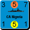
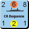
Perhaps only the 0 through 4 are essentail, (if I made that change I could add the word Sect in front of the number), but I think players will quickly learn that these are section box numbers and bombardment 'penalties'. If you loook at all the surface ships shown in the screen shot, you'll see that knowing the effect on the bombardment number is useful information: it isn't too hard to add up the total bombardment factors (lower right corner). Japan has 6 bombardment points available (before the air-to-air combat and naval air attack). The US has 7.


_____________________________

Steve

Perfection is an elusive goal.

(in reply to Froonp)
Post #: 1558
RE: MWIF Game Interface Design - 4/13/2009 1:58:14 AM   
macgregor


Posts: 990
Joined: 2/10/2004
Status: offline
I just want to say thank you Steve. It's obvious that this game is going to be to PC games what the boardgame was to boardgames -only much better because now married guys can play too. If I've insinuated that I thought it was an embellished version of CWiF, the stunning screenshots I've seen have shattered that notion. This is your baby now. I've been impatient and perhaps even a bit impetuous (moi?)but I'm as exited as anyone now. The non-perils and cashews are a bit stale but I can always get some more. Our man in Philly is pumped as well.

(in reply to Shannon V. OKeets)
Post #: 1559
RE: MWIF Game Interface Design - 4/13/2009 3:59:50 AM   
Shannon V. OKeets


Posts: 22095
Joined: 5/19/2005
From: Honolulu, Hawaii
Status: offline

quote:

ORIGINAL: macgregor

I just want to say thank you Steve. It's obvious that this game is going to be to PC games what the boardgame was to boardgames -only much better because now married guys can play too. If I've insinuated that I thought it was an embellished version of CWiF, the stunning screenshots I've seen have shattered that notion. This is your baby now. I've been impatient and perhaps even a bit impetuous (moi?)but I'm as exited as anyone now. The non-perils and cashews are a bit stale but I can always get some more. Our man in Philly is pumped as well.

Our man in Philly? The guitarist? Sadly I can not recall his name. You are still in contact?

_____________________________

Steve

Perfection is an elusive goal.

(in reply to macgregor)
Post #: 1560
Page:   <<   < prev  50 51 [52] 53 54   next >   >>
All Forums >> [New Releases from Matrix Games] >> World in Flames >> RE: MWIF Game Interface Design Page: <<   < prev  50 51 [52] 53 54   next >   >>
Jump to:


New Messages No New Messages
Hot Topic w/ New Messages Hot Topic w/o New Messages
Locked w/ New Messages Locked w/o New Messages
 Post New Thread
 Reply to Message
 Post New Poll
 Submit Vote
 Delete My Own Post
 Delete My Own Thread
 Rate Posts


Forum Software © ASPPlayground.NET Advanced Edition 2.4.5 ANSI

1.000