Shannon V. OKeets
Posts: 22095
Joined: 5/19/2005
From: Honolulu, Hawaii
Status: offline

|
quote:
ORIGINAL: Skanvak
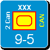
May be it is the color because nearly half the CW ships seems to have a light green bar around them, which is confusing with the light green one below.
I would rather go with an unselected box and a selected box with a click and drag/drop between the two boxes to select and not make row for BB/cruisers/Carriers (may be a button to show it, but i could do with carrier display first then BB then cruisers with the number of row according to the windows size (like icons in windows)). For the drag and drop multi-select you can then do with a standard greyed out counter (as you wan't really have to care about the counter being readable while selected for the drag and drop).
I don't know how you handle TF, but that could be a way to simplify the system if you compel ships to be a TF to be moved in stack. So one row for each TF would allow easy selection, as you would simply have to select TF on map for move once you form them.
I hope that I am not widely out of topics as I don't palytest, I reason only on the screenshot.
I doubled the size of the area below the selected unit (from 2 pixels high to 4) and used gray instead of light green. That should solve the visiblity issue.
---
Selecting and deselecting units is only one of the purposes of the Naval Review Details form. It will be used extensively to review enemy units at sea and in ports - in those cases all the units would be 'unselectable' and the 'selectable' column/row would be wasted space.
Similarly, you will want to examine units belonging to other major powers on your side. The game design is for a player to only be able to 'move' units for the currently active major power. You can switch between which major power is 'current' freely, provided the rules permit that to be done, but while the US player is making decisions, he can not 'move' CW units (for instance). During over-the-board games players are often a little loose in obeying those rules, and no harm is done. But for the computer version of WIF, all rules are strickly enforced.
All-in-all, I would guess that the word Review in the name of the form indicates its primary use.
The NRD form is designed to occupy no more than half the screen. That leaves room for the Naval Review Summary form to occupy the other half. I have also taken to using the double sized global map in the other half of the screen (instead of the NRS form). That lets me move the cursor over the different sea areas on the global map and have the NRD form update when the cursor enters a new sea area (or port).
---
I am not a fan of drag-and-drop. It requires some additional dexterity with the mouse - holding down the button while repositioning the cursor on the 'target'. MWIF never employs drag-and-drop. Instead, the player clicks on a unit/object to select it and then clicks on the 'target'. The benefit of this difference should be obvious to anyone who has used drag-and-drop extensively: when the target is not visible and scrolling (or something similar) is required, drag-and-drop requires contortions from either the interface design and/or the user.
< Message edited by Shannon V. OKeets -- 10/18/2009 7:47:20 PM >
_____________________________
Steve
Perfection is an elusive goal.
|
 Printable Version
 RE: MWIF Game Interface Design -


 If you must, then prepare yourself mentally first, and turn it off as soon as possible.


 .
. 


 That is not intentional, just one of my personality defects.
 New Messages
 No New Messages
 Hot Topic w/ New Messages
 Hot Topic w/o New Messages
 Locked w/ New Messages
 Locked w/o New Messages
 Post New Thread