It has now been more than a month since Aggressors was released. We've already released three big updates since then, and we are proud to say that just a minor portion of the changes were bugfixes. We would like to thank our beta testers who did an incredible job during the long beta testing phase with helping us identifying and fixing almost all technical issues.
One thing our players appreciate is our professional customer support. The game itself comes with a simple to use "error window" that pops up when a problem is encountered. This is a quick way of informing us that something went wrong. You can contact us directly either by using this tool, through e-mail or just by posting on our forums. We really do our best to answer within hours every time. In some cases we also do one-to-one support over phone/Skype to fix problems mostly related to PC configurations, old drivers or user permissions.
The low number of bugs allowed us to focus on implementing changes requested by players, either related to gameplay, UI or the rules. So what has been changed since then?
The biggest change in the first update was the introduction of UI scaling. I think we should humbly confess that this is something that should have been already in the vanilla version. Most of our beta players had resolutions up to FullHD, which was the resolution the game was initially designed for, and so it happened that this issue did not really come up during the beta. For higher resolutions there has always been a workaround which enabled change to FullHD. However, this solution proved to be insufficient and we realized it very soon after the release.
We made it our top priority for the first update and we were able to deliver full UI scaling within one week of the release. Players can now take full advantage of UI scaling without any limitations.
However, we wanted the solution to be robust and complex. Therefore, we implemented customizable UI scaling. Players can now decide what UI scaling fits their needs themselves and not have this solely based on their screen resolution. If you prefer to have smaller UI even at bigger resolutions, bigger UI even for FullHD or even play the game in (by today's standard) "obsolete" small resolution like 1024x768, you are able to do so.
The second most requested feature was an alternative mouse control system. Despite the fact that we consider Aggressors' mouse control system to be effective and innovative, players should be able to set it to suit their preferences. We understand that players who play games like Total War or Civilization are used to a different way of mouse behavior and that was also the reason why this was our second priority. It took us a couple of weeks to fully integrate a new player option called "Alternative mouse control" which allows the player to set the mouse controls the way he is used to. However, we still feel that the "Aggressors way" of mouse control deserves a chance. It might take a couple of hours to get used to it but based on the long beta test we can honestly say that most of the players managed to get a hold of it in few hours and they like and prefer it this way. From a quick survey we know that most of these players do not plan to switch back to the previous mouse control system they were used to.
We also watched many gameplay videos on YouTube and Twitch. We made notes of their complaints, struggles and suggestions. The list is pretty long and we want to give each of the ideas a proper consideration and eventually implement those that fit the game theme and logic. On the other hand, the number of features already implemented is also quite long. We’ll mention some of the most important here.
Main view changes:
One of the things the players struggled with was the supply management system. Not that they would not understand the concept but the indicators in tooltips about the tiles supply values were often overlooked and went unnoticed. On top of that, only a small portion of the players used the "Supply map" overlay intuitively.
We decided to address this imperfection and extend the standard way of how this information is presented. Players can now notice different highlights for out-of-supply or partially supplied tiles even in the standard view. They can see which suppliers provide supplies for a particular unit and to what extent the supplier participates in the supply level for that unit.
We expanded the settings for map appearance. One particular complaint we noticed was about the fog density. Players found it to be too dense and obscuring the view.
Again, like many times before, we didn’t want to hardcode specific values to the game. We realize that what one player likes might not satisfy another one. We already went through this with settings for terrain saturation, terrain overlay, contrast of highlights or displaying trees. In this case, we simply followed the established level of customization and we introduced yet another player option called "Fog density". This allows the player to set the fog density to his liking. Needless to say, some players were really happy about this.
Most comments we received are on game sounds. We wanted to be a bit different and used quite original "greeting" sounds. Players could hear yawning or bored sounds from settlers, "I'm the man" from military units or shouting soldiers ready for action. The feedback was surprisingly controversial. Some players found it very funny and liked it very much; others found it weird and immersion breaking.
If you have already understood our vision for the game, you probably know what we have done. We added another setting that allows the player to completely turn the greeting sounds off or replace them with a simple "click" sound. Hopefully this will make both sides happy.
User interface changes:
One of the things we constantly improve is the UI. Players ask to have a clear view of information, to get more indicators of what is going on under the hood and to know how can they influence the situation around them.
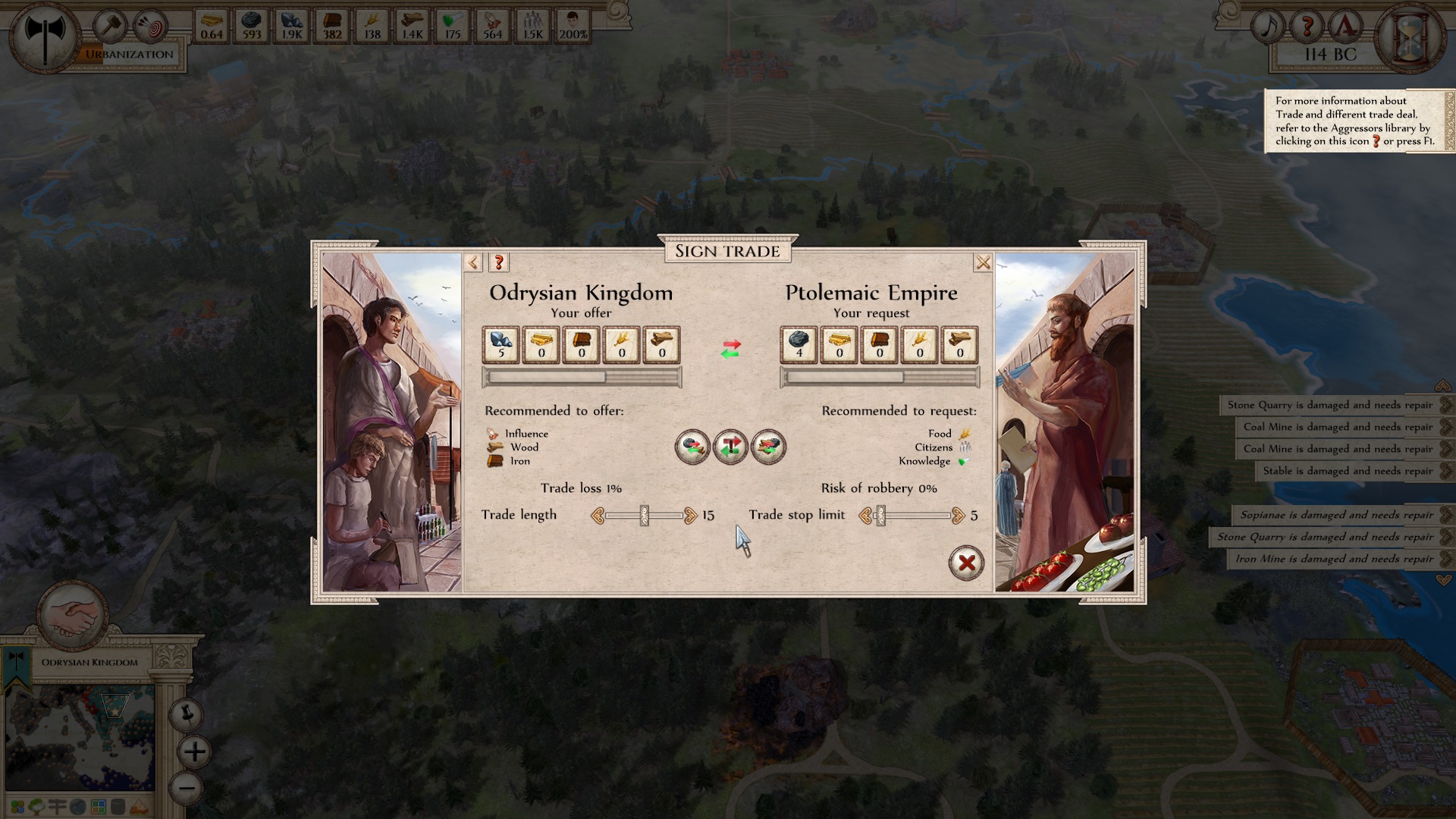
An area where we needed to improve the UI is Trade. Players seem to appreciate the depth of trading and like the concept but they were missing an indicator of what the opponent might need or what resources he has in abundance.
Last week we introduced the concept of "recommended resources to buy and sell". It is a list of 3 resources suggesting what the opponent needs most and what he might be willing to exchange. This not only accelerates the negotiation of new trades but it also lowers the number of "trade spam offers" (human players tend to send trade offers to many players at once to have a higher chance to get one accepted).
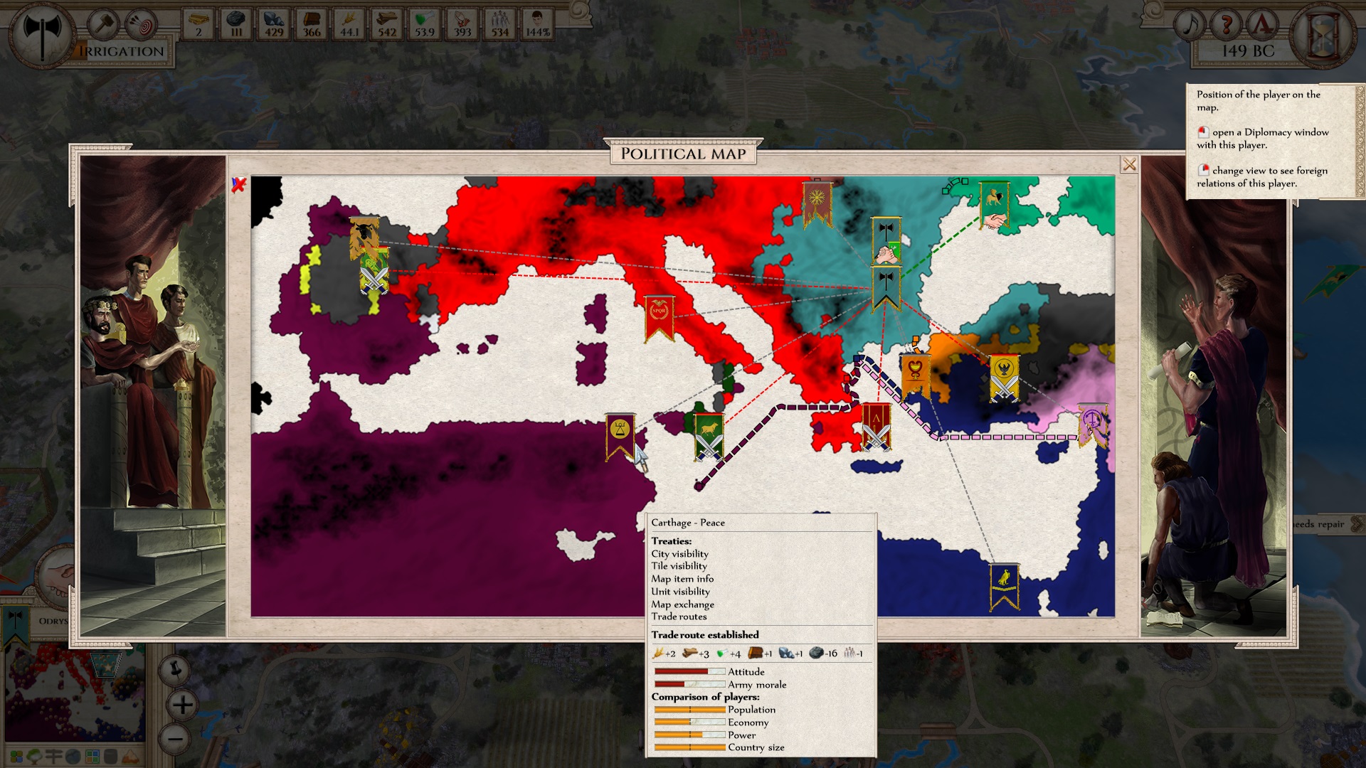
Other improvements were made on the Political Map where the player can now get extended information of other factions’statistics and battle prediction tooltips.
Game rules:
The changes which were made were not only related to the UI and controls. Players already came up with a number of new interesting ideas and suggestions on how to improve the existing rules.
The Player community is priority number one for us. We want you to be in control of the game and tell us your wishes. Of course we have our own vision of the game but every time a new suggestion is received, we carefully consider it and either implement it straight away, log it into our tracking system to be implemented later or we explain in detail our reasons to reject such changes. In this case we advise players on how to make such changes if they decide to create their own mod or scenario.
The list of changes is long but let’s list the ones we decided to implement straight away and that are already part of the latest build:
- When a unit is in the city, it automatically heals two times faster.
- The factors affecting possible army desertion were vastly expanded - overall enemy power, support of nearby units, army morale of enemy, and others are now taken into account.
- Recovery speed is now based on the unit's "base" power instead of the current power.
- Independent cities repair and improve themselves similarly to cities of other factions. The improvements available for them depend on the level of development of the factions around. This should reflect the real world when the "development" level of one country has an influence on nearby territories.
- Rules related to military units withdrawing from battles were improved.
- Factors that influence the occurrences of revolts and civil wars were extended to include loyalty and general morale.
AI players:
We are very happy that the AI player is perceived as very smart and quite unpredictable. Nevertheless, the work on AI improvements is a never ending story and we constantly try to make it better. In the last month we've already reviewed some of its behaviors:
- When the AI rejects a diplomatic offer, it also specifies why.
- Number and types of AI's diplomatic offers were reviewed and made more realistic.
- Changes in AI tactical behavior were introduced making it an even stronger opponent during wars.
It is needless to say that we plan to continue providing you the best player experience. We are happy that you have so many ideas and suggestions; it will keep us very busy in the upcoming months. So which card are we going to draw from the stack next? In the next week or two we want to release a new update focusing on modding and scenario building. We want to give the means to create a new scenario to as many people as possible.How do we want to achieve that? Stay tuned, we will reveal more details soon!
We want to thank all the players for reviews and spreading the word about the game. It is not only extremely motivating to read how you enjoy the game but it is also the best way how you can help us to continue working on it! As per the title of the dev diary…the show has just begun, and we’re looking forward to telling you what comes next!


 Cart (0)


