Matrix Games Forums

Forums  Register  Login  Photo Gallery  Member List  Search  Calendars  FAQ 

My Profile  Inbox  Address Book  My Subscription  My Forums  Log Out

RE: Unit Depictions on Screen

 
View related threads: (in this forum | in all forums)

Logged in as: Guest
Users viewing this topic: none
  Printable Version
All Forums >> [New Releases from Matrix Games] >> World in Flames >> RE: Unit Depictions on Screen Page: <<   < prev  6 7 [8] 9 10   next >   >>
Login
Message << Older Topic   Newer Topic >>
RE: Unit Depictions on Screen - 1/3/2006 8:18:14 PM   
stretch


Posts: 636
Joined: 12/17/2001
Status: offline
I like the middle one.

The marine anchor almost seems over the top to me, if I had to pick I'd stick with the previous one. But something in the middle (with respect to curvature on the ends, not sure what that part of an anchor is called) would probably be best.

(in reply to Shannon V. OKeets)
Post #: 211
RE: Unit Depictions on Screen - 1/3/2006 8:29:44 PM   
Mziln


Posts: 1107
Joined: 2/9/2004
From: Tulsa Oklahoma
Status: offline
quote:

ORIGINAL: stretch

I like the middle one.

The marine anchor almost seems over the top to me, if I had to pick I'd stick with the previous one. But something in the middle (with respect to curvature on the ends, not sure what that part of an anchor is called) would probably be best.


Link to discription of the parts of an Anchor

(in reply to stretch)
Post #: 212
RE: Unit Depictions on Screen - 1/3/2006 8:51:59 PM   
JanSorensen


Posts: 3684
Joined: 5/2/2005
From: Aalborg, Denmark
Status: offline
I concur with stretch

The middle armor looks better than the other two - and the large marine anchor looks wrong.

(in reply to Mziln)
Post #: 213
RE: Unit Depictions on Screen - 1/3/2006 9:43:17 PM   
buckyzoom


Posts: 69
Joined: 10/31/2005
Status: offline
I prefer the middle one, also. I would like the three line anchor for marines (basically a crucifix with a smile)

(in reply to Shannon V. OKeets)
Post #: 214
RE: Unit Depictions on Screen - 1/3/2006 10:39:22 PM   
Shannon V. OKeets


Posts: 22095
Joined: 5/19/2005
From: Honolulu, Hawaii
Status: offline
quote:

ORIGINAL: buckyzoom

I prefer the middle one, also. I would like the three line anchor for marines (basically a crucifix with a smile)


Do you have a picture of one somewhere?

Mziln's link was worth reading but I still would like a simple sample graphic of an anchor to model the NATO symbol on.

--------------

It is nice to see everyone agree with me.

I liked the center armor and thought the anchor was too big relative to the other symbols.

_____________________________

Steve

Perfection is an elusive goal.

(in reply to buckyzoom)
Post #: 215
RE: Unit Depictions on Screen - 1/3/2006 10:57:01 PM   
dhatchen


Posts: 45
Joined: 12/23/2005
Status: offline
Middle one for the Armour.

The Marine anchour isn't quite it yet, but is a LOT better.
The bottom is too prominent. It seems a little thick, but maybe if the bottom was a little smaller in length and height it might match the stem and cross piece better???

(in reply to Shannon V. OKeets)
Post #: 216
RE: Unit Depictions on Screen - 1/3/2006 10:59:07 PM   
Froonp


Posts: 7995
Joined: 10/21/2003
From: Marseilles, France
Status: offline
quote:

ORIGINAL: Shannon V. OKeets
Here is another pass at the NATO symbols for armor and marines.
The Armor HQ is a bit more round than the Armor unit, which in turn is a bit more rounded than the Armor Artillery.
I prefer the middle one. What do you think?

Same. Middle one.

quote:


And the Marine?


Nice drawing, but a little too much IMO.
The original WiF FE MAR symbol is simpler indeed.


Attachment (1)

(in reply to Shannon V. OKeets)
Post #: 217
RE: Unit Depictions on Screen - 1/4/2006 12:01:08 AM   
buckyzoom


Posts: 69
Joined: 10/31/2005
Status: offline
Something like this,


Attachment (1)

(in reply to Shannon V. OKeets)
Post #: 218
RE: Unit Depictions on Screen - 1/4/2006 12:01:47 AM   
pak19652002


Posts: 280
Joined: 1/2/2005
Status: offline
Middle armor looks best to me.

Regarding the MAR with the port anchor, I think this was a bold and worthy experiment that should terminated immediately before it escapes the lab and spreads to the general population.

Just add a few pixels to the ends of the normal anchor and call it a day!

Peter


(in reply to Shannon V. OKeets)
Post #: 219
RE: Unit Depictions on Screen - 1/4/2006 12:40:37 AM   
Shannon V. OKeets


Posts: 22095
Joined: 5/19/2005
From: Honolulu, Hawaii
Status: offline
quote:

ORIGINAL: pak19652002

Middle armor looks best to me.

Regarding the MAR with the port anchor, I think this was a bold and worthy experiment that should terminated immediately before it escapes the lab and spreads to the general population.

Just add a few pixels to the ends of the normal anchor and call it a day!

Peter


Ok. I'll go back to where I started and make only minor changes to that anchor. But I am not sure what to do about this tatoo I now have on my forearm!?

_____________________________

Steve

Perfection is an elusive goal.

(in reply to pak19652002)
Post #: 220
RE: Unit Depictions on Screen - 1/4/2006 5:39:47 AM   
Neilster


Posts: 2890
Joined: 10/27/2003
From: Hobart, Tasmania, Australia
Status: offline
quote:

Ok. I'll go back to where I started and make only minor changes to that anchor. But I am not sure what to do about this tatoo I now have on my forearm!?

I'd have it modified into a dusky babe who dances when you wiggle your fingers .

Cheers, Neilster

(in reply to Shannon V. OKeets)
Post #: 221
RE: Unit Depictions on Screen - 1/4/2006 6:31:27 AM   
Glen Felzien


Posts: 91
Joined: 5/21/2000
From: Swan Hills, Alberta, CDN
Status: offline
I like the 10-5 armour symbology. The marine ancher made me laugh. Really laugh. Reminded me of a poster used for the Pirates of Penzan(sp).

_____________________________

Glen

(in reply to Neilster)
Post #: 222
RE: Unit Depictions on Screen - 1/4/2006 9:37:51 AM   
composer99


Posts: 2923
Joined: 6/6/2005
From: Ottawa, Canada
Status: offline
quote:

The Canadians.


Woo-hoo! They look awesome! Go Canadians!

_____________________________

~ Composer99

(in reply to Shannon V. OKeets)
Post #: 223
RE: Unit Depictions on Screen - 1/4/2006 10:09:50 AM   
composer99


Posts: 2923
Joined: 6/6/2005
From: Ottawa, Canada
Status: offline

quote:

ORIGINAL: Shannon V. OKeets

Here is another pass at the NATO symbols for armor and marines.

The Armor HQ is a bit more round than the Armor unit, which in turn is a bit more rounded than the Armor Artillery.

I prefer the middle one. What do you think?

And the Marine?


The middle armour icon is my preference as well. I also really like that style for the Marine.

_____________________________

~ Composer99

(in reply to Shannon V. OKeets)
Post #: 224
RE: Unit Depictions on Screen - 1/5/2006 3:40:18 AM   
Neilster


Posts: 2890
Joined: 10/27/2003
From: Hobart, Tasmania, Australia
Status: offline
The middle armour symbol looks best IMHO. I like the simple anchor from the cardboard counter, a la Patrice's attachment.

Cheers, Neilster

(in reply to Shannon V. OKeets)
Post #: 225
RE: Unit Depictions on Screen - 1/5/2006 8:28:49 AM   
Greyshaft


Posts: 2252
Joined: 10/27/2003
From: Sydney, Australia
Status: offline
quote:

ORIGINAL: Neilster

The middle armour symbol looks best IMHO.

What Neilster said...

_____________________________

/Greyshaft

(in reply to Neilster)
Post #: 226
RE: Unit Depictions on Screen - 1/6/2006 2:51:43 AM   
Shannon V. OKeets


Posts: 22095
Joined: 5/19/2005
From: Honolulu, Hawaii
Status: offline
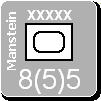
Here are the Commonwealth member nations with both the regular and elite units having the same interior colors.

I have added the country abbreviations for all land units except the major powers (e.g., UK, USA, USSR, ..). I tried it for them too, but it was too much. I have made all the colors of the surrounding text match (in these cases either white or black) so it is easier to tell the elite, white print units from the others at a glance.

There are also some territorials thrown in for good measure. Note that their base color matches the controlling major power (Commonwelath and France in these cases). I have also moved the reserve 'R' and made it slightly smaller.

I am still playing around with the NATO symbols, so ignore the armor and infantry NATO symbols - they are works in progress.


The JPG conversion makes the red really bleed. Trust me, is it not that fuzzy on the MWIF game screen.

Attachment (1)

< Message edited by Shannon V. OKeets -- 1/6/2006 2:56:11 AM >


_____________________________

Steve

Perfection is an elusive goal.

(in reply to Greyshaft)
Post #: 227
RE: Unit Depictions on Screen - 1/6/2006 3:39:22 AM   
stretch


Posts: 636
Joined: 12/17/2001
Status: offline
I love it at first glance. It's nice to see Montys name fit on a counter. Im sure his ego never would.

Im going to need to learn some new 3 letter abbreviations, I had to look one up. (Im not telling)

great work!

(in reply to Shannon V. OKeets)
Post #: 228
RE: Unit Depictions on Screen - 1/6/2006 3:48:43 AM   
Shannon V. OKeets


Posts: 22095
Joined: 5/19/2005
From: Honolulu, Hawaii
Status: offline
quote:

ORIGINAL: stretch

I love it at first glance. It's nice to see Montys name fit on a counter. Im sure his ego never would.

Im going to need to learn some new 3 letter abbreviations, I had to look one up. (Im not telling)

great work!


Thanks. 95% of the abbreviations came from the Olympic list (that several members were very helpful getting me pointed to). There were a lot of colonial countries during WW II, so I had to make up abbrevations on the spot. I didn't take any time on that since they are all in the country data file, and players can edit them if they want. Some examples of my choices: NRH (Northern Rhodesia) and ADE (Aden).

_____________________________

Steve

Perfection is an elusive goal.

(in reply to stretch)
Post #: 229
RE: Unit Depictions on Screen - 1/6/2006 4:02:23 AM   
Neilster


Posts: 2890
Joined: 10/27/2003
From: Hobart, Tasmania, Australia
Status: offline
Just what were those evil Axis dudes thinking? Taking on such hardcases.

I remember talking to an old Italian guy who was captured in North Africa and sent to a POW camp in Australia. When he and his fellow prisoners arrived by ship in Melbourne they were put on trains and railed for a couple of thousand kilometres north to their camp. He said they looked out at the endless grasslands, farms and forests and thought, "What was our idiotic leadership doing? This is only one part of the empire we attacked and it's like Russia."

Before long, most Italian POWs were working on farms. Many were from rural backgrounds and they much preferred this to cooling their heels in a camp. Initial suspicions were usually quickly broken down and usually the rules about POWs having to sleep in the barn were ignored. It wasn't uncommon for unescorted POWs to drive into town for supplies and be greeted with a "G'day Antonio. How's it going mate?" With so few men around they were also quite popular with the local lasses. Many (including the guy in question) decided to stay in Australia and to bring their families out here as well. This was really the beginning of the massive post-war migration that has tripled our population and added immeasurably to our culture.

Don't take too much notice of the drunken fools and culturally confused Middle Eastern youth who were involved in the riots in Sydney recently. That was more of a turf war over beaches. Overall the multicultural experiment has worked extremely well here and we're a better country for it.

Cheers, Neilster


< Message edited by Neilster -- 1/6/2006 4:06:21 AM >

(in reply to Shannon V. OKeets)
Post #: 230
RE: Unit Depictions on Screen - 1/6/2006 5:13:40 AM   
Glen Felzien


Posts: 91
Joined: 5/21/2000
From: Swan Hills, Alberta, CDN
Status: offline
Neilster, that is great to hear. Sometimes I wonder if we are self destructing up here in Canada but then we go and win hockey gold to help pull everyone together again!

Steve, terrific job on the CW units and thanks for making the Canadians (and the rest) uniform in interior colour. Regarding the abbreviations, I was able to make em all out. Just took a moment to consider the controlling power on one of them. About the Indian para unit, that is the correct interior colour yes?

_____________________________

Glen

(in reply to Neilster)
Post #: 231
RE: Unit Depictions on Screen - 1/6/2006 6:41:43 AM   
Shannon V. OKeets


Posts: 22095
Joined: 5/19/2005
From: Honolulu, Hawaii
Status: offline
quote:

ORIGINAL: Glen Felzien

Neilster, that is great to hear. Sometimes I wonder if we are self destructing up here in Canada but then we go and win hockey gold to help pull everyone together again!

Steve, terrific job on the CW units and thanks for making the Canadians (and the rest) uniform in interior colour. Regarding the abbreviations, I was able to make em all out. Just took a moment to consider the controlling power on one of them. About the Indian para unit, that is the correct interior colour yes?


Yes. The design protocol is that airborne unit types (there are a couple) get the light blue interior regardless of anything else (country, unit size, elite). The same applies to the light green for marine units. The reason for this is that those two unit types have special movement abilities (paradrop and invade from transports) which the players will want to be especially cognizant of. Elite units have white interiors except for the Commonwealth member nations (I was in the minority on that decision). Divisional units have a color that is specific to each major power, though artillery types (artillery, AA, AT) all have the same light blue as the airborne (running out of colors there). Of course Communist China is different as is also the SS. And don't forget that the countries with light base colors need to be handled differently.

One of my copies of WIF has all the units in a large, clear, plastic bag. If you shake it up, you can see all the pretty colors. The units in MWIF are like that.

Actually, when you play the colors are helpful. Since I made the changes, I find setting up the Russians and Germans for Barbarossa much easier because I can identify unit types immediately - I never accidentally try to stack 3 corps/armies in a hex anymore. The wide diversity of colors is less apparent in any one theater of operations too, because inevitably several of the major powers are not present.

_____________________________

Steve

Perfection is an elusive goal.

(in reply to Glen Felzien)
Post #: 232
RE: Unit Depictions on Screen - 1/6/2006 12:30:02 PM   
Froonp


Posts: 7995
Joined: 10/21/2003
From: Marseilles, France
Status: offline
quote:

I have added the country abbreviations for all land units except the major powers (e.g., UK, USA, USSR, ..). I tried it for them too, but it was too much. I have made all the colors of the surrounding text match (in these cases either white or black) so it is easier to tell the elite, white print units from the others at a glance.

In my opinion it is much better this way (all canadians having the yellow & red box).
However, I feel that the country abbreviation is much much too big.
It should be in my opinion of the same font size as the designation of the unit.

As for the abbreviations, even if you used the olympic ones (it was a great idea), I think you should document this into the game documentation & help system. The variety of countries can be confusing.

Anyway, congratulations for the work on the counters, thay are great !!!

Now we have to see how the naval & air units come up when the graphic artist has finished. I think it will be even greater !!!

Also, to tell it again, I think that the units would be definitively terrific if they had a tiny 3-d touch, with even a slim shade added to them (as in this screen shot of SSG's most excellent "Battles in Italy" game.


Attachment (1)

(in reply to Shannon V. OKeets)
Post #: 233
RE: Unit Depictions on Screen - 1/6/2006 3:05:22 PM   
Caranorn


Posts: 424
Joined: 8/31/2001
From: Luxembourg
Status: offline
quote:

ORIGINAL: Froonp

Also, to tell it again, I think that the units would be definitively terrific if they had a tiny 3-d touch, with even a slim shade added to them (as in this screen shot of SSG's most excellent "Battles in Italy" game.


But other then the shading I have to say those are some of the ugliest counters I've ever seen (and I've been playing wargames for 5/7th of my life ;-)).

Luckily MWiF appears to get a beautiful set of units (and I agree with Patrice on the size of the 3 letter country abreviation, reduce it (at first I was also for only first later in capitals, but that would only work well for some countries (like Can, Aus, Nzl but not for RSA etc.).

P.S.: Yes I'm starting to love the look of the MWiF counters as much as I loved the counters of my first ever copy of WiF (and I had to go back to the shop back then because someone had already stolen a countersheet (and I failed to notice the Asian map was misprinted too (Australia seemed far away at the time so I never mailed ADG for a new copy))).

_____________________________

Marc aka Caran... ministerialis

(in reply to Froonp)
Post #: 234
RE: Unit Depictions on Screen - 1/6/2006 5:56:50 PM   
Mziln


Posts: 1107
Joined: 2/9/2004
From: Tulsa Oklahoma
Status: offline
I am not bothered by the Unit Depictions displayed for marines for MWiF. To me they are all fine.


Just FYI:

Although the anchor may seem to be a major part of the marine emblem. The most important part is the rope or cable entangling or fouling the anchor. It represents the fact that marines are poor sailors.


(in reply to Caranorn)
Post #: 235
RE: Unit Depictions on Screen - 1/6/2006 6:48:08 PM   
Shannon V. OKeets


Posts: 22095
Joined: 5/19/2005
From: Honolulu, Hawaii
Status: offline
quote:

ORIGINAL: Mziln
I am not bothered by the Unit Depictions displayed for marines for MWiF. To me they are all fine.


Just FYI:

Although the anchor may seem to be a major part of the marine emblem. The most important part is the rope or cable entangling or fouling the anchor. It represents the fact that marines are poor sailors.


Not the wisest comment to make in a crowded bar.

I do appreciate seeing the official emblem though. I'll try to copy the anchor from the emblem (without the rope).

I should say in passing that I am definitely not an artist. My brother greedily hogs all the artistic talent in our family - with a Masters from the Royal Colege of Art in London (Lars Hokanson). If you Google him, you'll see what I mean.

_____________________________

Steve

Perfection is an elusive goal.

(in reply to Mziln)
Post #: 236
RE: Unit Depictions on Screen - 1/7/2006 12:18:06 AM   
dhatchen


Posts: 45
Joined: 12/23/2005
Status: offline
quote:

ORIGINAL: Froonp

quote:

I have added the country abbreviations for all land units except the major powers (e.g., UK, USA, USSR, ..). I tried it for them too, but it was too much. I have made all the colors of the surrounding text match (in these cases either white or black) so it is easier to tell the elite, white print units from the others at a glance.

In my opinion it is much better this way (all canadians having the yellow & red box).
However, I feel that the country abbreviation is much much too big.
It should be in my opinion of the same font size as the designation of the unit.

As for the abbreviations, even if you used the olympic ones (it was a great idea), I think you should document this into the game documentation & help system. The variety of countries can be confusing.

Anyway, congratulations for the work on the counters, thay are great !!!

Now we have to see how the naval & air units come up when the graphic artist has finished. I think it will be even greater !!!

Also, to tell it again, I think that the units would be definitively terrific if they had a tiny 3-d touch, with even a slim shade added to them (as in this screen shot of SSG's most excellent "Battles in Italy" game.


Beautiful terrain, but I find that it steals my attention

(in reply to Froonp)
Post #: 237
RE: Unit Depictions on Screen - 1/7/2006 12:37:35 AM   
Greyshaft


Posts: 2252
Joined: 10/27/2003
From: Sydney, Australia
Status: offline
quote:

ORIGINAL: dhatchen

Beautiful terrain, but I find that it steals my attention


The terrain on 'Supreme Ruler 2010' used satellite imagery to generate their map of the world. The idea had promise, but I think the SSG guys did it better with their art.

_____________________________

/Greyshaft

(in reply to dhatchen)
Post #: 238
RE: Unit Depictions on Screen - 1/7/2006 4:20:57 PM   
c92nichj


Posts: 440
Joined: 1/14/2005
Status: offline
I like the new counters a lot!
The middle armour version is nicest and the simpler marine symbol.
Regarding the size of the country abbreviation I agree that it is to big, not so big that I would want you to spend any time on changing it though as I am sure you have more important things to do.

Have you given any further thoughts about colours for aligned minors? The scheme used in CWIF would work quite well I think.

(in reply to Shannon V. OKeets)
Post #: 239
RE: Unit Depictions on Screen - 1/9/2006 5:42:34 AM   
Shannon V. OKeets


Posts: 22095
Joined: 5/19/2005
From: Honolulu, Hawaii
Status: offline
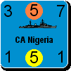
Here is a pass at using red for the German SS non-elite units and outlining it in white.

You can see the pure red in the name of the unit and the alternate yellow in the unit size (XXX) and reserve letter (R).

I prefer the yellow. I find the plain red hard to read and the outlined red somewhat strange compared to the numbers on other units (e.g. the German SS elite also shown here).


Attachment (1)

_____________________________

Steve

Perfection is an elusive goal.

(in reply to c92nichj)
Post #: 240
Page:   <<   < prev  6 7 [8] 9 10   next >   >>
All Forums >> [New Releases from Matrix Games] >> World in Flames >> RE: Unit Depictions on Screen Page: <<   < prev  6 7 [8] 9 10   next >   >>
Jump to:


New Messages No New Messages
Hot Topic w/ New Messages Hot Topic w/o New Messages
Locked w/ New Messages Locked w/o New Messages
 Post New Thread
 Reply to Message
 Post New Poll
 Submit Vote
 Delete My Own Post
 Delete My Own Thread
 Rate Posts


Forum Software © ASPPlayground.NET Advanced Edition 2.4.5 ANSI

2.250