Matrix Games Forums

Forums  Register  Login  Photo Gallery  Member List  Search  Calendars  FAQ 

My Profile  Inbox  Address Book  My Subscription  My Forums  Log Out

RE: Unit Depictions on Screen

 
View related threads: (in this forum | in all forums)

Logged in as: Guest
Users viewing this topic: none
  Printable Version
All Forums >> [New Releases from Matrix Games] >> World in Flames >> RE: Unit Depictions on Screen Page: <<   < prev  9 10 [11] 12 13   next >   >>
Login
Message << Older Topic   Newer Topic >>
RE: Unit Depictions on Screen - 2/3/2006 7:44:32 AM   
Anendrue


Posts: 817
Joined: 7/8/2005
Status: offline
I can't take it anymore. This is looking better and better everyday. I could give up beer for this.

Hmmm... maybe we need a WiF Addicts forum?


Keep up the outstanding work, this is absolutely awesome.

_____________________________

Integrity is what you do when nobody is watching.

(in reply to Shannon V. OKeets)
Post #: 301
RE: Unit Depictions on Screen - 2/3/2006 8:12:38 AM   
dhatchen


Posts: 45
Joined: 12/23/2005
Status: offline
quote:

ORIGINAL: Shannon V. OKeets

quote:

ORIGINAL: tigercub

I must say it`s all looking very good shannon great work a pat on the back!


Thank you. They more people I make happy, the more copies of the game will be sold.

-------------------

map. Now, the Screen Capture function removes the cursor from the screen shot, or you would see that the leftmost units (a stack of 3) are under a cursor and moving around with the cursor. The 2-6 mechanized, 4 GD, is shown twice. Once it is dropped on the map, it


I use JASC Paint Shop Pro 9. Its screen capture allows cursor or no cursor on full screen, client area, window, object. Its area capture doesn't show cursor, but I just do a window or client area capture and use the picture crop function. You can save it in every graphic format you didn't want to hear of (Recognizes 62 file extension types). Its about 100 USD.
I find it indispensible for user manual writing.

danh

< Message edited by dhatchen -- 2/3/2006 9:51:28 AM >

(in reply to Shannon V. OKeets)
Post #: 302
RE: Unit Depictions on Screen - 2/3/2006 10:02:28 AM   
Shannon V. OKeets


Posts: 22095
Joined: 5/19/2005
From: Honolulu, Hawaii
Status: offline
quote:

ORIGINAL: dhatchen

quote:

ORIGINAL: Shannon V. OKeets
Now, the Screen Capture function removes the cursor from the screen shot, or you would see that the leftmost units (a stack of 3) are under a cursor and moving around with the cursor.


I use JASC Paint Shop Pro 9. Its screen capture allows cursor or no cursor on full screen, client area, window, object. Its area capture doesn't show cursor, but I just do a window or client area capture and use the picture crop function. You can save it in every graphic format you didn't want to hear of (Recognizes 62 file extension types). Its about 100 USD.
I find it indispensible for user manual writing.

danh


Thanks. The graphics guy has already told me I should get something better for screen capture. But that just doesn't have much priority in my life at the present. When I do get around to really needing professional looking screen shots (e.g., for manuals), I'll keep your suggestion in mind.


_____________________________

Steve

Perfection is an elusive goal.

(in reply to dhatchen)
Post #: 303
RE: Unit Depictions on Screen - 2/4/2006 1:21:42 AM   
c92nichj


Posts: 440
Joined: 1/14/2005
Status: offline
A comment on the low res pictures of planes. would it be possible to have them resemble the other units.
LND from top as shown in the screenshot.
Figthers from the side in profile.
NAV diving
ATR from top but having their tail to the north.
This will make it very easy to see what type of planes that an icon represents.

(in reply to Shannon V. OKeets)
Post #: 304
RE: Unit Depictions on Screen - 2/4/2006 1:39:43 AM   
Shannon V. OKeets


Posts: 22095
Joined: 5/19/2005
From: Honolulu, Hawaii
Status: offline
quote:

ORIGINAL: c92nichj
A comment on the low res pictures of planes. would it be possible to have them resemble the other units.
LND from top as shown in the screenshot.
Figthers from the side in profile.
NAV diving
ATR from top but having their tail to the north.
This will make it very easy to see what type of planes that an icon represents.


Yes, I agree. Right now I am limited to my own graphics skills. Having me do them would be a waste of my time and produce a poor product.

It is low priority on my list of things for the graphics artist to do.

I am being very careful with choosing the tasks I assign to the graphics artist - his productivity is not as great as I would like. His quality of output is very good though. Therefore, I give him one assignment at a time and wait until that is complete, before handing him another - I don't want to confuse him with having several things to worry about simultaneuosly.

_____________________________

Steve

Perfection is an elusive goal.

(in reply to c92nichj)
Post #: 305
RE: Unit Depictions on Screen - 2/4/2006 11:32:34 AM   
Froonp


Posts: 7995
Joined: 10/21/2003
From: Marseilles, France
Status: offline
I second the remark of c92nichj.
You could also improve the visual of WiF FE by showing the right number of engines on bombers.
Cost 2 bombers : 1 engine.
Cost 3 bombers : 2 engines.
Cost 4 bombers : 4 engines.

Cheers

(in reply to Shannon V. OKeets)
Post #: 306
RE: Unit Depictions on Screen - 2/4/2006 1:00:09 PM   
Greyshaft


Posts: 2252
Joined: 10/27/2003
From: Sydney, Australia
Status: offline
quote:

ORIGINAL: abj9562

I can't take it anymore. This is looking better and better everyday. I could give up beer for this.


Enjoy it while it lasts... after the glitzy maps and counters are finished there will be a long period where nothing will seem to happen. That's because Steve will be busy under the hood making all the pieces work together.

_____________________________

/Greyshaft

(in reply to Anendrue)
Post #: 307
RE: Unit Depictions on Screen - 2/4/2006 5:52:00 PM   
Shannon V. OKeets


Posts: 22095
Joined: 5/19/2005
From: Honolulu, Hawaii
Status: offline
quote:

ORIGINAL: Greyshaft

quote:

ORIGINAL: abj9562

I can't take it anymore. This is looking better and better everyday. I could give up beer for this.


Enjoy it while it lasts... after the glitzy maps and counters are finished there will be a long period where nothing will seem to happen. That's because Steve will be busy under the hood making all the pieces work together.


Not completely.

I want to revise almost all the forms that are used in the user interface, roughly 100 of them. I have done the scrap and the setup form, and am almost done my first serious pass on the start of game screen. For the start of game screen I have collapsed what use to be a half dozen separate forms into one comprehensive screen where all the bits and pieces about starting a game can be performed. CWIF kept popping up different forms and having the player fill them out one at a time. It was difficult to see the whole picture of what was going on. With the single screen composed of separate panels, it is clear what needs to be done to to get a new game underway.

Here is a current screen shot of that. For this screen shot, I had to slice off part of the bottom. The colors haven't been reviewed by the graphics artist and will undoubtedly be changed to something more in keeping with the 'skin' that he will come up with for all the forms.

This is the first screen you see when you start the program. If you want to restore an ongoing game, all the most recent ones will be listed in the blue panel on the left. You just click on one and it will load the saved game.

Starting a new game requires a series of things to be done. The black panel provides directions for what haas to be completed next:
Mode of Play,
Scenarios,
Current Players,
Optional Rules,
Choose Major Powers - which player plays which major power(s) in the selected scenario.

However, you can review all the scenarios, enter player names, and set the optional rules in advance. That is, you can examine all the panels and make your selections/enter names in any order. The OK buttons will only be enabled in the fixed sequence listed above. When you click on one of the radio buttons in the Mode of Play section, the Scenario OK button will be enabled. When you click on Scenario OK, the Add Players OK button will be enabled. When you click on the Add Players OK button the Optional Rules OK button will be enabled, ... the last task is to Choose Major Powers.

Then the game begins with all the information in place for setting up players, countries, scenario specific details, units types, and communication capabilities.


Attachment (1)

_____________________________

Steve

Perfection is an elusive goal.

(in reply to Greyshaft)
Post #: 308
RE: Unit Depictions on Screen - 2/4/2006 9:54:43 PM   
Greyshaft


Posts: 2252
Joined: 10/27/2003
From: Sydney, Australia
Status: offline
Will the 'Optional Rules' section have a link to the Help screen so (for example) a player can easily determine whether chosing 'The Queens' means:

A. The Wives of the Heads of State try to resolve the whole war with Diplomacy over a cup of tea.
B. The British Army relaxes its homophobic attitude and thereby increases its number of available land units.
C. MWiF uses an alternative soundtrack for National Anthems. Germany get "Bohemian Rhapsody", Russia plays "Somebody to Love", and USA has "We Are the Champions".
D. The Allies get a couple of extra fast transports.

I vote for Option 'C'.

_____________________________

/Greyshaft

(in reply to Shannon V. OKeets)
Post #: 309
RE: Unit Depictions on Screen - 2/4/2006 10:29:47 PM   
Shannon V. OKeets


Posts: 22095
Joined: 5/19/2005
From: Honolulu, Hawaii
Status: offline
quote:

ORIGINAL: Greyshaft

Will the 'Optional Rules' section have a link to the Help screen so (for example) a player can easily determine whether chosing 'The Queens' means:

A. The Wives of the Heads of State try to resolve the whole war with Diplomacy over a cup of tea.
B. The British Army relaxes its homophobic attitude and thereby increases its number of available land units.
C. MWiF uses an alternative soundtrack for National Anthems. Germany get "Bohemian Rhapsody", Russia plays "Somebody to Love", and USA has "We Are the Champions".
D. The Allies get a couple of extra fast transports.

I vote for Option 'C'.


That option will be colored lavender, which should convey all necessary information.

CWIF had a short text description for each optional rule. When the cursor was over a rules option, a 'hint' was provided. This is standard practice in a Windows application interface. I will retain that and also add the ability to right click on an option to get more information.

The right click will bring up a menu with one item: "More Details". That in turn will bring up a modal (you have to close it before you do anything else) text box with more of the gruesome details. I do not want these to be long winded explanations, though in some cases they will have to be. For example, the Convoy in Flames option [which I was just looking into adding this morning] has a lot of rules changes, all of which should be at least mentioned in passing. They won't be described as thoroughly as in the Rules as Coded (RAC).

I probably will also modify the Start Screen to include going to the tutorials and other information sources included in MWIF: RAC, Scenario details (# of players, how many should be on which side, and which countries they should play), setting up for internet play, setting up for PBEM, ... possibly more.

_____________________________

Steve

Perfection is an elusive goal.

(in reply to Greyshaft)
Post #: 310
RE: Unit Depictions on Screen - 2/5/2006 12:31:20 AM   
dhatchen


Posts: 45
Joined: 12/23/2005
Status: offline
quote:

ORIGINAL: Shannon V. OKeets

quote:

ORIGINAL: Greyshaft

Will the 'Optional Rules' section have a link to the Help screen so (for example) a player can easily determine whether chosing 'The Queens' means:

A. The Wives of the Heads of State try to resolve the whole war with Diplomacy over a cup of tea.
B. The British Army relaxes its homophobic attitude and thereby increases its number of available land units.
C. MWiF uses an alternative soundtrack for National Anthems. Germany get "Bohemian Rhapsody", Russia plays "Somebody to Love", and USA has "We Are the Champions".
D. The Allies get a couple of extra fast transports.

I vote for Option 'C'.


That option will be colored lavender, which should convey all necessary information.


If you need more colour options, you can watch the 70's movie "Zorro, the Gay Blade."

If you haven't seen it, it is reasonably humourous.

(in reply to Shannon V. OKeets)
Post #: 311
RE: Unit Depictions on Screen - 2/6/2006 2:33:51 PM   
Greywolf


Posts: 105
Joined: 11/15/2000
Status: offline
2 things:

It could be great to have the rules number after the option in the choose option screen. Of course a hyperlink to the game help/manual would be even better ;)

Counter would be 10 time nicer with a clipped corner style, the added advantage is a better reading of the map and the situation with more of it showing between counter. And that way I would really feel like I am playing home ;)

_____________________________

Lt. Col. Ivan 'Greywolf' Kerensky

(in reply to Anendrue)
Post #: 312
RE: Unit Depictions on Screen - 2/6/2006 7:25:04 PM   
Shannon V. OKeets


Posts: 22095
Joined: 5/19/2005
From: Honolulu, Hawaii
Status: offline
quote:

ORIGINAL: Greywolf
2 things:

It could be great to have the rules number after the option in the choose option screen. Of course a hyperlink to the game help/manual would be even better ;)

Counter would be 10 time nicer with a clipped corner style, the added advantage is a better reading of the map and the situation with more of it showing between counter. And that way I would really feel like I am playing home ;)


Space is at a premium for the counters. Rounding the corners and addnig 3D effects steal pixels from the high resolution graphics. Expanding the counter size (maximum resolution is 96 by 96) reduces the number of hexes visible on the screen at every zoom level.

_____________________________

Steve

Perfection is an elusive goal.

(in reply to Greywolf)
Post #: 313
RE: Unit Depictions on Screen - 2/7/2006 9:21:03 AM   
Manic Inertia


Posts: 51
Joined: 2/7/2006
Status: offline
Hi Shannon!

Like everyone else here, I'm really looking forward seeing WiF on my computer: fantastic work so far, I reckon!

Will the Heavy Weapons upgrades from PatiF etc be in the game?

The other thing I wanted to say was I always found those tiny white boxes above each counter in CWiF really ugly, and rather confusing!

That said, I'm sure they're necessary, but is it possible that some status's can be indicated in a different way? A little while back someone suggested that units that are out of supply could be designated with a giant 'S' across the counter, for example .. is that doable?

(in reply to Shannon V. OKeets)
Post #: 314
RE: Unit Depictions on Screen - 2/7/2006 10:16:09 AM   
Shannon V. OKeets


Posts: 22095
Joined: 5/19/2005
From: Honolulu, Hawaii
Status: offline

quote:

ORIGINAL: Manic Inertia

Hi Shannon!

Like everyone else here, I'm really looking forward seeing WiF on my computer: fantastic work so far, I reckon!

Will the Heavy Weapons upgrades from PatiF etc be in the game?

The other thing I wanted to say was I always found those tiny white boxes above each counter in CWiF really ugly, and rather confusing!

That said, I'm sure they're necessary, but is it possible that some status's can be indicated in a different way? A little while back someone suggested that units that are out of supply could be designated with a giant 'S' across the counter, for example .. is that doable?


I started a new thread today on the Start Game screen. In it I included the latest on the add-ons and optional units/rules.

I haven't gotten to the status boxes yet (small boxes above each unit counter). They need a through review. However, the basic principle behind having them seems right.

The status of units changes during the course of play - sometimes during a turn, sometimes during an impulse , and sometimes during a phase or even subphase of an impulse. To make large/dramatic changes to the unit seems excessive (the large S for example). There are a lot of these changes occuring and there can be cases where one unit has multiple status changes at once. A simple example is a unit that is both disrupted and out of supply. Add in the other possibilities - being transported by an air/naval unit, currently available for movement (e.g., during rail movement it is in a city), is providing HQ support, just paradropped and does not currently have a ZOC, ... there are a lot of details. The details are different for land, air, and naval units too.

I want to look at what Chris did for CWIF and rethink everything. As a player I know that disruption occurs often and is important. It should be indicated more forcefully than having one of 6 equal boxes colored in. I also worry about players who are color blind being able to distinguish subtle changes in color in the status boxes.

I'll get to this task eventually, and (as always) solicit comments from the forum members on any design I propose.

_____________________________

Steve

Perfection is an elusive goal.

(in reply to Manic Inertia)
Post #: 315
RE: Unit Depictions on Screen - 2/7/2006 2:19:40 PM   
hakon


Posts: 298
Joined: 4/15/2005
Status: offline

quote:

ORIGINAL: Froonp

I second the remark of c92nichj.
You could also improve the visual of WiF FE by showing the right number of engines on bombers.
Cost 2 bombers : 1 engine.
Cost 3 bombers : 2 engines.
Cost 4 bombers : 4 engines.

Cheers


Perhaps showing all 4 engines on the He177 is demanding a bit too much?

(in reply to Froonp)
Post #: 316
RE: Unit Depictions on Screen - 2/8/2006 8:20:30 AM   
Dunedain


Posts: 224
Joined: 4/4/2000
Status: offline
Those are some very fine looking counters there, Shannon. :)

As far as the flag issue, the way that is often handled in computer games is that there
will be a separate version for sale in Germany, and everywhere else the game will have
swastika flags. For example, Return to Castle Wolfenstein (FPS from id) had nazi flags
all over the place, paintings of Hitler on the walls in the castles and such. It really
made for an authentic believable atmosphere in the game. But the German version didn't
have that (I assume it was replaced with other germanic style flags, etc.). Now, Matrix
probably doesn't want to go to the hassle of doing that, so I understand going with another
type of flag to represent Germany and then only having to release one version of the game for
sale here and in Germany. As long as it's easy to replace the German flag graphics with
accurate historical ones that will look perfect, as if the game came with it, then that's fine. :)

Too bad the red doesn't show up that well on the SS unit counters in the computer version.
I bet it looks great on the real counters, coal black with blood red letters... tasty! :)

Hmm, I was thinking, maybe a slightly less dark shade of solid red lettering, combined with
the natural darkening effect to the eye that the black around it has, would actually make the
red letters both easier to read and yet still look pretty accurate to the real counters? :)

(in reply to hakon)
Post #: 317
RE: Unit Depictions on Screen - 2/8/2006 8:50:02 AM   
Shannon V. OKeets


Posts: 22095
Joined: 5/19/2005
From: Honolulu, Hawaii
Status: offline
quote:

ORIGINAL: Dunedain

Those are some very fine looking counters there, Shannon. :)

As far as the flag issue, the way that is often handled in computer games is that there
will be a separate version for sale in Germany, and everywhere else the game will have
swastika flags. For example, Return to Castle Wolfenstein (FPS from id) had nazi flags
all over the place, paintings of Hitler on the walls in the castles and such. It really
made for an authentic believable atmosphere in the game. But the German version didn't
have that (I assume it was replaced with other germanic style flags, etc.). Now, Matrix
probably doesn't want to go to the hassle of doing that, so I understand going with another
type of flag to represent Germany and then only having to release one version of the game for
sale here and in Germany. As long as it's easy to replace the German flag graphics with
accurate historical ones that will look perfect, as if the game came with it, then that's fine. :)

Too bad the red doesn't show up that well on the SS unit counters in the computer version.
I bet it looks great on the real counters, coal black with blood red letters... tasty! :)

Hmm, I was thinking, maybe a slightly less dark shade of solid red lettering, combined with
the natural darkening effect to the eye that the black around it has, would actually make the
red letters both easier to read and yet still look pretty accurate to the real counters? :)


Thanks.

I have put the red on black problem aside for the moment. I did play around with it for a while but I have moved on to more important issues at the present. If you want to explore your idea using a graphics package and report back something that works well, .... I would only need the RGB values for the 'red' and I could modify a CSV file to try them out.

If not, I intend to have the graphics artist review all the unit counters eventually. He might have a solution readily at hand. Right now, I am keeping him focused on the items on the critical path for a beta test version.

_____________________________

Steve

Perfection is an elusive goal.

(in reply to Dunedain)
Post #: 318
RE: Unit Depictions on Screen - 2/8/2006 2:47:48 PM   
Caranorn


Posts: 424
Joined: 8/31/2001
From: Luxembourg
Status: offline
quote:

ORIGINAL: Dunedain

Those are some very fine looking counters there, Shannon. :)

As far as the flag issue, the way that is often handled in computer games is that there
will be a separate version for sale in Germany, and everywhere else the game will have
swastika flags. For example, Return to Castle Wolfenstein (FPS from id) had nazi flags
all over the place, paintings of Hitler on the walls in the castles and such. It really
made for an authentic believable atmosphere in the game. But the German version didn't
have that (I assume it was replaced with other germanic style flags, etc.). Now, Matrix
probably doesn't want to go to the hassle of doing that, so I understand going with another
type of flag to represent Germany and then only having to release one version of the game for
sale here and in Germany. As long as it's easy to replace the German flag graphics with
accurate historical ones that will look perfect, as if the game came with it, then that's fine. :)


The "authentic believable athmosphere" related to the Castle Wolfenstein game really makes me laugh. That was one of the silliest representation of Nazis I've ever seen. That's not really what the 3rd Reich was like (yes, propaganda activities always had hundreds of flags etc., but day to day life those outward signs were less obvious (yes they were present, one of my maternal grandfather's duties as city clerk was to wander around town and note who wasn't flying the flag as prescribed, who didn't have his Hitler portrait at home etc.)).

As to the flags in game, I think Steve has opted to include three flags for any country that will be acceptable anywhere. It is expected that some players will create alterante graphics (which I'd recommend not housing on the Matrix site (no direct links to a NAZI_FLAGS.COM type of site either;-))). Just to stay on the safe side, some of those modern legislations can be pretty silly, but no need to get into trouble over them either.

_____________________________

Marc aka Caran... ministerialis

(in reply to Dunedain)
Post #: 319
RE: Unit Depictions on Screen - 2/8/2006 8:55:13 PM   
Dunedain


Posts: 224
Joined: 4/4/2000
Status: offline
Caranorn: When I said believable atmosphere, I was merely referring to the fact that in
a castle and other facilities controlled by nazis one would expect to see nazi flags and paintings
of Hitler in some places on the walls. I was not commenting on the frequency of those paintings or
to the historical accuracy of any other aspect of the game. After all, it's a first-person shooter
from id software, you don't expect a realistic simulation of WWII from that, do you? haha :)

(in reply to Caranorn)
Post #: 320
RE: Unit Depictions on Screen - 2/17/2006 9:25:36 PM   
wodin


Posts: 10762
Joined: 4/20/2003
From: England
Status: offline
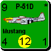
Ive seen some counters planes for WiF that look fantastic. WIll the counters in the computer version be just as good?


http://perso.wanadoo.fr/froon/WiF/counters/index.htm

Attachment (1)

_____________________________


(in reply to Dunedain)
Post #: 321
RE: Unit Depictions on Screen - 2/17/2006 10:07:36 PM   
Shannon V. OKeets


Posts: 22095
Joined: 5/19/2005
From: Honolulu, Hawaii
Status: offline

quote:

ORIGINAL: wodin

Ive seen some counters planes for WiF that look fantastic. WIll the counters in the computer version be just as good?


http://perso.wanadoo.fr/froon/WiF/counters/index.htm


My goal is better.

The screen shot you showed has an out-of-date counter sheet (1996). MWIF is using copyright 2003 for countersheet #1.

I have the program capable of displaying the high resolution air unit counters, and I'm waiting on the artist to provide the bitmaps. He, in turn, is waiting on Harry Rowland to provide him with the most recent versions of the master computer files for the counter sheets. Once I get a couple dozen of the bitmaps, I'll post screen shots.

_____________________________

Steve

Perfection is an elusive goal.

(in reply to wodin)
Post #: 322
RE: Unit Depictions on Screen - 2/18/2006 6:15:42 AM   
pak19652002


Posts: 280
Joined: 1/2/2005
Status: offline
Yummy!

(in reply to Shannon V. OKeets)
Post #: 323
RE: Unit Depictions on Screen - 2/18/2006 10:28:49 AM   
Manic Inertia


Posts: 51
Joined: 2/7/2006
Status: offline
Um, with the planes looking so good and all, is it possible the land units might look a bit crummy by comparison if they don't get touched up with a sort of 3D effect?

(in reply to pak19652002)
Post #: 324
RE: Unit Depictions on Screen - 2/18/2006 12:06:57 PM   
wodin


Posts: 10762
Joined: 4/20/2003
From: England
Status: offline
I also think the counters look very.........flat. They seem part of the map rather than ontop of it.


_____________________________


(in reply to Manic Inertia)
Post #: 325
RE: Unit Depictions on Screen - 2/26/2006 8:28:37 PM   
Shannon V. OKeets


Posts: 22095
Joined: 5/19/2005
From: Honolulu, Hawaii
Status: offline
I haven't posted any screen shots for a while so here is one - truly a work in progress.

I am finishing up the first version of MWIF to upload for the beta testers, so this is just what I could produce in 10 minutes. It needs many corrections.

What stimulated me to post this is that I just recieved the 2nd pass on the high resolution air and naval units from the artist, without anti-aliasing. The bitmap images from the artist are clean.

The program is still writing F5, N5, and L5 on the counters which is easy to remove - and I will once the 1st beta version is done.

The status boxes at the top impinge on the graphics. I expect I will move the status boxes higher, to give the graphics the full 96 by 96 pixels of the counters.

The square colored boxes need to be removed and the location of the numbers adjusted so they fit within the circles. What I will probably do is take a generic circle from the artist and have the program place it - that way I will know that the number is centered in the circle every time.

We also need to figure out how to capture the bitmap image from the original counters such that it uses the maximum amount of the space available without obscuring the numbers.

Finally, the text (unit name) is part of the bitmaps at present. I will probably go with having the program generate the name on the fly. At lower zoom levels the bitmap text disappears very quickly.

Other changes are: the rivers have been cleaned up and the icons for resources have lost their numbers, when there is only one resource in the hex.


Attachment (1)

_____________________________

Steve

Perfection is an elusive goal.

(in reply to wodin)
Post #: 326
RE: Unit Depictions on Screen - 2/26/2006 10:02:27 PM   
wodin


Posts: 10762
Joined: 4/20/2003
From: England
Status: offline
Needs work but looking good so far.

Is there no way to try and make the chits less flat?

_____________________________


(in reply to Shannon V. OKeets)
Post #: 327
RE: Unit Depictions on Screen - 2/26/2006 11:15:05 PM   
JagdFlanker


Posts: 689
Joined: 7/26/2003
From: Halifax, Canada
Status: offline
a simple suggestion might be to add a single black line on the bottom and RHS, indented in 2 pixels. just a slight hint of a shadow! i included a second example with a second black line indented in 4 pixels to add even more thickness as an option.

i did a prntscrn then put it in an editor at 16 colours to simplify it so sorry it's simpler in colour than the original!


Attachment (1)

(in reply to wodin)
Post #: 328
RE: Unit Depictions on Screen - 2/26/2006 11:22:33 PM   
JagdFlanker


Posts: 689
Joined: 7/26/2003
From: Halifax, Canada
Status: offline
a gentleman named cobra has been creating absolutly stunning artwork for War in the Pacific - since he's already done a pile of WW II aircraft you might consider asking him to do your counter artwork for you!

here's a sample:


Attachment (1)

(in reply to JagdFlanker)
Post #: 329
RE: Unit Depictions on Screen - 2/26/2006 11:22:35 PM   
c92nichj


Posts: 440
Joined: 1/14/2005
Status: offline
looks nice

(in reply to Shannon V. OKeets)
Post #: 330
Page:   <<   < prev  9 10 [11] 12 13   next >   >>
All Forums >> [New Releases from Matrix Games] >> World in Flames >> RE: Unit Depictions on Screen Page: <<   < prev  9 10 [11] 12 13   next >   >>
Jump to:


New Messages No New Messages
Hot Topic w/ New Messages Hot Topic w/o New Messages
Locked w/ New Messages Locked w/o New Messages
 Post New Thread
 Reply to Message
 Post New Poll
 Submit Vote
 Delete My Own Post
 Delete My Own Thread
 Rate Posts


Forum Software © ASPPlayground.NET Advanced Edition 2.4.5 ANSI

5.125