Matrix Games Forums

Forums  Register  Login  Photo Gallery  Member List  Search  Calendars  FAQ 

My Profile  Inbox  Address Book  My Subscription  My Forums  Log Out

RE: Unit Depictions on Screen

 
View related threads: (in this forum | in all forums)

Logged in as: Guest
Users viewing this topic: none
  Printable Version
All Forums >> [New Releases from Matrix Games] >> World in Flames >> RE: Unit Depictions on Screen Page: <<   < prev  10 11 [12] 13 14   next >   >>
Login
Message << Older Topic   Newer Topic >>
RE: Unit Depictions on Screen - 2/26/2006 11:27:53 PM   
Froonp


Posts: 7995
Joined: 10/21/2003
From: Marseilles, France
Status: offline
quote:

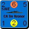
I haven't posted any screen shots for a while so here is one - truly a work in progress.

I am finishing up the first version of MWIF to upload for the beta testers, so this is just what I could produce in 10 minutes. It needs many corrections.

What stimulated me to post this is that I just recieved the 2nd pass on the high resolution air and naval units from the artist, without anti-aliasing. The bitmap images from the artist are clean.

Thanks !
As this is a work in progress, we can't really say anything, except that it looks promising.
One thing I can say is (except for the 3-D thing for counters ) : You should not make the bitmap touch the border of the counter. The bitmap sould be more "inside" the imaginary square formed by the numbers that are in the corners.

(in reply to Shannon V. OKeets)
Post #: 331
RE: Unit Depictions on Screen - 2/27/2006 12:39:05 AM   
tigercub


Posts: 2004
Joined: 2/3/2003
From: brisbane oz
Status: offline
truly stunning his artwork!

_____________________________


You have enemies? Good. That means you've stood up for something, sometime in your life

(in reply to JagdFlanker)
Post #: 332
RE: Unit Depictions on Screen - 2/27/2006 1:33:56 AM   
JagdFlanker


Posts: 689
Joined: 7/26/2003
From: Halifax, Canada
Status: offline
another idea when showing the counters on the map might be to have only the unit pic and the unit name showing (eg - the Me-262 pic and name - no stats), and when you hover the mouse over any counter the ikon grows to a single clear size with all the stats on it (mabe press down the shift key at the same time so it doesn't enlarge at annoying times - just when you want to). and if you zoom waaaaaay out to a more strategic view then have just the pic on it - no name. that way no matter what size the counter is when you are zooming the map in or out you can get the info off it quickly and clearly just by hovering the mouse over it (and mabe pressing the shift key)! it's not like you need ALL the info for ALL the counters right in front of your face, and it will make it easier to fit a stack of counters in a hex (assuming you can stack - i'v never had the pleasure of buying or playing this game but i'v always wanted to SOOOO bad!)

just a thought - it's a pain trying to fit lots of info in a tight space, especially when there's lots of zoom levels and everyone uses a different screen resolution!

(in reply to tigercub)
Post #: 333
RE: Unit Depictions on Screen - 2/27/2006 1:55:18 AM   
wodin


Posts: 10762
Joined: 4/20/2003
From: England
Status: offline
quote:

ORIGINAL: Flanker Leader

a simple suggestion might be to add a single black line on the bottom and RHS, indented in 2 pixels. just a slight hint of a shadow! i included a second example with a second black line indented in 4 pixels to add even more thickness as an option.

i did a prntscrn then put it in an editor at 16 colours to simplify it so sorry it's simpler in colour than the original!


BINGO!

_____________________________


(in reply to JagdFlanker)
Post #: 334
RE: Unit Depictions on Screen - 2/27/2006 1:55:55 AM   
wodin


Posts: 10762
Joined: 4/20/2003
From: England
Status: offline
quote:

ORIGINAL: Flanker Leader

a gentleman named cobra has been creating absolutly stunning artwork for War in the Pacific - since he's already done a pile of WW II aircraft you might consider asking him to do your counter artwork for you!

here's a sample:


Beautifull!

Can we please, please........

_____________________________


(in reply to JagdFlanker)
Post #: 335
RE: Unit Depictions on Screen - 2/27/2006 4:11:05 AM   
Shannon V. OKeets


Posts: 22095
Joined: 5/19/2005
From: Honolulu, Hawaii
Status: offline
quote:

ORIGINAL: Flanker Leader
a gentleman named cobra has been creating absolutly stunning artwork for War in the Pacific - since he's already done a pile of WW II aircraft you might consider asking him to do your counter artwork for you!

here's a sample:


They certainly are pretty.

I have some problems with doing something comparable though.

(1) The first image (upper left corner) is 149 by 79 pixels. I only have 96 by 96 pixels to work with. Going to a larger size would reduce the number of hexes visible on the screen at higher resolution.

The second set of images (overhead views) are closer to the size MWIF uses. Comparing them with the larger side views, you can see the loss of detail in the markings. The artist is using very nice shadowing effects to display structural contours. He is also using anti-aliasing to get the sharp deliniations between the gray planes and the blue sky. Anti-aliasing has two problems that I have already run into for MWIF: (a) it does not scale well at all - zooming out makes the images get really weird, (b) the background color can not change - this means that the background colors for the units would have be driven by the color used for the air unit bitmaps. The naval bitmaps would have to use the same color too.

(2) MWIF contains over 1200 air units, with 500+ of them unique plane types. That's a lot of bitmaps to create at this level of detail.

They sure are pretty though.

_____________________________

Steve

Perfection is an elusive goal.

(in reply to JagdFlanker)
Post #: 336
RE: Unit Depictions on Screen - 2/27/2006 4:25:41 AM   
Shannon V. OKeets


Posts: 22095
Joined: 5/19/2005
From: Honolulu, Hawaii
Status: offline

quote:

ORIGINAL: Flanker Leader

another idea when showing the counters on the map might be to have only the unit pic and the unit name showing (eg - the Me-262 pic and name - no stats), and when you hover the mouse over any counter the ikon grows to a single clear size with all the stats on it (mabe press down the shift key at the same time so it doesn't enlarge at annoying times - just when you want to). and if you zoom waaaaaay out to a more strategic view then have just the pic on it - no name. that way no matter what size the counter is when you are zooming the map in or out you can get the info off it quickly and clearly just by hovering the mouse over it (and mabe pressing the shift key)! it's not like you need ALL the info for ALL the counters right in front of your face, and it will make it easier to fit a stack of counters in a hex (assuming you can stack - i'v never had the pleasure of buying or playing this game but i'v always wanted to SOOOO bad!)

just a thought - it's a pain trying to fit lots of info in a tight space, especially when there's lots of zoom levels and everyone uses a different screen resolution!


I come from the world of playing WIF over the board. What that typically entails is studying the units on the map to decide which ones should go where. A lot of time is spent going through both your own and the enemy's land and air units to see who can move where to attack and defend. There are not as many counters in a theater of operations in WIF as in some other WW II games, but there are still quite a few. Very difficult to keep track of them all when they are in stacks and only the top unit visible.

I mention this as background for responding to your suggestion to leave the numbers off the units. You really need to know what the numbers are to make decisions. Examining a combat situation with all the numbers missing, and only visible when passing the cursor over the units, is going to really slow down playing the game. I can't really see any situation in the game where I would want to toggle the screen display to remove the numbers.

Toggling the screen display to remove the artwork and leave only the numbers - that I do plan to do. So that zooming out will still let you see the numbers clearly and plan your moves accordingly.

I haven't make any firm decisions on the medium and low resolution images for the units. First I want the high resolution images defined. When I do get to working on the medium and low resolution counters, I'll solicit input from everyone and try to pick the best of those ideas for MWIF.

_____________________________

Steve

Perfection is an elusive goal.

(in reply to JagdFlanker)
Post #: 337
RE: Unit Depictions on Screen - 2/27/2006 4:42:37 AM   
Shannon V. OKeets


Posts: 22095
Joined: 5/19/2005
From: Honolulu, Hawaii
Status: offline
quote:

ORIGINAL: wodin
quote:

ORIGINAL: Flanker Leader

a gentleman named cobra has been creating absolutly stunning artwork for War in the Pacific - since he's already done a pile of WW II aircraft you might consider asking him to do your counter artwork for you!

here's a sample:


Beautifull!

Can we please, please........


Ah, yes. The word beautiful is more appropriate than pretty.

This goes against one of my fundamental principles: "Do not change design decisions once they have been made".

The decision on how to render the graphics for the units was discussed back in July and August (2005) and the decision was to use the counter sheets that came with WIF FE - or as close to them as possible. That decision then drove the decision on the size of the hexagons. From there we decided on how to render the map elements: terrain and icons. I recoded the routines that draw the map and the units based on those decisions.

To change one of the fundamental design decisions has repercussions throughout the develpoment process. As one obvious point, the estimated costs for creating the graphics and the schedule for releasing the game would be significantly impacted.

Sadly, there are going to be more of these items that will come up. The world is not a stagnant place and some of the changes are actrually improvements. For example, the world of computers in general and computer graphics in particular is a'bubble and a'pop with faster, cheaper, and more features.

You can't keep changing your soxes, or you'll never get your shoes on.

_____________________________

Steve

Perfection is an elusive goal.

(in reply to wodin)
Post #: 338
RE: Unit Depictions on Screen - 2/27/2006 4:52:51 AM   
Shannon V. OKeets


Posts: 22095
Joined: 5/19/2005
From: Honolulu, Hawaii
Status: offline
quote:

ORIGINAL: wodin
quote:

ORIGINAL: Flanker Leader

a simple suggestion might be to add a single black line on the bottom and RHS, indented in 2 pixels. just a slight hint of a shadow! i included a second example with a second black line indented in 4 pixels to add even more thickness as an option.

i did a prntscrn then put it in an editor at 16 colours to simplify it so sorry it's simpler in colour than the original!


BINGO!


You guys certainly are pushing for this aren't you?

Personally, I am ambivalent about 2 1/2 D effects like shadowing. I typically go for flat images when given the choice for a user interface.

But I am not creating this game for me. I am doing it for you - that is the global you, not the individual you. Which means I do respond to public opinion, albeit slowly and often reluctantly.

I need to rethink what to do about the status boxes at the top, and I'll check out what shadowing looks like when there are 1, 2, 3, 4 units in a hex - at different levels of zoom. If I do use shadowing, it will likely only be a high zoom levels (5, 6, 7, 8), and will use a double thickness (2 pixels) because the single thickness disappears when you zoom out even a single level (i.e., 8 to 7).

_____________________________

Steve

Perfection is an elusive goal.

(in reply to wodin)
Post #: 339
RE: Unit Depictions on Screen - 2/27/2006 5:06:30 AM   
macgregor


Posts: 990
Joined: 2/10/2004
Status: offline
Count me as ambivalent as well. Low zoom could benefit from having maximum pixels for the image. No?

(in reply to Shannon V. OKeets)
Post #: 340
RE: Unit Depictions on Screen - 2/27/2006 5:23:00 AM   
JagdFlanker


Posts: 689
Joined: 7/26/2003
From: Halifax, Canada
Status: offline
good to see that even though i'm new to this forum i'm already causing trouble!

i would say that in light of keeping everything simple for you you may want to try to keep everything that is graphical in the game accessable for users who want to 'mod' the graphics themselves - in the end that always gives an opportunity for EVERYONE to be happy if they are willing to put the work into it! and it extends the life of the game too - you never know what great work an obsessive fan might be capable of! when the game was designed i'm sure the last thing the designers were worried about was the art on the counters!

keep up the good work - i can never argue starting with the traditional map and counter graphics! it is a classic wargame, after all and it's never going to go away!

(in reply to Shannon V. OKeets)
Post #: 341
RE: Unit Depictions on Screen - 2/27/2006 12:43:43 PM   
Froonp


Posts: 7995
Joined: 10/21/2003
From: Marseilles, France
Status: offline
quote:

a gentleman named cobra has been creating absolutly stunning artwork for War in the Pacific - since he's already done a pile of WW II aircraft you might consider asking him to do your counter artwork for you!

here's a sample:

I think that that kind of detailed and beautifull bitmap could be used when accessing some sort of "properties" window about the plane, you know, the place where you will place Greyshaft descriptions of the planes.

(in reply to JagdFlanker)
Post #: 342
RE: Unit Depictions on Screen - 2/27/2006 1:44:43 PM   
wodin


Posts: 10762
Joined: 4/20/2003
From: England
Status: offline
quote:

ORIGINAL: Froonp


I think that that kind of detailed and beautifull bitmap could be used when accessing some sort of "properties" window about the plane, you know, the place where you will place Greyshaft descriptions of the planes.


Great Idea.

Also thanks for taking the 3d counter effect onboard. The counters looked part of the map rather than a chit without the effect.

Also will it be possible for people to mod the counters? Or will they be hardcoded?

< Message edited by wodin -- 2/27/2006 1:45:47 PM >


_____________________________


(in reply to Froonp)
Post #: 343
RE: Unit Depictions on Screen - 2/27/2006 2:43:27 PM   
Andrew Brown


Posts: 5007
Joined: 9/5/2000
From: Hex 82,170
Status: offline
quote:

ORIGINAL: Shannon V. OKeets
You guys certainly are pushing for this aren't you?


I may be joining this discussion a bit late, but in my view some type of 3D effect for the counters is a must. It looks much better than just having 2D counters.

As an example, here is a screenshot of a counter mod I am experimenting with for GGWAW. It uses subtle shading and highlights for the various counters.


Attachment (1)

(in reply to Shannon V. OKeets)
Post #: 344
RE: Unit Depictions on Screen - 2/27/2006 5:50:11 PM   
mlees


Posts: 2263
Joined: 9/20/2003
From: San Diego
Status: offline
In regards to the "thickening" of the appearance of a unit-counter, I would vote that this effect is only used to indicate that multiple units are in the same hex.

However, I am not going to declare war over this...

(The Polish corridor, however...)

(in reply to Andrew Brown)
Post #: 345
RE: Unit Depictions on Screen - 2/27/2006 8:57:43 PM   
kafka


Posts: 159
Joined: 6/11/2004
Status: offline
quote:

The decision on how to render the graphics for the units was discussed back in July and August (2005) and the decision was to use the counter sheets that came with WIF FE - or as close to them as possible. That decision then drove the decision on the size of the hexagons. From there we decided on how to render the map elements: terrain and icons. I recoded the routines that draw the map and the units based on those decisions.


Does this design decision imply that the game won't allow for defining any custom grafics set (within the restrictions set by the implementation)?
This leads to the question whether the game will be moddable at all. I don't ask for an editor, but will text based modifications be possible?

(in reply to mlees)
Post #: 346
RE: Unit Depictions on Screen - 2/27/2006 9:57:00 PM   
Shannon V. OKeets


Posts: 22095
Joined: 5/19/2005
From: Honolulu, Hawaii
Status: offline

quote:

ORIGINAL: kafka

quote:

The decision on how to render the graphics for the units was discussed back in July and August (2005) and the decision was to use the counter sheets that came with WIF FE - or as close to them as possible. That decision then drove the decision on the size of the hexagons. From there we decided on how to render the map elements: terrain and icons. I recoded the routines that draw the map and the units based on those decisions.


Does this design decision imply that the game won't allow for defining any custom grafics set (within the restrictions set by the implementation)?
This leads to the question whether the game will be moddable at all. I don't ask for an editor, but will text based modifications be possible?


The graphics for the map are complex. That is because:
1 - the map is very large
2 - there are 8 levels of zoom
3 - each coastal hex is done as an individual bitmap (5000+)
4 - each river and lake is done as a handdrawn overlay (7000+ hexes involved)

To store that much information, primarily the bitmaps, requires clever coding. A straightforward approach simply exhausts the resources that Windows provides (pointers and other internal programming elements). The demand for screen refresh speeds also applies another major constraint on the design of the map graphics. "Clever coding" means that changing the primary graphical elements may make a hash of the map image. I do a lot of preprocessing to speed up screen refresh - yet still a lot more has to be done on the fly.

Designing a support system so players can edit the graphics is not part of MWIF product 1. That was my very first question to Matrix, before I even signed on to the project: What are we creating? WIF, the game, or a WIF design kit?

Whenever reasonably possible I will provide the players with the ability to make changes off line. That is why I have transformed the storage structure for all the files from Delphi binary to CSV (comma separated values). However, it is much more important to me to actually publish this game so people can play it, than it is to create WIF editing systems - for the map, the units, the graphics, or the rules.

_____________________________

Steve

Perfection is an elusive goal.

(in reply to kafka)
Post #: 347
RE: Unit Depictions on Screen - 2/28/2006 5:43:04 AM   
Neilster


Posts: 2890
Joined: 10/27/2003
From: Hobart, Tasmania, Australia
Status: offline
quote:

However, I am not going to declare war over this...
(The Polish corridor, however...)

Is this your last territorial demand in Europe?


Attachment (1)

< Message edited by Neilster -- 2/28/2006 5:59:54 AM >

(in reply to mlees)
Post #: 348
RE: Unit Depictions on Screen - 2/28/2006 6:07:19 PM   
mlees


Posts: 2263
Joined: 9/20/2003
From: San Diego
Status: offline

quote:

ORIGINAL: Neilster

quote:

However, I am not going to declare war over this...
(The Polish corridor, however...)

Is this your last territorial demand in Europe?


I'll let you know.

(in reply to Neilster)
Post #: 349
RE: Unit Depictions on Screen - 2/28/2006 6:17:55 PM   
Anendrue


Posts: 817
Joined: 7/8/2005
Status: offline
I've been away for a bit, but I am glad to here that a counter shading is being seriously reconsidered. Please, please, please... does the begging help? If so, I'll start a begging thread and even a collect a payoff for Steve thread

_____________________________

Integrity is what you do when nobody is watching.

(in reply to mlees)
Post #: 350
RE: Unit Depictions on Screen - 2/28/2006 6:54:30 PM   
Mziln


Posts: 1107
Joined: 2/9/2004
From: Tulsa Oklahoma
Status: offline

quote:

ORIGINAL: Flanker Leader

a gentleman named cobra has been creating absolutly stunning artwork for War in the Pacific - since he's already done a pile of WW II aircraft you might consider asking him to do your counter artwork for you!

here's a sample:


anyone else notice the swastikas are backwards on some of the planes?

(in reply to JagdFlanker)
Post #: 351
RE: Unit Depictions on Screen - 3/1/2006 2:58:54 PM   
Caranorn


Posts: 424
Joined: 8/31/2001
From: Luxembourg
Status: offline
quote:

ORIGINAL: Mziln


quote:

ORIGINAL: Flanker Leader

a gentleman named cobra has been creating absolutly stunning artwork for War in the Pacific - since he's already done a pile of WW II aircraft you might consider asking him to do your counter artwork for you!

here's a sample:


anyone else notice the swastikas are backwards on some of the planes?


I hadn't, but I bet those images were flipped horizontally at some point, which could mean some otehr inconsistencies slipped through (both sides usually ain't identical, though in most cases differences are minimal (unlike some armour graphics I did last year, flipping an M3Lee/Grant looks a bit odd).

Edit: Obviously my original assesment of flipping does not explain matters, or at least not in every case. If those images had been flipped horizontlly text would also be mirrored...

< Message edited by Caranorn -- 3/3/2006 2:20:14 PM >


_____________________________

Marc aka Caran... ministerialis

(in reply to Mziln)
Post #: 352
RE: Unit Depictions on Screen - 3/1/2006 4:50:45 PM   
Froonp


Posts: 7995
Joined: 10/21/2003
From: Marseilles, France
Status: offline
quote:

anyone else notice the swastikas are backwards on some of the planes?

In fact, worse than that, beyond the first "gorgeous" look of those pictures, the more I look at them now, the more bad things about them come to my mind and make me dissatisfied with them.
The poor choice of camo & unit for the Me109E comes first (A Battle of Britain one would have been best to picture an Emil, because Emils are best known for that), the reversed Svastikas you mentionned, the poor choice of camo for that Fw189 (an eastern front one would have been better as Fw189 were much more usual on the eastern front that in the Med), the poor choice of camo & unit for the Fw190A (the yellow one, hypotheticaly from JG2 and hypotheticaly flown by major Von Graff but without evidence of existence, there are a lot of cool camo & units for that great plane).

(in reply to Mziln)
Post #: 353
RE: Unit Depictions on Screen - 3/1/2006 11:44:20 PM   
JagdFlanker


Posts: 689
Joined: 7/26/2003
From: Halifax, Canada
Status: offline
these must have been done "for fun" by him since they are not for any mod - they fit with WitP but there is no scen designed for them. i'd call them more samples than actual work. he has a "portfolio" here:

http://mathubert.free.fr/Cobra_files.html#New_Look

chances are you'l be a little more impressed by the time you go through more of his work! the ships with a pink-ish background are repeated farther down with a sky backgound, usually. i like how he takes "requests" - like the Royal Canadian Airforce Hurricane (nice!)

< Message edited by Flanker Leader -- 3/2/2006 12:01:45 AM >

(in reply to Froonp)
Post #: 354
RE: Unit Depictions on Screen - 3/2/2006 7:16:32 AM   
tigercub


Posts: 2004
Joined: 2/3/2003
From: brisbane oz
Status: offline
http://www.matrixgames.com/forums/forceddownload.asp?file=0%3B1073404

_____________________________


You have enemies? Good. That means you've stood up for something, sometime in your life

(in reply to Neilster)
Post #: 355
RE: Unit Depictions on Screen - 3/3/2006 10:02:50 AM   
Norden_slith


Posts: 166
Joined: 8/27/2003
From: expatriate german
Status: offline
Will all airunits automaticly become visible, when airunits are moved, i.e. be on top of the stacks?

If this has been asked before, sorry.

Norden

_____________________________

Norden
---------------------------------------------------------------
Hexagonally challenged

(in reply to tigercub)
Post #: 356
RE: Unit Depictions on Screen - 3/3/2006 10:53:33 AM   
Shannon V. OKeets


Posts: 22095
Joined: 5/19/2005
From: Honolulu, Hawaii
Status: offline
quote:

ORIGINAL: Norden

Will all airunits automaticly become visible, when airunits are moved, i.e. be on top of the stacks?

If this has been asked before, sorry.

Norden


The key word here is 'automatically'.

I always look with great suspicion on that word when it is used to described part of a user interface. I have encountered innumerable software programs where the programmer coded in something to be done 'automatically' and I can't get the program to stop doing it. I am sure everyone has a list of these annoyances with the software they use.

As for MWIF and the placement of air units in a stack, I have not read the existing code in detail. I do know that during most phases of the game the units that are eligible to be selected/moved are placed on top of the stack - automatically. There is always the possibility that there are multiple units in a stack that can be selected, which is common for land and naval units, are fairly frequent for air units too.

The program currently provides the ability to decide how all the stacks on the map are sorted (I am pretty sure I saw that in the code). So you could use that capability to get all the air units on top.

I intend to include an additional way to view units on the map. Namely, let four units be seen at one time in a hex. The hex will be large (zoom level 8) and the units smallish (zoom level 4) but that will let you spread out the units. A typical hex might have 2 corps, a division and an air unit. You would be able to see them all at once without having to cycle through them. Note that the whole map would be done like that, so all the land units on the map would be "on top". To accompany this new basic feature for viewing units, I would provide different sorting options. For instance, you could spread out all the air units so they were all visible. Probably can't do that for the naval units since there are often a dozen or more in a hex - but I am going to try to think up a clever way to spread out the naval units so they are all visible too.

2 or 3 weeks before I get to the point of coding how units are displayed on the screen, I'll start some threads on the topic and see what ideas you-all have. We'll kick them around for a while and see if we can design something that makes playing MWIF easier than playing WIF over the board - at least insofar as viewing the units is concerned.

P.S. I don't think anyone should ever have to apologize for asking questions. It just doesn't seem right to me.

_____________________________

Steve

Perfection is an elusive goal.

(in reply to Norden_slith)
Post #: 357
RE: Unit Depictions on Screen - 3/3/2006 11:12:27 AM   
Froonp


Posts: 7995
Joined: 10/21/2003
From: Marseilles, France
Status: offline
quote:

The program currently provides the ability to decide how all the stacks on the map are sorted (I am pretty sure I saw that in the code). So you could use that capability to get all the air units on top.

You're right.
CWiF had a right click command allowing to sort all the stack on the map the same way (planes on the top).

(in reply to Shannon V. OKeets)
Post #: 358
RE: Unit Depictions on Screen - 3/11/2006 1:08:49 AM   
Shannon V. OKeets


Posts: 22095
Joined: 5/19/2005
From: Honolulu, Hawaii
Status: offline
I finished rewriting the save and restore routines so they use comma separated value files (CSV). This makes it easier to debug what is going on during development. It was also the last task I needed to complete so the beta testers could start. Erik Rutkins at Matrix will perform a final blessing on the executable and then release it for testing to the beta team. That should happen today.

So, I have been able to get back to the high resolution air units. I only have three air units to work with at the present. Once I get the placement of the numbers straightened out, I can give the artist precise directions on where the bitmaps are to be placed within the counter (frame). And get more samples to test.

Here is an improved version from the mess I last posted. I have replaced the colored rectangles with colored circles, within which I inscribe the numbers. When the numbers are larger, the circles are larger. The placement of the range for the air units differs by type. Fighters have it at the bottom and the other air units have it on the right side. The reason for that can be seen for the 3 German planes that are serving as my testbed for number placement.

Changes I still want to make to these are:

1 - The F5 with a range of 14 should have its yellow circle raised 1 pixel and centered left to right

2 - The Do217K unit bitmap has to be brought down 6 pixels; there will still be overlap with some of the numbers but that happens on the WIF FIE counter sheets too.

3 - The Ju88A4 bitmap needs to be centered left to right

4 - The L6 with an extended range of 17 needs to have the 17 lowered within the orange stripe. It should be in the same position as the other extended range air units.

5 - I will probably replace the bitmap names with names drawn on the fly using true type fonts. The text for the Ju-88 A4 looks ok here, at the highest level of zoom (8), but it deteriorates at lower zoom levels. I don't expect it to be legible below level 6, but I would like it to look ok at 6 and 7. Making that change will take some trial and error as I test out various fonts, font sizes, and splitting the name into 2 pieces (as it was done for the Me-262 A-1c). But once I get it working correctly, it will work for all 1200+ air units.

6 - There are still some more odd ducks to handle: extra large transports and transports that cannot paradrop. I also have to make sure the carrier air units look good.

7 - Finally, I will take the code I just wrote for the circles and apply it to the other units types that need circles. For example, the artillery and anti-aircraft units.


Attachment (1)

< Message edited by Shannon V. OKeets -- 3/11/2006 1:11:58 AM >


_____________________________

Steve

Perfection is an elusive goal.

(in reply to Froonp)
Post #: 359
RE: Unit Depictions on Screen - 3/11/2006 1:27:16 AM   
lomyrin


Posts: 3741
Joined: 12/21/2005
From: San Diego
Status: offline
Nice progress.

The numbers when using pilots ought to be F2, F3 and L2 L3 and L4 and NAV2, NAV3 and NAV4 though.

Can the numbers change with the use of the 'use pilots' option.

Lars


(in reply to Shannon V. OKeets)
Post #: 360
Page:   <<   < prev  10 11 [12] 13 14   next >   >>
All Forums >> [New Releases from Matrix Games] >> World in Flames >> RE: Unit Depictions on Screen Page: <<   < prev  10 11 [12] 13 14   next >   >>
Jump to:


New Messages No New Messages
Hot Topic w/ New Messages Hot Topic w/o New Messages
Locked w/ New Messages Locked w/o New Messages
 Post New Thread
 Reply to Message
 Post New Poll
 Submit Vote
 Delete My Own Post
 Delete My Own Thread
 Rate Posts


Forum Software © ASPPlayground.NET Advanced Edition 2.4.5 ANSI

4.922