Matrix Games Forums

Forums  Register  Login  Photo Gallery  Member List  Search  Calendars  FAQ 

My Profile  Inbox  Address Book  My Subscription  My Forums  Log Out

RE: MWIF Game Interface Design

 
View related threads: (in this forum | in all forums)

Logged in as: Guest
Users viewing this topic: none
  Printable Version
All Forums >> [New Releases from Matrix Games] >> World in Flames >> RE: MWIF Game Interface Design Page: <<   < prev  11 12 [13] 14 15   next >   >>
Login
Message << Older Topic   Newer Topic >>
RE: MWIF Game Interface Design - 5/2/2006 8:44:44 PM   
Shannon V. OKeets


Posts: 22095
Joined: 5/19/2005
From: Honolulu, Hawaii
Status: offline
Yes. That had been my understanding too. I had a few imprecise statements when describing it in words.

_____________________________

Steve

Perfection is an elusive goal.

(in reply to Froonp)
Post #: 361
RE: MWIF Game Interface Design - 5/17/2006 2:40:16 AM   
Shannon V. OKeets


Posts: 22095
Joined: 5/19/2005
From: Honolulu, Hawaii
Status: offline
Assignments for Keystroke Shortcuts
(as of May 16, 2006)

During play the availability of keystroke shortcuts makes things go faster for experienced players. It saves having to figure out which menu lets you perform certain actions or call up informational forms. I intend to revise the keystroke definitions from CWIF and here is my current list.

All of the following are in combination with the control key <Ctrl>. Some of these are common conventions (F, L, S, X, Z). Others are really obvious (A, B, C, G, H, I, M, N, O, P, R, T, U, V, W). A few depend on a little mind twisting to figure them out and hopefully remember them (D, E, K, Y, 2, 5). And lastly there are those which were stuck with choosing from the remaining letters (J, Q).

A. Activities available
B. Strategic bombing/Resource losses
C. Chat window
D. CAP/Air defense
E. US Entry
F. Find city/port
G. Global map
H. Help/Charts
I. Initiative/Impulse
J. Units in hex
K. Captured facilities
L. Load game
M. Show valid moves
N. Neutrality pacts
O. Optional rules
P. Production/Resources
Q. Units in pools
R. Relationships between countries
S. Save game
T. Trade agreements
U. Units in game
V. Victory totals
W. Weather
X. Exit game
Y. Rules (why?)
Z. Undo all
2. Distance calculator
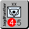
5. Partisans (5th column)

I expect I will have to modify these somewhat as I add more interface features. But these will do for now.

Comments?


_____________________________

Steve

Perfection is an elusive goal.

(in reply to Shannon V. OKeets)
Post #: 362
RE: MWIF Game Interface Design - 5/17/2006 8:14:20 AM   
fuzzy_bunnyy


Posts: 27
Joined: 8/26/2005
Status: offline
flip x and w? ctrl w is frequently used to close windows, x is not. confusion is best avoided imho.

EDIT-
also r and y. I find myself looking at the rules often, and Id rather have that be the intuitive keystroke than the relationships between countries which I can usually remember off the top of my head.

< Message edited by fuzzy_bunnyy -- 5/17/2006 8:17:33 AM >


_____________________________

Member #3 of the EBEA
Comrade #4 of the e-Socialist Liberation Army

(in reply to Shannon V. OKeets)
Post #: 363
RE: MWIF Game Interface Design - 5/17/2006 8:44:42 AM   
Shannon V. OKeets


Posts: 22095
Joined: 5/19/2005
From: Honolulu, Hawaii
Status: offline
quote:

ORIGINAL: fuzzy_bunnyy
flip x and w? ctrl w is frequently used to close windows, x is not. confusion is best avoided imho.

EDIT-
also r and y. I find myself looking at the rules often, and Id rather have that be the intuitive keystroke than the relationships between countries which I can usually remember off the top of my head.


Any other opinions out there?

_____________________________

Steve

Perfection is an elusive goal.

(in reply to fuzzy_bunnyy)
Post #: 364
RE: MWIF Game Interface Design - 5/17/2006 11:02:11 AM   
Froonp


Posts: 7995
Joined: 10/21/2003
From: Marseilles, France
Status: offline
quote:

ORIGINAL: Shannon V. OKeets
quote:

ORIGINAL: fuzzy_bunnyy
flip x and w? ctrl w is frequently used to close windows, x is not. confusion is best avoided imho.

I agree wholeheartly.

quote:

quote:


EDIT-
also r and y. I find myself looking at the rules often, and Id rather have that be the intuitive keystroke than the relationships between countries which I can usually remember off the top of my head.


For this one I'll be OK with any choice. In other words, I don't care .

quote:

quote:


Any other opinions out there?


(in reply to Shannon V. OKeets)
Post #: 365
RE: MWIF Game Interface Design - 5/17/2006 1:58:38 PM   
Neilster


Posts: 2890
Joined: 10/27/2003
From: Hobart, Tasmania, Australia
Status: offline
quote:

ORIGINAL: Shannon V. OKeets

quote:

ORIGINAL: fuzzy_bunnyy
flip x and w? ctrl w is frequently used to close windows, x is not. confusion is best avoided imho.

EDIT-
also r and y. I find myself looking at the rules often, and Id rather have that be the intuitive keystroke than the relationships between countries which I can usually remember off the top of my head.


Any other opinions out there?


W is pretty logical for weather. Is a shortcut for quitting such a good idea? By getting rid of it we help prevent accidental quitting and we can keep W for weather.

R for rules is probably a good idea. Y could be for "Your Relationships". A bit untidy though. People would get used Y for "Why?" in short order. Shortcuts are usually for the well practised anyway.

Cheers, Neilster


< Message edited by Neilster -- 5/17/2006 1:59:49 PM >

(in reply to Shannon V. OKeets)
Post #: 366
RE: MWIF Game Interface Design - 5/17/2006 7:25:34 PM   
Shannon V. OKeets


Posts: 22095
Joined: 5/19/2005
From: Honolulu, Hawaii
Status: offline
quote:

ORIGINAL: fuzzy_bunnyy
flip x and w? ctrl w is frequently used to close windows, x is not. confusion is best avoided imho.

EDIT-
also r and y. I find myself looking at the rules often, and Id rather have that be the intuitive keystroke than the relationships between countries which I can usually remember off the top of my head.


I tried a couple of applications and Ctrl+W seems to just close a window within an application. I would be using Ctrl+X for closing the application itself - quitting. Of course I could use Ctrl+Q, I guess, but Exit strikes me as a good fit (both X and Q are hard to use otherwise).

_____________________________

Steve

Perfection is an elusive goal.

(in reply to fuzzy_bunnyy)
Post #: 367
RE: MWIF Game Interface Design - 5/17/2006 11:01:50 PM   
Shannon V. OKeets


Posts: 22095
Joined: 5/19/2005
From: Honolulu, Hawaii
Status: offline
I am almost done the new Units form. When you first get MWIF, you will probably want to visit this form early on. It contains the cmoplete list of units in the game as thumbnail bitmaps. What I have changed is to add the full size bitmap and accompanying historical text on each unit (text all provided by Greyshaft.

These are for you Greyshaft!


Attachment (1)

_____________________________

Steve

Perfection is an elusive goal.

(in reply to Shannon V. OKeets)
Post #: 368
RE: MWIF Game Interface Design - 5/17/2006 11:04:39 PM   
Shannon V. OKeets


Posts: 22095
Joined: 5/19/2005
From: Honolulu, Hawaii
Status: offline
I wish I could show the whole screen, but the jpg is too large to upload. So I am doing this in three parts.

This second screen shot shows the list of all the units on the left. As you pass the cursor over each unit, the large bitmap on the right and the accompanying text updates immediately.


Attachment (1)

_____________________________

Steve

Perfection is an elusive goal.

(in reply to Shannon V. OKeets)
Post #: 369
RE: MWIF Game Interface Design - 5/17/2006 11:07:02 PM   
Shannon V. OKeets


Posts: 22095
Joined: 5/19/2005
From: Honolulu, Hawaii
Status: offline
Here is the bottom left corner of the same screen as the two previous screen shots.

When a unit is on the map, the small map portion you see here is also updated.

I have filtered for just the HQ units. Which is why you see only HQs on the list to the left.


Attachment (1)

_____________________________

Steve

Perfection is an elusive goal.

(in reply to Shannon V. OKeets)
Post #: 370
RE: MWIF Game Interface Design - 5/17/2006 11:48:15 PM   
Froonp


Posts: 7995
Joined: 10/21/2003
From: Marseilles, France
Status: offline
quote:

ORIGINAL: Shannon V. OKeets
quote:

ORIGINAL: fuzzy_bunnyy
flip x and w? ctrl w is frequently used to close windows, x is not. confusion is best avoided imho.

EDIT-
also r and y. I find myself looking at the rules often, and Id rather have that be the intuitive keystroke than the relationships between countries which I can usually remember off the top of my head.


I tried a couple of applications and Ctrl+W seems to just close a window within an application. I would be using Ctrl+X for closing the application itself - quitting. Of course I could use Ctrl+Q, I guess, but Exit strikes me as a good fit (both X and Q are hard to use otherwise).

Indeed, there is no need for a keyboard key to close the game. there is already the ALT+F4 combination key to quit any program.
There is also CTRL+F4 to close Windows within an Application.

Isn't that enough ?

Just get sure that both are understood by MWiF, and it will be ok I think.


< Message edited by Froonp -- 5/17/2006 11:50:24 PM >

(in reply to Shannon V. OKeets)
Post #: 371
RE: MWIF Game Interface Design - 5/17/2006 11:52:21 PM   
Froonp


Posts: 7995
Joined: 10/21/2003
From: Marseilles, France
Status: offline
quote:

I have filtered for just the HQ units. Which is why you see only HQs on the list to the left.


And where the hell is Manstein ????


(in reply to Shannon V. OKeets)
Post #: 372
RE: MWIF Game Interface Design - 5/18/2006 12:10:36 AM   
Shannon V. OKeets


Posts: 22095
Joined: 5/19/2005
From: Honolulu, Hawaii
Status: offline
quote:

ORIGINAL: Froonp

quote:

ORIGINAL: Shannon V. OKeets
quote:

ORIGINAL: fuzzy_bunnyy
flip x and w? ctrl w is frequently used to close windows, x is not. confusion is best avoided imho.

EDIT-
also r and y. I find myself looking at the rules often, and Id rather have that be the intuitive keystroke than the relationships between countries which I can usually remember off the top of my head.


I tried a couple of applications and Ctrl+W seems to just close a window within an application. I would be using Ctrl+X for closing the application itself - quitting. Of course I could use Ctrl+Q, I guess, but Exit strikes me as a good fit (both X and Q are hard to use otherwise).

Indeed, there is no need for a keyboard key to close the game. there is already the ALT+F4 combination key to quit any program.
There is also CTRL+F4 to close Windows within an Application.

Isn't that enough ?

Just get sure that both are understood by MWiF, and it will be ok I think.


I have been using Windows for over 10 years and I did not know you could close applications with ALT+F4. Not common knowledge.

Saving a key combination by eliminating a shortcut for closing the application would be nice. Players might expect there to be one though.

This piece of the design has a long way to go. I want to enable players to switch between screen layouts and detailed map views too. Game replay, Standing Orders for PBEM, and so on are all yet to be set in place. I anticipate that they all will be deserving of some shortcut keystrokes.

So, suggestions and comments are welcome, but nothing definitie is going to be decided until the other stuff has been worked on some more.

_____________________________

Steve

Perfection is an elusive goal.

(in reply to Froonp)
Post #: 373
RE: MWIF Game Interface Design - 5/18/2006 12:33:27 AM   
SamuraiProgrmmr


Posts: 353
Joined: 10/17/2004
From: Paducah, Kentucky
Status: offline
quote:

ORIGINAL: Shannon V. OKeets
I have been using Windows for over 10 years and I did not know you could close applications with ALT+F4. Not common knowledge.


Don't feel bad....

I have been programming in windows for over 12 years and did not know about the other ones that were mentioned.

I once spent part of several days trying to find documentation on what the 'standard' windows command keys were and was never able to find it. Of course that was before the MSDN knowledgebase.

Experience has shown that it really doesn't matter what keystrokes you pick. Some will like them. Some will hate them. Most will use the mouse no matter how much quicker it is to use the keyboard.

Keep up the great work. I have never worked with a programmer who was so interested in what the users thought. You are a shining example to all of us in that industry.

Kudos

_____________________________

Bridge is the best wargame going .. Where else can you find a tournament every weekend?

(in reply to Shannon V. OKeets)
Post #: 374
RE: MWIF Game Interface Design - 5/18/2006 12:51:15 AM   
Shannon V. OKeets


Posts: 22095
Joined: 5/19/2005
From: Honolulu, Hawaii
Status: offline
quote:

ORIGINAL: SamuraiProgrammer
quote:

ORIGINAL: Shannon V. OKeets
I have been using Windows for over 10 years and I did not know you could close applications with ALT+F4. Not common knowledge.


Don't feel bad....

I have been programming in windows for over 12 years and did not know about the other ones that were mentioned.

I once spent part of several days trying to find documentation on what the 'standard' windows command keys were and was never able to find it. Of course that was before the MSDN knowledgebase.

Experience has shown that it really doesn't matter what keystrokes you pick. Some will like them. Some will hate them. Most will use the mouse no matter how much quicker it is to use the keyboard.

Keep up the great work. I have never worked with a programmer who was so interested in what the users thought. You are a shining example to all of us in that industry.

Kudos


Thanks.

I have worked independently for quite some time and discovered early on that no matter what you do, you always have a boss. The easy way to figure out who your boss is, is to see how the money flows. From person X to you means person X is your boss. For the independent contractor that is the customer. I find it amusing when people I am paying to do work for me act as if they can override my decisions/judgments whenever they want. They clearly haven't grasped the idea that I can simply stop paying them.

Anyway, the players are the paying customers here. The money flows from them to me (eventually, I hope) when they buy the game. So, to me, it seems borderline insane to not solicit and respond to their opinions. Can't please everyone - requests are often mutually exclusive. But I should be able to get MWIF to please most WIF players.

_____________________________

Steve

Perfection is an elusive goal.

(in reply to SamuraiProgrmmr)
Post #: 375
RE: MWIF Game Interface Design - 5/18/2006 1:44:03 PM   
Greyshaft


Posts: 2252
Joined: 10/27/2003
From: Sydney, Australia
Status: offline
quote:

ORIGINAL: Shannon V. OKeets

I am almost done the new Units form. When you first get MWIF, you will probably want to visit this form early on. It contains the cmoplete list of units in the game as thumbnail bitmaps. What I have changed is to add the full size bitmap and accompanying historical text on each unit (text all provided by Greyshaft.

These are for you Greyshaft!


Thanks for the thanks. It's a real buzz seeing my work embedded within the game. Next job is to finish off sixteen air units I missed the first time around.

_____________________________

/Greyshaft

(in reply to Shannon V. OKeets)
Post #: 376
RE: MWIF Game Interface Design - 5/20/2006 11:19:11 PM   
Shannon V. OKeets


Posts: 22095
Joined: 5/19/2005
From: Honolulu, Hawaii
Status: offline
Things are kind of running together as I work on different pieces of the player interface. The result is that I need to finalize the design for the status indicators so that is in place as I work on other interface issues.

Here is what my current design looks like.

A - The large square number 10 indicates how many units are in the hex. When there is only one, this indicator does not show at all.

B - I have slightly rounded the corners of the units.

C - I have not added shading (3-D effects) but that would only be for the counter itself - not for any of the indicators that appear along the outside of the counter.

D - The circle indicators have been numbered 1 through 6 for reference only. Those numbers would not appear on the screen.

E - #1 & #2 are related to moving a unit. If a unit is not eligible for movement during a phase (e.g., a naval unit during an air phase), then the 1st circle would be missing completely.

F - #2 indicates units that are passive. In common WIF parlance they are called face down or disrupted units though both names are inappropriate for MWIF. Face down is wrong for obvious reasons. Disrupted is not quite right either for sometimes it is more closely related to 'expended' or "not fully functional". I prefer 'Passive', especially because a unit can have this status changed through a variety of means during a turn. This circle only appears if a unit is passive.

G - #3 indicates supply status and #4 indicates combat status. For units with normal supply status this circle does not appear. HQs always have circle #3.

H - Since I made the pretty picture I noticed that I need to add another indicator for Damaged naval units.

I - #5 is just for naval units.

J - #6 is for units transporting or being transported by other units.

K - It is quite possible that many units will have no indicators at all!

L - I believe the placement of the indicators at the side as well as on the top will make them easier to learn and remember. Therefore I strongly prefer these placements, despite the fact that that means the units will take up more room when shown in a unit's panel.


Attachment (1)

_____________________________

Steve

Perfection is an elusive goal.

(in reply to Greyshaft)
Post #: 377
RE: MWIF Game Interface Design - 5/21/2006 2:30:24 AM   
Shannon V. OKeets


Posts: 22095
Joined: 5/19/2005
From: Honolulu, Hawaii
Status: offline
Here my next pass at this.

1 - I have used a colored background since the background will never be pure white.

2 - I have added an quasi-3D effect

3 - I have removed the outlines from the circles since they will not scale well through all levels of zoom

4 - I added a 7th circle which is for damaged naval units. It is possible that you will have damaged naval units that have been forced to abort and are fighting through an enemy controlled sea area on their way home. In that case the 5th circle will be colored to indicateForced Abort rather than Fighting Through (since the latter is required).

5 - I added a sea box number to the side. This will not be shown for units that are on the map, but will be helpful when examining displays of units engaged in naval combat. I am working out a design for revising that form and want to be able to shown all the units grouped by unit type for each side. For example, in a naval combat you might have several BBs in sea box 2 and others in sea box 3. When reviewing the combat as a whole, knowing which sea box they are in can be important. Slicing and dicing the form into sea box areas makes it too complex. When I get the form farther along, I'll post it here.


Attachment (1)

_____________________________

Steve

Perfection is an elusive goal.

(in reply to Shannon V. OKeets)
Post #: 378
RE: MWIF Game Interface Design - 5/21/2006 4:28:13 AM   
Zorachus99


Posts: 1066
Joined: 9/15/2000
From: Palo Alto, CA
Status: offline
YES YES!!

_____________________________

Most men can survive adversity, the true test of a man's character is power. -Abraham Lincoln

(in reply to Shannon V. OKeets)
Post #: 379
RE: MWIF Game Interface Design - 5/21/2006 6:52:25 AM   
Neilster


Posts: 2890
Joined: 10/27/2003
From: Hobart, Tasmania, Australia
Status: offline
Are you still going with rounded squares/rectangles for the indicators; maximum number of pixels and all that? Are you going to size the indicators proportionally to their importance?

Cheers, Neilster

(in reply to Shannon V. OKeets)
Post #: 380
RE: MWIF Game Interface Design - 5/21/2006 8:46:55 AM   
Shannon V. OKeets


Posts: 22095
Joined: 5/19/2005
From: Honolulu, Hawaii
Status: offline
quote:

ORIGINAL: Neilster

Are you still going with rounded squares/rectangles for the indicators; maximum number of pixels and all that? Are you going to size the indicators proportionally to their importance?

Cheers, Neilster


1 - What you see above is the current design. The shades of the colors might vary slightly because the above was done in CorelDraw where I use the colors that are most conveniently at hand, rather than the ones that I have more or less standardized on for MWIF.

2 - The proportions of the circles and rectangles to the unit size are almost exact.

3 - The idea for different sizes was when I was still stuck on the concept of a solid row of rectangles across the top. Now, using circles, the indicators look better if they are all the same size. An alternative would be to use ellipses but that seems excessively fancy for no purpose. Instead I am using position of the circles to indicate their purpose/importance. The ones on the left hand side are either minor issues, or come up infrequently (e.g., onlt during combat).

_____________________________

Steve

Perfection is an elusive goal.

(in reply to Neilster)
Post #: 381
RE: MWIF Game Interface Design - 5/21/2006 2:32:57 PM   
Capitaine


Posts: 1043
Joined: 1/15/2002
Status: offline
Might it be possible to have a toggle for varying degrees of status information for counters on the map? I think I'd prefer less clutter on the map counters, but would like for the status detail to appear in the unit display panel. Perhaps I'd like some of the detail on the map counters, but not all. Maybe have a key cycle that goes from no status for on map counters, and about 3 more levels with low to full status shown.

The "quasi" counter shading is a good start!

(in reply to Shannon V. OKeets)
Post #: 382
RE: MWIF Game Interface Design - 5/21/2006 6:34:11 PM   
YohanTM2


Posts: 1143
Joined: 10/7/2002
From: Toronto
Status: offline
Um, let the first of the color blind speak <g>

I'm not sure all these shades/colors are going to be easy for the color blind.

(in reply to Capitaine)
Post #: 383
RE: MWIF Game Interface Design - 5/21/2006 6:58:47 PM   
Shannon V. OKeets


Posts: 22095
Joined: 5/19/2005
From: Honolulu, Hawaii
Status: offline
quote:

ORIGINAL: Yohan
Um, let the first of the color blind speak <g>

I'm not sure all these shades/colors are going to be easy for the color blind.


Always a concern, but I am pretty sure we can work something out here.

1 - The position of the indicator is much more important than the color.

2 - Some of the positions are binary (#2 & #7); there is either a circle there or not.

3 - the most colors that have to be differentiated are 6 (#1).

4 - I haven't used white as a color; it is in reserve.

5 - I expect to use a variety of colors just to make the indicators look pretty, instead of having a basic group of 6 colors for all 7 positions. A great diversity is not required by the design.

6 - If push comes to shove, I can have a toggle for using a different set of colors tailored specifically for color blind players. That would be a player interface setting somewhere.

Let me know which colors/positions are a problem and I'll start tweaking them.

_____________________________

Steve

Perfection is an elusive goal.

(in reply to YohanTM2)
Post #: 384
RE: MWIF Game Interface Design - 5/21/2006 7:12:49 PM   
Shannon V. OKeets


Posts: 22095
Joined: 5/19/2005
From: Honolulu, Hawaii
Status: offline
quote:

ORIGINAL: Capitaine
Might it be possible to have a toggle for varying degrees of status information for counters on the map? I think I'd prefer less clutter on the map counters, but would like for the status detail to appear in the unit display panel. Perhaps I'd like some of the detail on the map counters, but not all. Maybe have a key cycle that goes from no status for on map counters, and about 3 more levels with low to full status shown.

The "quasi" counter shading is a good start!


When I said there often will be no status indicators at all, I was serious. The default setting is for a unit to not need any status indicators.

The ones that are most likely to appear are #1 and #2. Since when they do appear, they are vital for almost all decisions, I do not think removing them would be helpful.

The HQs will always have a #3 but if any other unit has a #3, that is very important information that should not be hidden.

Numbers 4, 5, and 7 only appear during combat phases. During those phases they are important. Once the phase ends, they disappear.

#6 (transport) occurs rarely, but when it does appear, it is very important.

In summary, I think the status indicators only appear when they are quite important to game play. The only one I have some hesitancy about is #3 for HQs. I have that indicator on all the time to reemphasize that HQs are a secondary supply source. Now that is redundant information because every HQ has a third digit, within parentheses, at the bottom. They also have names of their commanders which tend to be longer than other land unit names. Nonetheless, I think it would be especially helpful to beginners to have forceful identification of HQs as supply sources. Nor do I think it would hurt experienced WIF players to be reminded either.

_____________________________

Steve

Perfection is an elusive goal.

(in reply to Capitaine)
Post #: 385
RE: MWIF Game Interface Design - 5/21/2006 7:14:00 PM   
Klingon


Posts: 52
Joined: 5/18/2006
Status: offline
For the color blind, I'd suggest a black/white pallette; using patterns for different statuses. Half black/half white circle; white; black; 2 or 3 shades of grey; also, possibly having a mouse-over popup explain the status, and the reason for it (apologies if that was mentioned before, and I missed it).

(in reply to Shannon V. OKeets)
Post #: 386
RE: MWIF Game Interface Design - 5/21/2006 7:31:47 PM   
c92nichj


Posts: 440
Joined: 1/14/2005
Status: offline
Having played a fair deal of CWIF and been givin this a fair bit of thought during the day I like to share my comments.

Firstly what information do you really need when glancing around the map, when playing CWFI I quickly memorised which box meant "passive" and the different shades of supply. None of the other boxes I learned the meaining of and never really paid any attention, didn't have to know them.

So the use of circle 4-7 I am uncertain of, do you really need to see that kind of information on the map, isn't it ok to have it just in the detailed status box?

Also I would like to thank you for including a little bit of shading of the counters that will make the game look so much more professional.


(in reply to Shannon V. OKeets)
Post #: 387
RE: MWIF Game Interface Design - 5/21/2006 8:32:07 PM   
Froonp


Posts: 7995
Joined: 10/21/2003
From: Marseilles, France
Status: offline
quote:

In summary, I think the status indicators only appear when they are quite important to game play. The only one I have some hesitancy about is #3 for HQs. I have that indicator on all the time to reemphasize that HQs are a secondary supply source. Now that is redundant information because every HQ has a third digit, within parentheses, at the bottom. They also have names of their commanders which tend to be longer than other land unit names. Nonetheless, I think it would be especially helpful to beginners to have forceful identification of HQs as supply sources. Nor do I think it would hurt experienced WIF players to be reminded either.

I think it is OK for HQ to show they are secondary supply sources.
Now, a suggestion : Why not having all others secondary supply sources having the same consistent sign of they being a secondary supply source (a consistent sign in the hex) ? And also, the Primary, a different but consistent sign. This would be an improvement from WiF, who can(t have such signs, because secondary supply sources can change.

Also, just to be sure I understood : The circles only appear when needed, which means that if not needed there is no circle ?

I think I like it.

But I cannot help to think that those "lights" could also have been embedded in the counters. But now that the work on the counters is nearly finished I guess it is too late. But I'm sure there will be people wondering why those "lights" are not inside the counters.

(in reply to Shannon V. OKeets)
Post #: 388
RE: MWIF Game Interface Design - 5/22/2006 2:26:59 AM   
pak19652002


Posts: 280
Joined: 1/2/2005
Status: offline
The use of colors for this purpose will be extremely confusing for the colorblind no matter what you do. There is probably too much information to be communicated in the 7 circles to avoid a confusing array of colors. You've got 24 different messages contained within 7 circles. That's a lot of data to be imbedded on the rim of a little counter!

Maybe it's my understandable aversion to color-coding, but I'm wondering if we really need all this. Is it possible to create an information overload? Counter density will be high and all these colored circles may become overwhelming. Could we look at a screenshot with maybe a dozen counters in full regalia to see if the map gets too busy?

I've been wrong before, but my spider sense is tingling about all these circles.

Peter

(in reply to YohanTM2)
Post #: 389
RE: MWIF Game Interface Design - 5/22/2006 4:01:10 AM   
Zorachus99


Posts: 1066
Joined: 9/15/2000
From: Palo Alto, CA
Status: offline
If you hide the indicators that are unneccesary then you average 3. This will reduce confusion nicely because the purpose of the indicator doesn't change. A little getting used to, and you will know the status of a unit at a glace (usually disrupted/not disrupted, and then whether it has moves available).

Naval units may have up to 7, but some of them may be unneccesary as well, such as indicators that appear during combat.

_____________________________

Most men can survive adversity, the true test of a man's character is power. -Abraham Lincoln

(in reply to pak19652002)
Post #: 390
Page:   <<   < prev  11 12 [13] 14 15   next >   >>
All Forums >> [New Releases from Matrix Games] >> World in Flames >> RE: MWIF Game Interface Design Page: <<   < prev  11 12 [13] 14 15   next >   >>
Jump to:


New Messages No New Messages
Hot Topic w/ New Messages Hot Topic w/o New Messages
Locked w/ New Messages Locked w/o New Messages
 Post New Thread
 Reply to Message
 Post New Poll
 Submit Vote
 Delete My Own Post
 Delete My Own Thread
 Rate Posts


Forum Software © ASPPlayground.NET Advanced Edition 2.4.5 ANSI

1.734