Matrix Games Forums

Forums  Register  Login  Photo Gallery  Member List  Search  Calendars  FAQ 

My Profile  Inbox  Address Book  My Subscription  My Forums  Log Out

RE: MWIF Game Interface Design

 
View related threads: (in this forum | in all forums)

Logged in as: Guest
Users viewing this topic: none
  Printable Version
All Forums >> [New Releases from Matrix Games] >> World in Flames >> RE: MWIF Game Interface Design Page: <<   < prev  12 13 [14] 15 16   next >   >>
Login
Message << Older Topic   Newer Topic >>
RE: MWIF Game Interface Design - 5/22/2006 4:50:28 AM   
scout1


Posts: 2899
Joined: 8/24/2004
From: South Bend, In
Status: offline
quote:

I have worked independently for quite some time and discovered early on that no matter what you do, you always have a boss


I believe this IS the definition of a wife

(in reply to Shannon V. OKeets)
Post #: 391
RE: MWIF Game Interface Design - 5/22/2006 6:03:00 AM   
Shannon V. OKeets


Posts: 22095
Joined: 5/19/2005
From: Honolulu, Hawaii
Status: offline
quote:

ORIGINAL: pak19652002
The use of colors for this purpose will be extremely confusing for the colorblind no matter what you do. There is probably too much information to be communicated in the 7 circles to avoid a confusing array of colors. You've got 24 different messages contained within 7 circles. That's a lot of data to be imbedded on the rim of a little counter!

Maybe it's my understandable aversion to color-coding, but I'm wondering if we really need all this. Is it possible to create an information overload? Counter density will be high and all these colored circles may become overwhelming. Could we look at a screenshot with maybe a dozen counters in full regalia to see if the map gets too busy?

I've been wrong before, but my spider sense is tingling about all these circles.
Peter


Spiders, Peter, hmmm.

I won't screw this up. Here is what status indicators currently look like (in development).

1 - the cursor is on a stack of 4 units and they are shown to the right in the Units Panel (whose sizing for the units I haven't fixed yet). There are two units available for movement (this is the German land movement phase) and they have green indicators on the upper left (as shown in the units panel).

2 - The top unit under the cursor can move. The naval air unit (N3) has already flown a mission (port attack) and is now Passive as indicated by the orange circle in the second position. The last unit in the hex is a bomber which is still available for a mission assignment this turn, just not in this phase (land movement).

2- Note that the naval air unit's Passive status is partially shown in the hex under the cursor. I am letting the status of units underneath come through to the top to give some visiblilty as to what is in the rest of the stack. I have a priority list for each of the indicators and show the highest priority status if more than one exists. The status of units underneath only comes through if the top unit does not have that status box in use.

3 - If you see no partially hidden status indicators, then you know that the hex does not contain units that have non-normal status. For example, the Russian 1-4 3rd infantry division is the top unit of 2 units in its hex and neither is disrupted. Meanwhile the 3 Siberian corps is fully functional, but underneath them is at least one unit that is currently Passive (it is an infantry unit that was disrupted by a ground strike).

4 - Conversely, the Stuka has already flown (Passive indicator) but there is a German land unit underneath that is still eligible for movement, as indicated by the green availability that is partially covered.

5 - Notice that the N4 Condor is on top of its stack and is Passive. However, there is a second unit underneath it about which we know very little. It is not a land unit that is elgible for movement, but is could be a land unit that moved in a previous impulse, a naval unit, or a second air unit. we do not know whether the second unit is Passive or not.

6 - I am using different thicknesses of shadows as a supplemental source of information on how many units are in a hex. The thicknesses vary: 2, 4, or 6.

7 - The bitmapped air units need to have their corners rounded - perhaps tomorrow, if I can find my nail clippers.

I am pretty happy with this. The status indicators appear infrequently and when they do, they provide information that is vital to the player's current activity. They really make it easy to identify which air units can fly missions during each air phase. They show up quite well at even zoom levels 3 and 4 (75% and 100%).

I have a lot more work to do with these, especially for the different combat phase (air, land, and naval). As I get farther along, I'll post more screen shots.


Attachment (1)

_____________________________

Steve

Perfection is an elusive goal.

(in reply to pak19652002)
Post #: 392
RE: MWIF Game Interface Design - 5/22/2006 6:10:08 AM   
Shannon V. OKeets


Posts: 22095
Joined: 5/19/2005
From: Honolulu, Hawaii
Status: offline
I forgot to mention in the previous post.

8 - there is an HQ underneath the 7-4 X Corps. That is a partially covered dark green supply status indicator. The Russian HQ also has a dark green (secondary supply source) status indicator. I will probably change the color from dark green because it is not readily noticeable.

_____________________________

Steve

Perfection is an elusive goal.

(in reply to Shannon V. OKeets)
Post #: 393
RE: MWIF Game Interface Design - 5/22/2006 6:29:12 AM   
c92nichj


Posts: 440
Joined: 1/14/2005
Status: offline
A few comments, on graphics.
1) The rounding of the corners are nice but almost too round.
2) The shadowing works well for the one unit in stack for the thicker shadings it is not quite there yet, maybe you can give it to the graphics artist.
3) Can we see a screen shot at zoomlevel 3 or 4?
4) It does not look that cluttered with the circles yet, but at this point, almost no combat have occured, how will it look like further in Russia after a turn or two of combat, with a few units OOS and a lot of flipped ones?
5) I do not think that people will memorise the meaing of the circles on the side, maybe you'll need a hoover help text on them.

Otherwise I think this is a big improvement over CWIF's boxes.


(in reply to Shannon V. OKeets)
Post #: 394
RE: MWIF Game Interface Design - 5/22/2006 8:41:52 AM   
Froonp


Posts: 7995
Joined: 10/21/2003
From: Marseilles, France
Status: offline
quote:

Here is what status indicators currently look like (in development).

This is quite beautifull !
My comments :
- I would like the counters to be a little less rounded at the corners. But I could live with this.
- Why not putting the shadow the other way around ?
- You must add tooltips to the indicators circles, that appear after 1 sec delay, so that explanation is available for them quite quickly. The players will be quickly used to them, so you should make them desactivable too.
- About the indicators, would it be possible to make them graphicaly look like to lights some more ?

(in reply to Shannon V. OKeets)
Post #: 395
RE: MWIF Game Interface Design - 5/22/2006 9:02:04 AM   
Neilster


Posts: 2890
Joined: 10/27/2003
From: Hobart, Tasmania, Australia
Status: offline
I agree with your plan for the indicators Steve. There are a zillion things to learn about this game anyway and with some practice, players will soon become familiar with the meaning of the indicators. Some mouseover help or suchlike should sort out any problems.

This is looking really good. I also think the counter corners are a tad too rounded. Perhaps in answer to Patrice, the shading is on the left and top because of the indicator placement. It looks like the shading thickness is proportional to the number of units in the hex. Will there be some upper limit to this? I'm thinking of major ports with many naval units in them.

Cheers, Neilster

(in reply to Shannon V. OKeets)
Post #: 396
RE: MWIF Game Interface Design - 5/22/2006 9:20:22 AM   
Neilster


Posts: 2890
Joined: 10/27/2003
From: Hobart, Tasmania, Australia
Status: offline
quote:

- About the indicators, would it be possible to make them graphicaly look like to lights some more ?


I had an idea that making the periphery of the indicators slightly darker and adding a highlight might help with this so I whipped this up really quickly using MS Paint. They obviously could be done much better, with more graduation of the darkening toward the periphery and a less blobby highlight. Also, what about the different zoom levels? Still should be doable, I think, perhaps abandoning this chrome when the indicators get too small.

Cheers, Neilster


Attachment (1)

< Message edited by Neilster -- 5/22/2006 9:32:17 AM >

(in reply to Froonp)
Post #: 397
RE: MWIF Game Interface Design - 5/22/2006 11:35:25 AM   
Shannon V. OKeets


Posts: 22095
Joined: 5/19/2005
From: Honolulu, Hawaii
Status: offline

quote:

ORIGINAL: Froonp

quote:

Here is what status indicators currently look like (in development).

This is quite beautifull !
My comments :
- I would like the counters to be a little less rounded at the corners. But I could live with this.
- Why not putting the shadow the other way around ?
- You must add tooltips to the indicators circles, that appear after 1 sec delay, so that explanation is available for them quite quickly. The players will be quickly used to them, so you should make them desactivable too.
- About the indicators, would it be possible to make them graphicaly look like to lights some more ?


Ok. As several people have requested, I'll reduce the rounding effect on the counters themselves.

I originally had the shadows bottom and right but they ran into the status indicators (space is extremely tight). Quite by chance I found that by placing them under the status indicators (in order to save room) I stumbled upon the possibility of partially covering the status indicators for the units underneath. I consider this a big plus.

Tooltips et al are polish to come later. I expect to include them for a whole lot of stuff on the screen.

_____________________________

Steve

Perfection is an elusive goal.

(in reply to Froonp)
Post #: 398
RE: MWIF Game Interface Design - 5/22/2006 11:37:10 AM   
Shannon V. OKeets


Posts: 22095
Joined: 5/19/2005
From: Honolulu, Hawaii
Status: offline

quote:

ORIGINAL: Neilster

quote:

- About the indicators, would it be possible to make them graphicaly look like to lights some more ?


I had an idea that making the periphery of the indicators slightly darker and adding a highlight might help with this so I whipped this up really quickly using MS Paint. They obviously could be done much better, with more graduation of the darkening toward the periphery and a less blobby highlight. Also, what about the different zoom levels? Still should be doable, I think, perhaps abandoning this chrome when the indicators get too small.

Cheers, Neilster


You are right, the indicators are very drab. Let me get them all functioning correctly and then I'll look into jazzing them up. Buff and polish, buff and polish.

_____________________________

Steve

Perfection is an elusive goal.

(in reply to Neilster)
Post #: 399
RE: MWIF Game Interface Design - 5/22/2006 2:52:40 PM   
YohanTM2


Posts: 1143
Joined: 10/7/2002
From: Toronto
Status: offline
quote:

I originally had the shadows bottom and right but they ran into the status indicators (space is extremely tight). Quite by chance I found that by placing them under the status indicators (in order to save room) I stumbled upon the possibility of partially covering the status indicators for the units underneath. I consider this a big plus.

Tooltips et al are polish to come later. I expect to include them for a whole lot of stuff on the screen.


The tool tips solves the color blind issue (and also have a nice PDF page I can print and put on the wall beside my computer to reference) and I think your shading idea to show an indicator on units underneath is perfect.

(in reply to Shannon V. OKeets)
Post #: 400
RE: MWIF Game Interface Design - 5/22/2006 3:03:48 PM   
Lothrim


Posts: 20
Joined: 4/7/2006
Status: offline
Hi Shanon

Out from lurking (having watched this space for more than 6 months) I just had to post a few notes to you.
When you took up this project some time ago I quietly laughed at the world for producing yet another fool willing to try on the task of implementing WIF. I liked Chris, but I considered his effort doomed from the outset.
I must admit that your effort has turned me into a believer. Now I only cry because you have to spend time doing trivial stuff like positioning units inside a 96 pixel space.
It would be great if you had more people to help you with the basic stuff, so you could code a proper AI.

I am still a doomsayer I guess, when I predict that you will fail to produce a good AI. But don´t let that discourage you. I will buy your game no matter how much the AI sucks. Having a virtual WIF board that you can play with your friends on email is GREAT.

Regarding your tries to make the stacks 3D:
Having the shadows to the top left might be handy in terms of space, but it is contratry to the way shadows work in windows. Light is always comming from the top left.
Also you need a highlight of the other side of the counter in white.
If it is impossible because of space, I would rather have flat counters, possibly with am indication that there are multiple units in the hex.

Regarding stacks:
You have chosen 3 categories:
- single unit
- small stack
- large stack

I would suggest that you keep it at 2 levels:
- single unit
- stack
The other option is confusing, and the difference between a large stack and a small stack is not really usefull.

Indicators (lights):
While we are at it, my opinion of them is that they should be eliminated if at all possible.
An indicator that surounds the entire unit is good. (I belive you have included that already), but a status-light like "has moved this turn" is crap and should be replaced by movement arrows on the map to indicate the path traveled. Also attacks could be displayed with arrows. (see Gary Grigsby's World At War way of doing it)


(in reply to Shannon V. OKeets)
Post #: 401
RE: MWIF Game Interface Design - 5/22/2006 3:45:06 PM   
Froonp


Posts: 7995
Joined: 10/21/2003
From: Marseilles, France
Status: offline
quote:

An indicator that surounds the entire unit is good. (I belive you have included that already), but a status-light like "has moved this turn" is crap and should be replaced by movement arrows on the map to indicate the path traveled. Also attacks could be displayed with arrows. (see Gary Grigsby's World At War way of doing it)

I disagree.
While seeing the path of moved units is a good idea, having the global picture of who moved and who didn't is important too, especially with crowded places.
MWiF would not be the sole wargame to have it.
The Battles in Italy / Normandy series has it, in another way : Moved units are greyed out on the map.

Show it anyway, but this is an information the player needs.

(in reply to Lothrim)
Post #: 402
RE: MWIF Game Interface Design - 5/22/2006 5:13:48 PM   
SamuraiProgrmmr


Posts: 353
Joined: 10/17/2004
From: Paducah, Kentucky
Status: offline

quote:

ORIGINAL: scout1

quote:

I have worked independently for quite some time and discovered early on that no matter what you do, you always have a boss


I believe this IS the definition of a wife


She who must be obeyed told me to tell you that was wrong.


_____________________________

Bridge is the best wargame going .. Where else can you find a tournament every weekend?

(in reply to scout1)
Post #: 403
RE: MWIF Game Interface Design - 5/22/2006 5:28:27 PM   
Capitaine


Posts: 1043
Joined: 1/15/2002
Status: offline

quote:

ORIGINAL: Lothrim

Regarding your tries to make the stacks 3D:
Having the shadows to the top left might be handy in terms of space, but it is contratry to the way shadows work in windows. Light is always comming from the top left.
Also you need a highlight of the other side of the counter in white.

I quite agree with this here. This was my thought, too, when I first saw the shading. The added depth was excellent, but it looks awkward. The actual face of the counter, too, needs the additional highlighting. The "crowding issue" can be solved; better to reduce the size of the lighted indicators than apply backwards shading in Windows.

quote:

Regarding stacks:
You have chosen 3 categories:
- single unit
- small stack
- large stack

I would suggest that you keep it at 2 levels:
- single unit
- stack
The other option is confusing, and the difference between a large stack and a small stack is not really usefull.

Again, quite agree. No need to show anything more than that there is a stack (if only added black shading is used to do this).

But the counters look much better than original already! Great effort.

(in reply to Lothrim)
Post #: 404
RE: MWIF Game Interface Design - 5/22/2006 5:43:28 PM   
Neilster


Posts: 2890
Joined: 10/27/2003
From: Hobart, Tasmania, Australia
Status: offline
quote:

I am still a doomsayer I guess, when I predict that you will fail to produce a good AI. But don´t let that discourage you.


Have you read the whole AI thread?

Cheers, Neilster

(in reply to Lothrim)
Post #: 405
RE: MWIF Game Interface Design - 5/22/2006 8:31:42 PM   
Shannon V. OKeets


Posts: 22095
Joined: 5/19/2005
From: Honolulu, Hawaii
Status: offline
quote:

ORIGINAL: Yohan
quote:

I originally had the shadows bottom and right but they ran into the status indicators (space is extremely tight). Quite by chance I found that by placing them under the status indicators (in order to save room) I stumbled upon the possibility of partially covering the status indicators for the units underneath. I consider this a big plus.

Tooltips et al are polish to come later. I expect to include them for a whole lot of stuff on the screen.


The tool tips solves the color blind issue (and also have a nice PDF page I can print and put on the wall beside my computer to reference) and I think your shading idea to show an indicator on units underneath is perfect.


To maintain focus I replaced my "comes as part of Windows" screen background with a bitmap screen shot from MWIF. I've got from Dublin to Voronezh, Leningrad to Berne, partially visible under all the applications I have running. That was done last week. I'll probably update it with different ones from time to time.

_____________________________

Steve

Perfection is an elusive goal.

(in reply to YohanTM2)
Post #: 406
RE: MWIF Game Interface Design - 5/22/2006 8:56:32 PM   
Shannon V. OKeets


Posts: 22095
Joined: 5/19/2005
From: Honolulu, Hawaii
Status: offline
quote:

ORIGINAL: Lothrim
Hi Shanon

Out from lurking (having watched this space for more than 6 months) I just had to post a few notes to you.
When you took up this project some time ago I quietly laughed at the world for producing yet another fool willing to try on the task of implementing WIF. I liked Chris, but I considered his effort doomed from the outset.
I must admit that your effort has turned me into a believer. Now I only cry because you have to spend time doing trivial stuff like positioning units inside a 96 pixel space.
It would be great if you had more people to help you with the basic stuff, so you could code a proper AI.

I am still a doomsayer I guess, when I predict that you will fail to produce a good AI. But don´t let that discourage you. I will buy your game no matter how much the AI sucks. Having a virtual WIF board that you can play with your friends on email is GREAT.

Regarding your tries to make the stacks 3D:
Having the shadows to the top left might be handy in terms of space, but it is contratry to the way shadows work in windows. Light is always comming from the top left.
Also you need a highlight of the other side of the counter in white.
If it is impossible because of space, I would rather have flat counters, possibly with am indication that there are multiple units in the hex.

Regarding stacks:
You have chosen 3 categories:
- single unit
- small stack
- large stack

I would suggest that you keep it at 2 levels:
- single unit
- stack
The other option is confusing, and the difference between a large stack and a small stack is not really usefull.

Indicators (lights):
While we are at it, my opinion of them is that they should be eliminated if at all possible.
An indicator that surounds the entire unit is good. (I belive you have included that already), but a status-light like "has moved this turn" is crap and should be replaced by movement arrows on the map to indicate the path traveled. Also attacks could be displayed with arrows. (see Gary Grigsby's World At War way of doing it)


It's always great to hear from new voices.

Your suggestion of 1 unit versus more than 1 unit for shading is a possibility. In WIF, having 3 in a stack is sort of a key number (when playing with divisions). This part of the design is still very young and I hope to gather more suggestions/alternatives about how to make it better before making any final decisions.

I am less perturbed by going against the 'standard' lighting scheme than most, I guess. It might be disconcerting at first use but after playing the game for a while the difference will fade away.

Attack arrows are already part of the code during the land combat declaration phase. I had the graphics artist upgrade their quality last month.

Modifications to the colors for the shadowing do need to be made. What I have in place now lets me code the routines that get the right colors for indicators to appear at the right time.

Marking out the path traveled isn't feasible in WIF. The unit density in the front lines is so high, that if I were to do that, it would look like a bowl of spaghetti run over by a steam roller. [At one time my brother and his wife, having consumed quite a bit of wine, gave into the temptation to let their 2 year old eat spaghetti with his hands. They placed him on the floor, with a tablecloth spread out underneath him, and let him have at it. When all was done, they picked up the tablecloth with him still inside of it and carrying the whole mess to the bathtub for a long soak and thorough wash.]

During game play it is almost a given that players will want to reconsider/undo moves. They possibilities are so numerous and there are so many units to move, that players frequently change their minds. For that reason having indicators for which units: can move, have moved, cannot move is a very useful feature. If I made it controllable by a toggle switch, I would bet that it would always be turned on. But I am still open to that possibilty.

_____________________________

Steve

Perfection is an elusive goal.

(in reply to Lothrim)
Post #: 407
RE: MWIF Game Interface Design - 5/22/2006 9:07:43 PM   
Shannon V. OKeets


Posts: 22095
Joined: 5/19/2005
From: Honolulu, Hawaii
Status: offline
quote:

ORIGINAL: Capitaine
quote:

ORIGINAL: Lothrim
Regarding your tries to make the stacks 3D:
Having the shadows to the top left might be handy in terms of space, but it is contratry to the way shadows work in windows. Light is always comming from the top left.
Also you need a highlight of the other side of the counter in white.

I quite agree with this here. This was my thought, too, when I first saw the shading. The added depth was excellent, but it looks awkward. The actual face of the counter, too, needs the additional highlighting. The "crowding issue" can be solved; better to reduce the size of the lighted indicators than apply backwards shading in Windows.


As always, thanks for the feedback.

I usually show just the most zoomed in view (zoom level 8) when I post screen shots. Despite the improements from using new software for capturing screen shots, there is still a drop in quality between what I see when playnig versus what appears in the forum posts. The zoomed in view permits a better informed discussion of the screen display and interface design.

I am deciding on the size for the status indicators such that they are visible/useful down to level 3 of zoom. That translates as a change from 136 by 152 pixels per hex down to 51 by 57 pixels per hex. Players tell me they usually play at zoom level 4 and would like to be able to play at zoom level 3. That's because they can see more of the map at the same time when zoomed out.

While I hold aesthetics to be quite important, more than merely eye candy, playability still rules supreme in the list of criteria.

_____________________________

Steve

Perfection is an elusive goal.

(in reply to Capitaine)
Post #: 408
RE: MWIF Game Interface Design - 5/23/2006 1:14:37 AM   
JagdFlanker


Posts: 689
Joined: 7/26/2003
From: Halifax, Canada
Status: offline
just curious as far as stacking goes, is there going to be 'tabs' or another way to let you put all aircraft on top of the stack for investigation/movement, or all naval, or all land? or even to see at a glance that there are aircraft under a stack of land units and so forth? in fooling around with vassel it was a real pain trying to seperatly move land units on top of (often flipped) aircraft or to see if you have an unused aircraft at the bottom of a land stack at a glance. hopefully i didn't miss an old post that already explained this!

(in reply to Shannon V. OKeets)
Post #: 409
RE: MWIF Game Interface Design - 5/23/2006 1:45:17 AM   
lomyrin


Posts: 3741
Joined: 12/21/2005
From: San Diego
Status: offline
And we also need to be able to read the labels and names at zoom level 4.

Keep in mind that zoom level 3 at 1024 x 780 is about equivalent to zoom level 4 at 1280 x 1024 in terms of map hexes visible and counter label readability.

Lars

(in reply to Shannon V. OKeets)
Post #: 410
RE: MWIF Game Interface Design - 5/23/2006 1:47:40 AM   
Shannon V. OKeets


Posts: 22095
Joined: 5/19/2005
From: Honolulu, Hawaii
Status: offline
quote:

ORIGINAL: Flanker Leader
just curious as far as stacking goes, is there going to be 'tabs' or another way to let you put all aircraft on top of the stack for investigation/movement, or all naval, or all land? or even to see at a glance that there are aircraft under a stack of land units and so forth? in fooling around with vassel it was a real pain trying to seperatly move land units on top of (often flipped) aircraft or to see if you have an unused aircraft at the bottom of a land stack at a glance. hopefully i didn't miss an old post that already explained this!


Sorting all the stacks on the map was part of CWIF (I believe). I want to add the ability to restrict which unit units are shown as well (using a filter). That would let you find all the Commonwealth units in Belgium and France, for instance.

Chris wrote what I consider a very sweet way of gonig through a stack of units. When you right click on a stack a menu comes up, which is fairly standard practice. What is different in CWIF (and now MWIF) is that the code is tracking both the down stroke of the mouse click and the release. By positioning the popup menu "just so", with Next Unit immediately under the cursor, Chris was able to make a single mouse click serve a dual purpose. You can select from the popup menu or you can simply let the mouse button return to normal position. In the latter case, the top unit in the stack is moved to the bottom.

Now that is a lot of technical detail, but the effect is you simply right click on a stack to see the next unit. Even with dozens of naval units in a stack, it takes almost no effort to go through them all.

_____________________________

Steve

Perfection is an elusive goal.

(in reply to JagdFlanker)
Post #: 411
RE: MWIF Game Interface Design - 5/23/2006 1:50:57 AM   
Shannon V. OKeets


Posts: 22095
Joined: 5/19/2005
From: Honolulu, Hawaii
Status: offline
quote:

ORIGINAL: lomyrin
And we also need to be able to read the labels and names at zoom level 4.

Keep in mind that zoom level 3 at 1024 x 780 is about equivalent to zoom level 4 at 1280 x 1024 in terms of map hexes visible and counter label readability.

Lars


I will do the best I can with the available pixels. Numbers are of more importance to me than the unit names.

_____________________________

Steve

Perfection is an elusive goal.

(in reply to lomyrin)
Post #: 412
RE: MWIF Game Interface Design - 5/23/2006 2:42:01 AM   
lomyrin


Posts: 3741
Joined: 12/21/2005
From: San Diego
Status: offline
Yes, I agree that the numbers are more important than the names.

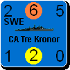
The ship symbols though, in particular, do need to be clearly visible as to the type BB, CA, TRS, etc. in order to easily select, discern, and move desired units.

Lars

(in reply to Shannon V. OKeets)
Post #: 413
RE: MWIF Game Interface Design - 5/23/2006 3:08:44 AM   
Shannon V. OKeets


Posts: 22095
Joined: 5/19/2005
From: Honolulu, Hawaii
Status: offline

quote:

ORIGINAL: lomyrin

Yes, I agree that the numbers are more important than the names.

The ship symbols though, in particular, do need to be clearly visible as to the type BB, CA, TRS, etc. in order to easily select, discern, and move desired units.

Lars

Yes.

I am thinking about other ways to deal with displaying the naval units so that larger areas of the map can be viewed at once. Very vague thoughts so far. The problem is that naval units can move over a very large area and the player would like to be able to see the entire scope of the map involved when moving a group of ships. Ideally, you would like to be able to see the map at zoom level 2 (maybe 1?), or at a minimum 3, and also see all the relevant naval units at the same time. Included under that umbrella I place naval air units and fighters that are presently on land but could reach a sea area along the route.

I have only gottten as far as having the units displayed at a different zoom level from the map. For example, the map is at zoom level 2 but the units are at zoom level 5. This would work ok for most sea area and I would view all the contiguous coastal hexes that border a sea area as a single land mass within which naval units in port would be stacked. As I said, a rather vague vision at this point. Once I get the naval units being displayed in those pretty little sea boxes I created, I'll come back to this issue.

My motivation is a comment from a forum member when I first started this project. He said that the naval portion of the game got less attention than it deserved in CWIF. And I agreed. So I'm stuck with the problem of making the system for displaying naval movement and combat as interesting as the one for land units. Perhaps that will lead to something for improving the display of air movement and combat too.

One issue that will come up when I create medium and low resolution versions of the counters is how to deal with the dozens of land unit types. I expect I will have to collapse them down into a mere 4 or 5.

_____________________________

Steve

Perfection is an elusive goal.

(in reply to lomyrin)
Post #: 414
RE: MWIF Game Interface Design - 5/23/2006 10:14:51 AM   
Neilster


Posts: 2890
Joined: 10/27/2003
From: Hobart, Tasmania, Australia
Status: offline
quote:

Your suggestion of 1 unit versus more than 1 unit for shading is a possibility. In WIF, having 3 in a stack is sort of a key number (when playing with divisions). This part of the design is still very young and I hope to gather more suggestions/alternatives about how to make it better before making any final decisions.


This is what I was hinting at earlier. Perhaps "3 or more" is a good limit. We have the number of units in the stack displayed anyway.

quote:

At one time my brother and his wife, having consumed quite a bit of wine, gave into the temptation to let their 2 year old eat spaghetti with his hands. They placed him on the floor, with a tablecloth spread out underneath him, and let him have at it. When all was done, they picked up the tablecloth with him still inside of it and carrying the whole mess to the bathtub for a long soak and thorough wash.


Well that's how I've always eaten it

quote:

Chris wrote what I consider a very sweet way of gonig through a stack of units. When you right click on a stack a menu comes up, which is fairly standard practice. What is different in CWIF (and now MWIF) is that the code is tracking both the down stroke of the mouse click and the release. By positioning the popup menu "just so", with Next Unit immediately under the cursor, Chris was able to make a single mouse click serve a dual purpose. You can select from the popup menu or you can simply let the mouse button return to normal position. In the latter case, the top unit in the stack is moved to the bottom.

Now that is a lot of technical detail, but the effect is you simply right click on a stack to see the next unit. Even with dozens of naval units in a stack, it takes almost no effort to go through them all.


And very handy it is too.

Cheers, Neilster

(in reply to Shannon V. OKeets)
Post #: 415
RE: MWIF Game Interface Design - 5/23/2006 12:40:49 PM   
Lothrim


Posts: 20
Joined: 4/7/2006
Status: offline
quote:

ORIGINAL: Neilster

quote:

I am still a doomsayer I guess, when I predict that you will fail to produce a good AI. But don´t let that discourage you.


Have you read the whole AI thread?

Cheers, Neilster


Yep, I am not saying that the AI is being ignored. I am just saying that it will be difficult to implement a good AI.
But if the AI can provide a challenge to people new to WIF that will be ok, writing an AI that can beat veteran WIF players is in my opinion just plain impossible.


(in reply to Neilster)
Post #: 416
RE: MWIF Game Interface Design - 5/23/2006 1:07:26 PM   
Lothrim


Posts: 20
Joined: 4/7/2006
Status: offline

quote:

ORIGINAL: Shannon V. OKeets
Marking out the path traveled isn't feasible in WIF. The unit density in the front lines is so high, that if I were to do that, it would look like a bowl of spaghetti run over by a steam roller. [At one time my brother and his wife, having consumed quite a bit of wine, gave into the temptation to let their 2 year old eat spaghetti with his hands. They placed him on the floor, with a tablecloth spread out underneath him, and let him have at it. When all was done, they picked up the tablecloth with him still inside of it and carrying the whole mess to the bathtub for a long soak and thorough wash.]


Hmm, I will have to try that with my 2 kids (1 and 3 years) :-)

quote:

ORIGINAL: Shannon V. OKeets
During game play it is almost a given that players will want to reconsider/undo moves. They possibilities are so numerous and there are so many units to move, that players frequently change their minds. For that reason having indicators for which units: can move, have moved, cannot move is a very useful feature. If I made it controllable by a toggle switch, I would bet that it would always be turned on. But I am still open to that possibilty.


You misunderstand me Shannon.
I would only show the path of a unit/stack when it was selected, not at all times.

The goal of the indicators is obviously to assist that player, so that he remembers to move all units. I just think that indicators might not be the best way to do that.

A sentry feauture where you indicate that this unit is meant to be standing still for a long time (garisons, anti-partisan units, reserve convoy points etc) is a must in almost any implementation.

A Move-To-Next-Unit feauture is a possibility, but it is not very great in a wif scale game.

A Hide-All-Units-That-Have-Moved is an idea I toyed with. You would press x and while the key was depressed only units that were able to move, had not moved previously and was not in sentry mode would be displayed. Enemy units would still be shown. You would not be able to do anything in "hide mode" It is purely a way to spot the forgotten units.
The problem is that the feauture would probably be difficult to learn for new players as it is not very "visible".

I can read from your threads that you have implemented a filter function, so perhaps what I am asking is the ability to bind a filter to a keystroke ??

Just my 2 cent :-)

(in reply to Shannon V. OKeets)
Post #: 417
RE: MWIF Game Interface Design - 5/23/2006 1:21:42 PM   
Neilster


Posts: 2890
Joined: 10/27/2003
From: Hobart, Tasmania, Australia
Status: offline
quote:

The goal of the indicators is obviously to assist that player, so that he remembers to move all units. I just think that indicators might not be the best way to do that.


They do a lot more than that. They represent a large amount of information.

quote:

A Move-To-Next-Unit feauture is a possibility, but it is not very great in a wif scale game.


It was already implemented in the old CWiF and it was actually very handy.

quote:

A Hide-All-Units-That-Have-Moved is an idea I toyed with.


How would you know what hexes are available to be moved to? They might already be full of hidden units. The indicators will tell you what units can still be moved. As partial moves are possible, this gets quite complicated without the indicators.

Cheers, Neilster


< Message edited by Neilster -- 5/23/2006 1:22:17 PM >

(in reply to Lothrim)
Post #: 418
RE: MWIF Game Interface Design - 5/23/2006 3:46:35 PM   
Capitaine


Posts: 1043
Joined: 1/15/2002
Status: offline

quote:

ORIGINAL: Shannon V. OKeets

I am deciding on the size for the status indicators such that they are visible/useful down to level 3 of zoom. That translates as a change from 136 by 152 pixels per hex down to 51 by 57 pixels per hex. Players tell me they usually play at zoom level 4 and would like to be able to play at zoom level 3. That's because they can see more of the map at the same time when zoomed out.

While I hold aesthetics to be quite important, more than merely eye candy, playability still rules supreme in the list of criteria.

Right, and I totally agree. I would have thought that a "zoom level" half of what you post in screenshots (level 4 vice level 8) would have to have a separate graphic anyway. The whole depiction could be different at lower zoom levels it seems. Dunno, maybe I'm wrong on how you do this. But if so, you could choose to emphasize certain things at the lower zooms as you perceive their needs. (In other words, it seems the indicators could be larger relative to the counter at zoom 4 than at zoom 8.)

Anyway, I comment on what you have posted and how that looks to me as just a single judge of the graphic quality and clarity. If you didn't post and solicit commentary, I wouldn't say anything, right?

(in reply to Shannon V. OKeets)
Post #: 419
RE: MWIF Game Interface Design - 5/23/2006 4:19:23 PM   
Froonp


Posts: 7995
Joined: 10/21/2003
From: Marseilles, France
Status: offline
quote:

The goal of the indicators is obviously to assist that player, so that he remembers to move all units. I just think that indicators might not be the best way to do that.

Moved units appearing greyed out would be great too.

quote:

A sentry feauture where you indicate that this unit is meant to be standing still for a long time (garisons, anti-partisan units, reserve convoy points etc) is a must in almost any implementation.

It exist in MWiF.

(in reply to Lothrim)
Post #: 420
Page:   <<   < prev  12 13 [14] 15 16   next >   >>
All Forums >> [New Releases from Matrix Games] >> World in Flames >> RE: MWIF Game Interface Design Page: <<   < prev  12 13 [14] 15 16   next >   >>
Jump to:


New Messages No New Messages
Hot Topic w/ New Messages Hot Topic w/o New Messages
Locked w/ New Messages Locked w/o New Messages
 Post New Thread
 Reply to Message
 Post New Poll
 Submit Vote
 Delete My Own Post
 Delete My Own Thread
 Rate Posts


Forum Software © ASPPlayground.NET Advanced Edition 2.4.5 ANSI

0.953