Sahok1
Posts: 1
Joined: 1/11/2021
Status: offline

|
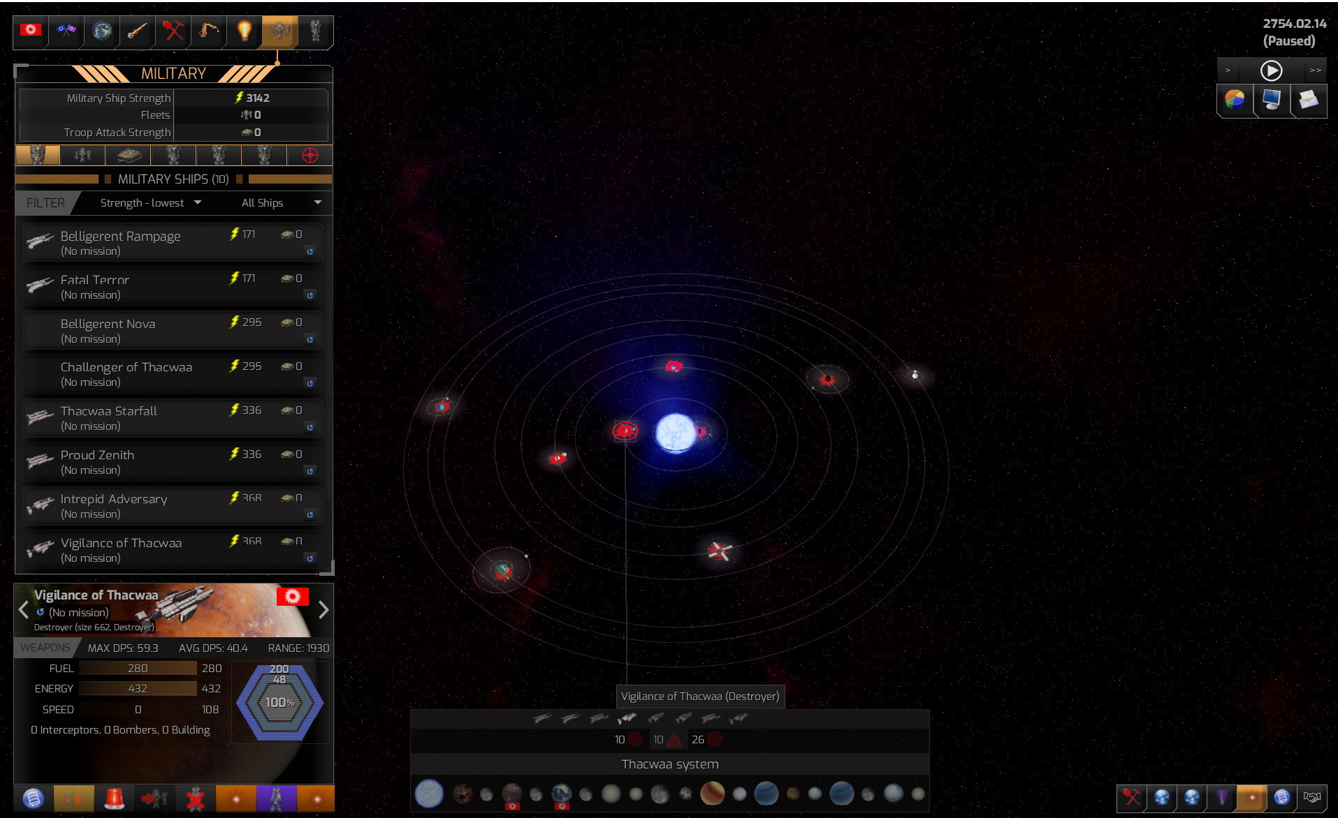
Hello! What about interface stile? in the screenshots, we can see an interface that is very similar to DW1. But the DW1 interface is very outdated and does not fit into the canons of the modern UI. In addition, the interface in this style creates a certain sense of hopelessness. Color scheme, font, symbols, icons, sliders, sprites. All this suggests that everything is bad in the empires. Even in colonies with the highest happiness, sullen creatures walk the streets, in cities overflowing with garbage and yellow tones, in the style of old films about space travel, produced by different countries.
What do you think about this and will there be a change in the interface? I understand that HD icons will probably be added, but the style itself will remain the same as shown in the screenshots? And will there be additional graphical improvements? I believe that in terms of ship design, we will see a truly revolutionary system that continues the idea of DW1, combining ideas from other projects + completely new solutions. Do you think that the graphics component should be improved or you are completely satisfied with it?
I'm not in any way saying that the interface is bad or the graphics are bad. With the features that are supposed to be in the game, this appearance is really great 
|
 Printable Version










 You should also make some stars more bright (a few of them).


 New Messages
 No New Messages
 Hot Topic w/ New Messages
 Hot Topic w/o New Messages
 Locked w/ New Messages
 Locked w/o New Messages
 Post New Thread