Matrix Games Forums

Forums  Register  Login  Photo Gallery  Member List  Search  Calendars  FAQ 

My Profile  Inbox  Address Book  My Subscription  My Forums  Log Out

RE: Weather

 
View related threads: (in this forum | in all forums)

Logged in as: Guest
Users viewing this topic: none
  Printable Version
All Forums >> [New Releases from Matrix Games] >> World in Flames >> RE: Weather Page: <<   < prev  2 3 [4] 5 6   next >   >>
Login
Message << Older Topic   Newer Topic >>
RE: Weather - 12/20/2006 9:54:31 AM   
Froonp


Posts: 7995
Joined: 10/21/2003
From: Marseilles, France
Status: offline
quote:

ORIGINAL: Shannon V. OKeets


quote:

ORIGINAL: Incy

A variation of 3) could be to not draw separate sea weather, but rather a big weather system graphic centered around each searchbox. Smallish weather system for "bad" weather, big storm system for "very bad" weather. Make it a huge graphic maybe 6 by 6 hexes? The map would look just like a satelite photo !!

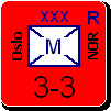
This would be rather easy to do. All sea hexes would not display a weather overlay and an extra 'weather sea box' could be added the the 10 existing sea boxes to indicate weather. It could also be simplified, as you noted, to bad versus very bad. Downside is that is doesn't match the rest of the weather depictions in the land hexes.

I am still open on this design issue. I expected that the addition of weather zone boundaries would cause us to have to revisit weather overlays (though I definitely do not want to start from scratch).

What do other forum readers think?

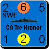
I am strongly against having the Weather zones boundaries crossing in the middle of sea areas as Incy propose it.

Sea box sections can be moved on the map, and so their position is no garantee that the player will know the weather zone for a Sea Area.
Just look for example at paper WiF, there is only 1 sea area where the weather zone is not clear, and we keep getting questions about it, regulary, after 10 years that the game is played.

Moreover, I for one do not find this disturbing (that the weather zone boundary is drawn around islands), for me this just make it even clearer that the weather in those islands is not the same as the weather in the surrounding sea area, and clearer that the whole sea area is under the same weather. With Incy's version, it would be less clear, as there would be no weather zone boundary around those islands, and the weather in the surrounding sea area would be unclear.

(in reply to Shannon V. OKeets)
Post #: 91
RE: Weather - 12/20/2006 9:59:29 AM   
Froonp


Posts: 7995
Joined: 10/21/2003
From: Marseilles, France
Status: offline
quote:

ORIGINAL: Incy
3) Is a bit more fancy. At sea, there is no difference between rain/snow and storm/blizzard. Why not use a separate weather overlay for sea hexes? For example small waves for rain/snow, and big waves for storm/blizzard? It would add to the graphic variation of the game, and it won't look that wierd when "waves" rather than "weather" crosses boundaries. It will also "remove" information where it's not needed, it will be easier for players to think about fine/bad/very bad weather for seas, rather than consider all 5 weather types and understanding how each of them work at sea.

I like this, but without the previous idea of the weather boundaries being changed.
Showing the weather at sea in another way may be good looking.

Another argument against "cutting sea areas in 2 (or more) weather zones" : When you are in a high level of zoom (large hexes), with the screen centered in a sectin where youonly see a part of the sea area, a player will be confused into believing he can't send planes at sea, if the weather boundaries show him that he first hexdots are in storm à blizzard.

No no, the weather into the whole sea areas should be accurately shown, both with consistent graphics, and with consistent weather zones boundaries.

(in reply to Incy)
Post #: 92
RE: Weather - 12/20/2006 10:00:40 AM   
Froonp


Posts: 7995
Joined: 10/21/2003
From: Marseilles, France
Status: offline
quote:

ORIGINAL: Incy

A variation of 3) could be to not draw separate sea weather, but rather a big weather system graphic centered around each searchbox. Smallish weather system for "bad" weather, big storm system for "very bad" weather. Make it a huge graphic maybe 6 by 6 hexes? The map would look just like a satelite photo !!

Nice idea too.

(in reply to Incy)
Post #: 93
RE: Weather - 12/20/2006 10:15:33 AM   
Froonp


Posts: 7995
Joined: 10/21/2003
From: Marseilles, France
Status: offline
Isn't the "side by side" boundaries & borders a possibility ?
I believe it would be the best.
If necessary, a couple of pixels could separate the, as Ballista shown in post #66, without necessarily have one boundary being dashed or dotted.

Isn't the WiF FE way a possibility too ?
A very large light blue line (without the darker blue blobs if you want), and the other lines would be within this wide line when they are overlaping (see post #65, and imagine the blobs are not here)?

(in reply to Froonp)
Post #: 94
RE: Weather - 12/20/2006 11:00:16 AM   
Shannon V. OKeets


Posts: 22095
Joined: 5/19/2005
From: Honolulu, Hawaii
Status: offline
quote:

ORIGINAL: Froonp
Isn't the "side by side" boundaries & borders a possibility ?
I believe it would be the best.
If necessary, a couple of pixels could separate the, as Ballista shown in post #66, without necessarily have one boundary being dashed or dotted.

Isn't the WiF FE way a possibility too ?
A very large light blue line (without the darker blue blobs if you want), and the other lines would be within this wide line when they are overlaping (see post #65, and imagine the blobs are not here)?


Side by side has problems as to which color goes on which side. Take the simple example of a Y intersection. If white is on the right side of the Y then which side of the upper left extension is also colored white? The colors will not be contiguous. One within the other is a possibility, but I have already seen 3 inside of 5 and that was a disaster - it looked like a mistake/smear.

Odd numbers for the width reduce the distortion effects of zooming.

Reducing the white border for weather boundaries between all sea and coastal is doable without much effort. But Lars (and you) were complaining about having difficulty seeing the thinner lines.

The WIF FE scheme for weather zone boundaries is something I consider as, at best, a last resort. Besides personally finding the dotted lines unattractive, circles do not zoom well. Trying for subtle effects (at the 1 or 2 pixel level) is doomed to fail under one or more of the 8 levels of zoom (zoom doomed?).
---
I agree that not showing the weather in every hex can present problems when the player is using a high level of zoom.
---
I am wondering where and how often the names of the weather zones should be displayed. One possibility is to add it to the name for the sea area, perhaps in parentheses under the sea area name. Since that is right next to the sea section boxes, it will always let the players know which weather zone each sea area is in. Right now the names for the weather zones are not shown anywhere on the map.
---
I have looked at using red instead of pink for the overlap of country borders and weather zone boundaries. That is a little more forceful/noticeable, and in my opinion, it looks ok.

_____________________________

Steve

Perfection is an elusive goal.

(in reply to Froonp)
Post #: 95
RE: Weather - 12/20/2006 12:20:37 PM   
Froonp


Posts: 7995
Joined: 10/21/2003
From: Marseilles, France
Status: offline

quote:

ORIGINAL: Shannon V. OKeets
Reducing the white border for weather boundaries between all sea and coastal is doable without much effort. But Lars (and you) were complaining about having difficulty seeing the thinner lines.

My difficulties seeing the thinner lines were inland. When it is next to the sea area, the white stands out so well, that it was clear even in the previous examples that you posted.

(in reply to Shannon V. OKeets)
Post #: 96
RE: Weather - 12/20/2006 12:24:04 PM   
Froonp


Posts: 7995
Joined: 10/21/2003
From: Marseilles, France
Status: offline
quote:

Side by side has problems as to which color goes on which side. Take the simple example of a Y intersection. If white is on the right side of the Y then which side of the upper left extension is also colored white? The colors will not be contiguous. One within the other is a possibility, but I have already seen 3 inside of 5 and that was a disaster - it looked like a mistake/smear.

Side by side, for me it is not important which is on which side. The important thing is that if both colors are here, I can focus on one color (& forget the other) and understand the countries, weather zones, and sea area boundaries more easily. By changing the color, you oblige me to decode that rose is dark red in one case and white in another case, and to understand that blue is white in one case and dark blue in another case. For me, this make understanding the map in one glance more difficult.
But I've not seen how it could look with the boundaries side by side, maybe it is ugly ?

(in reply to Shannon V. OKeets)
Post #: 97
RE: Weather - 12/20/2006 12:25:37 PM   
Froonp


Posts: 7995
Joined: 10/21/2003
From: Marseilles, France
Status: offline
quote:

I am wondering where and how often the names of the weather zones should be displayed. One possibility is to add it to the name for the sea area, perhaps in parentheses under the sea area name. Since that is right next to the sea section boxes, it will always let the players know which weather zone each sea area is in. Right now the names for the weather zones are not shown anywhere on the map.

You have the information in the task bar of the game, I'm not sure it is important to display it on the map.

Because of the map gigantic size, and because of the multiples levels of zoom, you're sure to miss the weather zone name anyway, even if it is displayed on the map.

(in reply to Shannon V. OKeets)
Post #: 98
RE: Weather - 12/20/2006 5:30:00 PM   
qgaliana


Posts: 311
Joined: 4/27/2005
Status: offline
Speaking for at least one of the colour impaired, I'm having a lot of trouble with the changing colour of lines. Side by side would be better.

But as long as I can toggle it all off and mouse over (or something) to check weather that's 99% what I'll wind up doing. So the lines won't matter.

(in reply to Froonp)
Post #: 99
RE: Weather - 12/20/2006 7:02:34 PM   
Shannon V. OKeets


Posts: 22095
Joined: 5/19/2005
From: Honolulu, Hawaii
Status: offline
quote:

ORIGINAL: qgaliana
Speaking for at least one of the colour impaired, I'm having a lot of trouble with the changing colour of lines. Side by side would be better.

But as long as I can toggle it all off and mouse over (or something) to check weather that's 99% what I'll wind up doing. So the lines won't matter.

I am very senstitive to what player with different color perceptions see. It's over 10% of the male population (which make up most of the target market for MWIF). Becuause I personally have no way of testing this, and people with different color perceptions are often reluctant to speak up, I have been aggressively soliciting their point of view. That's that only way I know of finding out if I am doing a good job for them. Please, don't be shy, I need to know what you see.
---
Yes, the weather zone is shown as part of the information panel(s) on the current hex, and it's not possible to make it visible everywhere, all the time. Nonetheless, I believe adding it at somewhere should be done so the player can tell what the weather zone is in places other than directly under the cursor.
---
I have been thinking about making the country boundaries a toggle (on/off). If I do that in combination with the same for the weather zone boundaries, that should solve the problem over the land. Over the sea is different. When looking at sea areas the players will want to know both the sea area and weather zone boundaries at the same time. Or am I wrong, and adding a toggle for sea area boundaries would solve that problem too?

_____________________________

Steve

Perfection is an elusive goal.

(in reply to qgaliana)
Post #: 100
RE: Weather - 12/20/2006 7:34:04 PM   
qgaliana


Posts: 311
Joined: 4/27/2005
Status: offline
Sure - I bring it up because we swapped some posts on the topic a while back.

Personally, I have a brutal time with the with the two blue colours over sea (face pressed against the screen, squinting "I think I see it"). But this will vary from person to person. Depending on what colours you pick, someone else may have trouble. As long as one is toggleable, plus the info panel, it should be easy to figure out. Two would make it easier, but I personnaly don't see it as more than an esthetic issue. I expect I will enjoy looking at the pretty map uncluttered by lines.

(in reply to Shannon V. OKeets)
Post #: 101
RE: Weather - 12/20/2006 7:59:07 PM   
Shannon V. OKeets


Posts: 22095
Joined: 5/19/2005
From: Honolulu, Hawaii
Status: offline

quote:

ORIGINAL: qgaliana

Sure - I bring it up because we swapped some posts on the topic a while back.

Personally, I have a brutal time with the with the two blue colours over sea (face pressed against the screen, squinting "I think I see it"). But this will vary from person to person. Depending on what colours you pick, someone else may have trouble. As long as one is toggleable, plus the info panel, it should be easy to figure out. Two would make it easier, but I personnaly don't see it as more than an esthetic issue. I expect I will enjoy looking at the pretty map uncluttered by lines.


I'll try some different colors for the shades of blue. Several other people also reported them as being too similar and hard to see.

How about the pink? I'll show the red variation later too.

_____________________________

Steve

Perfection is an elusive goal.

(in reply to qgaliana)
Post #: 102
RE: Weather - 12/20/2006 9:38:01 PM   
qgaliana


Posts: 311
Joined: 4/27/2005
Status: offline

quote:

ORIGINAL: Shannon V. OKeets


quote:

ORIGINAL: qgaliana

Sure - I bring it up because we swapped some posts on the topic a while back.

Personally, I have a brutal time with the with the two blue colours over sea (face pressed against the screen, squinting "I think I see it"). But this will vary from person to person. Depending on what colours you pick, someone else may have trouble. As long as one is toggleable, plus the info panel, it should be easy to figure out. Two would make it easier, but I personnaly don't see it as more than an esthetic issue. I expect I will enjoy looking at the pretty map uncluttered by lines.


I'll try some different colors for the shades of blue. Several other people also reported them as being too similar and hard to see.

How about the pink? I'll show the red variation later too.


Pink on green (esp clear terr) or yellow (desert?) is trouble, on low zoom I can't see it at all. On other terrain no prob. Again, if you have an alternative system that doesn't rely on coloured lines that will work best, and it sounds like you do (mouseover/hex select?). Tweaking colours until they look good to me is bound to lead to trouble (wife:can you bring me my black sweater, me:sure, wife: that's green, me:??, wife: the other dark one, me:aaah )

(in reply to Shannon V. OKeets)
Post #: 103
RE: Weather - 12/21/2006 7:58:50 AM   
Shannon V. OKeets


Posts: 22095
Joined: 5/19/2005
From: Honolulu, Hawaii
Status: offline
Here are the weather zone boundaries with one color inside of another. I have reduced the weather zone boundaries to a width of 3 when they are by themselves - that seems to work well everywhere.

What you are seeing here is a white line 1 pixel wide inside a dark blue line 7 pixels wide. The white really takes over doesn't it? Where the weather zone boundary parallels the Norway-Sweden border you can see the same 1 inside 7 but with maroon as the outside color.

This is zoom level 3 and it's not too bad. Compare the white inside blue in the Atlantic versus the pure white inside the Baltic.


Attachment (1)

_____________________________

Steve

Perfection is an elusive goal.

(in reply to qgaliana)
Post #: 104
RE: Weather - 12/21/2006 8:00:33 AM   
Shannon V. OKeets


Posts: 22095
Joined: 5/19/2005
From: Honolulu, Hawaii
Status: offline
Here is the land overlap at zoom level 5.


Attachment (1)

_____________________________

Steve

Perfection is an elusive goal.

(in reply to Shannon V. OKeets)
Post #: 105
RE: Weather - 12/21/2006 8:02:29 AM   
Shannon V. OKeets


Posts: 22095
Joined: 5/19/2005
From: Honolulu, Hawaii
Status: offline
Zoom level 6. There is one hexside that is 1 white inside of 5 maroon; the other s are 1 inside of 7. At higher levels of zoom, things are even clearer.


Attachment (1)

_____________________________

Steve

Perfection is an elusive goal.

(in reply to Shannon V. OKeets)
Post #: 106
RE: Weather - 12/21/2006 8:04:53 AM   
Shannon V. OKeets


Posts: 22095
Joined: 5/19/2005
From: Honolulu, Hawaii
Status: offline
Here is zoom level 4. This looks good too.

One of the reasons I am exploring two-toned boundaries is for the color blind players - does this work for you?


Attachment (1)

_____________________________

Steve

Perfection is an elusive goal.

(in reply to Shannon V. OKeets)
Post #: 107
RE: Weather - 12/21/2006 8:06:21 AM   
Shannon V. OKeets


Posts: 22095
Joined: 5/19/2005
From: Honolulu, Hawaii
Status: offline
Here is a difficult test for the design, zoom level 3. Not great, but not too bad either.


Attachment (1)

_____________________________

Steve

Perfection is an elusive goal.

(in reply to Shannon V. OKeets)
Post #: 108
RE: Weather - 12/21/2006 8:06:56 AM   
Shannon V. OKeets


Posts: 22095
Joined: 5/19/2005
From: Honolulu, Hawaii
Status: offline
Another zoom level 3. The reduction to a width of 3 for the white really helps here; the island outline effect is less pronounced.


Attachment (1)

_____________________________

Steve

Perfection is an elusive goal.

(in reply to Shannon V. OKeets)
Post #: 109
RE: Weather - 12/21/2006 8:08:41 AM   
Shannon V. OKeets


Posts: 22095
Joined: 5/19/2005
From: Honolulu, Hawaii
Status: offline
Zoom level 2. The white in maroon can be seen (if you look hard) but the white in blue is very difficult to see.


Attachment (1)

_____________________________

Steve

Perfection is an elusive goal.

(in reply to Shannon V. OKeets)
Post #: 110
RE: Weather - 12/21/2006 8:10:44 AM   
Shannon V. OKeets


Posts: 22095
Joined: 5/19/2005
From: Honolulu, Hawaii
Status: offline
8th and last in the series. Again the white in maroon can be seen, while the white in dark blue is hard to distinguish from the pure white.


Attachment (1)

_____________________________

Steve

Perfection is an elusive goal.

(in reply to Shannon V. OKeets)
Post #: 111
RE: Weather - 12/21/2006 8:19:53 AM   
Froonp


Posts: 7995
Joined: 10/21/2003
From: Marseilles, France
Status: offline
quote:

ORIGINAL: Shannon V. OKeets
Here is a difficult test for the design, zoom level 3. Not great, but not too bad either.

Personaly, I like all those way better than the "change color" way. For me it is a no brainer that those are better. No need to decode !!!!

What about if we go back to green ?

What about trying having the lines side by side ? This is not exactly the same as the "lines within", as there won't be one line separated in 2 lines by the line that is within.

(in reply to Shannon V. OKeets)
Post #: 112
RE: Weather - 12/21/2006 8:27:51 AM   
Shannon V. OKeets


Posts: 22095
Joined: 5/19/2005
From: Honolulu, Hawaii
Status: offline

quote:

ORIGINAL: Froonp

quote:

ORIGINAL: Shannon V. OKeets
Here is a difficult test for the design, zoom level 3. Not great, but not too bad either.

Personaly, I like all those way better than the "change color" way. For me it is a no brainer that those are better. No need to decode !!!!

What about if we go back to green ?

What about trying having the lines side by side ? This is not exactly the same as the "lines within", as there won't be one line separated in 2 lines by the line that is within.

Green is very hard to see against the blue all sea and also over the different green terrain types.

Side by side is difficult to program (the problem I described earlier with which color goes on which side) and I do not expect there to be much difference - the white will overwhelm the other color. That's primarily because of the medium (the computer monitor generates light instead of reflecting it). Those white lines inside of the dark ones have a ratio of 6:1 for the # of pixels in the darker color : white. White stills wins easily.

_____________________________

Steve

Perfection is an elusive goal.

(in reply to Froonp)
Post #: 113
RE: Weather - 12/21/2006 12:42:42 PM   
c92nichj


Posts: 440
Joined: 1/14/2005
Status: offline
I like those better than the previous option.

(in reply to Shannon V. OKeets)
Post #: 114
RE: Weather - 12/21/2006 2:15:23 PM   
Peter Stauffenberg


Posts: 403
Joined: 2/24/2006
From: Oslo, Norway
Status: offline
I like these weather zone lines too. It's great the weather lines don't conceal national borders and sea zone border.

(in reply to c92nichj)
Post #: 115
RE: Weather - 12/21/2006 5:02:13 PM   
qgaliana


Posts: 311
Joined: 4/27/2005
Status: offline
I think they look better but white in blue on the ocean is tough to see (Dark blue bleeds away in my vision except for the odd pixel that breaks up the white line). Low zoom was difficult but I don't think that's my colour vision.

Have you experimented with blue in white? Or dotted lines?

Agree these look better - it's easier to make the brain shift to seeing borders vs seeing weather zones.

(in reply to Peter Stauffenberg)
Post #: 116
RE: Weather - 12/21/2006 6:26:33 PM   
lomyrin


Posts: 3741
Joined: 12/21/2005
From: San Diego
Status: offline
I also agree that these latest weather zone lines are much better than the earlier versions.

Lars

(in reply to qgaliana)
Post #: 117
RE: Weather - 12/21/2006 8:39:28 PM   
Shannon V. OKeets


Posts: 22095
Joined: 5/19/2005
From: Honolulu, Hawaii
Status: offline
Ok, I think I've nailed it. Like so many things in programming, once you find the answer, you wonder why it took you so long to see it. Bloody obvious, mate!

Zoom level 2, and everything is clear (it also works at zoom level 1).


Attachment (1)

_____________________________

Steve

Perfection is an elusive goal.

(in reply to lomyrin)
Post #: 118
RE: Weather - 12/21/2006 8:41:14 PM   
Shannon V. OKeets


Posts: 22095
Joined: 5/19/2005
From: Honolulu, Hawaii
Status: offline
Here it is over land. I am keeping the weather white at the same size throughout (3). Country and sea area boundaries are 7.


Attachment (1)

_____________________________

Steve

Perfection is an elusive goal.

(in reply to Shannon V. OKeets)
Post #: 119
RE: Weather - 12/21/2006 8:43:20 PM   
Shannon V. OKeets


Posts: 22095
Joined: 5/19/2005
From: Honolulu, Hawaii
Status: offline
Subcountry borders are 5 pixels in width (e.g., between Transylvania and Hungary) instead of the normal 7 for country borders.


Attachment (1)

_____________________________

Steve

Perfection is an elusive goal.

(in reply to Shannon V. OKeets)
Post #: 120
Page:   <<   < prev  2 3 [4] 5 6   next >   >>
All Forums >> [New Releases from Matrix Games] >> World in Flames >> RE: Weather Page: <<   < prev  2 3 [4] 5 6   next >   >>
Jump to:


New Messages No New Messages
Hot Topic w/ New Messages Hot Topic w/o New Messages
Locked w/ New Messages Locked w/o New Messages
 Post New Thread
 Reply to Message
 Post New Poll
 Submit Vote
 Delete My Own Post
 Delete My Own Thread
 Rate Posts


Forum Software © ASPPlayground.NET Advanced Edition 2.4.5 ANSI

1.984