Shannon V. OKeets
Posts: 22095
Joined: 5/19/2005
From: Honolulu, Hawaii
Status: offline

|
quote:
ORIGINAL: Froonp
quote:
Here are some screen shots of the naval descritptions that Terje has been working on. I apologize for the irregular spacing in the text - I haven't quite decided on how to present paragraph text. I probably will write a little whip-de-doo routine that formats text descriptions using symbol combinations to denote new paragraphs (e.g., ".P" means new paragraph). Then I will remove extraneous blanks.
I like all those screens.
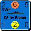
Nit pickers would ask for figure units to be uniformous through the naval units writups, for comparisons purposes. I suggest using millimeters instead of inches for armor and gun caliber (if I'm right that most of the world people uses mm instead of inches). Also use the right thousands separator, probably comma though the writups.
Also, why is the shadowing effect not showing on units in this dialog ?
Also, these writeups are real cool and real good reading, even for me who is kind of a WWII geek !!! Congrats to Terje !
and while I'm at congrats, congrats to Greyshaft for the Planes writups, and to Steve for the whole packaging !
Keep the faith dudes !!!
There are many contributors and I thank you all for your continuing assistance. The alternatives are either for the product to be poorer or for me to take more time filling in the missing pieces and/or locating and fixing mistakes.
As for measurements, I lean towards English for English speaking countries and Metric for non-English speaking countries. My logic here is rather simple: the literature on the ships (and other units) is likely to use the same measurements that the owning country uses. On the other hand, I will go with commas for thousands and periods for decimal points - just for consistency.
For the shadowing, I am only using it for the units when they are on the map - at the present time.
As you can see from the unit writeup screen, there are two sizes of unit depictions on the forms: zoom level 8 (the big one) and zoom level 4 (the smaller one). I use Z8 when showing one or two units on a form and Z4 when showing a list of units (either horizontal or vertical). Z4 is hard to read, but if the unit resoultion is set to medium that problem is solved.
For the last couple of days I have been messing around with the various components that you see here. For example, the unit data panel, which lists all the numeric factors for an individual unit now uses a slightly larger font and takes up a little more room. I also readjusted all the numbers so the colons (':') line up vertically. If you compare the air and naval units - and the different types of naval units - you will see that the layout for their information changes slightly.
Besides having both vertical and horizontal units lists, the lists vary depending on whether the status indicators are shown and whether there is any text under the unit. During setup it is important for the setup form/tray to have text describing each unit, but the status indicators have no value since every unit is the same (selectable). On the unit review form (used to display the unit descriptions amongst other things), the text is off to the side and the status indicators are omitted. This stuff varies from form to form and there are about 40 different ones that contain unit lists. I minimize the space required to display each unit whenever possbile. I am fighting smoe weird Delphi internal procedures about the sequence in which component variables are instantiated at the present. Once I get that settled, I'll define which forms get text and which get status indicators.
Then I will be able to go back and decide about using shadowing and outlining for the unit depictions in the forms. Probably yes for those at Z8, prossibly no for thse at Z4. By the way, I have fixed the transparency problem so the whites are whiter.
_____________________________
Steve
Perfection is an elusive goal.
|
 Printable Version
 RE: MWIF Game Interface Design -
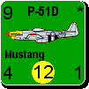


 New Messages
 No New Messages
 Hot Topic w/ New Messages
 Hot Topic w/o New Messages
 Locked w/ New Messages
 Locked w/o New Messages
 Post New Thread