Matrix Games Forums

Forums  Register  Login  Photo Gallery  Member List  Search  Calendars  FAQ 

My Profile  Inbox  Address Book  My Subscription  My Forums  Log Out

RE: MWIF Game Interface Design

 
View related threads: (in this forum | in all forums)

Logged in as: Guest
Users viewing this topic: none
  Printable Version
All Forums >> [New Releases from Matrix Games] >> World in Flames >> RE: MWIF Game Interface Design Page: <<   < prev  43 44 [45] 46 47   next >   >>
Login
Message << Older Topic   Newer Topic >>
RE: MWIF Game Interface Design - 7/23/2008 8:02:49 AM   
Norman42


Posts: 244
Joined: 2/9/2008
From: Canada
Status: offline

quote:

ORIGINAL: Shannon V. OKeets

I am resigned to using Uncontrolled (perhaps I'll get use to it).


Uncontrolled sounds right to me.

The addition of the '2 of 2' info I think will be an improvement to the form. The rest looks good.


_____________________________

-------------

C.L.Norman

(in reply to Shannon V. OKeets)
Post #: 1321
RE: MWIF Game Interface Design - 7/23/2008 8:16:22 AM   
Shannon V. OKeets


Posts: 22095
Joined: 5/19/2005
From: Honolulu, Hawaii
Status: offline

quote:

ORIGINAL: paulderynck

quote:

ORIGINAL: sajbalk

What is the category under build points for "no path" indicate?


I'd bet it is resources you control that cannot be traced to any factory by rail or by sea.

There is another entry for that. I am thinking (without reading the code) that it is build points that are part of trade commitments. I am not sure what happens (re RAW) to the build points if they cannot be shipped to the assigned destination country.

_____________________________

Steve

Perfection is an elusive goal.

(in reply to paulderynck)
Post #: 1322
RE: MWIF Game Interface Design - 7/23/2008 8:22:42 AM   
Froonp


Posts: 7995
Joined: 10/21/2003
From: Marseilles, France
Status: offline
quote:

ORIGINAL: Shannon V. OKeets
There is another entry for that. I am thinking (without reading the code) that it is build points that are part of trade commitments. I am not sure what happens (re RAW) to the build points if they cannot be shipped to the assigned destination country.

What happens to BP that are part of trade agreements and that cannot be shipped to the assigned destination country is that they are lost.

(in reply to Shannon V. OKeets)
Post #: 1323
RE: MWIF Game Interface Design - 7/23/2008 9:21:56 AM   
Shannon V. OKeets


Posts: 22095
Joined: 5/19/2005
From: Honolulu, Hawaii
Status: offline

quote:

ORIGINAL: Froonp

quote:

ORIGINAL: Shannon V. OKeets
There is another entry for that. I am thinking (without reading the code) that it is build points that are part of trade commitments. I am not sure what happens (re RAW) to the build points if they cannot be shipped to the assigned destination country.

What happens to BP that are part of trade agreements and that cannot be shipped to the assigned destination country is that they are lost.

Ok, thanks. That is almost certainly what the No Path build points are. But I'll read the code to make sure.

_____________________________

Steve

Perfection is an elusive goal.

(in reply to Froonp)
Post #: 1324
RE: MWIF Game Interface Design - 7/25/2008 11:32:59 PM   
Shannon V. OKeets


Posts: 22095
Joined: 5/19/2005
From: Honolulu, Hawaii
Status: offline
I had another idea for this form. Here is what the form looks like when you first examine it.

The new button I have added is the Expand List button.


Attachment (1)

_____________________________

Steve

Perfection is an elusive goal.

(in reply to Shannon V. OKeets)
Post #: 1325
RE: MWIF Game Interface Design - 7/25/2008 11:36:51 PM   
Shannon V. OKeets


Posts: 22095
Joined: 5/19/2005
From: Honolulu, Hawaii
Status: offline
Clicking on Expand List produces this.

My motivation for the change is that this form is used to decide where to send resources. Here you get a much longer list of your resources, or factories if you scroll down. The buttons and map at the bottom support this decision making; while the summary information at the top is not really needed.

You can flip back and forth between these views using the (now) Shrink List button.


Attachment (1)

_____________________________

Steve

Perfection is an elusive goal.

(in reply to Shannon V. OKeets)
Post #: 1326
RE: MWIF Game Interface Design - 7/25/2008 11:52:12 PM   
Froonp


Posts: 7995
Joined: 10/21/2003
From: Marseilles, France
Status: offline
quote:

ORIGINAL: Shannon V. OKeets

Clicking on Expand List produces this.

My motivation for the change is that this form is used to decide where to send resources. Here you get a much longer list of your resources, or factories if you scroll down. The buttons and map at the bottom support this decision making; while the summary information at the top is not really needed.

You can flip back and forth between these views using the (now) Shrink List button.

Very good idea !!!

Another idea : How difficult would it be to make the "Production" / "Save" choice for each resource directly in the list using drop down menu choices, rather than use the bottom buttons ?

Also, would it be possible to choose the Destination for each using a drop down menu in the list too rather than the "Change Destination" button ?

(in reply to Shannon V. OKeets)
Post #: 1327
RE: MWIF Game Interface Design - 7/26/2008 12:33:37 AM   
lomyrin


Posts: 3741
Joined: 12/21/2005
From: San Diego
Status: offline
The expanded list is very useful, a very good innovation.

Now for sorting capabilities next.

Lars

(in reply to Froonp)
Post #: 1328
RE: MWIF Game Interface Design - 7/26/2008 12:56:16 AM   
Shannon V. OKeets


Posts: 22095
Joined: 5/19/2005
From: Honolulu, Hawaii
Status: offline

quote:

ORIGINAL: Froonp

quote:

ORIGINAL: Shannon V. OKeets

Clicking on Expand List produces this.

My motivation for the change is that this form is used to decide where to send resources. Here you get a much longer list of your resources, or factories if you scroll down. The buttons and map at the bottom support this decision making; while the summary information at the top is not really needed.

You can flip back and forth between these views using the (now) Shrink List button.

Very good idea !!!

Another idea : How difficult would it be to make the "Production" / "Save" choice for each resource directly in the list using drop down menu choices, rather than use the bottom buttons ?

Also, would it be possible to choose the Destination for each using a drop down menu in the list too rather than the "Change Destination" button ?

Maybe for the Use/Save choice (I don't know what Don't Use could mean).

For Destination, I think the list of possibilities might be too long.

_____________________________

Steve

Perfection is an elusive goal.

(in reply to Froonp)
Post #: 1329
RE: MWIF Game Interface Design - 7/26/2008 12:10:55 PM   
Orm


Posts: 22154
Joined: 5/3/2008
From: Sweden
Status: offline

quote:

ORIGINAL: Shannon V. OKeets

Maybe for the Use/Save choice (I don't know what Don't Use could mean).

For Destination, I think the list of possibilities might be too long.


In CWIF I used "Don't use" for oil I wanted for reorganization purposes since you do not need to transport oil you own for reorg.

In CWIF the AI for transporting resources wasn't the best so I also used "Don't use" at times for CW on resources that screwed up my convoy lines. For example. I put convoy points to Australia to send 1 oil from NEI to Australia. But the AI then insisted to send 1 Australian resource to UK so I had to put "Don't use" on the Aus res in order to be able to save 1 oil in Australia.

-Orm

(in reply to Shannon V. OKeets)
Post #: 1330
RE: MWIF Game Interface Design - 7/28/2008 6:30:40 AM   
Shannon V. OKeets


Posts: 22095
Joined: 5/19/2005
From: Honolulu, Hawaii
Status: offline
I spent most of today correcting and prettying up the DOW on major powers form. Here is the result.

There are 3 screen shots here with the top one showing the start of the Lebensraum scenario. The German-USSR pact is still in place, but Germany can break it if it so desires.

In the middle screen shot. Germany has elected to do so, hence the pact has disappeared from the Break Pact list and the USSR has been added to the list of countries on which Germany can declare war.

The bottom screen shot shows that Germany has declared war on the USSR.

All three of these images are taken from the same place in the sequence of play, one right after the other. If Germany now clicks on OK - Done, it will be Italy's turn to decide about DOWs on major powers. And Italy will see that Germany has already DOW'ed the USSR.


Attachment (1)

_____________________________

Steve

Perfection is an elusive goal.

(in reply to Orm)
Post #: 1331
RE: MWIF Game Interface Design - 7/28/2008 10:43:07 PM   
YohanTM2


Posts: 1143
Joined: 10/7/2002
From: Toronto
Status: offline
Looks good but what is the "Skip major power" button for Steve?

(in reply to Shannon V. OKeets)
Post #: 1332
RE: MWIF Game Interface Design - 7/28/2008 10:46:57 PM   
Froonp


Posts: 7995
Joined: 10/21/2003
From: Marseilles, France
Status: offline
quote:

ORIGINAL: Yohan

Looks good but what is the "Skip major power" button for Steve?

It is to skip to Italy, and then Japan, and then Germany if wanted.
That means that you're not obliged to decide now, you can pass the decision to your allies, and then come back again here to decide.

(in reply to YohanTM2)
Post #: 1333
RE: MWIF Game Interface Design - 7/28/2008 10:51:38 PM   
Shannon V. OKeets


Posts: 22095
Joined: 5/19/2005
From: Honolulu, Hawaii
Status: offline

quote:

ORIGINAL: Froonp

quote:

ORIGINAL: Yohan

Looks good but what is the "Skip major power" button for Steve?

It is to skip to Italy, and then Japan, and then Germany if wanted.
That means that you're not obliged to decide now, you can pass the decision to your allies, and then come back again here to decide.

The most important use is when you want the US to DOW first and see if it succeeds or not, before deciding on whether other Allied Major Powers should DOW too (e.g., Japan).

The die rolls for US Entry are delayed until after all DOWs, but the die roll for whether the US succeeds or not is made immediately.

_____________________________

Steve

Perfection is an elusive goal.

(in reply to Froonp)
Post #: 1334
RE: MWIF Game Interface Design - 7/29/2008 8:24:18 PM   
YohanTM2


Posts: 1143
Joined: 10/7/2002
From: Toronto
Status: offline
Thanks, that makes sense

(in reply to Shannon V. OKeets)
Post #: 1335
RE: MWIF Game Interface Design - 8/2/2008 11:06:10 AM   
Shannon V. OKeets


Posts: 22095
Joined: 5/19/2005
From: Honolulu, Hawaii
Status: offline
Here are the changes I've made in the last 2 days to the Unit in Hex panel ans the Setup Tray.

This screen shot shows the Unit in Hex panel in the lowere left corner; it is about half of its previous size.

In the Main form there is now a Unit Data Panel. Because the cursor is over Taranto, the data shown is a summary of the units in the hex: no land units, one air unit with a 4 air-to-air factor, and 20 naval units with an attack strength of 46.

I've made the Country label bold so it is clear that this is summary data for the hex.


Attachment (1)

_____________________________

Steve

Perfection is an elusive goal.

(in reply to YohanTM2)
Post #: 1336
RE: MWIF Game Interface Design - 8/2/2008 11:12:35 AM   
Froonp


Posts: 7995
Joined: 10/21/2003
From: Marseilles, France
Status: offline
quote:

ORIGINAL: Shannon V. OKeets

Here are the changes I've made in the last 2 days to the Unit in Hex panel ans the Setup Tray.

This screen shot shows the Unit in Hex panel in the lowere left corner; it is about half of its previous size.

In the Main form there is now a Unit Data Panel. Because the cursor is over Taranto, the data shown is a summary of the units in the hex: no land units, one air unit with a 4 air-to-air factor, and 20 naval units with an attack strength of 46.

I've made the Country label bold so it is clear that this is summary data for the hex.

This is great ! This uses most of the space that was empty previously in the main form, and gives that informations that I'm so used to look at all the time. Now it is embedded in the main form, great !
Moreover, you've put the hex coordinates & description right below, which helps in understanding what is shown in the data panel.

(in reply to Shannon V. OKeets)
Post #: 1337
RE: MWIF Game Interface Design - 8/2/2008 11:13:42 AM   
Shannon V. OKeets


Posts: 22095
Joined: 5/19/2005
From: Honolulu, Hawaii
Status: offline
2nd in a series of 5. By slightly moving the cursor so it is over a specific unit in the Flyouts, teh unit data panel now shows the details for the Re.2000 Falco I.

You might notice that the buttons in the Main form are rearranged. Reading the top row from left to right they are:
show rail lines, show map labels, show weather zones (Off), show units, show medium resolution unit bitmaps (Off), show weather overlays (Off) and show hex control (Off).

If you go back to the previous post, you can see information on the hex Taranto (it is controlled by Italy, is Clear terrain with a factory and a major port (P+), experiencing fine weather in the Mediterranean weather zone.


Attachment (1)

_____________________________

Steve

Perfection is an elusive goal.

(in reply to Shannon V. OKeets)
Post #: 1338
RE: MWIF Game Interface Design - 8/2/2008 11:18:40 AM   
Shannon V. OKeets


Posts: 22095
Joined: 5/19/2005
From: Honolulu, Hawaii
Status: offline
3rd in the series.

The Commonwealth is setting up Poland. There is a line of text in the Main form that displays: the turn, the impulse, the phase/subphase and the # of activites available to the current major power. One bug is that the Sequence of Play form is not showing the Commonwealth flag to the right of "Setup Attacked Minor".

Note that the Flyouts now display the status indicators. You could actually remove the Units in Hex form at this point, and roll-up the sequence of play form to get it out of the way. That makes a large portion of the map visible.


Attachment (1)

_____________________________

Steve

Perfection is an elusive goal.

(in reply to Shannon V. OKeets)
Post #: 1339
RE: MWIF Game Interface Design - 8/2/2008 11:21:18 AM   
Shannon V. OKeets


Posts: 22095
Joined: 5/19/2005
From: Honolulu, Hawaii
Status: offline
4th in the series. This shows the new Setup Tray at its minimum size. By removing the unit data panel (that it use to contain), I've been able to reduce its "footprint" on the screen.


Attachment (1)

_____________________________

Steve

Perfection is an elusive goal.

(in reply to Shannon V. OKeets)
Post #: 1340
RE: MWIF Game Interface Design - 8/2/2008 11:24:20 AM   
Froonp


Posts: 7995
Joined: 10/21/2003
From: Marseilles, France
Status: offline
I see that there is a "back" button in the Flyou form.
I suppose it is used to go to the previous 9 units, if you were seeing more than 9 unit.
Why not have 2 black triangles here instead of that. One pointing left, that would allow to see the previous "page", and one pointing right that would allow to see the next "page".

Also, now that we are looking as if we were going to get rid of the "Units in Hex" Form, why not show all units in the flyouts ? I seem to remember that int he early days when we talked about this form, that it would not show the naval units. But seeing the above screeshot, I see that it shows naval units. Does it show all units in the hex ?

(in reply to Shannon V. OKeets)
Post #: 1341
RE: MWIF Game Interface Design - 8/2/2008 11:24:45 AM   
Shannon V. OKeets


Posts: 22095
Joined: 5/19/2005
From: Honolulu, Hawaii
Status: offline
5th and last in series.

Here is the setup tray expanded so all the USSR infantry and HQs are visible (those buttons are 'lit' on the left side of the setup tray). The cursor is over Yeremenko, so that is the information shown in the Main form's unit data panel.

By the way, the Units in Hex panel (see the first post in this series) can also be expanded horizontally.


Attachment (1)

_____________________________

Steve

Perfection is an elusive goal.

(in reply to Shannon V. OKeets)
Post #: 1342
RE: MWIF Game Interface Design - 8/2/2008 11:30:53 AM   
Shannon V. OKeets


Posts: 22095
Joined: 5/19/2005
From: Honolulu, Hawaii
Status: offline

quote:

ORIGINAL: Froonp

I see that there is a "back" button in the Flyou form.
I suppose it is used to go to the previous 9 units, if you were seeing more than 9 unit.
Why not have 2 black triangles here instead of that. One pointing left, that would allow to see the previous "page", and one pointing right that would allow to see the next "page".

Also, now that we are looking as if we were going to get rid of the "Units in Hex" Form, why not show all units in the flyouts ? I seem to remember that int he early days when we talked about this form, that it would not show the naval units. But seeing the above screeshot, I see that it shows naval units. Does it show all units in the hex ?

There are space constraints at the bottom of the Flyouts form or I would use Next and Previous. I dislike using arrows since they have so many different meanings within MWIF. Back is fairly common usage for gonig to the previously viewed information, and clicking on the # of units in hex advances to the next page. This can be learned quickly and since it will get a lot of use, shouldn't pose any problems for the players to remember.

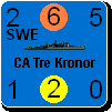
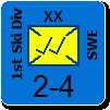
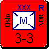
Yes, all units are shown in the Flyouts (that has always been true). They are sorted to show land units first, then air units (except carrier air units aboard carriers), and lastly naval units, with the carrier air units shown next to their carriers.

_____________________________

Steve

Perfection is an elusive goal.

(in reply to Froonp)
Post #: 1343
RE: MWIF Game Interface Design - 8/2/2008 6:45:00 PM   
Peter Stauffenberg


Posts: 403
Joined: 2/24/2006
From: Oslo, Norway
Status: offline
I think the latest changes are great. The form now uses the available space in a much better way so more of the map is shown. Great improvements indeed.

(in reply to Shannon V. OKeets)
Post #: 1344
RE: MWIF Game Interface Design - 8/2/2008 9:52:54 PM   
Peter Stauffenberg


Posts: 403
Joined: 2/24/2006
From: Oslo, Norway
Status: offline
quote:

ORIGINAL: Shannon V. OKeets

I had another idea for this form. Here is what the form looks like when you first examine it.

The new button I have added is the Expand List button.


I think it would be an improvement if the text in the location and destination columns are sorted this way instead:
Country, city, coordinate instead of city, country and coordinate

Then the text in the location would be United Kingdom, Cardiff [48, 25] etc.

The reason for this is that it can then be possible to sort on the column location and see all resources that would be sent from a specific country. This makes it easier when placing convoys so you don't get no path for any resources.

I think the form should be made in such a way you can click on a specific column to sort according to that column. Alternately it should be a button where you can choose the sort order. E. g. by selecting type as level 1, location as level 2 and action as level 3. It could even be a choice to select ascending or descending for each sort order level.


(in reply to Shannon V. OKeets)
Post #: 1345
RE: MWIF Game Interface Design - 8/2/2008 10:44:18 PM   
Shannon V. OKeets


Posts: 22095
Joined: 5/19/2005
From: Honolulu, Hawaii
Status: offline

quote:

ORIGINAL: Borger Borgersen

quote:

ORIGINAL: Shannon V. OKeets

I had another idea for this form. Here is what the form looks like when you first examine it.

The new button I have added is the Expand List button.


I think it would be an improvement if the text in the location and destination columns are sorted this way instead:
Country, city, coordinate instead of city, country and coordinate

Then the text in the location would be United Kingdom, Cardiff [48, 25] etc.

The reason for this is that it can then be possible to sort on the column location and see all resources that would be sent from a specific country. This makes it easier when placing convoys so you don't get no path for any resources.

I think the form should be made in such a way you can click on a specific column to sort according to that column. Alternately it should be a button where you can choose the sort order. E. g. by selecting type as level 1, location as level 2 and action as level 3. It could even be a choice to select ascending or descending for each sort order level.


Putting country before the city is an excellent idea.

I haven't gotten to sorting these entries yet. I think I might want more flexibility than what you suggested - but I am not sure.

_____________________________

Steve

Perfection is an elusive goal.

(in reply to Peter Stauffenberg)
Post #: 1346
RE: MWIF Game Interface Design - 8/2/2008 11:24:29 PM   
Shannon V. OKeets


Posts: 22095
Joined: 5/19/2005
From: Honolulu, Hawaii
Status: offline
Here is today's revision to the Main form's layout.

By reducing the size of the menu bar at the top and shuffling things around, I was able to free up enough room to place the form 100 pixels to the right. What you see here is a 1280 by 1024 monitor. With the minimum monitor size, the Main form will be against the right edge of the screen.

The reason I want the 100 pixel width on the left is I am going to put a column of units there for air missions. It will list all the units capable of flying during the current subphase of the air mission. So, it will start by showing the defender's units that can fly CAP (Combat Air Patrol), then show the attacking units that can fly the mission, then the defender's interceptors, and so on.

One of the problems when playing WIF (over the board or using the computer) is finding all the units that are eligible to move. That's especially difficult with air missions because of the long range of some of the bombers and naval air units. The left and right arrow keys help, but actually having the units listed is even better (in my opinion).

I'll try to get to programming the Eligible Unit List this week. There is a companion list I want to create for it: eligible destinations. So you click on a strategic bomber and a list of all the possible targets appears - most likely where the sequence of play form is being shown right now.
=======
I changed the panel that describes what factories, resources, and ports are in a hex. I toned down the color for it too. Previously Stettin would have had the cryptic notation: "F:1/P+". The replacement "Fact: 1/Major port" is much clearer.


Attachment (1)

_____________________________

Steve

Perfection is an elusive goal.

(in reply to Shannon V. OKeets)
Post #: 1347
RE: MWIF Game Interface Design - 8/9/2008 1:48:36 AM   
Shannon V. OKeets


Posts: 22095
Joined: 5/19/2005
From: Honolulu, Hawaii
Status: offline
Here is today's version of the main form, with the new Selectable Units form in the upper left corner.

Selectable Units only appears during air missions and even then only for those subphases of an air mission when the player has the option of flying units (or firing Anti-Aircraft). Its purpose is fairly simple: to let you quickly see which units are eligible to move during that subphase. Even when playing over the board, it is difficult to 'see' all the units that can fly at any point in time. There is always the nagging suspicion that you forgot one of them. Now the Next/Previous buttons (red arrows in teh top center of the Main form) lets you cycle through all eligible units but that can be tedious to do.

Here Germany has 6 air missions available (red box with A6 inside of it) and 4 units from which to choose for carpet bombing missions. Left clicking on a unit in the Selctable Units form selects it (picks it up) and you can then place it on a target hex. Or, you can left click on the gray strip just to the left of a unit, and the map is recentered on teh unit's location. The latter action is what I have done for the Ju 88A4.

The screen size shown here is 1280 by 1024 and therefore I have room for the Screen Layouts List and Map Views List form to the right of the Main form (right now they only hold the starting entries). If you are playnig with a resolution of 1024 by 768, then the right edge of your screen will be the right edge of the Main form, and you will have to find another location for the Screen Layouts and Map Views Lists - probably "roll them up" so they are just the thin header bar when they are not in use.

I have some more touchups to do here: (1) I want to change A6 to "Air: 6", (2) the new added yellow panel to the right of the German flag in the Main form has to have the text 'Combined' inserted - its purpose is to indicate the Action type taken, and (3) the scroll bars on the Selectable Units form aren't they way I want them.


Attachment (1)

_____________________________

Steve

Perfection is an elusive goal.

(in reply to Shannon V. OKeets)
Post #: 1348
RE: MWIF Game Interface Design - 8/9/2008 7:54:21 AM   
jjax


Posts: 289
Joined: 2/24/2005
Status: offline
Is there an ever useful mini-map available to the user?

_____________________________

--JJAX


(in reply to Shannon V. OKeets)
Post #: 1349
RE: MWIF Game Interface Design - 8/9/2008 9:22:25 AM   
Shannon V. OKeets


Posts: 22095
Joined: 5/19/2005
From: Honolulu, Hawaii
Status: offline

quote:

ORIGINAL: jjax

Is there an ever useful mini-map available to the user?

Yes, the global map. You can see screen shots of that in the 2nd tutorial thread (it's all about the maps).

_____________________________

Steve

Perfection is an elusive goal.

(in reply to jjax)
Post #: 1350
Page:   <<   < prev  43 44 [45] 46 47   next >   >>
All Forums >> [New Releases from Matrix Games] >> World in Flames >> RE: MWIF Game Interface Design Page: <<   < prev  43 44 [45] 46 47   next >   >>
Jump to:


New Messages No New Messages
Hot Topic w/ New Messages Hot Topic w/o New Messages
Locked w/ New Messages Locked w/o New Messages
 Post New Thread
 Reply to Message
 Post New Poll
 Submit Vote
 Delete My Own Post
 Delete My Own Thread
 Rate Posts


Forum Software © ASPPlayground.NET Advanced Edition 2.4.5 ANSI

3.219