Matrix Games Forums

Forums  Register  Login  Photo Gallery  Member List  Search  Calendars  FAQ 

My Profile  Inbox  Address Book  My Subscription  My Forums  Log Out

RE: Unit Depictions on Screen

 
View related threads: (in this forum | in all forums)

Logged in as: Guest
Users viewing this topic: none
  Printable Version
All Forums >> [New Releases from Matrix Games] >> World in Flames >> RE: Unit Depictions on Screen Page: <<   < prev  14 15 [16] 17 18   next >   >>
Login
Message << Older Topic   Newer Topic >>
RE: Unit Depictions on Screen - 5/14/2006 8:07:59 PM   
Shannon V. OKeets


Posts: 22095
Joined: 5/19/2005
From: Honolulu, Hawaii
Status: offline
quote:

ORIGINAL: Zorachus99
It's great to see such an informal rule allowed. It's how play works in real life to a large degree.

However how do you deal with the limitations of the phasing player?

Example of real game:

Italy is running the Med Theatre and wants to use german air missions to fly air units to a sea area. Since the naval action comes before any land actions, Italy asks the German player if and how many air missions they can use from the German player. If the italian had four units on loan and flew all four out to sea areas, germany would have 0 air missions for their land impulse. Heck I've had the italians ask whether the German is doing a land because land moves could be limited.

Will the player with loaned units have full control of the lent units, or will they have to request permission before they use a unit that has limited activities, such as air, naval, or land units - all of which could have limits depending on the type of impulse which is declared...

When working with an italian player I often get questions on how many air missions they can have for the turn - not to mention them trying to talk me into using some sort of combined action. I envision some sort of dialogue alerting the phasing ally, whether or not a unit with a limited number of activities can be used, or better yet a request for activities that are limited (this wouldn't force the map to refocus). This both keeps your head out of a theatre you aren't paying attention to, and allows you to keep a tight grip on your activities which are so limited during a turn.

If the loaned unit is affecting activities allowed in a turn without alerting me, I would personally not have any units on loan - defeating the idea.


This falls into a category I have loosely labeled "to be worked out by the players". Having MWIF enforce agreements/arrangements between allies, seems to me to be outside the scope of the game design. Primarily that is because when people reach agreements (verbal or written) there are always a bunch of odds and ends that are 'understood' yet not formally agreed to. Enforcing the RAW rules make MWIF a whole lot like writing a law dissertation already. I've no taste for more of the same.

More to your point, you will see all the moves that a player on your side makes, as he makes them. The team leader is in charge of sending off all the moves to the other side, once they have been completed by everyone on his side. You will have the opportunity to intervene between the time that your ally moves a loaned unit and the team leader sends off the moves. To intervene is rather simple: as the original owner, you just reassert control of the loaned unit. At that point you can undo its move, should you so desire.

----------------

Dan Hatchen and I have been working out the specifics of recording moves on all the different computers participating in an Internet game - and keeping them synchronized. What we have come up with is that there will be Entry #s, Transaction #s, and Interside Communication #s (ICs). An entry number is associated with each atom of detail that changes the game position. So if you move a land unit several hexes, there will be a unique entry # for each hex it traverses. When it has stopped moving, the sequence of entry #s associated with its full move will be recorded as a transaction. Indeed, the associated transaction # is part of the game record log for each entry #.

Now, when a side has moved all its units and is ready to end a phase and pass control over to the other side, an IC# will be created and all the entry #s for the phase will be sent to the other side. Oh, I forgot to mention, each transaction will be sent to every player on the same side when it is completed. This works out to entrys not being sent to any other players until a transaction has been completed. Once a transaction is done, all the players on the same side will see it. The players on the other side won't see anything until all the moves for the phase have been completed. There are details of the non-phasing player's decision making I am intentionally glossing over here.

In practice, I expect each player to have two detailed map windows visible at all times: a big one on which he makes his own moves, and a smaller one on which any moves by his allies are displayed upon receipt.

One of my intentions with this design is to give players the opportunity to show their allies what they are doing. In combination with chat messages, you should be able to work out how to coordinate forces. I would like to provide more capabilities along this line but I am reluctant to do so because: (1) until we actually start playing games over the Internet there will be too much guesswork required as to what should be created and (2) I could see this becoming almost a whole new interface in and of itself (i.e., a ton of work).

_____________________________

Steve

Perfection is an elusive goal.

(in reply to Zorachus99)
Post #: 451
RE: Unit Depictions on Screen - 5/14/2006 11:53:49 PM   
Shannon V. OKeets


Posts: 22095
Joined: 5/19/2005
From: Honolulu, Hawaii
Status: offline
Rob has given me the complete set of counters for counter sheet 7 (PLanes in Flames). Aside from the background colors on a few of the minor countries, these are done.

I have adjusted the positioning of almost all of them. Here are the USA fighters with a few flying boats.


Attachment (1)

_____________________________

Steve

Perfection is an elusive goal.

(in reply to Shannon V. OKeets)
Post #: 452
RE: Unit Depictions on Screen - 5/14/2006 11:56:26 PM   
Shannon V. OKeets


Posts: 22095
Joined: 5/19/2005
From: Honolulu, Hawaii
Status: offline
The second half of the USA fighters from counter sheet 7. I have removed the black hairline outline from around the units, but I need to put it back as a light green outline when the unit is selectable in the phase.


Attachment (1)

_____________________________

Steve

Perfection is an elusive goal.

(in reply to Shannon V. OKeets)
Post #: 453
RE: Unit Depictions on Screen - 5/14/2006 11:58:14 PM   
Shannon V. OKeets


Posts: 22095
Joined: 5/19/2005
From: Honolulu, Hawaii
Status: offline
Here are some more USA naval air units and a bunch of their bombers. I've been fairly successful at getting the airplane image to not be occluded by the text and numbers.

Though there are still a dozen or so that need some more tweaking.


Attachment (1)

_____________________________

Steve

Perfection is an elusive goal.

(in reply to Shannon V. OKeets)
Post #: 454
RE: Unit Depictions on Screen - 5/14/2006 11:59:44 PM   
Shannon V. OKeets


Posts: 22095
Joined: 5/19/2005
From: Honolulu, Hawaii
Status: offline
Most of the remaining USA bombers from counter sheet 7.


Attachment (1)

_____________________________

Steve

Perfection is an elusive goal.

(in reply to Shannon V. OKeets)
Post #: 455
RE: Unit Depictions on Screen - 5/15/2006 12:04:40 AM   
Shannon V. OKeets


Posts: 22095
Joined: 5/19/2005
From: Honolulu, Hawaii
Status: offline
Back in December, when we were working on the terrain for the map, several forum members wanted more colorful terrain (e.g., a brighter, more diverse color scheme). I argued against that, preferring more muted terrain so the units would really stand out. WIF has a very bright set of counters and if the terrain were bright too, it would most likely be discordant to the eye (mixed metaphors, I know).

Here is one in a series of 4 screen shots to reinforce my point.


Attachment (1)

_____________________________

Steve

Perfection is an elusive goal.

(in reply to Shannon V. OKeets)
Post #: 456
RE: Unit Depictions on Screen - 5/15/2006 12:07:27 AM   
Shannon V. OKeets


Posts: 22095
Joined: 5/19/2005
From: Honolulu, Hawaii
Status: offline
I haven't gotten to repositioing the air images for the minor country units. Throw in some Germans and Brits and this section of the map won't need dazzling mountain terrain to catch your eye.


Attachment (1)

_____________________________

Steve

Perfection is an elusive goal.

(in reply to Shannon V. OKeets)
Post #: 457
RE: Unit Depictions on Screen - 5/15/2006 12:09:19 AM   
Shannon V. OKeets


Posts: 22095
Joined: 5/19/2005
From: Honolulu, Hawaii
Status: offline
The color for the Netherlands air units is off. It should (and will) match the land unit background colors perfectly.


Attachment (1)

_____________________________

Steve

Perfection is an elusive goal.

(in reply to Shannon V. OKeets)
Post #: 458
RE: Unit Depictions on Screen - 5/15/2006 12:11:37 AM   
Shannon V. OKeets


Posts: 22095
Joined: 5/19/2005
From: Honolulu, Hawaii
Status: offline
Last in the series of 8 posts this morning. Some of these planes are lend lease. Next on my list is to put in the stripes for the lend lease planes. When I get that done, I'll post some screen shots for you to see.


Attachment (1)

_____________________________

Steve

Perfection is an elusive goal.

(in reply to Shannon V. OKeets)
Post #: 459
RE: Unit Depictions on Screen - 5/15/2006 12:14:38 AM   
Froonp


Posts: 7995
Joined: 10/21/2003
From: Marseilles, France
Status: offline
quote:

The color for the Netherlands air units is off. It should (and will) match the land unit background colors perfectly.

Didn't you say previously that you had the ART units square transformed into a circle ?

(in reply to Shannon V. OKeets)
Post #: 460
RE: Unit Depictions on Screen - 5/15/2006 12:25:17 AM   
Froonp


Posts: 7995
Joined: 10/21/2003
From: Marseilles, France
Status: offline
quote:

I have adjusted the positioning of almost all of them. Here are the USA fighters with a few flying boats.

I just thought of something.
How will you depict Subhunters ?
Subhunters are those planes that you can built if playing with CoiF. They are a version of a normal plane, more suited to ASW combat.
In paper WiF FE, they are depicted with their Air to Sea factor in a Pink or Red circle.
But, as you already put the Air to Sea factor of the Seaplanes and Flying Boats into a blue circle, how will you depict Subhunters ???

I have a suggestion :

Have the Seaplanes and Flying Boats Air to Sea factor back to normal, and have their Range Circle be Blue.

That way, you will be able to depict the Subhunters the same way they are in paper WiF FE, that is with their usual pink / red circled Air to Sea factor.

Edit : Hey, after all, this is logical to have the Range Circle be blue, as it is the way they move that makes Flying Boats & Seaplanes what they are : seaworthy.
They move in the water, thanks to their hull or their floats

< Message edited by Froonp -- 5/15/2006 12:30:06 AM >

(in reply to Shannon V. OKeets)
Post #: 461
RE: Unit Depictions on Screen - 5/15/2006 12:26:40 AM   
Froonp


Posts: 7995
Joined: 10/21/2003
From: Marseilles, France
Status: offline
quote:

Some of these planes are lend lease.

There is also one in Post #452.
That pretty Spitfire IX.

(in reply to Shannon V. OKeets)
Post #: 462
RE: Unit Depictions on Screen - 5/15/2006 2:17:05 AM   
Shannon V. OKeets


Posts: 22095
Joined: 5/19/2005
From: Honolulu, Hawaii
Status: offline

quote:

ORIGINAL: Froonp

quote:

The color for the Netherlands air units is off. It should (and will) match the land unit background colors perfectly.

Didn't you say previously that you had the ART units square transformed into a circle ?

I have set up for doing them, but I guess the actual coding got lost in the shuffle. Since it's not too hard to do, I'll put it in my next pass through the code.

_____________________________

Steve

Perfection is an elusive goal.

(in reply to Froonp)
Post #: 463
RE: Unit Depictions on Screen - 5/15/2006 2:23:59 AM   
Shannon V. OKeets


Posts: 22095
Joined: 5/19/2005
From: Honolulu, Hawaii
Status: offline

quote:

ORIGINAL: Froonp

quote:

I have adjusted the positioning of almost all of them. Here are the USA fighters with a few flying boats.

I just thought of something.
How will you depict Subhunters ?
Subhunters are those planes that you can built if playing with CoiF. They are a version of a normal plane, more suited to ASW combat.
In paper WiF FE, they are depicted with their Air to Sea factor in a Pink or Red circle.
But, as you already put the Air to Sea factor of the Seaplanes and Flying Boats into a blue circle, how will you depict Subhunters ???

I have a suggestion :

Have the Seaplanes and Flying Boats Air to Sea factor back to normal, and have their Range Circle be Blue.

That way, you will be able to depict the Subhunters the same way they are in paper WiF FE, that is with their usual pink / red circled Air to Sea factor.

Edit : Hey, after all, this is logical to have the Range Circle be blue, as it is the way they move that makes Flying Boats & Seaplanes what they are : seaworthy.
They move in the water, thanks to their hull or their floats


Not a viable solution. There are ATRs that are also flying boats too, so coloring their range blue would comflict with them being white for ATRs.

--

There are 2 subhunters that are also flying boats (one pink and one red). How about a red/pink number inside of a blue circle for those two? The other flying boats would have black numbers indicating normal air-to-sea factors. The other subhunters would have black numbers inside of red/pink circles.

_____________________________

Steve

Perfection is an elusive goal.

(in reply to Froonp)
Post #: 464
RE: Unit Depictions on Screen - 5/15/2006 1:17:01 PM   
Froonp


Posts: 7995
Joined: 10/21/2003
From: Marseilles, France
Status: offline
quote:

quote:

I have a suggestion :
Have the Seaplanes and Flying Boats Air to Sea factor back to normal, and have their Range Circle be Blue.

Not a viable solution. There are ATRs that are also flying boats too, so coloring their range blue would comflict with them being white for ATRs.

--

There are 2 subhunters that are also flying boats (one pink and one red). How about a red/pink number inside of a blue circle for those two? The other flying boats would have black numbers indicating normal air-to-sea factors. The other subhunters would have black numbers inside of red/pink circles.

Why not having the range circle half white, half blue ?

(in reply to Shannon V. OKeets)
Post #: 465
RE: Unit Depictions on Screen - 5/15/2006 1:17:45 PM   
Froonp


Posts: 7995
Joined: 10/21/2003
From: Marseilles, France
Status: offline
quote:

There are 2 subhunters that are also flying boats (one pink and one red). How about a red/pink number inside of a blue circle for those two? The other flying boats would have black numbers indicating normal air-to-sea factors. The other subhunters would have black numbers inside of red/pink circles.

I also like this suggestion.

(in reply to Shannon V. OKeets)
Post #: 466
RE: Unit Depictions on Screen - 5/15/2006 2:44:55 PM   
YohanTM2


Posts: 1143
Joined: 10/7/2002
From: Toronto
Status: offline
I agree go with the red number inside the blue circle. Just like some of the nightfighters have for their combat value.

Rob

P.S. Those poor BEL and NE troops, up against the Gustav rail gun and Jagd Tigers in 1940...sheesh <g>

(in reply to Froonp)
Post #: 467
RE: Unit Depictions on Screen - 5/15/2006 5:11:10 PM   
Zorachus99


Posts: 1066
Joined: 9/15/2000
From: Palo Alto, CA
Status: offline

quote:

ORIGINAL: Yohan

I agree go with the red number inside the blue circle. Just like some of the nightfighters have for their combat value.


*eyes explode*

_____________________________

Most men can survive adversity, the true test of a man's character is power. -Abraham Lincoln

(in reply to YohanTM2)
Post #: 468
RE: Unit Depictions on Screen - 5/15/2006 8:35:06 PM   
Shannon V. OKeets


Posts: 22095
Joined: 5/19/2005
From: Honolulu, Hawaii
Status: offline
quote:

ORIGINAL: Zorachus99
quote:

ORIGINAL: Yohan

I agree go with the red number inside the blue circle. Just like some of the nightfighters have for their combat value.


*eyes explode*


Yeah, the red number inside of a blue circle is a bit much.

However, there are just 2 air units out of 1335 in the game that would have this combination and they do not arrive until 1943 and 1944. You have to be playing with the Convoy in Flames rules too, so we can assume anyone who has these units on the map are very serious WIF players. They will just be real happy with having a range of 20+ on units that have strong ASW numbers (3 red and 2 red).

There wouldn't be any pink numbers inside of a blue circle since that combination isn't in the game.

_____________________________

Steve

Perfection is an elusive goal.

(in reply to Zorachus99)
Post #: 469
RE: Unit Depictions on Screen - 5/15/2006 8:42:09 PM   
Capitaine


Posts: 1043
Joined: 1/15/2002
Status: offline
quote:

ORIGINAL: Froonp

Also, to tell it again, I think that the units would be definitively terrific if they had a tiny 3-d touch, with even a slim shade added to them (as in this screen shot of SSG's most excellent "Battles in Italy" game.


quote:

ORIGINAL: Andrew Brown

quote:

ORIGINAL: Shannon V. OKeets
You guys certainly are pushing for this aren't you?


I may be joining this discussion a bit late, but in my view some type of 3D effect for the counters is a must. It looks much better than just having 2D counters.

As an example, here is a screenshot of a counter mod I am experimenting with for GGWAW. It uses subtle shading and highlights for the various counters.


The counter art is looking great, but I'll add another plea for a 3D effect on the counters. Even a simple 2-edged effect on the right and left side of the counter, as can be seen on Froonp's "Manstein" avatar, adds tremendous substance to the perception of the pieces. A strict 2D effort will look like a "budget" title compared to virtually every other quality board and counter PC game I can think of. A slight 3D look to the counter art (and possibly a slight rounding of the corners) would greatly increase the graphic appeal of the game.

(in reply to Froonp)
Post #: 470
RE: Unit Depictions on Screen - 5/15/2006 9:02:04 PM   
Shannon V. OKeets


Posts: 22095
Joined: 5/19/2005
From: Honolulu, Hawaii
Status: offline
quote:


The counter art is looking great, but I'll add another plea for a 3D effect on the counters. Even a simple 2-edged effect on the right and left side of the counter, as can be seen on Froonp's "Manstein" avatar, adds tremendous substance to the perception of the pieces. A strict 2D effort will look like a "budget" title compared to virtually every other quality board and counter PC game I can think of. A slight 3D look to the counter art (and possibly a slight rounding of the corners) would greatly increase the graphic appeal of the game.


I have been making progress towards this - sort of. I haveplaced the status boxes at the top of the units outside the 96 by 96 pixel frame for the counter and I have removed the black outline around the counters. This has given me a little bit more room to work with. One consequence has been to reduce the number of units in a stack whose status boxes are continuously visible (it use to be 4, now it's 3).

What still gives me pause here are the status boxes at the top. The other units in the screen shots from other games do not have this feature.

I want to review what each of the 6 status boxes indicates. I expect to reduce their number back down to 5 (as CWIF had originally) and to make them of varying sizes, so the more important ones (e.g., disrupted unit) are slightly larger. Doing away with the status boxes seems to me to be a very bad idea. Besides indicating which units are disrupted, they show supply status, whether a unit is transporting/being transported, and whether a unit has been committed to a land attack. These are crucial aspects of a unit the player needs to know when playing the game. Putting more numbers or other indicators inside a unit's frame would be insane.

I'll get to this design problem eventually, but I think the edging for the counters (shadows, rounding) has to be resolved simultaneously with defining the status boxes.

_____________________________

Steve

Perfection is an elusive goal.

(in reply to Capitaine)
Post #: 471
RE: Unit Depictions on Screen - 5/15/2006 9:04:44 PM   
Shannon V. OKeets


Posts: 22095
Joined: 5/19/2005
From: Honolulu, Hawaii
Status: offline

quote:

ORIGINAL: Yohan

I agree go with the red number inside the blue circle. Just like some of the nightfighters have for their combat value.

Rob

P.S. Those poor BEL and NE troops, up against the Gustav rail gun and Jagd Tigers in 1940...sheesh <g>

No, no , you have it all wrong. Germany waited until 1944 to attack the Lowlands. Busy in the east, I guess.

_____________________________

Steve

Perfection is an elusive goal.

(in reply to YohanTM2)
Post #: 472
RE: Unit Depictions on Screen - 5/15/2006 9:10:58 PM   
YohanTM2


Posts: 1143
Joined: 10/7/2002
From: Toronto
Status: offline

quote:

ORIGINAL: Shannon V. OKeets


quote:

ORIGINAL: Yohan

I agree go with the red number inside the blue circle. Just like some of the nightfighters have for their combat value.

Rob

P.S. Those poor BEL and NE troops, up against the Gustav rail gun and Jagd Tigers in 1940...sheesh <g>

No, no , you have it all wrong. Germany waited until 1944 to attack the Lowlands. Busy in the east, I guess.


Damn revisionists :)

(in reply to Shannon V. OKeets)
Post #: 473
RE: Unit Depictions on Screen - 5/16/2006 3:37:22 AM   
Shannon V. OKeets


Posts: 22095
Joined: 5/19/2005
From: Honolulu, Hawaii
Status: offline
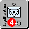
Here are the new unit types from Convoys in Flames.

1 - I have not added the bitmap graphics yet. When I do, they will be generic for all units of the type. Indeed, there is just one bitmap for all the submarines, which will be used for all their variations.

2 - I will probably make the font for these generic names larger, but that decision will wait until after I've put in the bitmap images.

3 - Notice that I have removed the large TRS, CONV, and SUB labels that CWIF used. Instead of abbreviations, I prefer to use the full words whenever possible. I am thinking of changing the color of the font to white for the special submarines; so they will stand out more when you're playing.

4 - Several types of submarines can be missile subs. Because of that, I have not made them a special submarine type. I just have the program detect that they have a bombardment value greater than zero. To make this capabilty more noticeable, I am displaying it as a white number in a red circle. [WIF FE simply used red numbers - which is less forceful visually.]

5 - Another change from WIF FE is that I have labeled each of these generic unit types. WIF FE relies upon the player detecting small differences in the graphic image (I often had trouble telling naval transports and amphibiouos units apart).

6 - Notice the flying sub with its carrier capacity - the only unit in the game like this.

7 - There are 2 Walther subs shown: one with missiles and one without.

8 - Once the bitmap images are added, all of these unit types will become a little more differentiated. They're still too similar visually for my taste.


Attachment (1)

_____________________________

Steve

Perfection is an elusive goal.

(in reply to YohanTM2)
Post #: 474
RE: Unit Depictions on Screen - 5/16/2006 3:54:20 AM   
Zorachus99


Posts: 1066
Joined: 9/15/2000
From: Palo Alto, CA
Status: offline

quote:

ORIGINAL: Shannon V. OKeets

You will have the opportunity to intervene between the time that your ally moves a loaned unit and the team leader sends off the moves. To intervene is rather simple: as the original owner, you just reassert control of the loaned unit. At that point you can undo its move, should you so desire.


There are some moves that cannot be undone IMHO...

I'm not terribly sold on having a screen monitoring my allies on a regular basis. A nice feature perhaps.

Instead what I'm asking for is a mechanism that alerts the phasing player that an activity that is limited for the impulse chosen is being used by another player.

A simple truth table would be something like this.
ask for permission when:
Air mission, Land Movement, Naval Movement
Impulse:
Air - ignore, ignore, ignore
Land - prompt, ignore, ignore
Naval - prompt, ignore, ignore
Combined - prompt, prompt, prompt
Pass - ignore, ignore, ignore

as you can see there would not be a lot of pop-ups based on activity limits. A yes/no dialogue to allow the limited movement for a loaned unit would be nice... Dont know how realistic it would be to code....


_____________________________

Most men can survive adversity, the true test of a man's character is power. -Abraham Lincoln

(in reply to Shannon V. OKeets)
Post #: 475
RE: Unit Depictions on Screen - 5/16/2006 4:21:49 AM   
Shannon V. OKeets


Posts: 22095
Joined: 5/19/2005
From: Honolulu, Hawaii
Status: offline
quote:

ORIGINAL: Zorachus99
quote:

ORIGINAL: Shannon V. OKeets
You will have the opportunity to intervene between the time that your ally moves a loaned unit and the team leader sends off the moves. To intervene is rather simple: as the original owner, you just reassert control of the loaned unit. At that point you can undo its move, should you so desire.

There are some moves that cannot be undone IMHO...

I'm not terribly sold on having a screen monitoring my allies on a regular basis. A nice feature perhaps.

Instead what I'm asking for is a mechanism that alerts the phasing player that an activity that is limited for the impulse chosen is being used by another player.

A simple truth table would be something like this.
ask for permission when:
Air mission, Land Movement, Naval Movement
Impulse:
Air - ignore, ignore, ignore
Land - prompt, ignore, ignore
Naval - prompt, ignore, ignore
Combined - prompt, prompt, prompt
Pass - ignore, ignore, ignore

as you can see there would not be a lot of pop-ups based on activity limits. A yes/no dialogue to allow the limited movement for a loaned unit would be nice... Dont know how realistic it would be to code....


This is still in the design stage so exploring possibilities is a good thing.

I need to keep the game up-to-date on everyone's computer during Internet play. That is a primary goal.

To do that, transactions (groups of moves) are sent between the computers of players on the same side. Since the information is coming in anyway, and the game state is being updated to reflect what everybody on the same side is doing, we might as well show it on a detailed map. Actually, if you are looking at your French units in France facing the Germans in 1940, and the Commonwealth player moves a unit in Belgium (say), then your copy of the map will be updated automatically. You need to know what he is doing with his land and air units.

Having a second detailed map is more for situations such as when you, as Germany, are movnig units in Western Europe and Italy is moving units in North Africa. You don't have to have a separate detailed map window open, but the option exists.

As to the status of activity limits, how about a small form that shows the current number of each available. You can keep it on display at all times, and if your ally uses one of the precious few air missions, then besides immediately updating this Available Activities form, it might blink the change for a while, or emit a loud whooping noise over your sound system.

At some point you have to trust your allies. I would not enjoy playing with an ally who wanted me to say "Mother, may I" every time I wanted to move one of the units he had loaned to me. Nor would I want to impose such a restriction on an ally to whom I had loaned units.

_____________________________

Steve

Perfection is an elusive goal.

(in reply to Zorachus99)
Post #: 476
RE: Unit Depictions on Screen - 5/16/2006 7:14:51 AM   
Manic Inertia


Posts: 51
Joined: 2/7/2006
Status: offline
The blue circled air-to-sea factors that denote flying boats are great, but how will you denote flying boats upgraded with ASW factors? I think there is one .. is it the Sunderland?

(in reply to Shannon V. OKeets)
Post #: 477
RE: Unit Depictions on Screen - 5/16/2006 11:41:44 AM   
amwild


Posts: 105
Joined: 2/9/2004
Status: offline

quote:

ORIGINAL: Shannon V. OKeets

The color for the Netherlands air units is off. It should (and will) match the land unit background colors perfectly.


I noticed that the CR.42bis aircraft bitmap doesn't look too good against the dark background - the dark areas of the camouflage tend to get lost in the background. At first glance, I saw an engine and wheel, a wing, and a fuselage, all seemingly separate, until I looked much closer, and even then... Perhaps these sorts of bitmaps need a single pixel white/light outline to separate them properly from dark backgrounds.

(in reply to Shannon V. OKeets)
Post #: 478
RE: Unit Depictions on Screen - 5/16/2006 11:50:38 AM   
Shannon V. OKeets


Posts: 22095
Joined: 5/19/2005
From: Honolulu, Hawaii
Status: offline
quote:

ORIGINAL: amwild
I noticed that the CR.42bis aircraft bitmap doesn't look too good against the dark background - the dark areas of the camouflage tend to get lost in the background. At first glance, I saw an engine and wheel, a wing, and a fuselage, all seemingly separate, until I looked much closer, and even then... Perhaps these sorts of bitmaps need a single pixel white/light outline to separate them properly from dark backgrounds.


Let me see, you're complaining that the camouflage works too well?

Yeah, I need to figure something out for the 3 or 4 air units for which this is a problem.

_____________________________

Steve

Perfection is an elusive goal.

(in reply to amwild)
Post #: 479
RE: Unit Depictions on Screen - 5/16/2006 11:55:48 AM   
Shannon V. OKeets


Posts: 22095
Joined: 5/19/2005
From: Honolulu, Hawaii
Status: offline
Final insepction for minor country units from counter sheet 7.

1 - The PZL's need to move up a couple of pixels (or should I say Pizels?). Also the Boston IV.

2 - Do you like the stripes for the lend leased planes?

3 - All the circles need smoothing. Now where did I put that sander?

4 - The extended range for the Liberator needs a black circle around the yellow circle. The name should be hyphenated too.


Attachment (1)

_____________________________

Steve

Perfection is an elusive goal.

(in reply to Shannon V. OKeets)
Post #: 480
Page:   <<   < prev  14 15 [16] 17 18   next >   >>
All Forums >> [New Releases from Matrix Games] >> World in Flames >> RE: Unit Depictions on Screen Page: <<   < prev  14 15 [16] 17 18   next >   >>
Jump to:


New Messages No New Messages
Hot Topic w/ New Messages Hot Topic w/o New Messages
Locked w/ New Messages Locked w/o New Messages
 Post New Thread
 Reply to Message
 Post New Poll
 Submit Vote
 Delete My Own Post
 Delete My Own Thread
 Rate Posts


Forum Software © ASPPlayground.NET Advanced Edition 2.4.5 ANSI

0.860