Matrix Games Forums

Forums  Register  Login  Photo Gallery  Member List  Search  Calendars  FAQ 

My Profile  Inbox  Address Book  My Subscription  My Forums  Log Out

RE: Modding unit bitmaps

 
View related threads: (in this forum | in all forums)

Logged in as: Guest
Users viewing this topic: none
  Printable Version
All Forums >> [New Releases from Matrix Games] >> World in Flames >> RE: Modding unit bitmaps Page: <<   < prev  20 21 [22] 23 24   next >   >>
Login
Message << Older Topic   Newer Topic >>
RE: Modding unit bitmaps - 6/8/2006 5:21:28 PM   
trees trees


Posts: 125
Joined: 6/6/2006
From: Manistee, MI
Status: offline
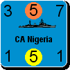
Using the colored dot to indicate flipped units looks a little tricky, in this case, with the Russians and an orange dot.

One idea: maybe the status indicator could be blinking? (possibly annoying. so possibly optional, like the way you can control your cursor blink rate or no blink at all on a computer) but maybe that coulp help anyone having trouble with the colors.

We used to play WiF5 on a wall, using poster putty to attach the units to the map. Instead of flipping the pieces over as you do on a table, we would rotate them 180 degrees to indicate which ones were flipped over.

(in reply to Neilster)
Post #: 631
RE: Modding unit bitmaps - 6/8/2006 5:41:12 PM   
Froonp


Posts: 7995
Joined: 10/21/2003
From: Marseilles, France
Status: offline
quote:

Using the colored dot to indicate flipped units looks a little tricky, in this case, with the Russians and an orange dot.

One idea: maybe the status indicator could be blinking? (possibly annoying. so possibly optional, like the way you can control your cursor blink rate or no blink at all on a computer) but maybe that coulp help anyone having trouble with the colors.

Maybe disrupted Aicraft & Ships units could show the generic Aircraft & Ship graphic ?
This is a bit like the WiF FE game, where disrupted units are flipped down, thus showing the generic graphic.
This is a habit WiF FE players have, and they immediately recognise disrupted aircraft in the whole map picture because they see the generic graphic.

(in reply to trees trees)
Post #: 632
RE: Modding unit bitmaps - 6/8/2006 9:04:34 PM   
Shannon V. OKeets


Posts: 22095
Joined: 5/19/2005
From: Honolulu, Hawaii
Status: offline
quote:

ORIGINAL: Neilster
Steve, do you have an opinion on the question I asked about AI vs AI playtesting? I know that when you don't reply it oftens means that "Deep Thought" is analysing the position :)

Also, and I apologise if this has been covered before, will it be possible to create bitmaps to replace those used as unit counters? I have something specific in mind where I want to replace certain air units with some of my own creation. I know I'll be able to modify the units' values/year of entry etc via the CSV files but it would be good if I could create my own bitmaps to complete the swap. I understand that even if this is possible, several bitmaps will be required for each unit to handle zoom levels.

Cheer, Neilster


Enabling AI versus AI is a task not on my radar.

Right now I have the high resolution air and naval unit bitmaps as one per counter. Once I have them all, I will be consolidating them into bitmap pages of 100 units per page. I might consider providing a untility program for: (1) splicing the pages apart into individual counters and (2) reformulating the pages. That would let the players modify individual counters. I am considering this mainly because I have to do the second piece anyway. It will not be a polished program, just a quick and dirty.

_____________________________

Steve

Perfection is an elusive goal.

(in reply to Neilster)
Post #: 633
RE: Modding unit bitmaps - 6/8/2006 9:09:36 PM   
Shannon V. OKeets


Posts: 22095
Joined: 5/19/2005
From: Honolulu, Hawaii
Status: offline
quote:

ORIGINAL: Froonp
quote:

Using the colored dot to indicate flipped units looks a little tricky, in this case, with the Russians and an orange dot.

One idea: maybe the status indicator could be blinking? (possibly annoying. so possibly optional, like the way you can control your cursor blink rate or no blink at all on a computer) but maybe that coulp help anyone having trouble with the colors.

Maybe disrupted Aicraft & Ships units could show the generic Aircraft & Ship graphic ?
This is a bit like the WiF FE game, where disrupted units are flipped down, thus showing the generic graphic.
This is a habit WiF FE players have, and they immediately recognise disrupted aircraft in the whole map picture because they see the generic graphic.


It's good to hear other ideas, but none of these wins over my heart and mind.

The program will already come with a disclaimer about the monitor's active light beams inducing epilepsy (I am serious about this), so blinking the lights is out.

I do not want the passive units to remove any information from the player's view. Or make it harder to read.

At this point, I do not see the problem with the status indicators you are trying to fix.

_____________________________

Steve

Perfection is an elusive goal.

(in reply to Froonp)
Post #: 634
RE: Modding unit bitmaps - 6/8/2006 11:48:41 PM   
trees trees


Posts: 125
Joined: 6/6/2006
From: Manistee, MI
Status: offline
WiF players are just used to counters being upside down. People will blow a big attack somewhere, forgetting about that unflipped aircraft in that one stack, because of the little status indicator, bitch and moan for a few days, get used to it, and get down to playing the new computer game.

(in reply to Shannon V. OKeets)
Post #: 635
RE: Modding unit bitmaps - 6/9/2006 12:26:43 AM   
Shannon V. OKeets


Posts: 22095
Joined: 5/19/2005
From: Honolulu, Hawaii
Status: offline

quote:

ORIGINAL: trees trees

WiF players are just used to counters being upside down. People will blow a big attack somewhere, forgetting about that unflipped aircraft in that one stack, because of the little status indicator, bitch and moan for a few days, get used to it, and get down to playing the new computer game.

If the concern is finding/missing air units that can participate in a combat, then I am working on other solutions to that problem.

The idea is to have a disembodied list of units available when doing strategic bombing, or performing any other air mission. The placement of the "selectable units" list will be under the players control, as will whether it is shown at all. Its purpose is simple: to show all the air units who can fly an air mission during that phase. The reason for wanting this list, in addition to the status indicators and other ways of indicating which units can move during a phase, is that sometimes a long range bomber is off-screen and easily forgotten.

By clicking on any unit in the list, the player can center the map on that unit. I expect this to be of some use in addressing the problem you mentioned. It comes with the price of more clutter on the screen - but one person's clutter is another person's vital information.

_____________________________

Steve

Perfection is an elusive goal.

(in reply to trees trees)
Post #: 636
RE: Modding unit bitmaps - 6/9/2006 1:52:10 AM   
trees trees


Posts: 125
Joined: 6/6/2006
From: Manistee, MI
Status: offline
That air unit idea sounds real good. A 'show unflipped fighters only' option would be great. So would a little zone around them basically showing which hexes currently had figher cover. If I was ordering around a Star Trek style computer, that's what I would tell it to do.

Every WiF player has their own style on how to stack the counters. (and the stacks can be pretty big these days. it can be handy to use a little piece of paper with a copy of the Belgian front hexes on it just for airplanes, or a small map with blown-up hexes for that front). Most folks put guns and divs on top of the corps/armies, and then air units on top of that. Then some want all flipped units at the bottom of the stack, others still want flipped air on top, and flipped divs/guns still on top of corps.

Will the computer always stack pieces in the same way?

(in reply to Shannon V. OKeets)
Post #: 637
RE: Modding unit bitmaps - 6/9/2006 3:22:28 AM   
Shannon V. OKeets


Posts: 22095
Joined: 5/19/2005
From: Honolulu, Hawaii
Status: offline
quote:

ORIGINAL: trees trees

That air unit idea sounds real good. A 'show unflipped fighters only' option would be great. So would a little zone around them basically showing which hexes currently had figher cover. If I was ordering around a Star Trek style computer, that's what I would tell it to do.

Every WiF player has their own style on how to stack the counters. (and the stacks can be pretty big these days. it can be handy to use a little piece of paper with a copy of the Belgian front hexes on it just for airplanes, or a small map with blown-up hexes for that front). Most folks put guns and divs on top of the corps/armies, and then air units on top of that. Then some want all flipped units at the bottom of the stack, others still want flipped air on top, and flipped divs/guns still on top of corps.

Will the computer always stack pieces in the same way?


There are a myriad of ways to sort the counters on the map. I propse to add the ability to filter which units are shown too (e.g., just fighters).

Once I get all the different resolution depictions sorted out, I'll go back to my favorite idea on making units visible. That is: place 4 small unit stacks in a square grid formation within a large hex. Using units sized appropriately for zoom level 4 in a map hex at zoom level 8, makes that readily possible. Basically, you will have 4 units completely visible in each hex. You should be able to see all the land units and a stack of air units, for example, without having to cursor over anything.

_____________________________

Steve

Perfection is an elusive goal.

(in reply to trees trees)
Post #: 638
RE: Modding unit bitmaps - 6/9/2006 11:44:42 AM   
Neilster


Posts: 2890
Joined: 10/27/2003
From: Hobart, Tasmania, Australia
Status: offline
quote:

ORIGINAL: Shannon V. OKeets

quote:

ORIGINAL: Neilster
Steve, do you have an opinion on the question I asked about AI vs AI playtesting? I know that when you don't reply it oftens means that "Deep Thought" is analysing the position :)

Also, and I apologise if this has been covered before, will it be possible to create bitmaps to replace those used as unit counters? I have something specific in mind where I want to replace certain air units with some of my own creation. I know I'll be able to modify the units' values/year of entry etc via the CSV files but it would be good if I could create my own bitmaps to complete the swap. I understand that even if this is possible, several bitmaps will be required for each unit to handle zoom levels.

Cheer, Neilster


Enabling AI versus AI is a task not on my radar.

Right now I have the high resolution air and naval unit bitmaps as one per counter. Once I have them all, I will be consolidating them into bitmap pages of 100 units per page. I might consider providing a untility program for: (1) splicing the pages apart into individual counters and (2) reformulating the pages. That would let the players modify individual counters. I am considering this mainly because I have to do the second piece anyway. It will not be a polished program, just a quick and dirty.


Understood. I just threw AI vs AI out there in case it may be useful later. I know that at least TOAW 3 and Conquest of the Aegean have been testing using AI vs AI.

That sounds like good news about the bitmaps. My alternative-history Luftwaffe, in which a radical canard-pusher He 112 is built in preference to the Me 109 in many variants, looks like it's coming together

Cheers, Neilster


Attachment (1)

< Message edited by Neilster -- 6/9/2006 12:23:03 PM >

(in reply to Shannon V. OKeets)
Post #: 639
RE: Modding unit bitmaps - 6/9/2006 1:25:42 PM   
Froonp


Posts: 7995
Joined: 10/21/2003
From: Marseilles, France
Status: offline
quote:

At this point, I do not see the problem with the status indicators you are trying to fix.

Please note that I was not trying to fix anything.
My suggestion was just an idea out of the blue, just a suggestion that I felt was cool :-)

But I'm satisfied with the indicators as they are now.

(in reply to Shannon V. OKeets)
Post #: 640
RE: Modding unit bitmaps - 6/9/2006 1:34:43 PM   
Froonp


Posts: 7995
Joined: 10/21/2003
From: Marseilles, France
Status: offline
quote:

My alternative-history Luftwaffe, in which a radical canard-pusher He 112 is built in preference to the Me 109 in many variants, looks like it's coming together

Are you saying that this canard winged pusher plane is a He 112 ????

I beg to differ, the He 112 is not that plane. A He 112 is this (see illo)
But what is that plane ?


Attachment (1)

(in reply to Neilster)
Post #: 641
RE: Modding unit bitmaps - 6/10/2006 3:14:54 PM   
Neilster


Posts: 2890
Joined: 10/27/2003
From: Hobart, Tasmania, Australia
Status: offline
quote:

ORIGINAL: Froonp

quote:

My alternative-history Luftwaffe, in which a radical canard-pusher He 112 is built in preference to the Me 109 in many variants, looks like it's coming together

Are you saying that this canard winged pusher plane is a He 112 ????

I beg to differ, the He 112 is not that plane. A He 112 is this (see illo)
But what is that plane ?


I know what the historical He 112 is. It's actually an oddball favourite of mine. This aircraft is one I designed for fun; the He 112 Kobra. My illustrations represent a He 112E fighter variant; in service in my alternative-history 1939 . Earlier models had more canopy framing, among other differences. The Kobra is actually a bit of a tribute to the historical He 112 because I think that aircraft was a little unlucky to lose out to the Me 109 in their fly-off.

What got me thinking was that the DeHavilland Mosquito was a radical design in that, aside from being mainly constructed from wood, it eschewed turrets and relied on speed and manoeuvrability for defence. This flew in the face of conventional wisdom but proved to be a master stroke. In this case, basically all the designer’s assumptions turn out to be correct. Compare this to those made by the designers of the Boulton Paul Defiant or those massive French monstrosities of the mid 30s that were neither fighter nor bomber. Their assumptions turned out to be wrong, although in fairness, it wasn’t obvious at the time of their design.

Now, although the best fighters of the mid 30s were developed into very capable aircraft, they suffered from poor range, bad ground handling (due to terrible forward vision from the cockpit on the ground, among other things), poor cockpit vision, vulnerability and compromised armament layouts (with limited space for ammunition and/or weapon firing rates limited by prop synchronisation).

Before the Japanese began designing the Kyushu Shinden (Magnificent Lightning) in 1943, they realized that they would need to produce an exceptional aircraft to counter Allied numerical superiority. After analysing all possible configurations and keeping in mind the failings of current fighters, they decided on a canard-pusher as the best one.

My idea was, “What if, someone designing a fighter in the mid 30s, someone had ‘done a mosquito’ and just happened to make radical design decisions that turned out to be correct?” The subsequent fighter would have been available in numbers by SEP/OCT 39 (to use a WiFism) and made a decisive difference. Since radical thinking was most common in Germany at that time and they get first crack at victory, in my alternative history, Heinkel designs such a He 112 and wins the fly-off against the Me 109.


The canard-pusher layout has some disadvantages. I'll deal with them first.

1. It requires some kind of ejection seat or a system to detach the prop. Obviously, no-one was too keen to bail out of an aircraft with a big thrashing prop behind them. Ejection seats were in development anyway and a primitive one would have been easily doable with a determined effort in the mid 30s. The early ones were pretty low tech.

2. Having the prop at the back makes for a long undercarriage. I minimized the length of the main gear legs by using a Vought Corsair style gull-wing layout. A long nose undercarriage is required too but this is fairly light and rotates through 90 degrees as it retracts to lie under the nose armament. The P-47 Thunderbolt hydraulically compressed it's undercarriage to fit it into the wings, so that trick is available too. I haven't done a detailed undercarriage design yet.

It has many advantages however.

1. You get a tricycle undercarriage. Ground handling from tail-dragging aircraft was so bad that tricycle undercarriages were being introduced on fighters by the late 30s anyway, as seen on the P-39. They also allow long loads like torpedoes to be carried easily. I designed the Kobra to give the pilot a good all-round view as this proved absolutely vital in combat. An accident of design enabled me to give the seat an F-16 style backward lean. This would be more comfortable on longer missions and facilitates “checking your six”. One of the major failings of WW2 era fighters was pilot comfort. Sitting behind a deafening engine in un-ergonomic discomfort for long periods was a nightmare. With its engine at the rear, the Kobra should be much quieter for the pilot.

2. Aerodynamic efficiency: Unlike a tail-dragger, both wing and foreplane provide lift. This means the wing can be made smaller, which reduces weight, which means the wing can be smaller, and so on. Canards generally also have nice stalling characteristics, being very forgiving. The fighters of WW2 often had vicious traits that killed many unwary pilots.

A tail first design seems to generate space efficiencies too. I estimate that the Kobra will be able to carry much more internal fuel than an Me 109. No guns in the wings mean they could be used for fuel, especially on the recon variant. The wing and centreline are plumbed for drop tanks, enabling long range if required.

3. Generally, conventional fighters of the late 30s had, in the space behind the cockpit, very little except oxygen bottles and radios. In fighter vs fighter combat one was typically attacked from behind and these items were both very vulnerable and dangerous things to have hit. Not only that but before much armour was added, the pilot and any under-seat fuel tanks were extremely vulnerable. My rear-engined layout uses its huge metal mass to protect the main fuel tank, the radiator, the radios, the oxygen bottles and with the help of sloped armour above it and an armoured seat, the pilot from rear attack. Big 1930s/40s reciprocating engines were very tough. It was their radiators (unless air cooled) that were vulnerable. The Kobra’s prop spinner is armoured and the prop would probably be toughened up as well but props were rarely hit anyway. I incorporate some armour in the rear fuselage to help protect it too.

Incidentally, although I would like to have chosen an air-cooled engine for their radically superior battle damage resistance, the Germans didn’t have a powerful enough one available in the mid 30s, so I went with the historical DB 600 series as used in the Me 109.

4. A canard-pusher configuration enables the armament to be concentrated in the nose. This has the advantage of concentrating firepower, providing more space for ammunition and allowing very long barrels that increase muzzle velocity and accuracy.

A ground attack/tankbuster version could have a single, fairly rapid firing armour piercing/ high explosive cannon in the nose. Imagine what havoc such an aircraft with say, a 25mm gun, could have caused in 1939/1940. After dropping any bombs it would be almost as fast as the fighter version (allowing for a bit of extra drag from the gun and bomb racks) and just as manoeuvrable (perhaps more so at low level if it had clipped wings) so it would be hard to intercept. It would be a potent bomber destroyer too. Later on, as tanks get tougher, something like the historical 37mm anti-tank gun carried by the Stuka could be fitted.

5. In fact, a canard-pusher layout means that many variants could easily be created. Apart from fighters and the ground attack aircraft described, I can think of high altitude recon (long span wings, pressurised cockpit, wet wings, turbo-supercharger, nose camera), low altitude recon (more armour, clipped wings, nose camera) Carrier strike-fighter (naval equipment, stronger undercarriage, small torpedo capability, rockets) and two-seater trainer. The Luftwaffe could scrap a bunch of projects and concentrate on building as many Kobras as possible.

One of the best aspects of a rear engine is that when turbojets are developed, it would be relatively easy to replace the piston engine with one without major redesign (He 212?). The ventral air intake that normally feeds the radiator, oil cooler and supercharger can become the jet intake. There’s plenty of room for a centrifugal turbojet or perhaps two axial ones. This should drastically reduce development problems as the rest of the aircraft would be basically unchanged. This was one of the reasons the Japanese chose this configuration. They planned a turbojet powered Shinden, designated the J7W2.

Luft '46/Luftwaffe paper-planes are very popular and I enjoy studying them but in reality they would have been hacked out of the sky by swarms of P-80 Shooting Stars, Gloster Meteors and DeHavilland Vampires with highly trained pilots at the controls. My idea is for a kind of Luft '39 with variants of my He 112 Kobra replacing not just the Me 109 but the Ju 87 and some of the medium bombers as well. They were somewhat marginal anyway and the production capacity they required would be better used churning out heaps of fighter-bomber and ground attack He 112s. The Ju 88 would stay for carrying heavier bombs and missions requiring multiple crewmembers. The FW 190 was so good that it might be worth building anyway. Pilots used to a tricycle undercarriage probably wouldn’t enjoy going back to a tail-dragger though.

Thanks Patrice for enabling me to explain my design. I had the huge advantage of knowing in advance what worked and what didn’t but it was still fun working out all the details. I've done some much more detailed drawings on paper but I'm still working on them. I’m also going to do a website with illustrations of the various versions, using historical unit markings and paint jobs. I’d like to do a virtual 3D model too but I don’t have the software or the skill.

Cheers, Neilster

Edit: to remove an error and a crappy plan view. It was my first draft and very rough.


< Message edited by Neilster -- 6/15/2007 3:29:01 AM >

(in reply to Froonp)
Post #: 642
RE: Modding unit bitmaps - 6/10/2006 3:24:48 PM   
Neilster


Posts: 2890
Joined: 10/27/2003
From: Hobart, Tasmania, Australia
Status: offline
Here's a piccie of the J7W1 Kyushu Shinden.

Cheers, Neilster


Attachment (1)

< Message edited by Neilster -- 6/10/2006 4:05:25 PM >

(in reply to Neilster)
Post #: 643
RE: Modding unit bitmaps - 6/10/2006 5:36:33 PM   
trees trees


Posts: 125
Joined: 6/6/2006
From: Manistee, MI
Status: offline
Playing Germany I always put a Pilot in the He-112. I might not even scrap it the first time lost. Ditto it's cousin the 100. They spend the war shooting down CW carrier biplanes.

Have a nice weekend everyone...I will, I'm off to play World in Flames the rest of the day!

(in reply to Neilster)
Post #: 644
RE: Modding unit bitmaps - 6/10/2006 6:10:49 PM   
Froonp


Posts: 7995
Joined: 10/21/2003
From: Marseilles, France
Status: offline
quote:

Thanks Patrice for enabling me to explain my design. I had the huge advantage of knowing in advance what worked and what didn’t but it was still fun working out all the details. I've done some much more detailed drawings on paper but I'm still working on them. I’m also going to do a website with illustrations of the various versions, using historical unit markings and paint jobs. I’d like to do a virtual 3D model too but I don’t have the software or the skill.


Wow, I loved the explanation, it all sounded real

However, the fight test cannot be passed for this bird, to tell if all your assumptions are right.
I'm particulary weary on some details item, that could have ruined the project, if it had existed.

For example, the ejection seat would have been crucial with this desing, and I'm not sure that the 30s would have produced one reliable enough to make the pilot willing to pilot the bird.

Also the landing gear. Even if you're basing on existing things, such a long landing gear may not have proven reliable in the middle 30s.

The double tails (Me110-like) fixed on the main wings. I'm not sure the aerodynamic flow of air would not have been full of turmoils here, which can be very bad for a plane.

Also, the canard wings seems rather large to me, and the flow of air arriving at the normal wings on the rear may well be so disturbed as to lessen the lift of the main wing resulting in lots of problems in High G manoeuvers I beleive. Generaly canard wings are small, I do not remember a successful plane having such large canard wings. Not large enough to have a sufficient lift for the aircraft, too large to be neutral with the flow of air given to the main wing IMHO.

But I'm no flight designer .

Anyway, this was great to imagine, I would love if a model could be built and flown

(in reply to Neilster)
Post #: 645
RE: Modding unit bitmaps - 6/11/2006 10:18:30 AM   
Neilster


Posts: 2890
Joined: 10/27/2003
From: Hobart, Tasmania, Australia
Status: offline
quote:

For example, the ejection seat would have been crucial with this desing, and I'm not sure that the 30s would have produced one reliable enough to make the pilot willing to pilot the bird.

I think those clever Germans could have developed a simple but reliable seat in the mid 30s if the project relied on it. The early ones were very simple and the only reason they hadn't been developed earlier was that there was little demand until airspeeds increased. They don't require any technology that wasn't available in 1935 and they were developed quite quickly when they were needed. I've worked on ejection seats from the 1950s and even then they were pretty basic. The seat is mounted on a guide rail and a huge cartridge fires to blow it out of the cockpit. A linked system to blow off the canopy is also pretty easy to do, or the seat can have canopy breakers at its top.

quote:

Also the landing gear. Even if you're basing on existing things, such a long landing gear may not have proven reliable in the middle 30s.

Landing gear was a mature technology by the mid 30s. They've barely changed since. There was nothing very high-tech about the fighter u/c that I maintained in the 21st century. If necessary, you spend some weight to gain strength. Not ideal but I think the benefits of a tricycle undercarriage justify it. An enormous proportion of aircraft losses in WW2 were due to ground handling accidents. I've factored in the use of fairly large tyres to enable operations from grass strips. The P-39 Aircobra was a late 30s design, used a tricycle u/c and was operated by the Russians from grass strips, so I think it's not unreasonable.

quote:

The double tails (Me110-like) fixed on the main wings. I'm not sure the aerodynamic flow of air would not have been full of turmoils here, which can be very bad for a plane.

Also, the canard wings seems rather large to me, and the flow of air arriving at the normal wings on the rear may well be so disturbed as to lessen the lift of the main wing resulting in lots of problems in High G manoeuvres I believe. Generally canard wings are small, I do not remember a successful plane having such large canard wings. Not large enough to have a sufficient lift for the aircraft, too large to be neutral with the flow of air given to the main wing IMHO.

The design of the canard is the part I am most unsure about. I don't know enough about subsonic aerodynamics to say anything definitive. I'm sure you have to keep the correct vertical separation between the canard and the mainplane (wing) and as I have used a gull-winged layout to reduce u/c length, I assumed I needed to use those downward angled sections of the canard to lower the horizontal stabilizers. This will increase drag slightly but they will generate some lift to help offset this. I didn't mount the canard lower because I assumed that for strength it needs to be a "straight through" or one-piece structure but at the same time the nose u/c needs to be stowed and I wanted to keep the guns directly on the thrust line of the aircraft. This is very important as it means that firing the armament doesn't throw the aircraft off its line (especially crucial if a big cannon is in the nose).

You might be right about the canards inducing airflow problems, although they are a long way forward and still vertically separated from the wing to about the same degree as other canard designs. Around the vertical stabilizers might be a problem area but I deliberately organised it so they avoided the tip vortices from the canard, which I think would be the main problem. I might revisit this part of the design by mounting them lower as two shorter units secured with very high strength bolts. Some high-G aircraft use bolts to secure the wings so this method seems more than reasonable for a canard.

Thanks for your feedback. Anyone got a virtual windtunnel?

Cheers, Neilster


< Message edited by Neilster -- 6/15/2007 3:36:03 AM >

(in reply to Froonp)
Post #: 646
RE: Modding unit bitmaps - 6/12/2006 4:01:55 AM   
Klingon


Posts: 52
Joined: 5/18/2006
Status: offline
Well, when you have a canard wing layout, my understanding, is that with the canards in neutral position, they tend to make the canard/wing combo act like a delta wing, as one combined structure; when the canards are move, is when things get interesting. The X-29 Stingray had computers to keep things stable, because the non-canard wings were swept forward, and so were technically unstable, and without computer control would be totally unflyable (plane would tumble and come apart before the pilot could react), but that was with forward swept wings, and jet power. Not sure how that would work with a) non-forward swept wings, and b)piston power (and thus lower speeds).

(in reply to Neilster)
Post #: 647
RE: Modding unit bitmaps - 6/12/2006 6:05:54 AM   
Neilster


Posts: 2890
Joined: 10/27/2003
From: Hobart, Tasmania, Australia
Status: offline

quote:

ORIGINAL: Klingon

Well, when you have a canard wing layout, my understanding, is that with the canards in neutral position, they tend to make the canard/wing combo act like a delta wing, as one combined structure; when the canards are move, is when things get interesting. The X-29 Stingray had computers to keep things stable, because the non-canard wings were swept forward, and so were technically unstable, and without computer control would be totally unflyable (plane would tumble and come apart before the pilot could react), but that was with forward swept wings, and jet power. Not sure how that would work with a) non-forward swept wings, and b)piston power (and thus lower speeds).


I've never heard of canard/wing combos acting like a delta. Deltas produce very little lift at low speed and hence require high take-off and landing speeds. The WW2 pusher canards like the Ambrosini SS4 and the Kyushu Shinden had normal take-off and landing speeds so it doesn't sound right.

You need the computers for a Control Configured Vehicle (CCV) where the centre of gravity is moved rearwards. Modern fighters tend to have a CCV configuration for enhanced manoeuvrability and the packaging efficiency of having the engines at the rear. Supersonic flight changes the centre of lift and further complicates matters. It's all a very complex topic.

The X-29 was built with forward swept wings because they theoretically reduced transonic drag, among other things and modern fighters spend a lot of time in the transonic regime. Forward swept wings were almost impossible (see Ju 287 but it was no fighter) before the introduction of composite materials that can be layered in ways to increase strength in certain directions. Interestingly, it seems FSW may not be worth the effort. The benefits do not outweigh the expense and difficulty of manufacturing such wings.

Here's the Sukhoi S-37 Berkut (Golden Eagle). Anyone remenber Firefox? "Think in Russian!"

Cheers, Neilster


Attachment (1)

(in reply to Klingon)
Post #: 648
RE: Modding unit bitmaps - 6/12/2006 7:35:45 AM   
Neilster


Posts: 2890
Joined: 10/27/2003
From: Hobart, Tasmania, Australia
Status: offline
Patrice, the Fuehrer has ordered that the design changes to the He 112 Kobra are to receive highest priority . An accelerated flight-test program is then to be flown from Rechlin.

I've done some more research on the Go 229 and although it's suitability as a gun platform is still in doubt and its roll rate wouldn't have been fantastic, it's manoeuvrability was probably pretty good. This is after the design was compromised by the redesign for the fatter than expected engines too. I've become quite skeptical of the claims made for a lot of Luft 46 projects but the more I look into this one, the better it gets. Anyway, I like having a 13 air-to-air unit to help ward off all those pesky Allied fighters .

The problem with a lot of last-ditch Luftwaffe projects is that although they often featured advanced aerodynamics, they were going to have to be built by slave labour and piloted by pimpley-faced kids with hardly any training. The Australian War Memorial's Me 262, which from memory was built in very early 1945, has a rear fuselage that is crooked, shows dreadful workmanship in places and contains recycled bits of other aircraft. The german jet engines had to be built without high temperature alloys due to shortages and besides being unreliable in the extreme, only lasted about 25 hours at best before overhaul was required. Wonder weapons that fall out of the sky by themselves or are sitting in a hanger in pieces don't shoot down any aircraft.

Cheers, Neilster

(in reply to Froonp)
Post #: 649
RE: Modding unit bitmaps - 6/12/2006 4:44:13 PM   
trees trees


Posts: 125
Joined: 6/6/2006
From: Manistee, MI
Status: offline
[on a similar tangent, Neilster, do you think it is correct for the Heinkel-112 to have an air-to-air rating of three in WiF? you mentioned an 'unfair' flight test?]

(in reply to Neilster)
Post #: 650
RE: Unit Depictions on Screen - 6/13/2006 9:21:46 AM   
composer99


Posts: 2923
Joined: 6/6/2005
From: Ottawa, Canada
Status: offline
quote:

2 - Do you like the stripes for the lend leased planes?


I think they look great!

_____________________________

~ Composer99

(in reply to Shannon V. OKeets)
Post #: 651
RE: Modding unit bitmaps - 6/13/2006 1:35:43 PM   
Neilster


Posts: 2890
Joined: 10/27/2003
From: Hobart, Tasmania, Australia
Status: offline

quote:

ORIGINAL: trees trees

[on a similar tangent, Neilster, do you think it is correct for the Heinkel-112 to have an air-to-air rating of three in WiF? you mentioned an 'unfair' flight test?]


It seems low. The He 112 was improved considerably after it lost the trial to the Me 109 and by 1937ish they were roughly equivalent. The exhaustive wikipedia entry on the He 112 goes into great detail about the fly-off with the Me 109...

http://en.wikipedia.org/wiki/He_112

The correct decision was probably made at the time but the He 112 had much development potential and it's superior canopy would have been a significant improvement on the 109. Sky-search meant the difference between life and death.

A rating about the same as the Me 109 seems appropriate. Incidently I think an air-to-air rating of 2 for the He 51 is a bit rough too. They weren't that quick but highly manoeuvrable and tough. Their pilots would have used those qualities well. I'd say 3.

Cheers, Neilster

(in reply to trees trees)
Post #: 652
RE: Modding unit bitmaps - 6/19/2006 4:35:13 AM   
Dunedain


Posts: 224
Joined: 4/4/2000
Status: offline
Wow, the counters are looking great! :)

Shannon V. OKeets: Have you fellows come up with a way to handle those
black and red SS unit colors accurately yet?

I was thinking, maybe a slightly less dark shade of solid red lettering, combined with
the natural darkening effect to the eye that the black around it has, would actually make the
red letters both easier to read and yet still look pretty accurate to the real counters? :)

(in reply to Neilster)
Post #: 653
RE: Modding unit bitmaps - 6/19/2006 11:25:33 PM   
Shannon V. OKeets


Posts: 22095
Joined: 5/19/2005
From: Honolulu, Hawaii
Status: offline

quote:

ORIGINAL: Dunedain

Wow, the counters are looking great! :)

Shannon V. OKeets: Have you fellows come up with a way to handle those
black and red SS unit colors accurately yet?

I was thinking, maybe a slightly less dark shade of solid red lettering, combined with
the natural darkening effect to the eye that the black around it has, would actually make the
red letters both easier to read and yet still look pretty accurate to the real counters? :)

My most recent pass on that is to give the red a white outline. How to improve it is on my list of things to discuss with the graqphics artist.

It is difficult to get a lighter shade of red. In the RGB world, Red is 100% red and 0% the others - which is what I am currently using for red. To make it darker, you lower the red percentage. To make it brighter, you have to add some of the G and B - which distorts the color from red.

_____________________________

Steve

Perfection is an elusive goal.

(in reply to Dunedain)
Post #: 654
RE: Modding unit bitmaps - 6/19/2006 11:52:42 PM   
Dunedain


Posts: 224
Joined: 4/4/2000
Status: offline
Yeah, a very thin white outline around the red letters would make the letters standout
from the black just enough to be easily readable. Can you show us a couple unit examples of
this new look in action? :)

(in reply to Shannon V. OKeets)
Post #: 655
RE: Modding unit bitmaps - 6/22/2006 12:08:15 PM   
Shannon V. OKeets


Posts: 22095
Joined: 5/19/2005
From: Honolulu, Hawaii
Status: offline
Here are the last of the high resolution air units - these needed extra stuff added.


Attachment (1)

_____________________________

Steve

Perfection is an elusive goal.

(in reply to Dunedain)
Post #: 656
RE: Modding unit bitmaps - 6/22/2006 7:14:02 PM   
Froonp


Posts: 7995
Joined: 10/21/2003
From: Marseilles, France
Status: offline
quote:

Here are the last of the high resolution air units - these needed extra stuff added.

These are great great great !
The skulls are here, the DIV symbol is here, the no paradrop symbol is here, these are great counters !!!!
Really a great job that add a lot IMO to the play of the game !

If I had to find bad things in this shot, I'd say that :

- The Potez (P.663) top-view seems not centered in the counter.
- The asterisk symbol inside the circles is not centered inside the circles, but that have to do with the asterisk symbol being not centered in the font set.
- I would like to have a better shadowing, not just a black shadow. With a band of same color of the counter, but darker, on the left & top sides, as if the counter was a real 3D thing, you see ?

(in reply to Shannon V. OKeets)
Post #: 657
RE: Modding unit bitmaps - 6/22/2006 8:55:48 PM   
Shannon V. OKeets


Posts: 22095
Joined: 5/19/2005
From: Honolulu, Hawaii
Status: offline
quote:

ORIGINAL: Froonp
quote:

Here are the last of the high resolution air units - these needed extra stuff added.

These are great great great !
The skulls are here, the DIV symbol is here, the no paradrop symbol is here, these are great counters !!!!
Really a great job that add a lot IMO to the play of the game !

If I had to find bad things in this shot, I'd say that :

- The Potez (P.663) top-view seems not centered in the counter.
- The asterisk symbol inside the circles is not centered inside the circles, but that have to do with the asterisk symbol being not centered in the font set.
- I would like to have a better shadowing, not just a black shadow. With a band of same color of the counter, but darker, on the left & top sides, as if the counter was a real 3D thing, you see ?


Thanks. The Potez is unlikely to be tweaked any more. It will have to limp throught the war as is.

Changing the font set is not going to happen either.

The shadowing is on the list of things to have Rob Armstrong give me advice on. He just did: (1) the graphic elements for the above screen shot and (2) black and white silhouettes for the medium resolution air and naval units. First I have to create the interface for the player to switch between high and medium resolution graphics before I can start using the latter. I don't think the medium and low (if needed) graphics will take very long to do but I am busy at the moment checking out version 2.00 changes so I can upload it for the beta testers, and working with Dan Hatchen on adding the NetPlay code.

Next on Rob's list is to finish off the graphics for the fortifications (90% done back in April but interrupted by the high resolution unit bitmaps) and weather overlays. Then I will have him give me advice about the color scheme/theme for the interface so I can finalize all the changes I have been making to the different forms. His task list is still quite long.

_____________________________

Steve

Perfection is an elusive goal.

(in reply to Froonp)
Post #: 658
RE: Modding unit bitmaps - 6/22/2006 10:27:11 PM   
Froonp


Posts: 7995
Joined: 10/21/2003
From: Marseilles, France
Status: offline
quote:

Changing the font set is not going to happen either.

But maybe there could be some code that says that the number should be shifted some pixels toward the bottom if it is not a number but an asterisk, so that it looks more centered ?

(in reply to Shannon V. OKeets)
Post #: 659
RE: Modding unit bitmaps - 6/23/2006 12:47:59 AM   
Shannon V. OKeets


Posts: 22095
Joined: 5/19/2005
From: Honolulu, Hawaii
Status: offline

quote:

ORIGINAL: Froonp

quote:

Changing the font set is not going to happen either.

But maybe there could be some code that says that the number should be shifted some pixels toward the bottom if it is not a number but an asterisk, so that it looks more centered ?

It's a little harder than that given the 8 levels of zoom. Other things seem more important.

_____________________________

Steve

Perfection is an elusive goal.

(in reply to Froonp)
Post #: 660
Page:   <<   < prev  20 21 [22] 23 24   next >   >>
All Forums >> [New Releases from Matrix Games] >> World in Flames >> RE: Modding unit bitmaps Page: <<   < prev  20 21 [22] 23 24   next >   >>
Jump to:


New Messages No New Messages
Hot Topic w/ New Messages Hot Topic w/o New Messages
Locked w/ New Messages Locked w/o New Messages
 Post New Thread
 Reply to Message
 Post New Poll
 Submit Vote
 Delete My Own Post
 Delete My Own Thread
 Rate Posts


Forum Software © ASPPlayground.NET Advanced Edition 2.4.5 ANSI

0.969